Overview
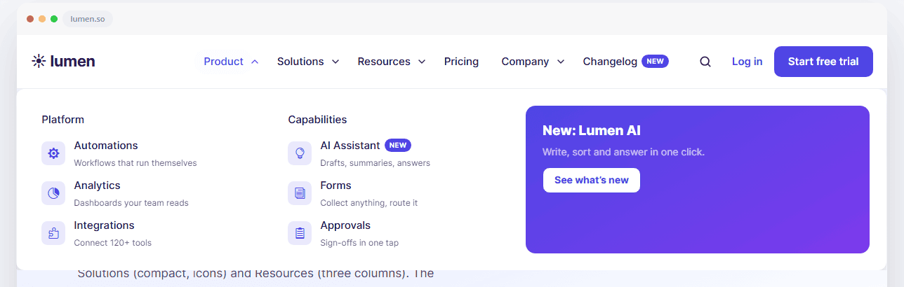
DG Advanced Menu builds your whole site header in one Divi 5 module: logo, menu, mega menus, search, cart, buttons, contact details, social icons and the mobile menu. You design everything in the Visual Builder. There is no separate dashboard and no code.
What you can build with it:
Headers with up to three rows (top bar, main row, bottom row)
Mega menus with columns, photo cards, promo cards, or any Divi Library layout
Badges (New, Hot, Popular), icons and short descriptions on menu links
8 mobile menu styles and your own burger icon
A sticky header that can hide, shrink, change its logo and adapt to dark sections
Requirements: Divi 5 and DiviGrid. WooCommerce only for the Cart item.
How to Add the Module to Your Page
Open the Theme Builder. Go to Divi → Theme Builder and click Add Global Header (or edit the one you have).
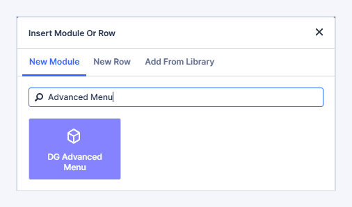
Add the module. Add a section with a one-column row and insert DG Advanced Menu. It starts with a logo, your main menu, a search icon and a button, so you see a working header right away.
Pick your menu. Open the Menu item. In Menu, choose a WordPress menu. Auto uses the menu in the "Primary Menu" location.
Set your colours. In the module's Design → Quick Style, set the Accent Color, Text Color and Background Color. Most parts of the header use these three colours, so one change restyles everything.
Check the phone view. Switch the builder to the phone view. The burger appears and the menu moves into the mobile menu. Choose a look in Content → Mobile → Mobile Menu Style.
Save. Click Save in the builder, then save the Theme Builder.
Tip: You can also use the module inside a normal page section, for example a landing page with its own header.
How the module is organised
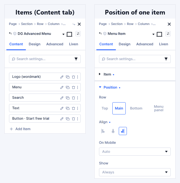
The header is made of items. Each item is one thing: a logo, a menu, a button and so on. You add, sort and remove items in the module's Content tab, like the slides of a slider.
Rows and slots
The header has three rows:
Row | Typical use |
|---|---|
Top | A notice bar, phone number, opening hours, social icons |
Main | Logo, menu, search, cart, button |
Bottom | A second menu, for example the category bar of a shop or magazine |
Each row has three slots: left, center and right.
You place an item with two settings in the item's Position group:
Row: Top, Main, Bottom, or Menu panel. "Menu panel" means the item is shown only inside the mobile menu.
Align: left, center or right.
Items in the same slot follow the order of the item list. Drag an item in the list to move it.
Empty rows are not printed, so a header with only a main row stays light.
True center
In Content → Layout → Center Column:
True center keeps the middle items exactly in the middle of the header, even when the left side is wider than the right. Use it for a centred logo.
Auto lets the middle grow when there is more space.
The items
Choose the type in the item's Item Type. Only the settings for that type are shown.
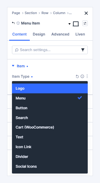
Item | What it does | Good to know |
|---|---|---|
Logo | Your logo, linked to the home page | Empty = the site logo from Appearance → Customize or Divi Theme Options. Optional Logo When Sticky and Logo On Dark Sections. |
Menu | A WordPress menu | Mega menus, badges and icons are set in Menu Links (see section 4). |
Button | A call-to-action button | Optional icon on the left or right. |
Search | A search field | Inline field, Expand (an icon that opens the field) or Modal (a centred search box). Search in everything, posts, pages or products. Icon Size (Design tab) sets the size of the search icon. |
Cart (WooCommerce) | Cart icon with item count and total | Updates right after "Add to cart", without a page reload. Use the built-in cart icon or any Divi icon; Icon Size sets its size. Hidden when WooCommerce is not active. |
Text | Any short text | Phone number, notice, opening hours, a "Log in" link. |
Icon Link | One icon with a link | Fill in Label For Screen Readers, for example "Call us". |
Divider | A thin line between items | Vertical or horizontal. A horizontal divider in the mobile menu spans the full width unless you set a Length. |
Social Icons | Links to your social profiles | One per line: the network name, a space, the URL, for example |
Where items go on phones
The item's On Mobile setting decides this:
Auto (recommended): the logo and cart stay in the bar. The menu, button, search, text and social icons move into the mobile menu. Dividers are hidden.
Keep in bar: always visible in the header.
Move into menu panel: shown inside the mobile menu.
Hide: not shown on phones.
Show only when sticky
With Sticky Header on, any item can use Show: Only when sticky or Only when not sticky. Example: a "Book now" button that appears only after scrolling.
Menu links: mega menus, badges, icons
Open the Menu item and look at Menu Links. Every link of your WordPress menu is listed. Click a link to expand it.
Your settings are saved with the page and work with Undo. Your WordPress menu itself is not changed.
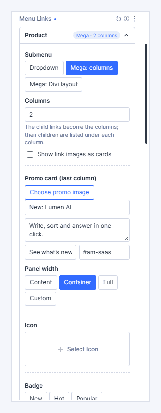
Submenu types (top-level links)
The Submenu options appear only on top-level links that have sub-links.
Type | What it shows |
|---|---|
Dropdown | A classic list under the link. |
Mega: columns | A wide panel. Each sub-link becomes a column heading, and its own sub-links are listed below it. |
Mega: Divi layout | A panel that shows any Divi Library layout, built with any modules you like. |
Mega: columns
Columns: how many columns the links use.
Panel width:
Content: only as wide as the links need.
Container: as wide as the header content.
Full: the full screen width.
Custom: a width you set.
Panel alignment (for Content and Custom widths): Auto, Left, Center or Right.
Show link images as cards: each column heading gets a photo on top. Pick the photos in the Card images box that appears. A link without an image shows as plain text.
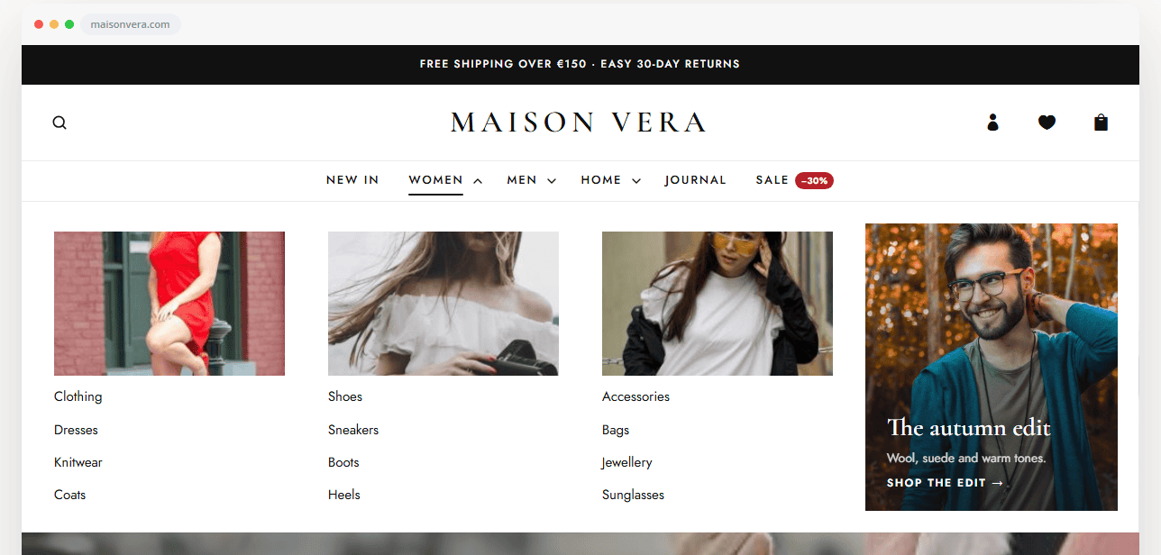
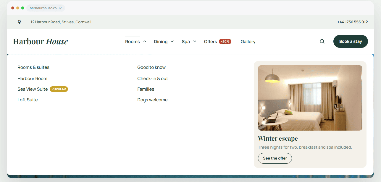
Promo card (last column): an extra column with an image, title, text and button. Use it for an offer, a new feature or a featured article.
How the menu becomes columns: in Appearance → Menus, put the column headings under the top-level link, and the links under each heading.
Product                ← top-level link (Mega: columns)
  Platform             ← column heading
    Automations        ← link in the column
    Analytics
  Solutions            ← column heading
    Startups
Mega: Divi layout
Choose a layout from your Divi Library, or click Create mega layout. This creates a new Library layout and opens it in a new tab, so you can design it. Edit layout opens it again later. On phones the mobile menu shows the normal sub-links instead of the layout.
Link options (every link)
Option | What it does |
|---|---|
Icon | A Divi icon before or after the text. Icon only hides the text (screen readers still read it). Inside dropdowns and megas the icon is shown in a small tinted tile. |
Description | A small line under the link, for example "Dashboards your team reads". Shown in dropdowns and megas. |
Badge | New, Hot, Popular or your own text. Hide after removes it automatically after a date. |
Image | The link's photo, used by Show link images as cards. |
Who sees it | Everyone, Logged in or Logged out, limited to certain user roles if you want. Devices shows the link only on desktop, tablet or phone. |
Copy settings and Paste settings copy a link's options to another link. Clean up removes saved settings of links that are no longer in the menu.
The mobile menu
Mobile menu styles
Content → Mobile → Mobile Menu Style changes the whole look with one click.
Style | Looks like |
|---|---|
Classic | A drawer that slides in from the side. |
Glass | A frosted drawer; the page is blurred behind it. |
Editorial | Fullscreen, big type, numbered links (01, 02…). |
Bottom Sheet | Slides up from the bottom, like an app. Drag down to close. |
Tiles | Top links as an app-like grid of tiles. |
Circle Expand | Fullscreen; a circle grows out of the burger. |
Island | A floating rounded panel under the header. |
3D Push | The page tilts back while the menu slides in. |
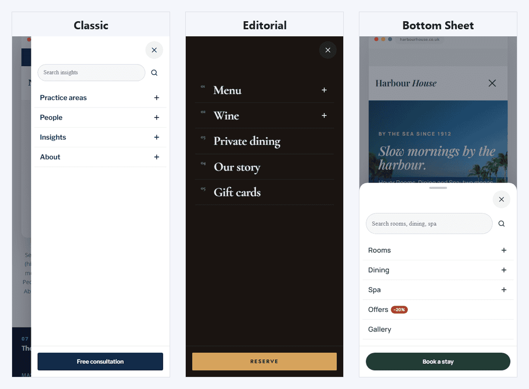
Related settings:
Menu Opens As: drawer from the right or left, slide down under the header, or fullscreen. Editorial, Circle Expand, Bottom Sheet and Island choose this themselves.
Submenus On Mobile:
Accordion opens sub-links in place.
Drill-down slides them in with a Back button.
Mobile Menu Below: the screen width where the burger replaces the menu (default 980px). Raise it if your desktop menu gets crowded on laptops.
Burger Menu On All Screens: use the burger and mobile menu on desktop too, for a minimal look.
Items Fade In One By One, Swipe To Close, Current Page Marker: small touches you can switch off.
The burger icon
In Content → Mobile → Burger Icon:
Animated lines (default): choose how they turn into a close icon in Burger Animation (X, Arrow, Squeeze, Spin, Morph).
Divi icon: pick a Menu Icon, and optionally a Close Icon shown while the menu is open.
Your image: upload an image or SVG in Menu Image.
Text Next To The Icon adds a word such as "Menu". Text Position puts it before or after the icon.
Size, colour, background and corners are in Design → Burger Icon.
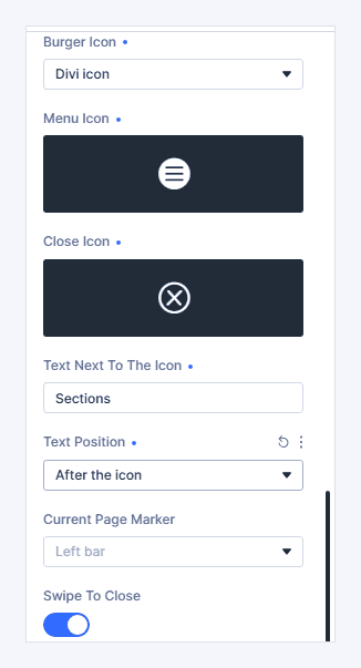
If you choose Divi icon or Your image but leave it empty, the animated lines are shown, so the burger never disappears.
What goes into the mobile menu
The menu panel has three areas: the top (next to the close button), the links, and the bottom (for example a full-width button). Items set to On Mobile: Auto go to the right place by themselves.
Sticky header
Turn on Content → Sticky → Sticky Header.
Option | What it does |
|---|---|
Sticky Behavior | Always visible, or Hide on scroll down, show on scroll up. |
Top Offset | Space between the top of the screen and the stuck header. |
Shrink When Sticky | The rows and logo get smaller after scrolling. Set the small logo size in the Logo item's Logo Height When Sticky. |
Transparent Over The Hero | The header floats over the first section and gets its background after scrolling. |
Hide Top Row When Sticky | The top bar slides away once the header is stuck. |
Reading Progress Bar | A thin line under the stuck header shows how much of the page has been read. |
Adapt Colors To The Section Below | Over dark sections the header uses its On Dark Sections colours (Design tab). |
Colours after scrolling are in Design → Sticky Header.
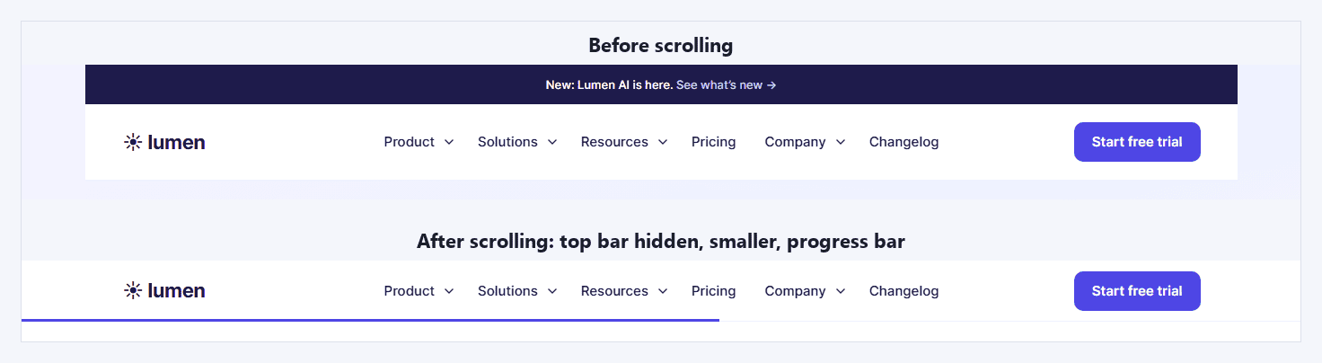
Important: style the header with the module's own rows (Design → Rows), not with the Divi section around it. Only the module sticks, not the section.
Dark sections with a photo: the module detects dark background colours. For a section with a dark photo or video, add the CSS class digr-amenu-dark to that section (Advanced → CSS ID & Classes).
Styling
Start with Design → Quick Style: accent, text, background, corner radius and shadow. Go into the other groups only when you want to change one part.
Design group | Styles |
|---|---|
Layout | Content width, space between items, main row height |
Rows | Top, Main and Bottom row (tabs): background, border, spacing |
Menu Links | Font, spacing, Hover Effect (10 effects: underline, pill, text roll, marker, magnetic…), hover and current-page colours |
Dropdown | Panel background, border, shadow, link font and colours, minimum width |
Mega Panel | Background, border, maximum height, column gap, column heading colour |
Promo Card | Tabs for Card, Image, Text and Button: layout (image on top, text over the image, no image), width, image shape and hover effect, overlay, button style |
Badge | Colours for New, Hot, Popular, text colour, corners |
Mobile Drawer | Background, link font, width, overlay, glass blur, corner radius (the inner edge of side drawers), dividers, current-page colour |
Burger Icon | Size, colour, background, corners |
Sticky Header / On Dark Sections / Progress Bar | Shown only when that feature is on |
Focus | The ring shown when someone uses the keyboard |
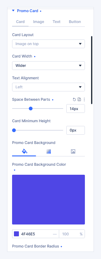
Each item also has its own Design tab: button colours, logo height, icon size, search field and so on.
Preview while you design
Content → Builder Preview shows states that normally need a mouse or scrolling. The live site is not affected.
Show A Submenu: keeps the first dropdown or mega menu open so you can style it.
Show The Mobile Menu: opens the mobile menu in the builder.
Show The Sticky State: shows the header as it looks after scrolling.
Animation speed
Content → Menu Behaviour → Animation Speed (default 300ms) and Animation Feel (Smooth, Ease out, Snappy, Spring) control every animation in the header. Visitors who turn on "reduce motion" in their system get no animations.
Ready-made recipes
Header | How to build it |
|---|---|
SaaS / product | Logo left, Menu center, Text "Log in" and Button right. Product as Mega: columns with icons and descriptions, plus a promo card. Sliding Indicator Pill. |
Shop | Top row: Text notice, center. Main row: Search left, Logo center (True center), Icon Links and Cart right. Bottom row: Menu center, with Show link images as cards. |
Restaurant (split menu) | Two Menu items: one left, one right, Logo center. Mobile style Editorial. |
Agency (minimal) | Burger Menu On All Screens, mobile style Circle Expand, Burger Icon with the text "Menu". |
Law firm / business | Top row with phone and email (On Mobile: Hide). Menu right, Divider, Button. |
Magazine | Top row: date and Social Icons. Main row: big Logo center (True center). Bottom row: Menu (categories) and Search Modal. |
Transparent over a photo | Main row background transparent, white text in Quick Style. With Sticky on, use Transparent Over The Hero. |
See all of these live on the Advanced Menu demo page.
Troubleshooting
The menu is empty. Pick a menu in the Menu item, or assign a menu to the "Primary Menu" location in Appearance → Menus.
I don't see the Submenu (mega menu) options. They appear only on top-level links that have sub-links. Add sub-links under the link in Appearance → Menus first.
The desktop menu overlaps the logo or button on a laptop. Raise Mobile Menu Below (for example to 1160px), lower Space Between Links, or shorten link labels.
The mega menu is cut off. A parent element is hiding overflow. A rounded Divi section, row or group clips its content. Set that element's Overflow to Visible (Advanced → Visibility), or remove its rounded corners.
The sticky header has no background. Style the module's rows, not the Divi section around it. Or set a Sticky Background in Design → Sticky Header.
The header doesn't change colour over a dark photo. Add the class digr-amenu-dark to that section.
The Cart doesn't show. It needs WooCommerce to be active. In the builder you see a small "needs WooCommerce" note instead.
The Create mega layout button is missing. Your user role needs permission to create Divi Library layouts.
Some common questions about Advanced Menu
Getting started
Does it work with the Divi Theme Builder?
Yes. Add it to the global header, or to any header template. It also works inside a normal page section.
Does it work with Divi 4?
No. DG Advanced Menu is made for Divi 5.
Do I need a separate mega menu or mobile menu plugin?
No. Mega menus, the mobile menu and the sticky header are all built in.
Does it use my WordPress menus?
Yes. Pick any menu from Appearance → Menus. Mega menus, badges, icons and descriptions are saved in the module, so your menus stay as they are and work with other themes too.
Can I have two menus in one header?
Yes. Add two Menu items, for example one on the left and one on the right of a centred logo, or a second menu in the top row.
Mega menus
Can a mega menu contain any Divi module?
Yes. Choose Mega: Divi layout and pick a Divi Library layout, or click Create mega layout and design it like a normal page: images, buttons, blurbs, even forms.
Can each top-level link have its own mega menu?
Yes. Every top-level link has its own submenu settings. One header can mix dropdowns, column megas and layout megas.
Can I add photos to a mega menu?
Yes, in three ways:
Show link images as cards puts a photo on top of each column.
A promo card adds a photo, title, text and button as the last column.
A Divi layout mega can contain anything.
Can each mega menu have its own promo card?
Yes. The promo content (image, title, text, button) is set per link. The promo design in Design → Promo Card applies to all promo cards in that header, so they match.
How wide can a mega menu be?
As wide as its links (Content), the header content (Container), the full screen (Full) or a custom width. Content-width panels stay inside the header.
What do mega menus look like on phones?
They become normal sub-links in the mobile menu, as an accordion or drill-down. Layout megas show the menu's sub-links, so phones get a clean list.
Mobile
How many mobile menu styles are there?
Eight: Classic, Glass, Editorial, Bottom Sheet, Tiles, Circle Expand, Island and 3D Push.
Can I use my own burger icon?
Yes. Choose Divi icon or Your image (PNG or SVG) in Content → Mobile → Burger Icon. You can also add a close icon and a word such as "Menu".
Can I show the burger on desktop too?
Yes. Turn on Burger Menu On All Screens.
At what width does the mobile menu start?
980px by default. Change it in Mobile Menu Below.
Can I put a button or social icons at the bottom of the mobile menu?
Yes. Items set to On Mobile: Auto or Move into menu panel appear in the menu. Use Row: Menu panel for items that should exist only there.
Can I hide something on phones?
Yes. Set the item's On Mobile to Hide. For a single menu link, use Who sees it → Devices.
Sticky header
Can the header hide when scrolling down?
Yes. Sticky Behavior → Hide on scroll down, show on scroll up.
Can I use a different logo after scrolling?
Yes. Upload it in the Logo item's Logo When Sticky. Logo On Dark Sections works the same way for dark sections.
Can the header be transparent over my hero image?
Yes. Turn on Transparent Over The Hero. It gets its background once visitors scroll.
Can a button appear only after scrolling?
Yes. Set the button item's Show to Only when sticky.
Links, badges and visibility
Can a badge disappear by itself?
Yes. Set a date in the badge's Hide after. For example, show "New" for 30 days.
Can I show a link only to logged-in users?
Yes. In the link's Who sees it, choose Logged in, and optionally only certain user roles. Use Logged out for a "Log in" or "Sign up" link.
Will my link settings survive a site migration or demo import?
Yes. Settings are found by the link's ID, and when the IDs change after an import, by the link's title and URL.
I renamed or removed a menu link. What happens to its settings?
They stay saved until you click Clean up in Menu Links.
Does it work with one-page sites?
Yes. Turn on Highlight Sections While Scrolling, and #section links become active as visitors scroll.
WooCommerce and search
Does the cart update without a page reload?
Yes, with Update Without Reload on. The count changes right after "Add to cart".
What does search look in?
Everything, or only posts, pages or products (Search In).
Speed, SEO and accessibility
Will it slow down my site?
It is built for speed. No jQuery, scripts load deferred, and the mobile menu and sticky scripts load only when a header uses them. The header has no layout shift while the page loads.
What is "Instant Page Loads"?
When a visitor rests the mouse on a link, the page starts loading in the background, so the click feels instant. Logout, cart and external links are skipped. WordPress 6.8 and newer already does this for every link on your site; the module then leaves it to WordPress and only adds it on older versions.
Is the menu accessible?
Yes:
It works with the keyboard (Tab, Enter, Esc) and shows a clear focus ring.
It has a Skip To Content link.
It gives screen readers a menu name, and reads labels for icon-only links.
It respects "reduce motion".
Is the menu printed twice (desktop + mobile)?
No. The menu is rendered once and reused, so search engines and screen readers see each link once.
Can I change the animation speed?
Yes. Content → Menu Behaviour → Animation Speed and Animation Feel.