The Divigrid Tilt Image Card Module is a powerful and versatile tool designed to create visually engaging and interactive image cards with dynamic tilt effects. This module offers extensive customization options that allow you to fine-tune every aspect of the card's content and design. Below is a comprehensive guide to configuring the Content and Design tabs for the Tilt Image Card module.
Content Tab Customization
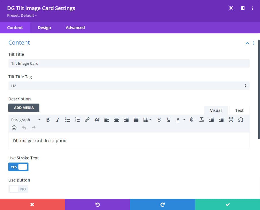
1. Contents
Tilt Title Text: This field allows you to enter the primary title that will appear on the tilt card. The title is a key element that catches the viewer's attention.
Tilt Title Tag: Select the appropriate HTML tag for the title, such as H1, H2, H3, etc., based on its importance in your content hierarchy. This choice affects SEO and the visual presentation of the title.
Description: Add a brief description that provides context or additional information to complement the title. This is particularly useful for summarizing the content or providing a call to action.
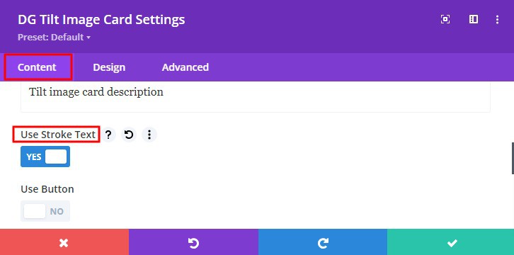
Use Stroke Text Switch: Enable this option to apply a stroke effect to the title text, giving it a more pronounced and styled appearance. This can make the title stand out against various backgrounds.
Use Button Switch: Activate this switch to include a button within the card, turning it into an interactive element. The button can link to other pages, products, or external resources.
2. Image & Icon
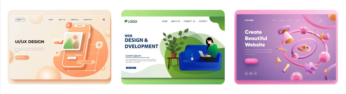
Use Image Switch: Turn on this switch if you want to display an image on the tilt card. This image serves as the main visual element and should be high-quality and relevant to the content.
Use Icon Switch: Toggle this switch to display an icon instead of an image. Icons are useful for minimalist designs or to represent abstract concepts visually.
Note: Both switches can remain off if you do not wish to display an image or icon, focusing the card purely on text content.
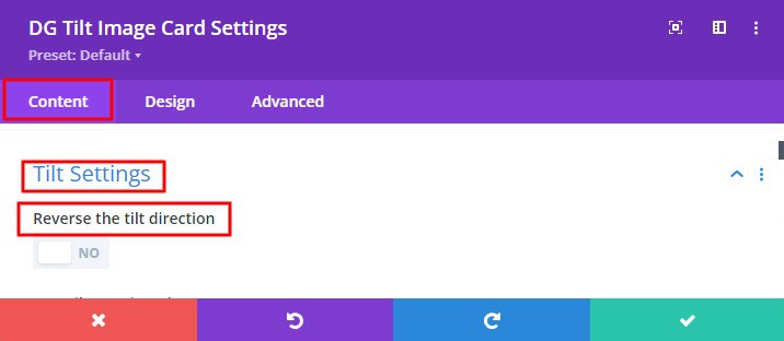
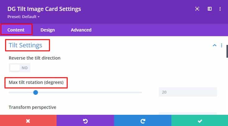
3. Tilt Settings
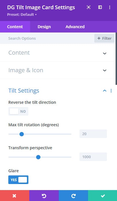
Reverse the Tilt Direction: This option allows you to reverse the default direction of the tilt effect, changing how the card responds to mouse movements. It's useful for creating a customized user experience.
Tilt Rotation: Adjust the degree of rotation applied to the card when it tilts. This setting defines the intensity of the tilt effect, giving you control over how subtle or dramatic the effect appears. Control the degree of rotation applied to the card when it is tilted. This setting defines how much the card will tilt on the X and Y axes.
Transform Perspective: Set the perspective from which the card appears to tilt. A higher perspective value creates a more pronounced 3D effect, adding depth to the card.
Glare Switch: Enable this switch to add a glare effect to the card. The glare simulates light reflecting off the card's surface, enhancing the 3D appearance.
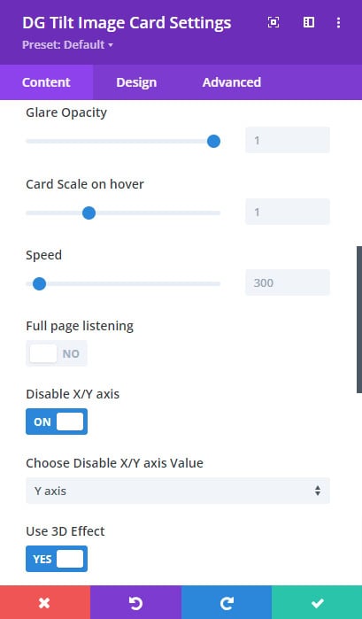
- Glare Opacity: Fine-tune the opacity of the glare to adjust its visibility. A higher opacity makes the glare more noticeable, while a lower opacity creates a subtler effect.
Card Scale on Hover: This option allows the card to slightly scale up when hovered over, adding a dynamic zoom effect. It draws attention to the card and invites interaction.
Speed: Control the speed of the tilt and hover effects. A faster speed creates a more responsive effect, while a slower speed can create a more relaxed, fluid motion.
Full Page Listing Switch: When this switch is activated, the card will extend to cover the full width of the page, making it a prominent visual feature.
 |
 |
 |
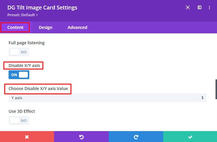
Disable X/Y Axis Switch: Choose to disable the tilt effect on the X-axis, Y-axis, or both. This setting is useful if you want to restrict the tilt movement to a single axis or prevent it entirely.
- Disable X/Y Axis Value: Specify which axis (or both) should be disabled to restrict the tilt effect.
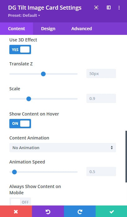
Use 3D Effect Switch: Toggle this switch to enable a 3D transformation effect, adding depth and a more immersive experience to the tilt card.
- Translate Z: Adjust the Z-axis translation to control the depth of the 3D effect. This setting helps to create a more or less pronounced 3D illusion.
- Scale: Modify the scale of the card to enhance or minimize the 3D effect. Scaling can make the card appear larger or smaller when tilted.
Show Content on Hover: Activate this option to reveal the card’s content only when the user hovers over it. This effect can create a sense of discovery and interactivity.
- Content Animation: Select from various animation styles to control how the content appears when the card is hovered over. This adds an extra layer of engagement.
- Animation Speed: Animation Speed: Set the speed of the content to reveal animation, ensuring that it aligns with the overall design aesthetic and user experience.
Always Show Content on Mobile: Always Show Content on Mobile: Enable this setting to ensure that the card’s content is always visible on mobile devices, where hover effects may not function as intended.
Design Tab Customization
The Design Tab provides options to refine the visual style of the Tilt Image Card, including settings for images, icons, typography, and overall card appearance.
1. Image & Icon Style
Image/Icon Alignment: Set the alignment of the image or icon within the card. Options include left, center, and right alignment, allowing you to position the visual element precisely.
Width & Height: Define custom dimensions for the image or icon to ensure that it fits seamlessly within the card’s layout and complements the overall design.
Margin & Padding: Control the spacing around the image or icon by adjusting the margin and padding. This helps to fine-tune the visual balance and spacing within the card.
Border: Apply a border to the image or icon to make it stand out. You can customize the border style, width, and color to match the card’s design.
Box-Shadow: Add a shadow effect to the image or icon, creating depth and emphasizing the visual element. The box-shadow setting allows you to control the shadow’s color, size, and position.
2. Font Styles
Individual Font Styles for Title and Description: Customize the typography for the tilt title and description separately. You can set the font family, size, weight, text shadow, line height, alignment, letter spacing, color, and padding, ensuring that each text element is distinct and visually appealing.
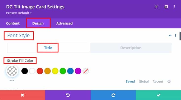
Stroke Fill Color: If the stroke text option is enabled, you can select a fill color for the stroke, allowing you to create a vibrant, outlined text effect that enhances readability and style.
3. Content Wrapper Settings
Background: Set a background color or image for the content wrapper. This background serves as a canvas for the card’s text and visuals, adding contrast and depth to the design.
Margin & Padding: Adjust the spacing around the content wrapper by modifying the margin and padding. This setting allows you to control the layout and spacing within the card, ensuring a balanced and aesthetically pleasing design.
Border: Define a border for the content wrapper, with options to customize the style, width, and color. This can help to frame the content and make it stand out within the card.
Box-Shadow: Apply a shadow effect to the content wrapper, giving it a layered look that adds depth and dimension to the card.
Some Common FAQs About Tilt Image Card
Q. Can I reverse the tilt direction on the Tilt Image Card?
Yes, you can reverse the tilt direction by toggling the "Reverse Tilt Direction" switch in the Tilt Settings. Go to Tilt Settings >> Reverse the tilt direction switch >> Turn ON
Q. Can I use both an image and an icon on the same Tilt Image Card?
No, you must choose either an image or an icon by turning on the corresponding switch under the Image & Icon section.
Q. How do I apply a stroke effect to the title text?
Enable the "Use Stroke Text" switch under the Content section, and then customize the stroke fill color under the Design tab.
To activate the stroke go to Go to Content >> Use stroke text >> Turn ON
To design stroke text Go to the Design tab >> Font Styles >> Title >> Stroke fill color
Q. How can I change the tilt rotation angle?
You can adjust the tilt rotation angle in the Tilt Settings by setting the desired degree of rotation. Go to Tilt Settings >> Max tilt rotation (Degrees)>> Modify the degree value
Q. What does the Glare effect do?
The Glare effect simulates light reflecting off the card's surface, enhancing its 3D appearance. You can enable this in the Tilt Settings and adjust its opacity.
Q. Can I disable the tilt effect on certain axes?
Yes, you can disable the tilt effect on the X-axis, Y-axis, or both using the "Disable X/Y Axis Switch" in the Tilt Settings. Go to Tilt Settings >> Disable X/Y Axis >> Activate the switch >> Choose disable X/Y axis value
Q. What does the Full Page Listing switch do?
When enabled, the Full Page Listing switch expands the Tilt Image Card to cover the full width of the page, making it a prominent visual element.
Q. Can I add animation to the content reveal on hover?
Yes, you can select from various content reveal animations and set the speed in the Tilt Settings under the Show Content on Hover option.
Q. How can I make the Tilt Image Card full-width?
Enable the Full Page Listing switch under Tilt Settings to make the card extend to the full width of the page.
Q. How can I control the perspective of the tilt effect?
The Transform Perspective setting in the Tilt Settings allows you to control the depth and angle of the tilt effect, giving you more control over how the card moves in 3D space.
Q. What does the "Always Show Content on Mobile" option do?
The "Always Show Content on Mobile" option ensures that all content on the card is displayed on mobile devices, regardless of the hover or reveal settings.