WordPress Posts
A WordPress post is what makes up the blog aspect of your site. A WordPress post contains content written in order of publication and it can be arranged and categorized. Posts may also be “pinned” in a blog, meaning that regardless of the publication date.
WordPress Posts are generally news or informational updates about a certain topic or talking point. Posts can be tagged, categorized, and even archived on your site. They’re dynamic and constantly changing the content your end users see.
We all know Post is the most important in WordPress. From the idea of how to make your work with posts more efficient and smooth, we created a module with advanced features compatible with WordPress and Divi. This module can easily design, style, and modify all WordPress posts. The module is named PostGrid.
If you want to know more about us or our other products, please visit us Here
Post Grid
Once you have installed DiviGrid Module, you will find the PostGrid alongside the other Divi Modules available in the “Insert Module” window.
PostGrid-related common questions
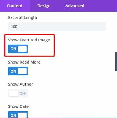
1. How to add a featured image?
If the post does not have a featured image, you can set or replace the featured image from the WordPress post's settings option.
If the featured image is set in the post, you can show that image as desired.
You can turn it off if you want. There is a switch in the element toggles of the Postgrid plugin called Show Featured Images.
From there the featured image of the post can be turned on or off.
 |
 |
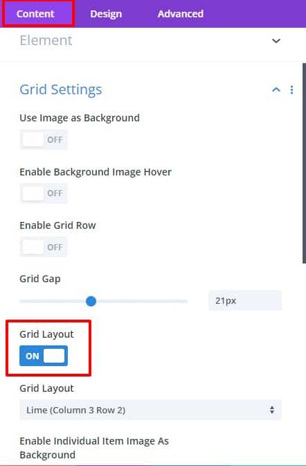
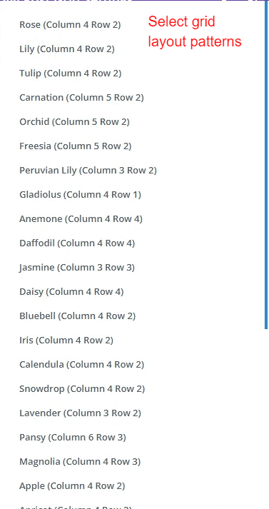
2. How to change grid layout patterns?
There are more than 30 grid layout patterns in our plugin. To change the grid layout pattern,
first, go to the grid settings and from there turn on the grid layout switch.
After turning it on, grid layout style options will appear. Choose one as per preference.
go to plugins grid settings toggle -> Enable grid layout switch -> Choose your desired grid pattern style
 |
 |
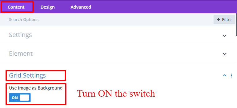
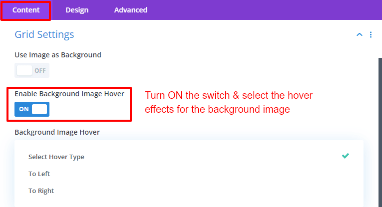
3. How to use the image as a background?
If your post has a featured image set, you can set that image as the background image from our plugin.
For this, first, go to the grid settings of the plugin. Then turn on the Use Image As Background switch.
All items in the grid will show the featured image as the background image.
go to the plugin's grid settings --> ON the switch " Use Image As Background".
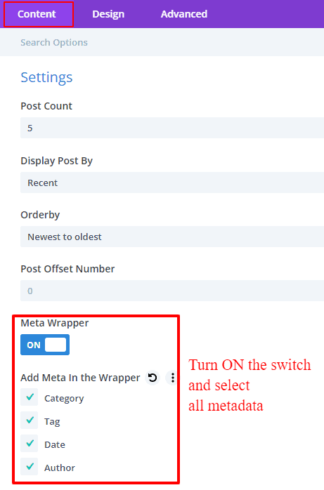
4. How to change meta data-position?
All metadata can be repositioned by wrapping them together.
First, the metadata should be switched on. Then open the Meta Wrapper switch from the settings toggle and select all metadata.
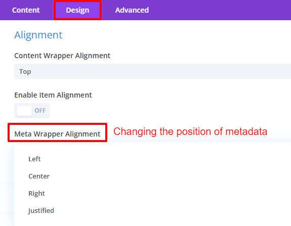
Then the metadata can be changed to Left, Right, Center, or Justified position from the Alignment toggle of the Design tab.
 |
 |
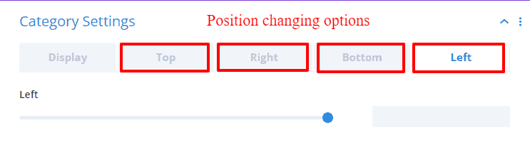
Also, if you want to change the position of metadata separately, you need to switch on metadata from the content settings tab.
If turned on, a separate toggle will be created for each metadata in the Content tab.
The position of the metadata can be easily set to any position from the Left, Right, Top, and Bottom option fields.
 |
 |
 |
 |
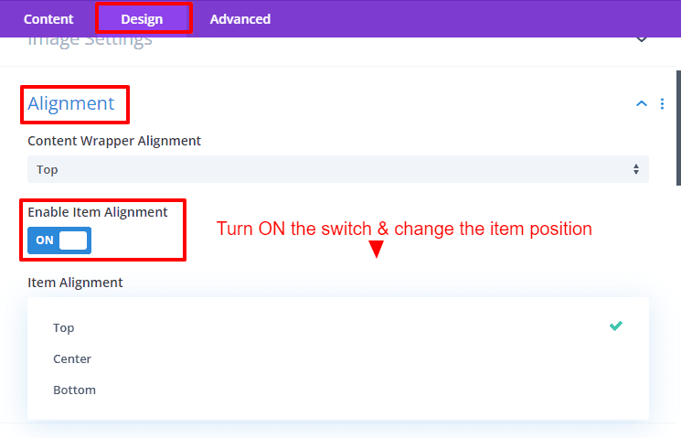
5. How to change post content position?
Go to the Alignment toggle on the Design tab. Here you choose to place the content wrapper at the top,
center, or bottom.
And if you want to change the position of the grid item, you can set the position to the top,
center or bottom by turning on the item alignment switch.
6. How to create hover effects?
Go to the Overlay and Hover Settings toggle on the Design tab.
Click the Hover Image Type field. Select the hover type for featured images in the post.
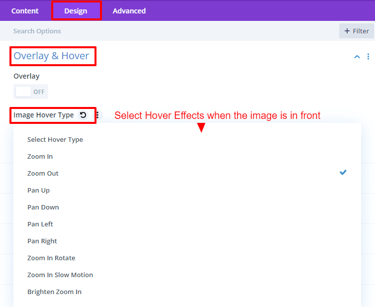
Also if you want to use the hover effect for the background image then enable the background image hover switch from the grid settings of the content tab.
You can choose the specific hover effect from here.
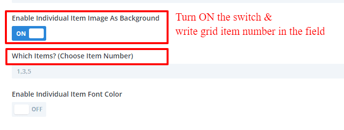
7. How to set the background image as a selected item?
If you want to use the featured image of one or more items in PostGrid as a background,
you must turn on the Enable Individual Item Image As Background switch from the Grid Settings.
The number of the grid item should be defined from the field that appears there.
The featured image of the defined numbers will show as a background.
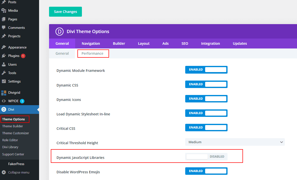
8. How to remove the blurry effect when the pagination is active?
Sometimes when pagination is active and you go to new or old posts the section gets blurred. Due to this, the content cannot be properly focused. It takes a little effort to overcome this problem. Go to Performance Tab from General Settings of Divi Theme Options. Then from there, the dynamic javascript library switch should be disabled. Then the blur effect will be removed from the pagination. Which option to disable is selected in the image below.
OVERVIEW
Divi Post Grid Module
PostGrid gives you the simplest and easiest way to create a post grid from WordPress posts with just a few clicks Additionally, you can filter post content and display it in a grid view. We have created many attractive premade layouts that you can use as per your choice. This module lets you simply display your posts and thumbnails in a post grid layout using the grid layout style.
In this article, we will go into detail about how our module's advanced features and design options work. Let's start...
Divi Post Grid Content Settings
After inserting the Divi Post Grid Module you will find several new toggles along with the default toggles. Toggle names are listed below
- Settings
- Element
- Grid Settings
- Category Settings
- Tag Settings
- Date Settings
- Author Settings
- Divider
- Item Order
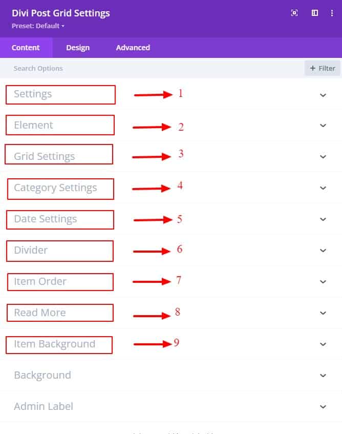
Every toggle has a bunch of fields for modifications. A detailed explanation of how each setting works is provided below.
Settings
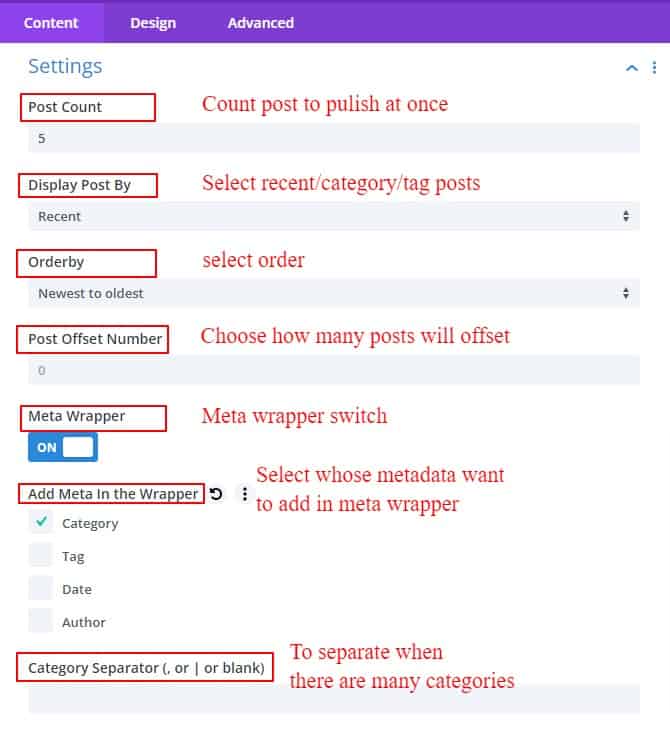
1. Post Count
This field is for specifying how many posts you want to display in a post grid style. From here you can decide how many posts you want to publish at once.
2. Display Post By
This field is for selecting whether you want to show the posts category-wise, tag-wise, or just recent posts. If you select the category, the posts will be displayed according to the category, if you select the tag, the posts will be displayed according to the tag. Initially, the posts will show based on recent posts. You have to select any tag or category post you want to show from the selection box
3. Post Offset Number
Offsets are useful because they can allow a user to skip a certain number of WordPress posts before starting output. The post offset number of users specifies how many posts from the beginning you don't want to show, or want to exclude. If you write the number of posts you want to exclude, other posts will be shown in our grid.
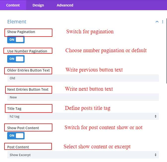
4. Show Pagination
Pagination is one of the most common and important aspects of WordPress. Our module has two switches for pagination. One is to display pagination and the other is to display pagination as numbers. If you turn on the first one only the pagination will show. If both switches are turned on, you can see the number of pages you are on along with pagination.
5. Use Number pagination
By switching on the use number pagination you can see which pagination page you are on. And if you keep it off, only the default pagination tie will be active.
6. Older Entries Button text
After the pagination is active, you can write any text of your choice as a new entry, such as New Post, First Post, etc. Whatever you type will show as the first part of the pagination.
7. Next Entries Button Text
After the pagination is active, you can write any text of your choice as an old entry, such as Old Post, Next Post, etc. Whatever you type will show as the last part of the pagination.
8. Category Separator & Tag Separator
A post can have one or more categories and multiple tags. Each tag and category can be separated using commas or pipes. How to separate tags or categories in a post by writing here will separate the tags/categories accordingly.
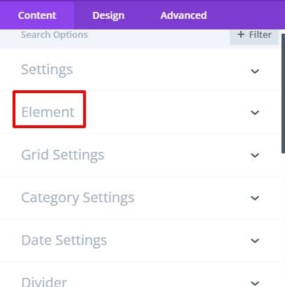
Element
- Meta Wrapper
- Add Meta in the Wrapper
- Title tag
- Show Post Content
- Post Content
- Use post Excerpt
- Excerpt Length
- Show Read More
- Show Author
- Show Author Image
- Author Image Size
- Hide Author Text
- Show Date
- Date Format
- Show Categories
- Show Tags
Meta wrapper
Meta items can be wrapped together with the Meta Wrapper switch. If the switch is turned on, every meta item will be neatly wrapped inside this wrapper. They can be well placed inside the meta wrapper.
Add Meta in the Wrapper
You can select your metadata through the Add Meta Wrapper field. Select the data you want to show inside a wrapper and they will be enclosed by a wrapper. Then it will be convenient to place them together. Your selected metadata will be aligned together.
Title Tag
In this field, you will get the option to change the title tag of the post titles of the post grid. From here you can select the required title for your post. Changing from one place will change the title of all posts.
Show Post Content
This is the switch to show the post contents. If it is OFF, the grid will not show any posted content. There are options to show post content in full or in excerpts.
Post Content
There are two options in the post content field. One to display the content of your post as an excerpt and the other to display the entire content together. If you select Excerpt, you can add text with a Read More button below.
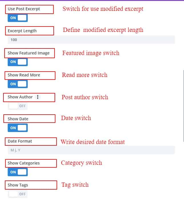
Use Post excerpt
If you want to show only post excerpts, then you need to turn on the Use Post Excerpts switch.
Excerpt Length
After switching on Use Post Excerpt, another field called Excerpt Length will appear. From this field, you can determine how many words you want to keep the length of your excerpt. By default, the length of the excerpt will be 270 words.
Show Read More
When except is selected, a read more button option is provided for ease of understanding to view the rest of the content. When on click the full content will show on a single post page. You can write any text of your choice on this Read More button to prompt the client to read or view the full content of your post.
Show Author
You can turn your author off or on at will with a switch. The author has two separate switches for Text and Image. Through which you can hide or show the author's text or the image of the author. When you hide, that option will no longer be shown in the post grid. The ability to define the size of the author's image is given in this author's setting.
Show Date
The vital metadata of a post is the date. The date can be shown on or off through the switch. You can also define the format of how the date will be shown. You can attach the date to the post as you wish.
Show Categories
Categories provide a helpful way to group related blog posts. You might want to create categories for different topics you cover in your blog. For example, if you have articles that cover a specific genre of music, you might want to keep those grouped in a category.
Categories not only help keep posts organized, but you can also use categories to display posts in several places across your site, making it easier for your visitors to find what they’re looking for quickly. You can show or hide the category type with this switch.
Show Tags
WordPress tag is one of the default tools you can use to categorize your WordPress posts. Each post can contain multiple tags and visitors can click on a tag to find similar posts that have that same tag. Tags are completely optional. There is a switch called a show tag switch to show and hide these tags together. If the switch is on, it will show tags and if it is off, it will not show any tags in Postgrid.
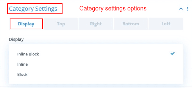
Category Settings
The category Settings has 5 sub-toggles to align & positioning the category's metadata. Display, Left, Right, Top, and Bottom. From the 1st sub-toggle, you can define how to keep the display position of category data. The remaining sub-toggles are for the alignment of category metadata. To set in any position, you can align from left, right, top, or bottom as desired.
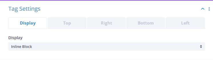
Tag Settings
The Tag Settings has 5 sub-toggles to align & positioning tags metadata. Display, Left, Right, Top, and Bottom. From the 1st sub-toggle, you can define how to keep the display position of tags. The remaining sub-toggles are for the alignment of tags metadata. To set in any position, you can align from left, right, top, or bottom as desired.
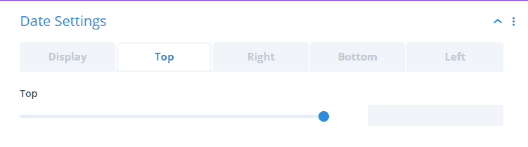
Date Settings
The Date Settings has 5 sub-toggles to align & positioning date metadata. Display, Left, Right, Top, and Bottom. From the 1st sub-toggle, you can define how to keep the display position of dates. The remaining sub-toggles are for the alignment of dates metadata. To set in any position, you can align from left, right, top, or bottom as desired.
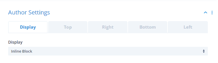
Author Settings
The Author Settings has 5 sub-toggles to align & positioning author metadata. Display, Left, Right, Top, and Bottom. From the 1st sub-toggle, you can define how to keep the display position of the author. The remaining sub-toggles are for the alignment of authors' metadata. To set in any position, you can align from left, right, top, or bottom as desired.
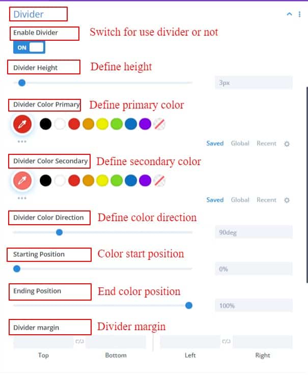
Divider
Dividers can be used to separate content or metadata from images. You will get many fields to define divider height, gradient color, direction, color starting position, and color ending position. Styling of dividers can be done as required.
Item Order
Image order toggle to change the order of post content like metadata, images, dividers, titles, etc. You can change the order to place any content first in your grid layout.
Read More
A button to show the entire post is required when the post excerpt is used. So that the post can be shown in a single post by clicking the button. Whatever is written in this field will show as button text at the end of the excerpt.
Item Background
This field is for giving background color, image, and gradient color between each item. Background can be given to all posts together.
Grid Settings
Use Image As Background
This switch is useful for using the feature image as a background. If the switch is turned on, the feature image will appear in the background. And the rest of the post content will come on top of the image and the metadata can be shown as desired. And the background scale on the hover switch is given because if desired when the developers hover over the post, the image will zoom in or zoom out a bit. By doing this, the look out of the post grid will change a lot and look beautiful.
Enable Background Image Hover
When hovering over an item, this option makes the featured image change its position and move slightly to the right or left to be slightly more focusable. This hover effect can be used based on the type of post.
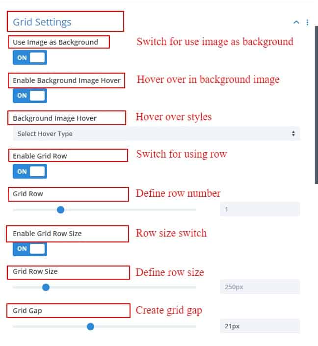
Enable Grid Row & Enable Grid Row Size
When Enable Row is switched on there are two options and select fields. One is dependent on the other. Its row size will depend on your grid row selection. The thing is, if you select a row, all the items in the 1st row will implement that row size. If two rows are selected or three rows are selected, the row size will be applied to all items in those two or three rows.
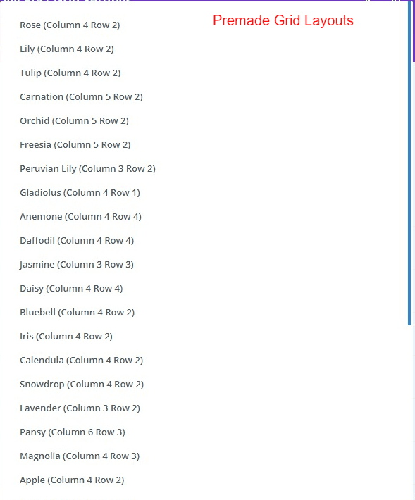
Grid Layout Switch & Grid Layout Style
The grid layout switch is for selecting any grid layout from the options of premade layouts. You can select one according to your choice from here without creating a new grid. These layout options are available when the switch is turned on.
Grid Gap
This switch creates a gap between each item in the grid. Gaps can be made from 0 to 50 pixels
Enable individual Item Image As Background
If you want to specify an item from the grid and use it as the background of the post, you will get the option by turning on the switch. Selecting from there will show the post's featured image as the background image.
Choose the Image Background Individually
If a post-featured image of the grid is shown as a background, the featured image of these items will show as the background image only after writing the number of grid layout items.
Enable Individual Item Font Color
After turning on the Individual Item Font Color switch, 4 color options are available. Title and Content Color will change the title and content color of the item. Wrapper Inside Meta Color Meta can be used to change the color of the metadata inside the wrapper. MetaColor outside the wrapper can be used to change the color of the metadata outside the wrapper. Both options are given here. But keep in mind that, this feature will only work when the Feature Image Edge Background switch is turned on.
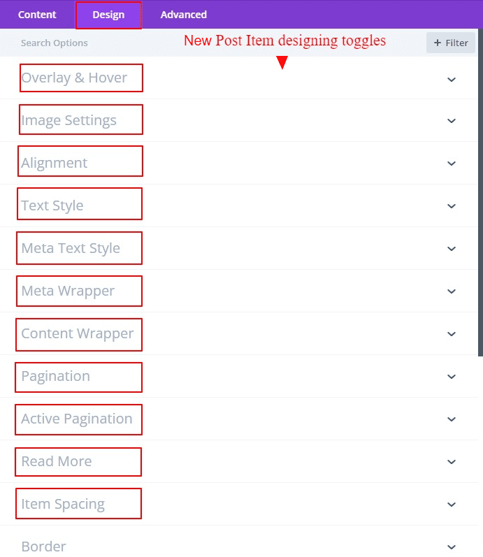
Post Grid Design Settings
There are tons of design options to style the post grid beautifully. The options given to design each item are listed.
- Overlay & Hover
- Image Settings
- Alignments
- Text Style
- Meta Text Style
- Meta Wrapper
- Content Wrapper
- Pagination
- Active Pagination
- Read More
- Item Spacing
Overlay & Hover
The overlay will work when the item hovers over. If the overlay is switched on, two colors will appear. One is primary and the other is secondary. There will be directions for combining the two colors. Also, icons can be used as extras on overlays. All icon styles can be done here.
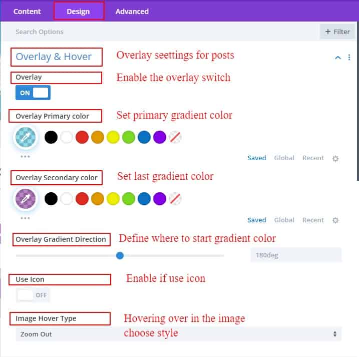
Image Hover Type is one of the unique features of the Divi post grid. there are many image hover types in the list. from the several types of image hover types, you can choose one of the best image scale types for your post-grid layout. you can use the image hover type with or without overlay active. if you don't use overlay then the image hover type works only in the images.
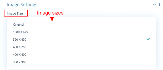
Image Settings
You can select what size image you want to use as the featured image in a post. You can select a size as per your requirement from various ratios.
There are also options for designing image borders, box shadows, etc. You can give a more attractive look to the post image from these settings.
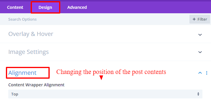
Alignments
There are three types of alignment in this setting.
The first alignment will work if the image is in the background. The contents can then be used to align the top, center, or bottom as desired.
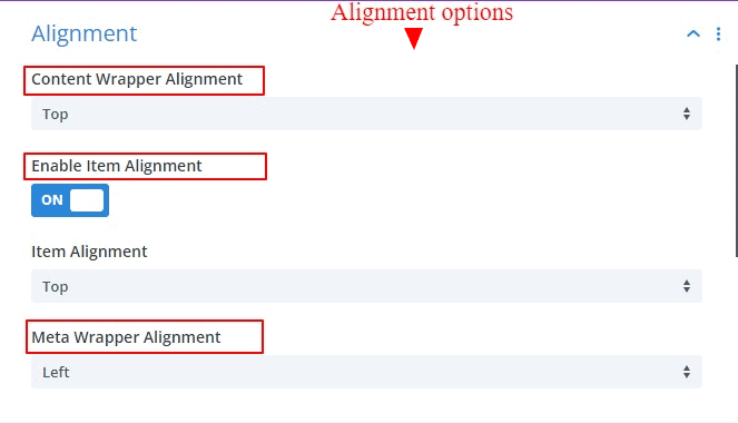
The 2nd alignment is bound by a switch. Switching it on will reveal the alignment option. This alignment allows each item to be positioned at the top, bottom, or center. This allows images, metadata, and posts content to be repositioned together.
The 3rd and last alignment is the alignment of the meta wrapper data. How categories, tags, dates, and author data can be positioned can be decided. Metadata can be changed to left, right, center, or justified positions.
Text Style & Meta Text Style
The Divi default text styles for post titles and content text are available as toggles. Metadata text font, stylings, background style, margin, and padding can be done from here.
Meta Wrapper & Content Wrapper
There are various styling options to style the wrapper box where the metadata will be together. Margin, padding, background, meta wrapper width, border, box-shadow, etc. styles can be found in this toggle. There are similar setting options for the content wrapper toggle.
Pagination
Pagination is an important part of the post grid. Important options like alignment, background, next and previous icon selection, icon size, margin, padding, pagination font styles, border, and box-shadow have been added to give a nice look to pagination.
Active Pagination
This toggles settings, to indicate which page is active within the grid. Options for changing the background, border, box shadow, and background color are available.
Read More
The main idea is to give the client a button to read the entire post on a single page when the post excerpt is turned on. Details on how to style this button can be found in Read More Toggles
Item Spacing
This field is for giving a specific amount of space to each item. Required Margin and Padding can be done from here. This field applies to all items together.
Border
There are two field options for styling the border of containers and items together. Each item's border can be styled together from here. Also, the full container border can be styled.