The Scroll Image module is a feature-rich component of the Divigrid plugin, which is a third-party plugin for the Divi theme. This module allows you to create visually engaging scrollable images with a wide variety of customization options, such as adding badges, setting scroll direction and speed, applying different overlays, and more. Perfect for creating interactive and dynamic website experiences, this module is ideal for showcasing products, portfolios, or any image-heavy content that requires movement and a modern design.
Content Tab Customization
The Content tab in the Scroll Image module contains the core settings that define the image, its scroll behavior, and any accompanying content such as badges, titles, and descriptions. These settings allow you to control what image is used, how it behaves during the scroll, and the additional elements that appear over or near the image.
Upload Image
The most fundamental part of this module is the image itself. Uploading an image is simple, and it serves as the base for the scrolling effect. The image will scroll either horizontally or vertically, depending on the settings you choose. The Scroll Image module works best with high-resolution images to prevent any pixelation or blur when the image moves.
[ For best results, choose an image that is larger than the module container to allow for a smooth scrolling effect. ]
Use Badge Switch
The Use Badge Switch gives you the option to overlay a badge on top of the scroll image. A badge is a small label that appears over the image, providing additional information such as a discount, promotion, or any other noteworthy content.
Badge Text: This is the core content of the badge. Once the badge is enabled, you’ll see a Badge Text field where you can input the text you want to display. Common use cases for this could be adding labels like "New," "Sale," "Exclusive," or any short, impactful message. The badge adds an extra layer of visual interest to the image.
Title & Title Tag
Below the badge, the Title field allows you to add a title that appears near the scroll image. This is useful for adding a heading or descriptive title to complement the image. Divigrid provides a wide variety of options for customizing the title, both in terms of text content and SEO relevance.
- Title Content: You can add any descriptive title you want. For example, if the scroll image is part of a product catalog, you can include the product’s name here.
- Title Tag: From an SEO perspective, you can choose different HTML heading tags such as H1, H2, H3, etc. It’s a best practice to use H1 for the primary title on a page and H2 or H3 for sub-headings.
Description
The Description field allows you to add a block of text that further explains or supports the image content. This text can be as brief or as long as you need, though shorter descriptions are generally more effective for maintaining a clean design.
Settings
The Scroll Image module offers several key settings that govern how the image behaves when it scrolls. These settings are essential for ensuring a smooth and visually appealing user experience.
Scroll Direction
The Scroll Direction setting allows you to control how the image scrolls across the screen. This adds dynamic movement to an otherwise static image, making it more engaging for viewers. You can select one of the following options:
- Top to Bottom: The image starts from the top and slowly moves downward, revealing different sections of the image.
- Bottom to Top: The image begins at the bottom and scrolls upward.
- Left to Right: The image starts from the left side and scrolls to the right, which is particularly useful for wide, panoramic images.
- Right to Left: The image begins from the right side and scrolls to the left, creating an eye-catching horizontal movement.
By combining the right image with the appropriate scroll direction, you can create a visually compelling experience. For instance, a city skyline would work beautifully with a left-to-right scroll.
Scroll Speed
Scroll Speed controls how fast the image moves. You can adjust the scroll speed using a millisecond, where the lower the millisecond, the faster the scroll. Conversely, a higher millisecond results in a lower scroll. A slower scroll speed is ideal for images where you want viewers to spend more time absorbing details. It’s perfect for intricate product images or designs that need to be revealed gradually. When setting the scroll speed, consider how the image interacts with the rest of your page's content. Too slow a scroll can bore users, while too fast a scroll might make it difficult to catch important details.
Design Tab Customization
The Design tab offers a wealth of customization options to help you refine the appearance of the scroll image and its associated elements like the badge, font styles, and overlays.
Scroll Image Customization
This section allows you to control how the scroll image looks within the module. These options ensure that the image fits seamlessly into your overall page design.
Image Height
The Image Height setting allows you to specify the visible height of the scroll image container. This setting does not change the height of the image itself but adjusts the container’s height, controlling how much of the image is visible at one time.
Scroll Image Spacing
Scroll Image Spacing controls the space between the scroll image and other nearby elements on the page. This setting ensures that the image doesn’t feel cramped or awkwardly positioned within your design.
Scroll Image Border
Adding a Scroll Image Border can help define the image's boundaries. You can customize the border's color, width, and style, which can either blend with or contrast against the rest of the page.
Scroll Image Box Shadow
The Box Shadow setting allows you to create depth by adding a shadow around the scroll image. This effect can be used to make the image appear as though it’s hovering above the page. The shadow settings include adjustments for:
- Color
- Blur Strength
- Spread Spread Strength
- Horizontal and Vertical Offsets
Font Style Customization
The Scroll Image module allows you to customize the Title and Description fonts independently, giving you precise control over how each text element appears.
Title Font Style
In the Title Font Style section, you can customize the font settings for the title text:
- Font Family: Choose from a wide variety of fonts to match your website’s branding.
- Font Weight: Adjust the weight of the text (e.g., Light, Normal, Bold).
- Alignment: Align the text to the left, right, or center, depending on your layout.
- Letter Spacing: Increase or decrease the spacing between letters to achieve your desired typographic look.
- Line Height: Adjust the space between lines of text for better readability.
- Color: Choose the color of the title text.
- Text Shadow: Add a shadow behind the text to create depth and highlight the title.
Description Font Style
Similarly, the Description Font Style offers a wide range of options for customizing the description text. This ensures that your description is styled in a way that complements the overall design of the scroll image.
Badge Customization
Badges are a crucial part of the Scroll Image module, especially if you’re using the scrollable image to highlight special offers or important content. The Badge Customization section offers several options for styling the badge:
Badge Background
The Badge Background is one of the most customizable elements in the Scroll Image module. You can choose between a solid color, gradient color, or even use an image as the background for your badge, giving it a unique look that suits your website’s style.
-
Badge Background Color: You can set a solid color for the badge background, choosing from any color in the palette or using custom hex codes. This is ideal if you want a bold, uniform badge that stands out.
-
Badge Background Gradient Color: If a single color feels too flat, you can add a gradient background to your badge. The Gradient Color feature lets you choose a primary and secondary color, as well as define the direction of the gradient (horizontal, vertical, diagonal). This gives the badge a more dynamic and polished look.
-
Badge Background Image: For even more customization, you can use an image as the badge’s background. This is useful for brands that want to use logos, textures, or patterns within the badge. The Background Image setting allows you to upload any image, adjust its size, and control its position to ensure it fits well within the badge area.
Badge Spacing
The Badge Spacing settings control how much space surrounds the badge, ensuring it is visually distinct from the rest of the content. This option includes the ability to add margin and padding to the badge.
- Margin: Adjust the distance between the badge and other elements of the scroll image. This ensures the badge doesn't feel cramped or too close to other content.
- Padding: Padding adds space inside the badge, between the badge’s content (text or icon) and its border. This is useful if you want to create a more spacious, well-balanced badge design.
Badge Font Style
The Badge Font Styles section gives you the tools to customize the appearance of the badge text. You can control every aspect of the text, from font family to color and shadow effects, to make sure the badge fits your website’s overall design language. Here’s what you can customize:
- Font
- Font Weight ( Bold, medium, etc )
- Font Style ( Italic, underlined, etc )
- Alignment ( left, center, right )
- Font Color
- Line Height
- Letter Spacing
- Text Shadow
Badge Border
Adding a Border to your badge can enhance its visual appeal and define its shape. The Scroll Image module allows you to fully customize the badge border, offering settings for border width, style, and color.
Badge Box Shadow
Adding a Box Shadow to the badge gives it depth and creates the illusion that the badge is hovering above the scroll image. Box shadows are highly customizable, allowing you to control the shadow color, blur, spread, and offset.
Overlay Customization
Overlays are a powerful design element that can be applied to the scroll image, allowing you to place a semi-transparent layer over the image to improve the readability of text, highlight specific areas, or add an icon.
Use Overlay Switch
The Use Overlay switch allows you to enable or disable the overlay feature on the scroll image. Once activated, you can access a range of options to customize the overlay’s appearance, including color, gradient, and even the addition of an icon.
-
Overlay Background Color: You can set a solid color for the overlay. This is especially useful for images where you want to dim or highlight certain areas to make text or badges more legible. The color opacity can also be adjusted to fine-tune the visibility of the underlying image.
-
Overlay Background Gradient Color: Similar to the badge, you can apply a gradient to the overlay for a more sophisticated look. The gradient can include a primary and secondary color, and you can adjust the gradient direction to match the design.
-
Overlay Background Image: For a more creative overlay, you can use an image. This feature allows you to layer an image over your scroll image, providing extra texture or thematic elements to enhance the design. The background image can be adjusted for size and position to ensure it fits perfectly within the overlay area.
Use Overlay Icon
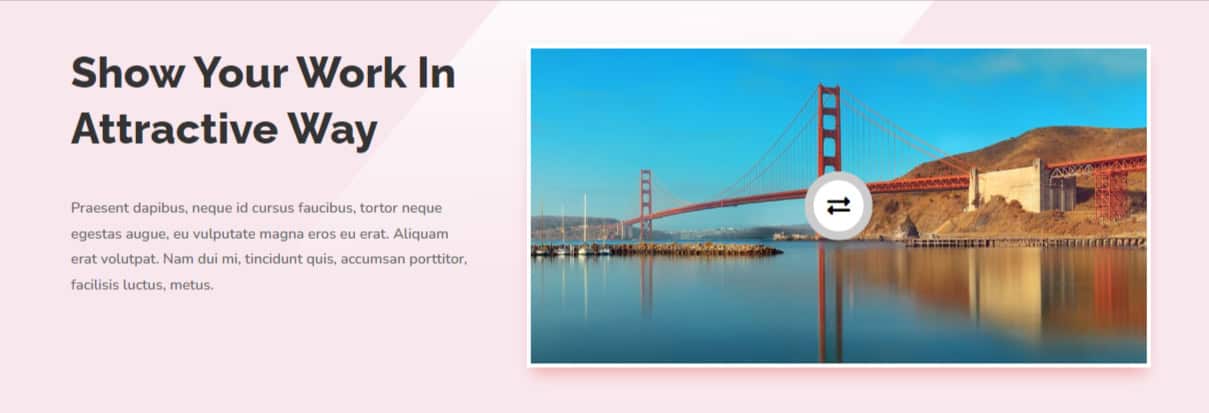
Enabling the Overlay Icon places an icon in the center of the scroll image. This is ideal for creating a clickable image or adding a visual cue to the image. Once activated, you’ll have access to customization options for the icon’s style and background.
-
Icon Selection: You can choose from a wide variety of icons, such as arrows, play buttons, or custom icons, to place in the center of the overlay. This is perfect for creating interactive elements on the image, like linking to a video or another page.
-
Icon Color: You can customize the color of the icon to ensure it stands out against the overlay and the image. Choose from the default color palette or use custom hex codes to match your site’s design scheme.
-
Icon Background: The background of the icon is customizable with three options:
- Background Color: Set a solid color for the background of the icon to make it stand out more.
- Background Gradient Color: Add a gradient to the background, similar to the badge, for a more polished and layered look.
- Background Image: For even more design flexibility, you can use an image as the icon’s background.
Overlay Icon Spacing
The Icon Spacing settings allow you to control how much space surrounds the overlay icon. This ensures that the icon does not feel cramped or too close to the edges of the scroll image.
-
Padding: Control the space inside the overlay icon background, ensuring that the icon is properly balanced within its background area.
-
Margin: Adjust the margin to position the icon appropriately on the scroll image.
Overlay Border
The Overlay Border settings allow you to add a border around the entire overlay, creating a defined space between the image and the surrounding page elements. You can adjust the border’s width, style, and color for full control.
Overlay Box Shadow
Lastly, the Overlay Box Shadow allows you to create depth around the overlay by adding shadows. This feature helps the overlay stand out, especially if you want it to hover above the image content.
The Scroll Image module for Divigrid is a powerful tool for adding dynamic, scrollable images to your Divi-based website. By using the extensive customization options within the Content and Design tabs, you can create visually stunning designs that captivate your audience and elevate your content. Whether you’re showcasing products, portfolios, or any other image-based content, this module offers the flexibility and control needed to create a professional and engaging experience.
FAQs for Scroll Image Module
Q. How can I add a scroll effect to an image?
The Scroll Image Module automatically adds a scroll effect to the image. You can adjust settings such as the scroll speed and direction in the module settings.
Q. What are badges in the Scroll Image Module?
Badges are visual elements that you can place on your images to highlight important information such as sales, promotions, or new product features.
Q. Is the Scroll Image Module responsive on all devices?
Yes, the module is fully responsive and automatically adjusts to various screen sizes, including desktops, tablets, and mobile devices.
Q. What is the overlay feature in the Scroll Image Module?
The Overlay feature allows you to apply a semi-transparent layer over the image, which can include a background color, gradient, image, or icon.
Q. How do I add an icon to the overlay?
To add an icon, enable the Use Overlay Icon switch, and select an icon from the available options.
Q. Can I animate the scroll image?
Yes, you can add hover and scroll animations using the Animation Settings available in the Design tab.
Q. Is the Scroll Image Module SEO-friendly?
Yes, you can add alt text and image titles to enhance the SEO of your scroll images, making them easier for search engines to index.
Q. Can I apply different scrolling speeds for different sections of a webpage?
Yes, by adding multiple instances of the Scroll Image Module to different sections, you can apply varying scroll speeds, creating dynamic and interactive content.