Overview
Welcome to the Image Hotspot Documentation, where creativity meets interactivity! Image hotspots are your gateway to transforming static images into captivating and informative visual experiences. This comprehensive guide will walk you through the process of implementing, customizing, and optimizing image hotspots to elevate your projects to new heights.
Image hotspots are dynamic overlays strategically positioned on images to create interactive points of interest. By responding to user interactions such as clicks or hovers, hotspots unveil additional information, multimedia content, or navigational elements. Whether you're building educational content, interactive maps, or product showcases, image hotspots inject life into your visuals, fostering engagement and exploration.
Image Hotspot Item Content Tab
👉 Spot Content
👉 Spot Settings
👉 Tooltip Content
Spot Content:
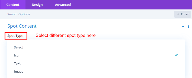
You will get three types of options in Spot Content. Images, icons, and text. Find out how to use different spot types to tell your story. Each type has its own flair, and we'll guide you on how to make the most of them.
Spot Settings
In the world of image hotspots, the spotlight is on spot settings—your tools for fine-tuning the placement, size, and animation of each interactive element. Adjust the horizontal and vertical positions with ease, ensuring your spots align perfectly with your visual narrative. Tailor the spot width and height to suit the content, providing a seamless and visually pleasing experience. Dive into the world of animations by toggling the animation switch and selecting from five distinctive styles. Want to add a touch of flair? Customize the animation color to match your project's aesthetic. With spot settings, your interactive canvas is not just a canvas—it's a masterpiece in the making. Explore the possibilities and let your creativity shine!
Tooltip Content
Welcome to the Tooltip Content section—a place where you weave a layer of informative magic into your image hotspots. Choose between two options: Basic Tooltip(Text) and Library Content Tooltip, each offering unique advantages.
Basic Tooltip(Text): Craft your narrative with the essentials. Toggle the tooltip image switch to include visuals, enhancing engagement. Prioritize SEO with the image alt attribute. Then, let your words shine by adding descriptive tooltip text. Simple, effective, and perfect for a personalized touch.
Library Content Tooltip: For a seamless experience, opt for Library Content. Dive into your Divi Library, select content, and effortlessly integrate it into your tooltips. No need to recreate the wheel—just choose, save, and elevate your user experience.
Image Hotspot Item Design Tab
With the Image Hotspot Item Design Tab, each set is a brushstroke, allowing you to paint a masterpiece of interactive storytelling. Within this tab, you'll find a myriad of settings that empower you to tailor the appearance of your image hotspots with precision and creativity.
👉 Spot Icon Design:
The heartbeat of your hotspot, the Spot Icon Design settings, allows you to customize the essence of guidance and interaction. Choose the spot icon color to align seamlessly with your visual palette, ensuring coherence within your design. Tailor the spot icon size, allowing it to command attention or gracefully complement the surrounding elements. Introduce a spot icon background for an added layer of distinction, enhancing the visual impact of your interactive markers.
👉 Image Styling:
When you choose spot type image you will find its design options. For those who leverage the storytelling power of images, the Design tab provides a canvas for customization. Define the image width and height, ensuring your visuals fit harmoniously into your overall design scheme. Fine-tune margins and padding to sculpt the spacing around your image hotspot, achieving the perfect balance in your composition. Borders and box shadows further elevate the aesthetic, adding depth and dimension to your visual narrative.
👉 Responsive Magic:
In the dynamic landscape of various devices, ensure your image hotspots maintain their allure. Responsive settings for image or icon margin, padding, and sizing ensure a seamless experience, whether viewed on a desktop, tablet, or smartphone. This responsive magic guarantees that your carefully crafted design adapts effortlessly to the diverse screens of your audience.
👉 Spot Font:
Beyond the visual elements, the Spot Font settings provide the typography tools to express your narrative eloquently. Choose from a range of fonts to infuse personality into your text. Adjust font size and line height for optimal readability and visual hierarchy. Harmonize your text with the overall color scheme through font color settings, and experiment with font styles to emphasize key points. Responsive typography ensures your text maintains its impact across different screen sizes.
👉 Additional Design Elements:
Comprehensive design encompasses every detail. Adjust the image or icon margin, padding, border, and box shadow to refine the spatial relationships within your image hotspots. Precision in positioning, alignment, and transformation of text adds an extra layer of finesse to your visual storytelling.
Image Hotspot Content Tab
👉 Content
👉 Tooltip Settings
Hotspot Image
At the heart of the Hotspot module lies the significance of the Main Image—a canvas that serves as the cornerstone for the entire interactive narrative. This primary image dictates the positions and arrangements of all hotspot items, dictating the visual choreography that unfolds for users. Let's delve into the pivotal role that the Main Image plays in shaping the user experience within this module.
The Main Image acts as the visual anchor, determining the spatial coordinates of each hotspot item. Every element, from spot icons to images and text, finds its place on this canvas, creating a cohesive and harmonious composition. The Main Image is not just a backdrop; it is the stage upon which your interactive story unfolds.
All hotspot items align themselves with the features and landmarks within the Main Image. The positions are intricately connected to the visual cues present in this central canvas, ensuring that users seamlessly navigate through the interactive elements, fostering a sense of intuitive exploration.
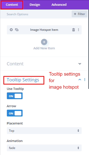
Tooltip Settings
The Tooltip Settings within the Hotspot module offer a plethora of customization options, transforming your interactive narrative into a finely tuned and user-centric experience. Let's unravel the key points that define the dynamics of tooltips, shaping the way users engage with your content.
1. Use Tooltip Switch:
At the heart of tooltip functionality lies the Use Tooltip switch. When activated, tooltips come to life, providing additional information upon interaction with hotspot items. Conversely, when turned off, tooltips gracefully step aside, allowing users to explore without the intrusion of informational overlays.
2. Arrow Switch:
The Arrow Switch introduces a visual cue to hotspot items. When activated, arrows gracefully guide users, indicating the direction of the associated tooltip. This subtle addition enhances the user experience, providing intuitive navigation and orientation within the interactive canvas.
 |
 |
3. Tooltip Placement and Animation Styles:
Customization reaches new heights with the ability to strategically position tooltips in 12 different places empowering users to finely tune the placement of informational overlays. The visual allure of tooltips reaches new heights with a curated selection of six animation styles, infusing a dynamic and engaging dimension to the unveiling of information.
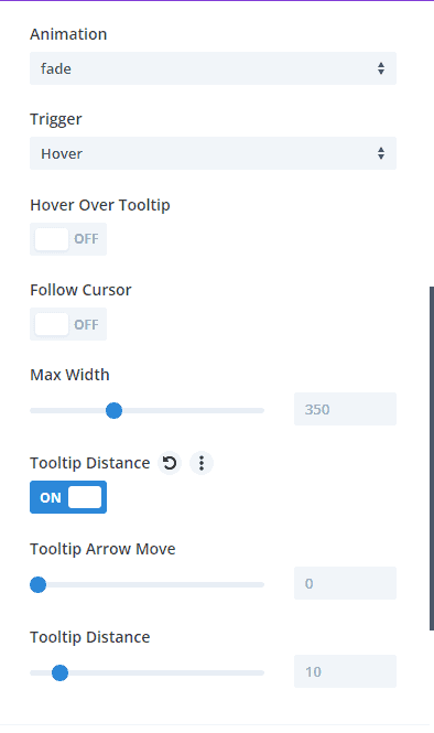
4. Trigger Options:
The trigger options dictate the user interaction required to reveal tooltip content. Choose between hover and click triggers based on your design intent. Hover triggers activate tooltips upon cursor hover, seamlessly integrating information into the user's exploration. On the other hand, click triggers offer a deliberate interaction, ensuring tooltips appear only upon a user's intentional click on a hotspot item.
5. Hover Over Tooltip:
The Hover Over Tooltip switch introduces an additional layer of control. Activate this switch to enable or disable the tooltip hover area, allowing you to define whether tooltips appear when the cursor hovers over the item. The Tooltip Content Hide Delay complements this feature, determining how long tooltips persist after the cursor leaves the hotspot item.
6. Follow Cursor Switch:
For a dynamic and fluid experience, the Follow Cursor Switch allows tooltips to move with the cursor, revealing content precisely where the user's attention is focused. This feature enhances engagement, making the tooltip content an extension of the user's exploration.
7. Max-Width:
Fine-tune the visual aesthetics of tooltips with the Max-Width setting, defining the maximum width that tooltips can occupy. This ensures that tooltips maintain an optimal size, balancing information density with a visually pleasing presentation.
8. Tooltip Distance Switch:
Within this setting, two distinct options, Tooltip Arrow Move, and Tooltip Distance, provide nuanced control. Tooltip Arrow Move creates a defined distance between the hotspot item and the arrow, ensuring a visually appealing layout. Tooltip Distance, on the other hand, specifies the overall distance from the hotspot item to the tooltip content, allowing for precise placement and spacing.
Image Hotspot Design Tab
👉 Global Spot Image & Icon Settings
👉 Global Spot Font Settings
👉 Tooltip Image
👉 Tooltip Style
👉 Tooltip Fonts
👉 Item Settings
Global Spot Image & Icon Settings
There is a global settings feature for grouping to avoid repeating the same actions over and over again. The Global Spot Image & Icon Settings serve as the curator of visual consistency in the Hotspot module, allowing for a unified and polished design across all hotspot items. From defining the color and size of spot icons to controlling the dimensions of spot images, these settings provide a cohesive visual language. The Spot Icon Background adds distinction, while Spot Margin and Padding ensure precise spatial relationships, guiding users through an organized exploration. With options to customize spot item borders and introduce subtle box shadows, these global settings add the finishing touches, elevating the overall aesthetic of the interactive canvas. In essence, these settings empower creators to craft an immersive and harmonious visual narrative, where every hotspot item contributes seamlessly to the cohesive design language.
Global Spot Font Settings
The Global Spot Font Settings in the Hotspot module serve as the orchestrators of typographic consistency, providing creators with centralized control over font type, size, color, and styling. These settings unify the textual elements across hotspot items, establishing a cohesive and visually pleasing narrative. With options for responsive typography, ensuring adaptability across diverse devices, and features like text alignment and transformations, creators can craft a seamless reading experience. Notably, the global font settings feature for grouping minimizes redundancy, enabling creators to apply the same font adjustments effortlessly across multiple hotspot items.
Tooltip Image
1. Alignment: Alignment options for Tooltip Images—left, center, and right—allow creators to precisely position images in relation to the associated tooltips. This choice ensures a visually pleasing and intentional layout, enhancing the overall design coherence.
2. Tooltip Image Width and Height: Fine-tune the dimensions of Tooltip Images with global control over width and height. This setting ensures uniformity, creating a consistent visual language that complements the entire interactive canvas.
3. Margin and Padding: Spatial relationships play a crucial role in design, and Tooltip Image settings provide control over margin and padding. These options allow for meticulous adjustments, ensuring images are appropriately spaced within tooltips, creating a polished and well-organized appearance.
4. Border and Box Shadow: Customization extends to the finer details with the ability to add borders and box shadows to Tooltip Images. Whether it's a subtle border or a gentle shadow, these settings add a touch of sophistication, contributing to the overall visual appeal.
Tooltip Style
The Tooltip Style settings within the Hotspot module offer a palette of customization options, transforming informational overlays into visually refined elements. Key points in Tooltip Style settings shape the aesthetic nuances of tooltips:
1. Tooltip Background: The foundation of Tooltip Style—the background setting—allows creators to define the color or texture that envelops the tooltip. This choice not only sets the tone for the overall design but also ensures a visually cohesive and engaging backdrop.
2. Tooltip Arrow Color: The Tooltip Arrow Color setting introduces a subtle yet impactful detail, allowing creators to customize the color of the arrow that points to the hotspot item. This choice adds a touch of flair and enhances the visual harmony between tooltips and the interactive canvas.
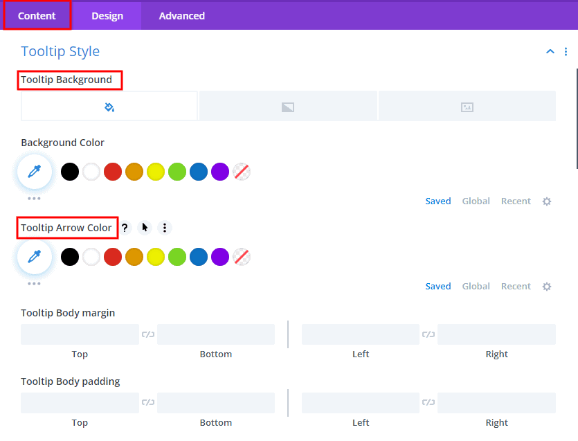
3. Tooltip Margin and Padding: Spatial precision is achieved through the Tooltip Margin and Padding settings. Creators can fine-tune the spacing around tooltips, ensuring they seamlessly integrate into the design layout. This attention to detail contributes to a polished and well-organized appearance.
4. Border and Box Shadow: Refinement extends to the edges of tooltips with options for Borders and Box Shadows. Creators can add borders to define the tooltip's boundaries and introduce box shadows for a subtle depth effect, elevating the overall sophistication of the design.
In addition to these individual settings, the Tooltip Style settings feature a global capability for grouping, allowing creators to apply the same style adjustments effortlessly across multiple tooltips. This feature streamlines the design process, promoting consistency and efficiency.
Tooltip Fonts & Tooltip Heading Fonts
Tooltip Fonts and Tooltip Heading Fonts emerged as the architects of typographic excellence, enabling creators to sculpt a visually immersive textual narrative. As the narrative unfolds within tooltips.
The Paragraph (p) setting becomes pivotal, offering creators the ability to fine-tune font types, sizes, and colors, ensuring a consistent and readable structure. Unordered Lists (ul) and Ordered Lists (ol) find their distinct style within tooltips, with customized fonts shaping the aesthetic of bullet points or numbering, seamlessly integrating lists into the overall typographic theme. Links (a) take center stage with font customization, allowing creators to distinguish hyperlinks within tooltips, not only guiding user interaction but also contributing to the overall elegance of the design. The Blockquote (quote) setting introduces a unique typographic identity for quoted content within tooltips, enhancing visual clarity and prominence.
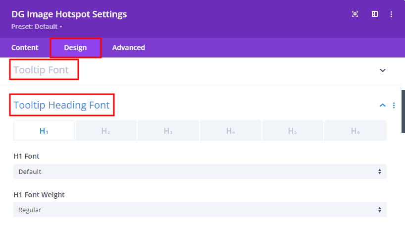
The hierarchical structure of Headings (h1, h2, h3, h4, h5, h6) receives meticulous attention, empowering creators to individually style and customize fonts, sizes, and colors, establishing a clear hierarchy and visual flow. The global settings feature for grouping becomes a beacon of efficiency, streamlining the design process by enabling creators to apply consistent font adjustments effortlessly across diverse textual elements within tooltips. In essence, Tooltip Fonts and Tooltip Heading Fonts empower creators to not only convey information but to weave a harmonious and visually refined typographic narrative within tooltips, where each element plays a pivotal role in shaping the overall user experience.
Item Settings
Item Settings within the Hotspot module serve & grant creators control over the visual characteristics of each hotspot item. By customizing the Item Width and Height, designers can ensure that each element seamlessly integrates into the overall layout, fostering a sense of precision and intentionality. The Item Background Color becomes a vibrant canvas, allowing for personalization that aligns with the overarching theme, creating a cohesive and visually appealing interactive canvas.
Spatial relationships are finely tuned through Item Margin and Padding settings, ensuring each hotspot item finds its strategic place within the design, presenting a polished and organized appearance. With the addition of Borders and Box Shadows, creators can introduce a layer of refinement, framing each item elegantly and adding a subtle depth effect that elevates the overall aesthetic of the interactive narrative.
Common Questions About Image Hotspots
🛑 Can I give each spot item a different or the same background?
✔️ Yes, you have the flexibility to assign either a distinct or uniform background to each spot item within the Hotspot module. If a consistent background is desired for all items, navigate to the parent Design tab labeled "Item Settings," where you can select a background color, gradient, or image to be applied uniformly across all items. Conversely, for individualized backgrounds, access the Item Content tab, specifically named "Background," and configure unique backgrounds for each spot item as per your design preferences. This dual approach provides creators with the freedom to tailor the visual presentation of spot items according to their specific design goals.
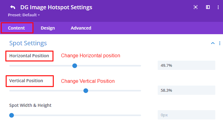
🛑 From where can I change the position of the spot item?
✔️ To adjust the position of the spot item within the Hotspot module, navigate to the "Spot Settings" within the Image Hotspot Item Content tab. Within the Spot Settings, you will encounter two pivotal options—horizontal position and vertical position. These settings empower you to precisely place the spot item within the interactive canvas, allowing for fine-tuned control over both its horizontal and vertical coordinates. By manipulating these parameters, you can strategically position the spot item according to your design preferences and create an engaging and visually pleasing interactive experience.
🛑 Is it possible for each spot item to have a distinct image, icon, or text?
✔️ Absolutely, each spot item can indeed have a distinct image, icon, or text. The flexibility lies in the Spot Content options, where you can individually select your desired media or text for each item. Simply choose the preferred spot type – be it an image, icon, or text – within the Spot Content settings for each item, providing a tailored and varied visual or informational experience across the interactive canvas.
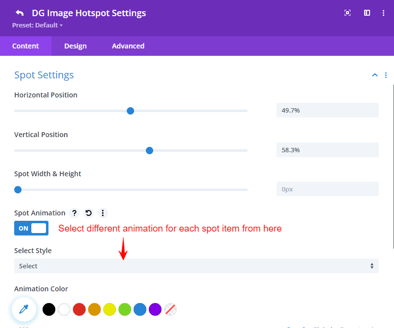
🛑 Is it possible to use different animations for each spot item?
✔️ Certainly, you can absolutely employ various animations for each spot item within the Hotspot module. The customization options reach the animation styles applied to individual items. By activating the spot animation switch for each spot item, you have the freedom to choose distinct animations, resulting in a diverse and captivating visual experience as each piece of content is revealed. This flexibility provides creators with the means to imbue a distinctive flair into each spot item, enhancing the overall dynamism and allure of the interactive narrative.
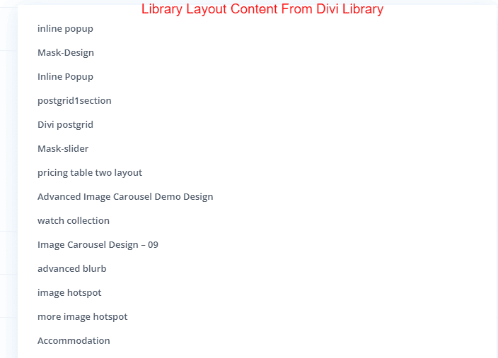
🛑 How can I use the library layout?
✔️ To implement the library layout, start by selecting the library layout option in the Tooltip Content Type option.
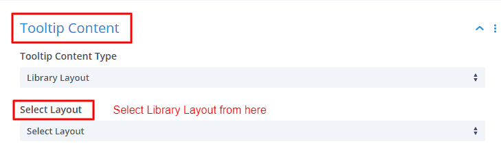
Upon selection, a "Select Layout" box will appear, offering various layouts you saved previously. Choose the preferred layout, and save your selection.
It's important to note that the changes made using the library layout are visible exclusively on the front end of the website, but not showing in the visual builder. This streamlined process allows users to effortlessly integrate and customize library layouts, ensuring a visually appealing and well-structured design for their website or platform.