The Divigrid Advanced Heading Module is a powerful tool designed to create visually captivating headings with a wide range of customization options. This module is perfect for enhancing the typography of your website, allowing you to create dynamic and engaging headings that stand out. Below, you'll find comprehensive documentation for the Content and Design tabs of the Advanced Heading module, guiding you through the process of customizing your headings to suit your design needs.

How to Add a Module to Your Page
Once Divi Grid is activated, multiple modules are introduced to the Divi Builder. To add a module to a page, follow these steps:
Create or Edit a Page/Post: Open an existing page or post, or create a new one using the Divi Builder.
Create or Edit a Row: Add a new row or edit an existing one within the page layout.
Add a Module:
- Click the Add New Module button within the selected row.
- From the module list, select DG Advanced Heading.
Content Tab Customization
The Content Tab in the Advanced Heading module provides you with a variety of input fields and settings to customize the text content and structure of your headings.
1. Content
Prefix Text: Add a text prefix to your heading. This could be a small introductory word or phrase that precedes your main title.
Infix Text: Place additional text in the middle of your heading, allowing you to emphasize or highlight certain parts of the title.
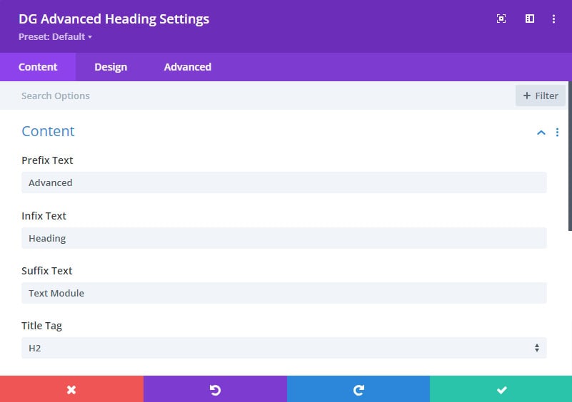
Suffix Text: Add text after your main title to complete the heading. This can be useful for subheadings or additional context.
Title Tag: Select the appropriate HTML tag for your heading (e.g., H1, H2, H3, etc.). This not only defines the visual hierarchy but also impacts SEO.
2. Duel Text
Dual Text Switch: Enable this setting to create a dual text effect, where this text is presented upper or deeper from the main text.
Enable Custom Switch: Once the Dual Text switch is enabled then just show the prefix, infix, and suffix text in the duel text effects. You can turn on the Enable Custom switch to customize the text further.
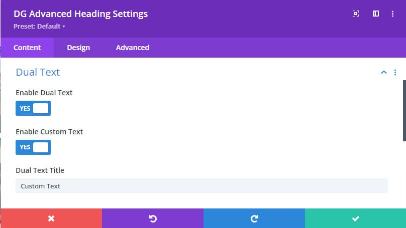
Dual Text Title: This input box will appear when custom dual text is enabled. You can enter your custom text here, providing flexibility in design.
3. Divider
Divider Position: Choose where to place the divider in relation to your heading (e.g., top, or bottom between the text sections).
Divider Color: Select the color for the divider line to match your design scheme.
Divider Thickness: Adjust the thickness of the divider line to make it more prominent or subtle.
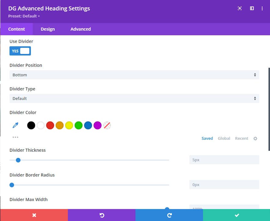
Divider Border Radius: Customize the corners of the divider, allowing for rounded edges or sharp corners.
Divider Max Width: Set the maximum width of the divider to control how far it extends across the heading area.
Divider Alignment: Align the divider to the left, right, or center to achieve the desired visual balance.
Design Tab Customization
1. Heading
Background: Once the Dual Text switch is enabled then set a background color, background gradient color, or image for the heading area, allowing for a distinct visual separation from other content.
Margin & Padding: Adjust the space around the heading to control its placement and spacing in relation to other elements.
Border: Define a border around the heading, with options for rounded corners, color, style, and thickness.
Box Shadow: Add a shadow effect to the heading for depth and emphasis.
2. Heading Font
Customize the font for all heading text (prefix, infix, and suffix). This ensures a consistent typography style across the entire heading.
3. Font Styles
Style the font settings (font family, weight, size, color, etc.) individually for the prefix, infix, and suffix texts. This provides flexibility in creating a visually dynamic heading.
3. Duel Text
Margin & Padding: Fine-tune the spacing around the dual text, ensuring it integrates smoothly with the rest of your content.
Dual Text Font Styles: Customize the font styles specifically for the dual text to differentiate it from the main heading text.
5. Gradient & Background Clip
Gradient Tab:
Select Gradient Field: Choose the text field of text where you want to apply gradient color (prefix, infix, and suffix).
Gradient Type: Choose the type of gradient you want to apply (linear, radial, etc.).
Primary Color & Location: Set the starting color and its position within the gradient.
Secondary Color & Location: Choose the ending color and its placement in the gradient.
Gradient Angle: Control the angle of the gradient, giving you more creative control over the visual flow.
Background Clip Tab:
Select Background Clip Field: Choose whether the background should be clipped to the text.
Image Field: Optionally add an image to be used as the background for the text.
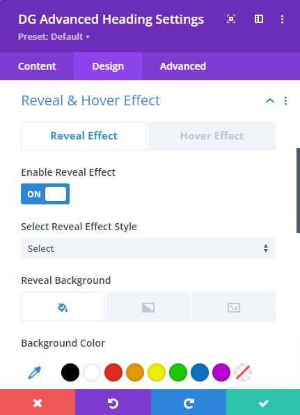
6. Reveal and Hover Effect
Reveal Effect Tab:
Once you activate the reveal effect, you can choose from multiple styling options to customize its appearance.
Select Reveal Effect Style: Choose from over 5 unique styles to reveal the heading text in a visually engaging way.
Reveal Background: Customize the background for the reveal effect to enhance the visual impact.
 |
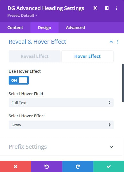 |
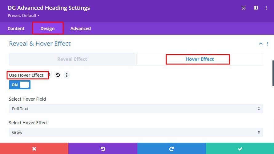
Hover Effect Tab:
Select Hover Field: Specify whether the hover effect applies to the prefix, infix, or suffix text.
Select Hover Style: With over 30 modern hover styles available, you can create interactive and dynamic headings that respond to user interaction.
7. Prefix, Infix & Suffix Settings
Enable Outline Text Switch: Toggle this option to apply an outline effect to the text, which can help it stand out.
Overflow Visible Switch: Enable this option to ensure that any overflow text is visible, rather than being clipped.
Display Block Switch: This setting allows the text to behave as a block-level element, influencing its layout and positioning.
Use Background Switch: Apply a background color or image specifically to the prefix, infix, or suffix text.
Margin & Padding: Adjust spacing around these text elements for precise control over layout.
Border: Customize the borders around each text element for added emphasis.
Box Shadow: Apply a shadow effect to individual text elements, creating depth and separation.
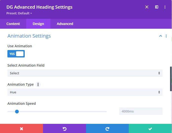
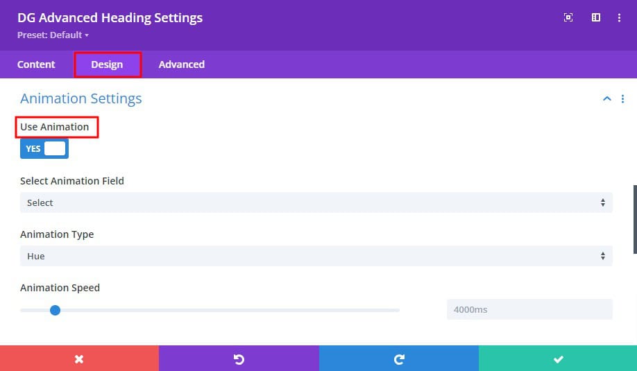
8. Animation Settings
Select Animation Field: Choose which part of the heading (prefix, infix, or suffix) the animation applies to.
Animation Type: Select from over 12 animation types to bring your heading text to life.
Animation Speed: Control the speed of the animation, tailoring it to the overall pacing of your webpage.
9. Divider Image & Icon
Divider Image Switch: Enable this switch to use an image as the divider.
Divider Icon Switch: Alternatively, use an icon as the divider for a more stylized appearance
Divider Z-Index: Control the stacking order of the divider, ensuring it appears above or below other elements as needed.
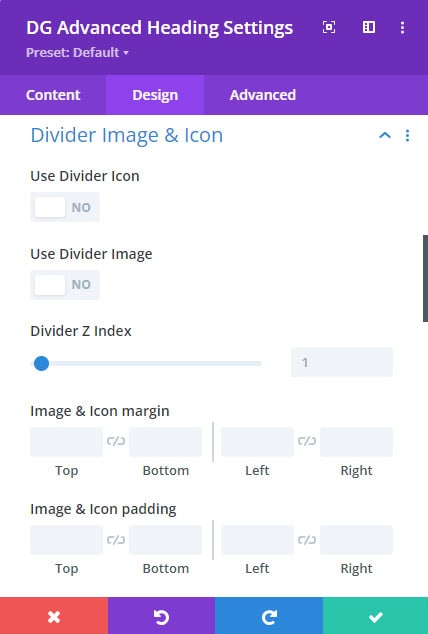 |
 |
Divider Image & Icon Margin and Padding: Fine-tune the spacing within the divider image or icon.
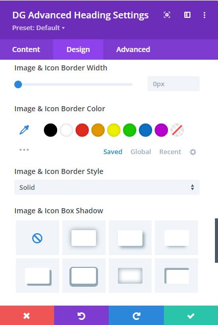
Divider Image and Icon Border & Box Shadow: Apply border and shadow effects to the divider image or icon for additional emphasis.
Divider Margin & Padding: Adjust the spacing around the divider image or icon to integrate it seamlessly into your design.
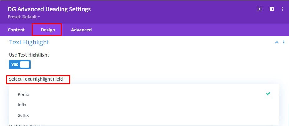
10. Text Highlight
Select Text Highlight Field: Choose which part of the heading (prefix, infix, or suffix) to apply the highlight effect.
Highlight Type: With over 7 highlighting options, you can draw attention to specific parts of your heading text.
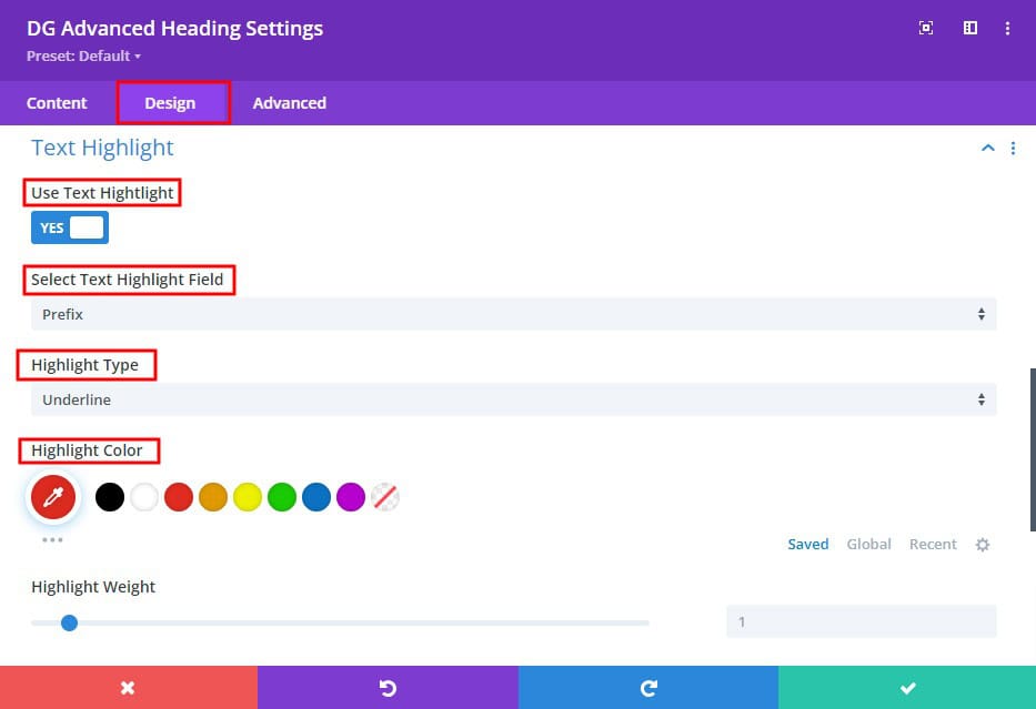
Highlight Color: Customize the color of the highlight to match your branding or design scheme
Highlight Weight: Adjust the thickness of the highlight, making it more or less prominent.
Some Common FAQs About Advanced Heading Module
Q. What is the purpose of the Prefix, Infix, and Suffix text in the Content tab?
These text input boxes allow you to add text before (Prefix), in the middle of (Infix), and after (Suffix) your main heading to create a customized heading layout.
Q. How do I select the correct Title Tag for SEO purposes?
The Title Tag option lets you choose the appropriate HTML tag (e.g., H1, H2, H3) for your heading, impacting both the visual hierarchy and SEO. Go to content >> Title Tag >> Select
Q. What is the Dual Text feature, and how do I use it?
The Dual Text feature allows you to create a heading with two lines of text. When enabled, you can also add custom text for a more tailored design.
Q. How do I customize the divider in the Advanced Heading Module?
In the Divider section, you can set the divider's position, color, thickness, border radius, max width, and alignment to match your design needs.
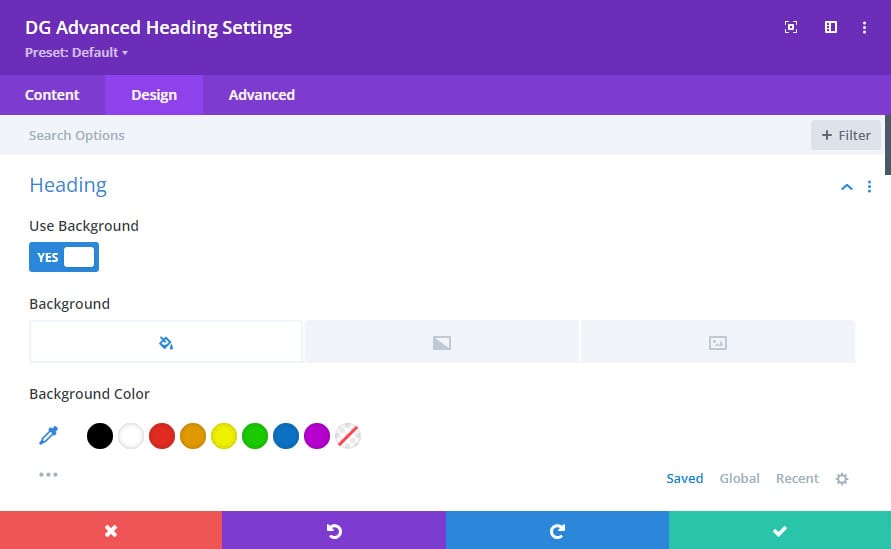
Q. How can I apply a background to my heading?
In the Design tab, under the "Heading" section, you can select a background color or image to make your heading stand out. Go to Design tab >> Heading >> Use Background Switch >> Turns ON >> Select Background Color / Image.
Q. How do I apply hover effects to my heading?
Under the "Reveal and Hover Effect" section, you can select hover styles for your heading text, with over 30 modern hover effects available. Go to Design tab >> Reveal & Hover Effect >> Hover Effect >> Use Hover Effect >> Turns ON >> Select Hover Field and Select Hover Effect
Q. Can I animate my heading text?
Yes, the "Animation Settings" in the Design tab allows you to choose animation types and control the speed for the prefix, infix, or suffix text. Go to Design tab >> Animation Settings >> Use Animation >> Turns ON >> Select Animation Field and Animation type
Q. How do I highlight specific text within my heading?
In the "Text Highlight" section, you can choose a highlight type, color, and weight to emphasize the prefix, infix, or suffix text.
Q. What does the "Enable Outline Text" switch do?
When you enable outline text, you're creating a border or stroke around each character of your text. This stroke can be customized in terms of its width, color, and other properties, allowing you to create a visually distinct and eye-catching effect.
Q. Can I apply a border and box shadow to individual text elements?
Yes, in the "Prefix, Infix & Suffix Settings," you can add borders and box shadows to each text element, enhancing their visual impact.
Q. What is the "Use Background" switch for?
This switch allows you to apply a background color or image to specific text elements within your heading.
Q. Why isn't my dual text displaying correctly?
Ensure that the Dual Text and Enable Custom switches are both enabled. Then, check that you've entered text in the Dual Text Title Input Box.
Q. Why aren't my hover effects working?
Verify that you've selected a hover style and applied it to the correct text element (prefix, infix, or suffix). Additionally, make sure the hover effects are enabled in the module settings.
Q. Can I apply different fonts to the Prefix, Infix, and Suffix text?
Yes, you can apply individual font styles to each text element in the Design tab, allowing for diverse and creative heading designs. Go to Design tab >> Font Styles >> Select Your Specific text