The Off Canvas module in DiviGrid offers a seamless way to showcase different types of website content, enhancing user experience and engagement. This versatile widget allows you to present content in an appealing and efficient manner, making it more attractive and accessible for your visitors.
In this documentation, we’ll explore how to use the Off Canvas module to elevate your website’s design and functionality.
Prerequisites
To use the Off Canvas module, ensure you have the following:
- Divi theme or builder
- DiviGrid Plugin installed and activated
Module Setup: Inserting the DG Off Canvas Module
- Activate Divi Grid: Ensure Divi Grid is activated, as it adds additional modules like the DG Off Canvas to your Divi builder.
- Add the Off Canvas Module:
- Open a page or post that uses the Divi builder.
- Add or edit a row, then click on Add New Module.
- Select DG Off Canvas from the module options.
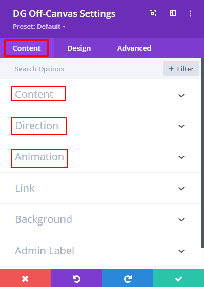
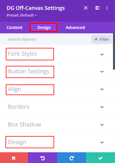
Once you’ve added the Off Canvas module, you'll find various settings to customize its functionality and appearance. The module is divided into two main tabs: Content and Design.
Off canvas Content Tab |
Off Canvas Design Tab |
| Content | Font Styles |
| Direction | Button Settings, |
| Animation | Align, |
| Background | Design |
 |
 |
Off Canvas Content Tab Settings
Content
The Content tab within the Off Canvas module allows you to customize the toggle and main content that will appear in the Off Canvas panel. This tab includes options to define the type of content displayed on the toggle, set the trigger behavior, and select the primary content for the canvas from the Divi library. Below is a breakdown of the settings available:
Toggle Content Type
The Toggle Content Type option lets you choose one of five different types of toggle content to activate the Off Canvas panel. Each type provides specific fields and customization options:
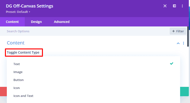
- Text: Displays a text toggle. When selected, a text input field will appear, allowing you to enter custom text for the toggle.
- Icon: Displays an icon as the toggle. This option gives access to the Divi icon library, where you can select an icon and customize its color and size.
- Image: Displays an image toggle. When selected, fields for uploading an image, adding image alt text, and adjusting image width and height will appear.
- Button: Displays a button as the toggle. Similar to the other options, selecting this will allow you to customize the button’s appearance and behavior.
- Icon & Text: Combines both icon and text within the toggle. You can customize both elements individually to achieve a cohesive look.
[Note: Only one toggle content type can be selected at a time. Each option comes with specific fields that allow you to style and configure the toggle content to align with your website’s design.]
Trigger
The Toggle Trigger setting defines how the Off Canvas panel will be activated. There are two options available:
- Hover: The Off Canvas panel will open when the user hovers over the toggle.
- Click: The Off Canvas panel will open when the user clicks on the toggle.
Choose the trigger type based on your design needs and the interaction style you want to create for your users.
Canvas Content
The Canvas Content option lets you select the main content that will appear within the Off Canvas panel. This content is pulled directly from the Divi library. Here’s how it works:
- Design Off Canvas Content: First, create and design your Off Canvas content using the Divi Builder. Customize it according to your needs and save it in the Divi library.
- Select from Library: Once your content is saved, return to the Off Canvas module settings, click on Select Off Canvas Content from Library, and choose the content you saved previously.
This feature provides flexibility in designing your Off Canvas content, allowing you to create rich, customized panels that seamlessly integrate with your website’s design.
Off Canvas Direction
The Off Canvas Direction setting provides control over where and how the Off Canvas content appears on the screen. This setting offers four distinct options that dictate the slide-in or drop-down effect, giving you flexibility to align the content's movement with your website’s design aesthetic:
- Left: Choosing "Left" will make the Off Canvas content slide in from the left side of the screen. This is useful for menus or panels that you want to appear as though they are expanding from the left margin of the page.

- Right: Selecting "Right" will cause the Off Canvas content to slide in from the right side of the screen. This effect is particularly suited for secondary menus or quick-access content you want to appear from the right.
- Top: With "Top," the Off Canvas content drops down from the top of the screen. This setting is ideal for announcements, navigation, or other information you want to have a full-width, top-down effect.
- Bottom: Choosing "Bottom" makes the Off Canvas content rise up from the bottom of the screen. This is commonly used for footers, notifications, or quick links that naturally appear from the bottom.
Each direction provides a seamless and visually appealing transition, allowing you to create an engaging experience for your users based on where you want the content to appear. This flexibility helps ensure the Off Canvas module aligns perfectly with your website’s layout and user interaction flow.
Animation Settings
The Animation settings in the Off Canvas module allow you to customize how the content appears on the screen, adding an extra layer of interactivity and visual appeal. By selecting different animation types and easing effects, you can control the style and behavior of the Off Canvas transitions, creating a smooth, engaging user experience.
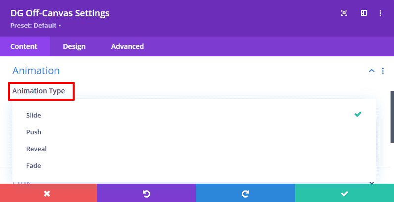
Animation Type
Choose from four animation types to define how the Off Canvas content moves into view:
-
Slide: The Off Canvas content slides smoothly into place from the selected direction (left, right, top, or bottom). This is a popular and visually appealing choice for side panels and menu options.
-
Push: With the push effect, the Off Canvas content will push the main page content aside as it enters the screen, creating a more dynamic interaction.
-
Reveal: The reveal effect allows the Off Canvas content to unfold as if it’s being uncovered, making it appear as though it was hidden behind the main content. This effect adds a unique layer of depth to the interface.
-
Fade: The fade effect gently fades in the Off Canvas content, creating a smooth and subtle transition. This effect is particularly suitable for notifications and overlays, giving them a polished appearance.
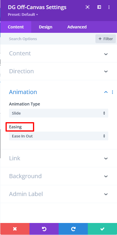
Easing
The Easing option lets you control the speed and timing of the animation, creating either a fast, immediate transition or a smoother, gradual movement. Each easing type gives a distinct feel to the animation, allowing you to match the Off Canvas content’s movement to your website’s tone. You can choose from 13 different easing options:
 |
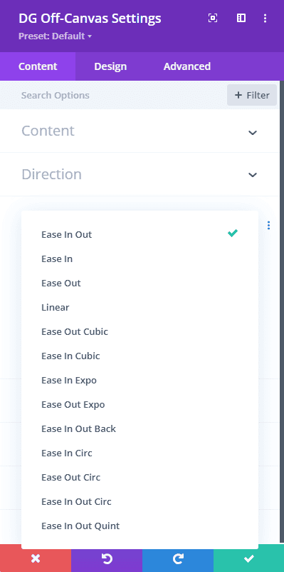 |
- Ease In: Starts slowly, then speeds up for a smooth entrance.
- Ease Out: Starts quickly, then slows down for a gentle finish.
- Ease In Out: Starts and ends slowly, with a faster transition in the middle, providing a balanced motion.
- Linear: Maintains a constant speed throughout the animation, creating a straightforward effect.
- Ease Out Cubic: Speeds up at the beginning and eases towards the end, creating a sharp yet smooth finish.
- Ease In Cubic: Begins gradually and accelerates quickly, ideal for drawing attention.
- Ease In Expo: Creates a dramatic effect with a slow start and rapid acceleration.
- Ease Out Expo: Quick start with a slow deceleration for a strong finish.
- Ease In Out Back: Adds an “overshoot” effect, giving the animation a playful bounce at both the beginning and end.
- Ease In Circ: Uses a circular easing function to create a softer, natural movement.
- Ease Out Circ: Similar to Ease In Circ but decelerates towards the end.
- Ease In Out Circ: Smooth circular transition both at the start and end.
- Ease In Out Quint: A powerful easing function that provides a fast start and slow end, making the animation feel deliberate and controlled.
These animation and easing options give you total control over how the Off Canvas content enters the screen, allowing you to tailor the motion to the user experience you want to deliver. With these settings, you can make your Off Canvas content feel engaging, polished, and fully in harmony with your site’s design.
Design Tab Settings
The Design Tab in the Off Canvas module provides powerful styling options, allowing you to fully customize the look and feel of your Off Canvas content. With these settings, you can define typography, button styles, alignment, image borders, and more to ensure that your Off Canvas module matches your site’s branding and visual identity.
Font Styles
The Font Styles settings allow you to control the typography of the title and main text within the Off Canvas content. Here’s what you can customize:
- Title Heading Level: Choose the appropriate heading level (H1 to H6) to set the semantic importance of the title in your Off Canvas content.
- Fonts: Select from a variety of fonts to match your site’s typography style.
- Font Style: Apply italic, underline, and other font styles for emphasis and unique design.
- Font Weight: Choose from a range of font weights (light, regular, bold, etc.) to control the thickness of the text.
- Font Color: Customize the font color to match your brand’s color scheme.
Button Settings
The Button Settings allow you to style buttons in the Off Canvas content, providing full control over their appearance. You have access to Divi’s default button styling options, as well as additional customizations:
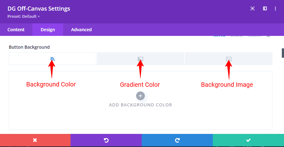
- Background Color: Set a solid background color for the button to make it stand out.
- Gradient Background: Use a gradient background for a more dynamic look, with control over gradient direction and colors.
- Background Image: Add an image background to the button for a visually engaging effect.
These settings allow you to create buttons that capture attention and invite users to take action.
Alignment
The Alignment option gives you control over the alignment of the Off Canvas content within the module. You can position your content to the:
- Left
- Center
- Right
This ensures that the content aligns perfectly within the Off Canvas panel, based on the layout and design of your site.
Image Border and Box Shadow
If you select Image as the toggle content type in the Off Canvas settings, you can further style it with border and shadow effects:
- Border: Customize the border style, color, and width to enhance the image’s appearance and make it stand out.
- Box Shadow: Apply a shadow effect to give the image a sense of depth and make it more visually appealing. You can control the shadow color, intensity, and positioning.
These options give you flexibility in styling images to make them more integrated with the Off Canvas design.
Design Settings
The Design Settings provide additional styling options specific to the Off Canvas module:
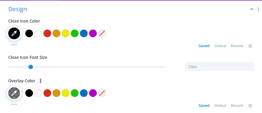
- Close Icon Color: Customize the color of the close icon to ensure it’s visible and matches the module’s aesthetic.
- Close Icon Font Size: Control the size of the close icon for easy usability.
- Overlay Color: Set an overlay color for the screen background that appears when the Off Canvas content is open. This color can be semi-transparent to provide a subtle dimming effect on the background.
These options allow you to create an accessible and polished experience for users interacting with the Off Canvas content.
Sizing
The Sizing settings control the dimensions of the Off Canvas content, allowing you to set an optimal layout:
- Off Canvas Content Width: Adjust the width of the Off Canvas panel to accommodate the amount of content while keeping it user-friendly.
- Off Canvas Content Height: Control the height of the Off Canvas panel to fit your design needs.
- Divi Default Sizing Options: Utilize Divi’s standard sizing controls to fine-tune the Off Canvas dimensions.
With these sizing controls, you can tailor the layout of the Off Canvas panel to fit different devices and screen sizes, ensuring a responsive and user-friendly design.
The Design Tab offers comprehensive styling options, enabling you to create a cohesive, attractive, and branded Off Canvas experience for your website visitors. By adjusting font styles, button appearance, alignment, image effects, and sizing, you can make the Off Canvas module an integral part of your site’s design.
Frequently Asked Questions (FAQs)
Q. What is the DG Off Canvas module in DiviGrid?
The DG Off Canvas module is a feature in DiviGrid that allows you to create side panels or overlays to display additional content, enhancing user experience and engagement.
Q. What content types can I use for the Off Canvas toggle?
You can choose from Text, Icon, Image, Button, or Icon & Text as your toggle content types.
Q. How do I add the DG Off Canvas module to my page?
Open your page in Divi Builder, add or edit a row, click on Add New Module, and select DG Off Canvas.
Q. What are the prerequisites for using the Off Canvas module?
You can select Slide, Push, Reveal, or Fade for the animation type.
Q. Can I customize the close icon?
Yes, in the Design Settings, you can change the close icon color,size for better visibility.
Q. Can I add an overlay color when the Off Canvas panel is open?
Yes, set an overlay color to dim the background when the panel is active.
Q. Can I display videos in the Off Canvas panel?
Yes, include a video module in the Off Canvas content created in the Divi Library.
Q. How can I make the Off Canvas panel full-screen?
Adjust the Off Canvas Content Width and Height settings to cover the full screen.
Q. Can I add borders or shadows to images in the Off Canvas panel?
Yes, You can add border and box shadow for the image. If you want that then Go to Design tab >> Border >> you found image border settings. And for the box shadow Go to Design tab >> Box Shadow >> you found image box shadow settings
Q. Can I make the Off Canvas panel slide in from a different direction?
Yes! you can make the Off Canvas panel slide in from the different direction
Q. How do I add multiple Off Canvas panels on a single page?
Add multiple DG Off Canvas modules, each configured with unique content.
Q. Can I add both an icon and text to the toggle button?
Go to the Content tab of the Off Canvas module, select Toggle Content type "Icon & Text" and input your desired text and select your icon. You can further style the text under the Design tab, adjusting font, size, color, and spacing to match your site’s design.