The Divigrid Testimonial Carousel module offers an elegant and customizable way to showcase client testimonials on your website using the Divi theme. This documentation will cover each setting in detail, with step-by-step instructions and tips for maximizing each feature’s potential. With options for carousel styling, item arrangement, and visual customization, this module is a powerful tool for adding credibility and aesthetic appeal to any page.

Testimonial Carousel Item Settings
The Item Settings allow you to add content specific to each testimonial and include image and rating customization.
Content Settings
Define the main content for each testimonial, including author details and the company they represent.
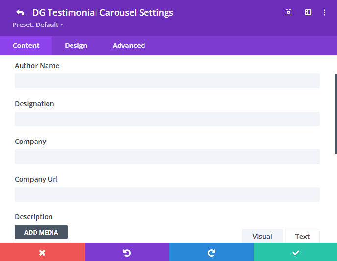
- Author Name: Enter the name of the individual providing the testimonial.
- Author Designation: Add the author’s title or role for authenticity.
- Company: Specify the name of the company associated with the testimonial.
- Company URL: Add a clickable link to the company’s website.
- Description: Provide the main testimonial text that highlights the customer's experience.
Image Settings
Manage images associated with each testimonial, including author photos and brand logos.
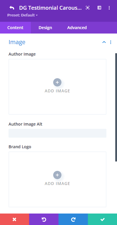
- Upload Author Image: Add a photo of the author to personalize the testimonial.
- Author Image Alt Text: Include alternative text for the author’s image for accessibility and SEO.
- Upload Brand Logo: Add a company logo that will display alongside the testimonial.
- Brand Logo Alt Text: Provide alternative text for the brand logo for accessibility and SEO.
 |
 |
Settings
Additional configuration options for icons and ratings.
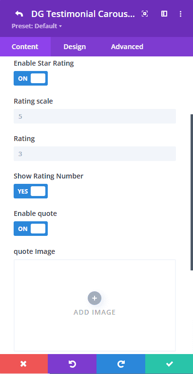
- Enable Star Rating Switch: Enable or disable the star rating feature.
- Enable Quote Switch: Toggle this to display a quote icon or image.
- Enable Quote Icon: If using an icon instead of an image, enable this switch, and select an icon from the Divi library.
Testimonial Carousel Item Design Tab
In the Design Tab, child items share a unified design, so specific design options for individual items are not available. This approach ensures a consistent visual style across all testimonials.
Testimonial Carousel Settings (Global)
Content Tab
The Content Tab is divided into multiple settings sections, allowing you to customize the overall carousel, coverflow effects, and item order within the carousel.
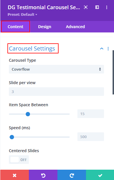
1. Carousel Settings
The Carousel Settings section allows you to define the overall functionality and layout of your carousel.
Carousel Type
You have the option to choose between two carousel types: "Slide" and "Coverflow." The default setting is "Slide," which provides a smooth, continuous scroll effect, moving images or content panels horizontally or vertically in a streamlined manner.
- Coverflow: Display testimonials in a 3D rotating view where each item is angled for a dynamic appearance. Ideal for highlighting one testimonial at a time.
- Slide: A classic sliding effect where each testimonial appears next to the previous, offering a smoother flow. Great for continuous scrolling of testimonials.
Slide per View
- The "Slides Per View" setting lets you control how many slides are displayed at once, with specific customization options for desktop, tablet, and mobile views.Each view setting ensures that the carousel adjusts responsively, providing a seamless browsing experience across all device types. Customize these options to create the ideal layout for your audience.
- Desktop: Adjust the number of testimonials shown simultaneously on desktops.
- Tablet: Set the optimal view for tablets.
- Mobile: Optimize the number of slides for mobile screens to ensure readability.
Item Space Between
The "Item Space Between" setting allows you to control the spacing or gap between individual slides in the carousel, enhancing both aesthetics and readability across devices. This customization is crucial for achieving a balanced, clean look that adjusts responsively.
Speed (ms)
The "Transition Speed" setting lets you define the duration, in milliseconds, for the transition between each slide. This feature allows you to control how quickly slides, such as testimonials, rotate within the carousel.
Centered Slide
The "Enable Centered Slide" setting allows you to focus on a single, central slide within the carousel, giving it prominence over the surrounding slides. When enabled, the selected slide is positioned in the center of the carousel, typically appearing larger or highlighted, while the neighboring slides are partially visible on each side.
 |
 |
Enable Looping
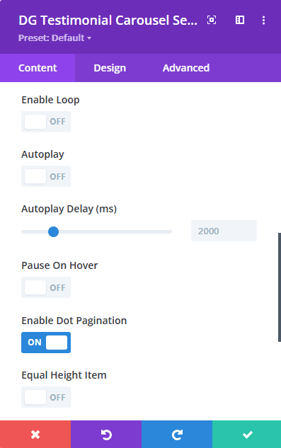
The "Enable Loop" setting allows the carousel to continuously cycle through the slides without stopping, creating an infinite loop effect. When this option is activated, once the last slide is reached, the carousel seamlessly transitions back to the first slide, providing an uninterrupted viewing experience.
Autoplay
The "Autoplay" setting enables the carousel to automatically rotate through the slides without any user intervention. When activated, the slides will transition at a predetermined interval, allowing users to enjoy the content without needing to click or scroll manually.
Autoplay Delay
The "Autoplay Delay" setting determines the amount of time, in milliseconds, that each slide remains visible before transitioning to the next one in an autoplay carousel. This interval is crucial for managing the pace at which content is presented, allowing you to tailor the viewing experience based on the type of content and audience preferences.
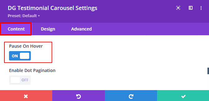
Pause on Hover
The "Pause on Hover" setting allows the autoplay feature of the carousel to temporarily halt when a user hovers their mouse pointer over a slide. This functionality enhances user control over the viewing experience, ensuring that they can pause and focus on specific content without the carousel automatically transitioning to the next slide.
Enable Dot Pagination Switch
The "Dot Pagination" setting provides a visual navigation aid for the carousel, displaying a series of dots or indicators at the bottom of the slider that represent each slide. These dots allow users to see their current position within the carousel and navigate directly to specific slides by clicking on the corresponding dot.
Equal Height Item
The "Equal Height Item" setting ensures that all slides in the carousel maintain the same height, regardless of the content within each slide. This feature creates a visually balanced and cohesive look, enhancing the overall aesthetics of the carousel while improving user experience.
2. Coverflow Settings
The Coverflow Settings are applied when the Coverflow effect is enabled. Customize the 3D appearance and rotation of the slides.
Enable Slide Shadows
Enabling the "Shadow Effect" option adds a visually appealing shadow to the testimonial carousel slider, enhancing its depth and making it stand out on the page. This feature provides two distinct coloring methods for the shadow: dark and light, allowing for customization based on your design preferences. You can easily adjust the shadow color to complement your overall design scheme. This flexibility ensures that the carousel blends seamlessly with your website’s aesthetics, enhancing the visual hierarchy of the content. By default, the shadow effect remains turned OFF.
Slide Rotate (Degrees)
Adjust the degree of rotation for each slide, giving testimonials a tilted look. A higher degree creates a more dramatic rotation.
[Tips: Ensure that the rotation effect looks good across different devices and screen sizes. Subtle rotations may work better on smaller screens, while more dramatic rotations might be suited for larger displays.]
Stretch Space Between Slides
The "Stretch Space Between Slides" setting allows you to adjust the spacing between individual slides within the carousel, effectively controlling the amount of space that separates each item. This feature enhances the visual layout of the carousel, contributing to a more organized and aesthetically pleasing presentation.
Depth Offset (px)
Set the depth of the carousel, providing a sense of layered depth among testimonials. A larger offset brings the central slide closer to the viewer. The "Depth Offset (px)" setting allows you to create a sense of depth in the carousel by adjusting the vertical positioning of slides. This feature lets you offset each slide in relation to the others, adding a three-dimensional effect that enhances visual interest and engagement.
Effect Multiplier
The "Effect Multiplier" feature serves as a powerful tool that amplifies the values of all attributes within the Coverflow carousel settings. By adjusting this multiplier, you can enhance the visual effects and transitions applied to each slide, allowing for a more dynamic and engaging presentation. This setting takes all the defined attributes—such as rotation, scale, and opacity—and multiplies them by the specified value. This means that increasing the multiplier will intensify the effects, making the carousel more visually striking. In summary, the "Effect Multiplier" feature provides a flexible way to control the intensity of the Coverflow carousel's visual effects, enabling you to create a captivating and cohesive user experience tailored to your design vision.
3. Items Order
The Items Order section provides you with the flexibility to customize the display order of various elements within the testimonial carousel. This feature enables you to arrange content in a way that best suits your design and enhances user engagement. Here’s how each component can be configured:
-
Quote Order: Determine the placement of the quote icon or image within the testimonial. You can choose to position it prominently at the beginning, in the center, or any other location that aligns with your design preferences.
-
Brand Logo Order: Control the arrangement of the brand logo associated with the testimonial. Whether you want it to appear at the top, bottom, or alongside the testimonial text, this setting allows you to create a cohesive visual flow.
-
Description Order: Set the position of the testimonial description to ensure that the content is presented in a logical sequence. This could involve placing the description before or after the author’s details, depending on how you wish to convey the message.
-
Author Wrapper Order: Organize the information about the author of the testimonial, such as their name, title, and other relevant details. You can decide where this information fits best within the overall layout, enhancing clarity and user understanding.
By utilizing the Items Order feature, you can create a tailored presentation of testimonials that effectively highlights key elements and improves the overall user experience on your site.
Testimonial Carousel Design Settings (Global)
The Global Design Tab governs the overall style, layout, and appearance of each component within the testimonial carousel, ensuring a cohesive and visually appealing presentation across all slides. Here’s a breakdown of the key features available under this tab:
1. Image Settings
Customize the appearance and spacing for author images to enhance their visual impact within the carousel.
-
Author Image Max Width: Specify a maximum width for the author images to maintain consistency in size and ensure that they fit well within the layout. This control helps to create a balanced look without overwhelming other elements in the carousel.
-
Spacing (Margin and Padding): Adjust the spacing around the author images using margin and padding settings. This flexibility allows you to create the desired amount of space between the images and other elements, promoting clarity and visual harmony.
-
Image Border and Box Shadow: Personalize the appearance of author images by adding borders and shadow effects. Custom borders can frame the images beautifully, while box shadows can add depth, making the images stand out and drawing the viewer’s attention.
1. Brand Logo Settings
The Brand Logo Settings section provides design options specifically tailored for the logos associated with testimonials. These settings allow you to customize the appearance of brand logos, ensuring they enhance the overall aesthetic of the carousel. Here’s an overview of the key features:
-
Brand Logo Max Width: Set a maximum width for brand logos to ensure consistent sizing across all testimonials. This control helps maintain a uniform look and prevents logos from dominating the visual hierarchy of the carousel.
-
Alignment: Choose the alignment of the brand logos to suit your layout preferences. Options may include left, center, or right alignment, allowing you to position the logos in a way that complements the overall design and improves readability.
-
Background Options: Customize the background for the brand logos with color, gradients, or images. This flexibility enables you to create a distinct visual context for the logos, enhancing their visibility and integration within the carousel.
-
Spacing, Border, and Box Shadow: Define spacing around the brand logos to maintain proper separation from other elements. Additionally, you can add borders or shadows to enhance the styling of the logos, making them stand out and contributing to the overall design cohesiveness.
By leveraging the features within the Brand Logo Settings, you can create a polished and visually appealing presentation for brand logos in your testimonial carousel, reinforcing brand identity and enhancing user engagement.
Author Settings
The Author Settings section offers design options specifically tailored for the display of author information within the testimonial carousel. These settings allow you to customize the presentation of the author’s details, ensuring they are both visually appealing and coherent with the overall design. Here’s a breakdown of the key features:
-
Author Image Position: Adjust the positioning of the author image to create a balanced layout. You can choose to place the image alongside the text, above it, or in any configuration that enhances readability and visual flow.
-
Horizontal and Text Alignment: Set the alignment for both the author text and image. Options include left, center, or right alignment, allowing you to create a harmonious arrangement that fits your design preferences and improves user engagement.
-
Author Box Spacing: Control the spacing around the author box to ensure adequate separation from other elements in the carousel. Proper spacing enhances clarity and allows users to focus on the author's information without distraction.
-
Author Box Background: Customize the background of the author box with a solid color, gradient, or image. This feature enables you to create a distinct visual context for the author’s information, making it more prominent and engaging.
-
Border and Box Shadow: Add borders or shadow effects to the author box to enhance its styling. Borders can frame the author information, while shadows can create depth, adding to the overall visual appeal of the carousel.
By utilizing the features within the Author Settings, you can effectively design a visually compelling and organized presentation of author information, enhancing the overall user experience of your testimonial carousel.
Font Styles
Typography is one of the most important aspects of design. The Font Style section gives you full control over how the text appears, allowing you to craft a cohesive look for your Testimonial.
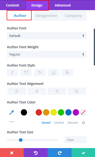
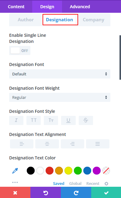
Font Styles for Author, Designation, and Company
Define fonts, colors, alignments, text shadows, etc for the author’s name, title, and company. Here’s what you can adjust:
 |
 |
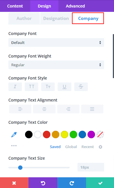 |
Fonts: Select from Divi’s wide range of available fonts to create a distinct look that aligns with your brand. This customization lets you use a modern, professional, or playful font depending on the tone of your Testimonial carousel.
Font Weight: Control the thickness of the text with font weight options, ranging from light to extra bold. This allows you to emphasize certain elements.
Text Alignment: Align the text to the left, center, or right to match the overall alignment of your carousel items.
Line Height: Adjust the spacing between lines of text. By modifying the line height, you can make your content more readable and improve its overall visual flow.
Letter Spacing: Set the space between individual letters to make the text feel more open or condensed.
Text Shadow & Color: Add a shadow effect to the text for a subtle 3D appearance. You can also choose text colors that complement the rest of your design, ensuring a harmonious color scheme.
Font Styles (Description)
Define Fonts, Colors, Alignments, Text shadows, Line height, Font styles, Font weights, Font sizes padding and Background for the description
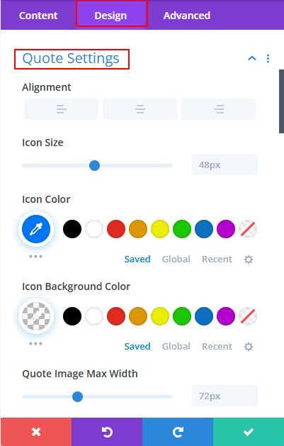
Quote Settings
The Quote Customization Settings section allows you to tailor the appearance of quotes used in testimonials, ensuring they effectively convey the intended message while enhancing the overall design of the carousel. Here are the key features available for customizing quotes:
-
Alignment: Set the alignment of the quote to your preference—left, center, or right. This flexibility allows you to integrate the quote seamlessly within the layout of your testimonial carousel.
-
Icon Size: Define the size of the quote icon to ensure it is proportionate to the text and other elements. A well-sized icon can enhance visibility and improve the overall aesthetic of the testimonial.
-
Icon Color: Choose a color for the quote icon that complements your theme, ensuring it stands out without clashing with other design elements.
-
Icon Background Color: Add a background color to the quote icon for emphasis, helping it to catch the viewer's eye and drawing attention to the testimonial.
 |
 |
-
Quote Image Max Width: Set a maximum width for any quote images used, maintaining a consistent look across different testimonials and ensuring that images do not overwhelm the text.
-
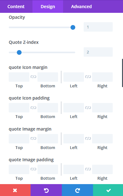
Opacity: Adjust the opacity of the quote to create a transparent effect, allowing for a more layered and sophisticated visual presentation.
-
Z-Index: Control the stacking order of the quote elements, ensuring that the quote appears correctly layered above or below other components within the carousel.
-
Quote Icon Spacing: Define spacing around the quote icon to prevent overcrowding, allowing each element to breathe and contributing to a cleaner layout.
-
Quote Image Spacing: Set spacing around the quote image for a balanced design that enhances overall readability and aesthetics.
-
Quote Container Spacing: Control spacing for the entire quote container to facilitate better layout management, ensuring that the quote is visually distinct from other elements.
-
Quote Border and Box Shadow: Add borders and shadow effects to the quote container for added visual interest, creating a more engaging and dynamic presentation.
Arrow Settings
The Navigation Arrow Customization section allows you to personalize the navigation arrows used in your testimonial carousel, enhancing usability and visual consistency. Here are the key features available for customizing navigation arrows:
-
Previous and Next Arrow Icon Selection: Choose custom icons for the navigation arrows to match your branding and style preferences. This flexibility allows for a unique look that aligns with the overall design of your carousel.
-
Arrow Position: Define the positioning of the arrows relative to the carousel. You can select whether they appear top, center or bottom of the carousel, allowing for optimal placement based on your layout.
-
Arrow Alignment: Set the horizontal alignment of the arrows, with options for left, center, or right alignment. This control ensures that the arrows are positioned in a way that complements the overall layout and enhances user experience.
-
Opacity: Adjust the opacity of the arrows to create a subtle effect, allowing them to blend seamlessly with the carousel while remaining functional and easily identifiable.
-
Icon Color: Customize the color of the arrows to fit your design scheme, ensuring they stand out appropriately against the carousel background.
-
Icon Size: Control the size of the arrows to ensure they are easily clickable and accessible to users, promoting better navigation throughout the carousel.
-
Icon Background Color: Add a background color to the arrows for emphasis, helping them to pop against the surrounding elements and improve visibility.
-
Icon Border Radius: Define how rounded the corners of the arrow icons are for stylistic choices. This feature allows you to create a softer or more modern look, depending on your design goals.
-
Previous Arrow Spacing: Set spacing around the previous arrow to achieve an optimal layout that balances the visual elements of the carousel.
-
Next Arrow Spacing: Control spacing around the next arrow to maintain equilibrium and ensure a visually appealing arrangement.
-
Arrow Container Spacing: Manage spacing for the entire arrow container, facilitating better integration with the rest of the carousel design.
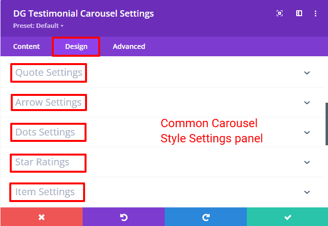
Dot Pagination Settings
The Pagination Dot Customization section allows you to manage the appearance and layout of the pagination dots used for navigation within your testimonial carousel. This feature enhances user experience by providing clear visual cues for slide navigation. Here are the key customization options available:
-
Dots Size: Set the size for pagination dots to ensure they are easily visible and proportionate to the overall design of the carousel. A well-sized dot can enhance user interaction and visibility.
-
Alignment: Define the alignment of the dots, with options for left, center, or right positioning. This flexibility allows you to integrate the dots harmoniously within your carousel layout.
-
Large Active Dot Switch: Enable or disable a larger size for the active dot, making it stand out from the inactive dots. This feature helps users easily identify the currently displayed slide. The large active dot size is 40px.
-
Dots Color: Choose colors for the inactive dots to match your design scheme, ensuring they are cohesive with the overall look of the carousel.
-
Active Dot Color: Set a distinctive color for the active dot to draw attention, allowing users to quickly see which slide they are currently viewing.
-
Dots Spacing: Control the spacing between the dots for a clean and organized appearance. Proper spacing contributes to an uncluttered layout, enhancing the user experience.
Star Ratings
The Star Rating Customization section enables you to define the design parameters for star ratings, allowing you to create a visually appealing and cohesive representation of ratings within your testimonial carousel. Here are the key features available for customizing star ratings:
-
Alignment: Define the alignment of the star rating, with options for left, center, or right alignment. This flexibility allows you to position the star ratings in a way that complements the overall layout of your testimonial carousel.
-
Star Font Size: Control the size of the star icons to ensure they are easily recognizable and proportionate to other elements in the carousel. Proper sizing enhances visibility and readability.
-
Star Icon Space: Set the space between individual star icons to create a balanced and visually appealing arrangement. Adequate spacing helps prevent overcrowding and improves the overall aesthetic.
-
Filled Star Color: Choose the color for filled stars, which signify positive ratings. Selecting a distinct color can enhance user engagement and visually communicate the quality of the testimonial.
-
Empty Star Color: Set the color for empty stars to provide contrast against filled stars, contributing to a clearer representation of ratings.
-
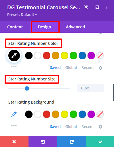
Star Rating Number Color: Customize the color of the numeric rating display to ensure it aligns with your design scheme, making the ratings easily readable.
-
Star Rating Number Size: Control the font size of the numeric rating to enhance visibility and ensure it is proportionate to the star icons.
-
Star Rating Background: Set a background color for the rating display to help it stand out and integrate smoothly within the overall design of the carousel.
-
Star Ratings Spacing: Adjust the spacing for the entire star rating component to create a cohesive layout that enhances readability and overall design harmony.
Item Settings
The Item Settings section provides a comprehensive set of options for individual item customization within your testimonial carousel. This allows you to define the overall layout and visual appearance of each testimonial. Below are the key features available for customizing testimonial items:
Items
-
Item Background Options: Set the background style for each testimonial item, offering a range of options:
- Background Color
- Gradient Color
- Background Image
-
Border: Define the border properties for each testimonial item, allowing for a visual distinction between testimonials.
-
Box Shadow: Add shadow effects to create depth, giving each testimonial item a layered appearance that stands out.
-
Spacings: Control padding and margins around each testimonial to achieve balanced layouts and enhance readability. Proper spacing is crucial for an uncluttered design.
Item Box
-
Item Box Background Options: Similar to the item settings, this feature allows you to customize the box surrounding each testimonial, ensuring a cohesive design throughout.
-
Border: Set borders for the item box to provide visual distinction and enhance the overall layout.
-
Box Shadow: Incorporate shadows for depth and emphasis, making the item box visually appealing.
-
Spacings: Adjust spacings around the item box to ensure a well-structured layout that aligns with the overall design.
The Divigrid Testimonial Carousel Module offers a comprehensive solution for displaying customer testimonials with flexibility and style. By utilizing the extensive settings available in the Content and Design tabs, you can create a visually appealing and functional carousel that enhances the credibility of your website. This documentation provides a detailed overview of each setting to ensure you can make informed decisions about how to best utilize this powerful module.
Frequently Asked Questions (FAQs)
Q. Is it possible to use images in the testimonials?
Absolutely! You can upload images for authors or brands within the testimonial settings.
Q. How can I pause autoplay on hover?
Enable The pause on hover switch, the autoplay feature when the user hovers over the carousel, allowing them to read a specific testimonial without interruption.
Q. What is the "Centered Slide" feature?
The Centered Slide feature ensures that the current testimonial is prominently displayed in the center of the carousel.
Q. What happens if I enable the Equal Height Item option?
Enabling the Equal Height Item option ensures that all testimonials have the same height, providing a uniform appearance.

Q. Can I add a link to the company name in the testimonial?
Yes, you can include a Company URL in the item settings, allowing users to click through to the company website.
Q. Are there any limitations on the number of testimonials I can add?
Typically, there is no strict limit, but performance may be affected if you add too many testimonials, so it's best to keep it manageable.
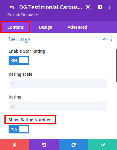
Q. Is it possible to display numeric ratings alongside star ratings?
Yes, you can enable the numeric rating display, which can be customized in terms of color and font size.
 |
 |
Q. What is the "Effect Multiplier"?
The Effect Multiplier enhances the visual effects of the carousel, multiplying the values of attributes set in the Coverflow settings for more pronounced effects.
Q. Can I use multiple testimonial carousels on one page?
Yes, you can add multiple instances of the Testimonial Carousel Module on a single page, allowing for varied testimonials in different sections.
Q. What image formats are supported for uploading author images and logos?
The module supports standard image formats such as JPG, PNG, and GIF for author images and brand logos.
Q. How do I ensure my testimonials are responsive?
The module is designed to be fully responsive. You can test responsiveness by adjusting the display on various devices and screen sizes.
Q. Can I link testimonials to specific pages on my website?
Yes, you can add links to testimonials that direct users to specific pages for more information about the service or product being reviewed.
Q. Can I set a delay for autoplay?
Yes, you can set an autoplay delay in milliseconds to control how long each testimonial is displayed before the next one appears.
Q. What kind of support is available for troubleshooting?
Divigrid offers customer support through documentation, and direct contact options for resolving issues.