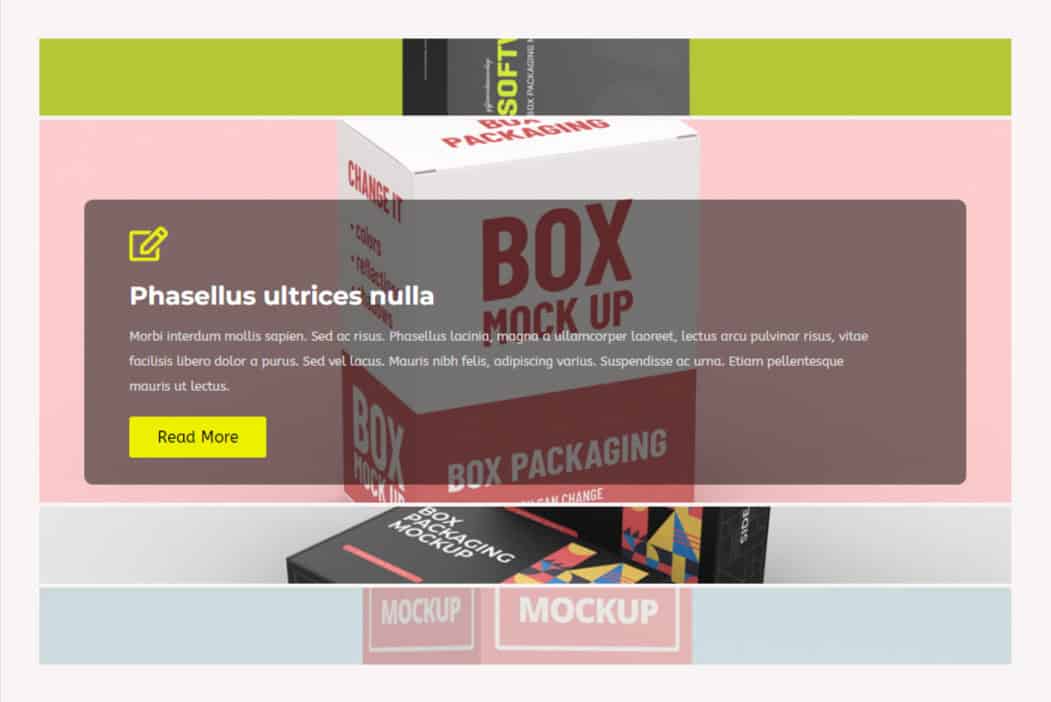
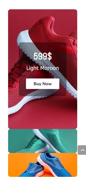
The Divigrid Image Accordion module is a versatile and visually engaging tool for showcasing content in an accordion layout. It allows you to display multiple images that expand to reveal additional information when interacted with. This module is highly customizable, giving users full control over the accordion’s layout, style, and animations. This module allows users to present images in an accordion format where individual accordion items expand to reveal additional content on hover or click. It's ideal for showcasing portfolios, galleries, and dynamic content in an interactive manner.
In this documentation, we'll dive into the various settings available in the Content and Design tabs of the Image Accordion module, and how you can customize these settings to create visually consistent and professionally designed accordion layouts.
Content Tab Settings
Accordion Settings
The Accordion Settings section is where you control the overall behavior and interaction of the accordion. You can determine how users will interact with the accordion (by hovering or clicking), its orientation, height, and how content is displayed. Here are the settings explained in detail:
Accordion Trigger:
- Hover: When this option is selected, the accordion items will expand automatically when the user hovers their mouse over them. This is ideal for creating a more fluid, user-friendly experience, where users don’t need to click but can simply explore by moving their cursor.
- Click: With this option, the accordion items will expand when the user clicks on them. This gives users more control over the interaction, as they can decide when to expand an item.
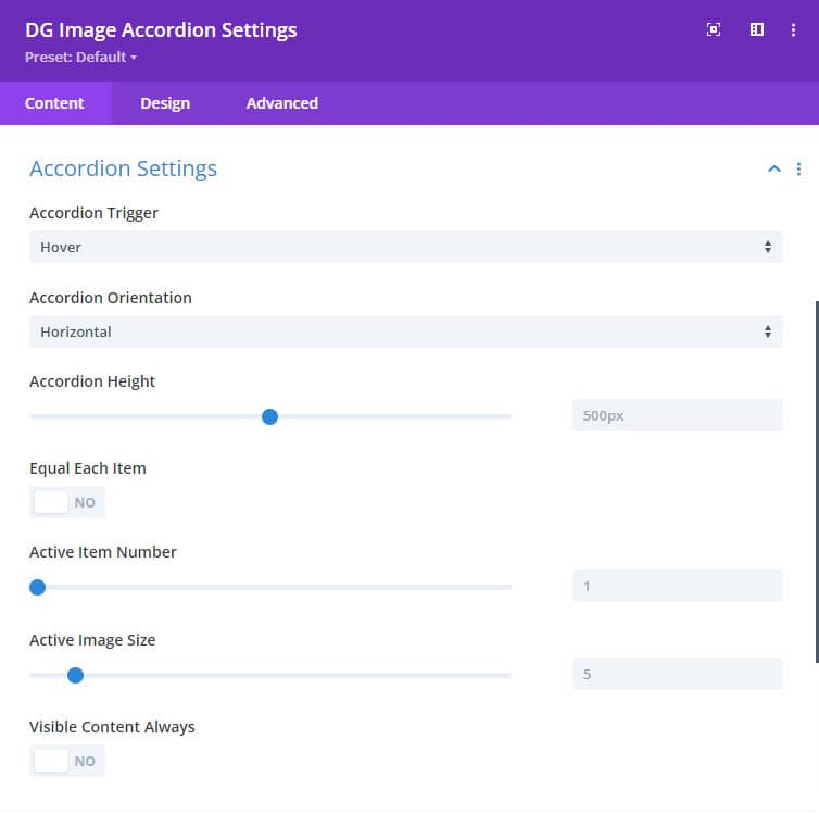
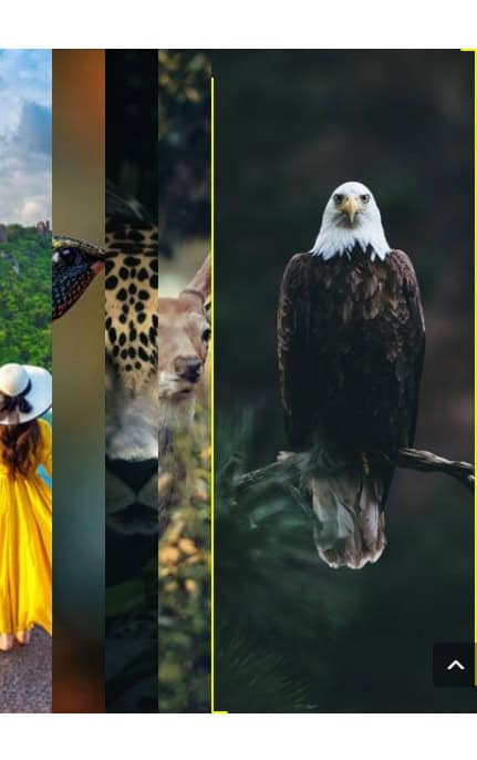
Accordion Orientation
- Horizontal: The accordion items will expand horizontally across the width of the container. This is the default orientation and is suitable for horizontal layouts where images are aligned side by side.
- Vertical: The accordion items expand vertically, stacking on top of one another. This orientation is perfect for sidebar-style accordions or for displaying content in a vertical scrolling format.
Accordion Height: This setting allows you to specify the height of the accordion. By adjusting this value, you can control how tall the accordion appears on the page. A fixed height ensures that the accordion fits perfectly within your page layout.
Equal Each Item Switch:
- Enabled: When this switch is turned on, all accordion items will have the same width, even when they are collapsed. This ensures a uniform, grid-like structure where each item is balanced in size.
- Disabled: If the switch is turned off, accordion items will adjust their width based on their content or other settings.
Active Item Number: This option lets you select which accordion item will be active when the page initially loads. If you want to highlight a particular item, you can set it to be open by default. You can select from any of the items in your accordion.
Active Image Size: You can control the size of the image for the active accordion item. The image for the expanded item can be larger or smaller than the collapsed items, helping to draw attention to the currently active content.
Visible Content Always Switch:

- Enabled: When this switch is turned on, the content inside each accordion item will always be visible, even when the accordion is collapsed. This is useful for designs where you want the user to always have access to the content without needing to interact with the accordion.
- Disabled: If turned off, the content will only be visible when the accordion item is expanded.
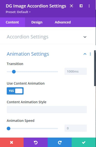
Animation Settings
The animation settings add a dynamic, interactive element to your accordion. With these settings, you can control the movement and visual effects that occur when accordion items are expanded or collapsed.
Transition Time: This setting controls how quickly the accordion items expand and collapse. A lower value will result in faster transitions, creating a snappier interaction, while a higher value will slow down the transition for a more dramatic effect. Transition time is measured in milliseconds.
 |
 |
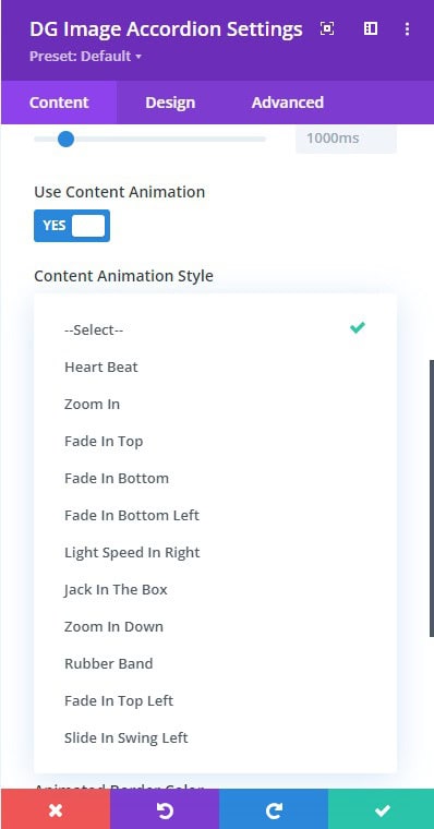
Use Content Animation Switch: Once you activate this switch, several additional settings for content animations will appear. These settings allow you to apply animated effects to the text and other content inside the accordion.
-
Content Animation Style: Select from over 12 modern animation styles to animate the content within each accordion item. These animations can range from subtle fades to more dramatic movements, adding a layer of interactivity and engagement.
-
Animation Speed: Set the speed at which the content animations occur. You can adjust this to create faster or slower movements, depending on the aesthetic you’re going for.
 |
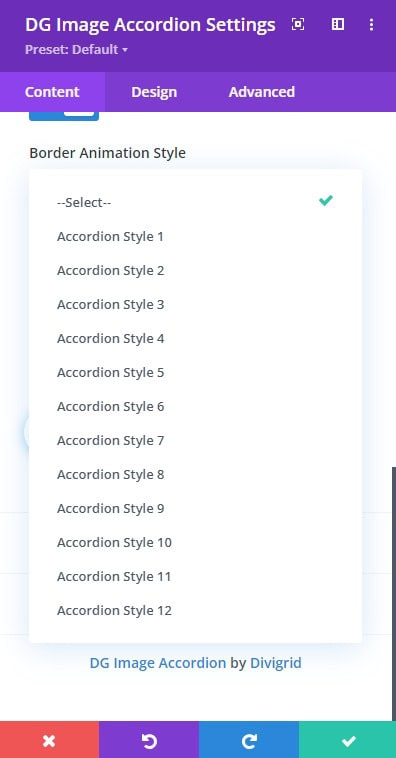 |
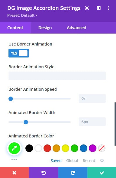
Use Border Animation Switch: This switch activates the animated border settings, allowing you to add motion to the borders of each accordion item when they expand or collapse.
-
Border Animation Style: Choose from over 12 animation styles for the borders. This adds another layer of design flair to your accordion by making the borders animated, providing a polished and modern feel.
-
Border Animation Speed: Set how fast the border animations occur. A higher value slows down the animation, while a lower value speeds it up.
-
Animated Border Width: Define the width of the animated border. You can create thin, delicate borders or thick, bold outlines depending on your design preferences.
-
Animated Border Color: Select a color for the animated border to ensure it matches your overall design theme.
Image Accordion Item Content Tab
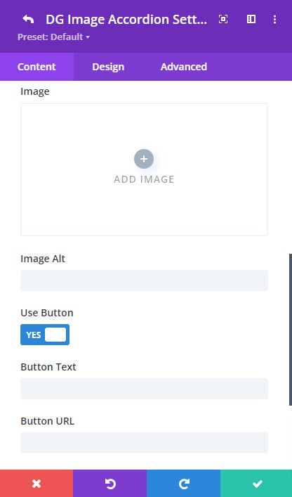
Each individual accordion item has its own set of content options. This section allows you to upload an image, add text, and optionally include buttons for each accordion item.
Image:
- Accordion Main Image Upload Field: Use this field to upload the main image for the accordion item. The image will be displayed as part of the accordion and will expand when the accordion item is activated.
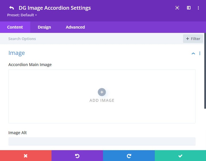
- Image Alt: Provide alternative text for the image. This is crucial for improving the accessibility of your site, as screen readers will use this text to describe the image to visually impaired users. Alt text is also important for SEO purposes.
Content:
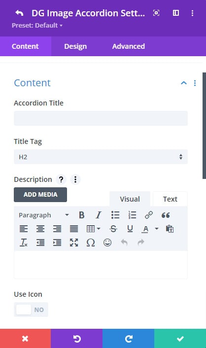
- Accordion Title: Enter the title that will be displayed as part of the accordion item. This title is typically the main clickable or hoverable element of the accordion and should clearly describe the content within.
- Title Tag: Choose the appropriate HTML tag for the title (H1, H2, H3, etc.). This is important for SEO, as search engines use these tags to understand the hierarchy of your content.
- Description: Add a description that will be revealed when the accordion item is expanded. This is a great place to add more context or information about the content being showcased.
 |
 |
Use Icon Switch:
If you activate this switch, the image field will disappear, and you’ll be able to use an icon instead. This is useful for designs where you want a simpler or more abstract representation rather than an image.
Use Button:
- Button Text: Enter the text for the button that will be displayed inside the accordion item.
- Button URL: Specify the URL that the button will link to. This is ideal for creating CTA buttons that direct users to other pages or content.
- URL Opens: Choose whether the URL should open in the same tab or in a new tab. Opening in a new tab is often useful when linking to external content.
Design Tab Settings
Image Accordion Design settings
[ Design Customization ( Global ) ]
The Image Accordion Design Tab offers global styling options for the entire accordion. These options allow you to style every accordion item at once, ensuring uniformity and saving you time.
 |
 |
All the detailed styling options available for individual accordion items—such as Image & Icon, Font Styles, Overlay, and Content Settings—can be applied globally via this tab. This ensures that all individual accordion items share a consistent appearance, streamlining the design process.
Image Accordion Item Design settings
[ Individual Design settings for every accordion item ]
Instead of styling each item individually, these global options allow you to make changes across the entire accordion with a single adjustment.
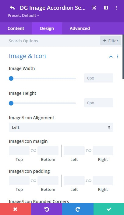
Image & Icon Customization
In the Image Accordion Item Design Tab, the Image & Icon section provides granular control over how both images and icons are displayed. Each setting is essential to creating a visually cohesive and striking design, ensuring flexibility while maintaining consistency across your site.
- Image Width: This setting controls how wide your image appears within the accordion item. By default, images scale based on their natural size, but here you can specify a custom width
- Image Height: This setting determines the height of your image, allowing for custom height values similar to the width. Use this in conjunction with the width setting for a balanced design:
 |
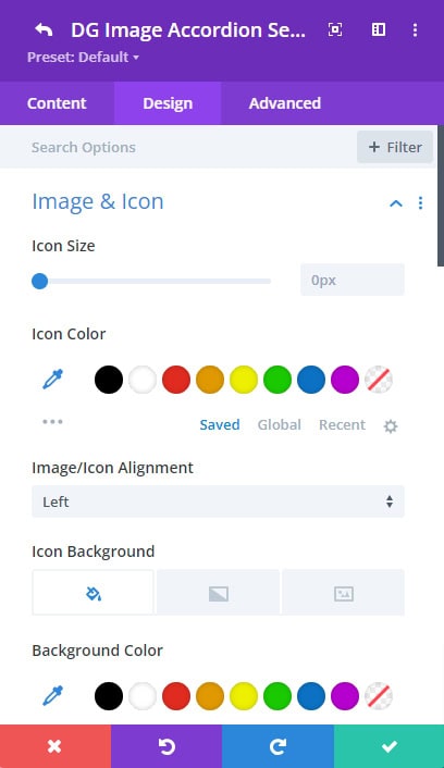 |
- Icon Size: Customize the size of the icon if you’ve chosen to use an icon instead of an image. When using an icon instead of an image, the Icon Size setting becomes essential. This setting controls how large the icon will appear relative to the container
- Icon Color: Select a color that matches your design scheme for the icon.
- Icon Background: You can set a background color for the icon, adding contrast or visual separation from the content. The Icon Background setting allows you to add a background color behind the icon. This adds contrast and ensures your icon stands out, especially against complex images or gradient backgrounds.
- Image/Icon Alignment: Control the placement of the image or icon within the accordion, allowing for left, right, center, or justified alignment.
-
Image/Icon Spacing: The spacing around the image or icon helps create a clean layout:
- Padding: Controls the internal spacing between the image/icon and its container edges. Adjusting padding ensures the image doesn’t feel cramped or too far from the content.
- Margin: Sets the external spacing between the image/icon and other elements. This provides separation from other accordion items or content areas, creating visual breathing room.
-
Image/Icon Border
Borders can help define the edges of your images or icons. This setting lets you add:
- Border Width: Set the thickness of the border (in px).
- Border Style: Choose from solid, dashed, dotted, or double borders, allowing for stylistic flair.
- Border Color: Select a color that either contrasts or complements the image/icon and background.
- Border Radius: Rounds the corners of the border. A higher radius results in more circular or rounded edges, while a lower radius maintains sharp corners.
-
Image/Icon Box-Shadow
Box-shadow adds a shadow effect behind the image or icon, giving the appearance of depth:
- Horizontal & Vertical Shadow: Set how far the shadow extends horizontally and vertically (in px).
- Blur Radius: Controls how blurry or sharp the shadow appears.
- Shadow Color: Select a color for the shadow to make it subtle or bold.
A well-applied shadow can make the image or icon appear lifted from the background, enhancing the visual hierarchy of the accordion.
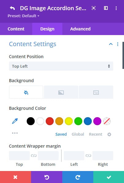
Content Settings
The Content Wrapper Settings allow you to manage the overall appearance and layout of the content within each accordion item. This includes text, buttons, and any other content that accompanies the image or icon.
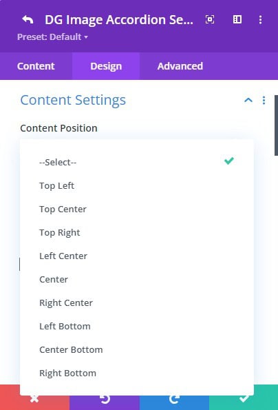
Content Position
This setting allows you to choose where the content appears relative to the image or icon. There are 9 predefined positions, giving you plenty of flexibility:
- Top-Left, Top-Center, Top-Right: Content is aligned at the top in the chosen direction.
- Center-Left, Center-Center, Center-Right: Content is centered horizontally and vertically within the accordion item.
- Bottom-Left, Bottom-Center, Bottom-Right: Content is aligned at the bottom of the item, useful for keeping text close to a CTA button.
 |
 |
Content Wrapper Background
The background of the content wrapper helps distinguish the text from the rest of the accordion. You can choose from:
- Solid Color: Pick a uniform background color for the content wrapper.
- Gradient: Apply a gradient using two or more colors, which can add depth and visual interest.
- Image: Use a custom image as the background of the content wrapper, adding a unique texture or pattern.
This setting allows you to play with color theory or match the brand theme to create a cohesive design.
Content Wrapper Spacing
This setting controls the padding and margin of the content wrapper:
-
- Padding: Adjust the internal spacing inside the content wrapper. This creates space between the content and the wrapper's border.
- Margin: Control the external spacing outside the wrapper, allowing you to separate it from the image/icon and other design elements.
Content Wrapper Border: Add a border around the content wrapper with full control over style, width, and color.
Content Wrapper Box-Shadow: Apply a shadow effect to the entire content wrapper, giving it more depth and prominence.
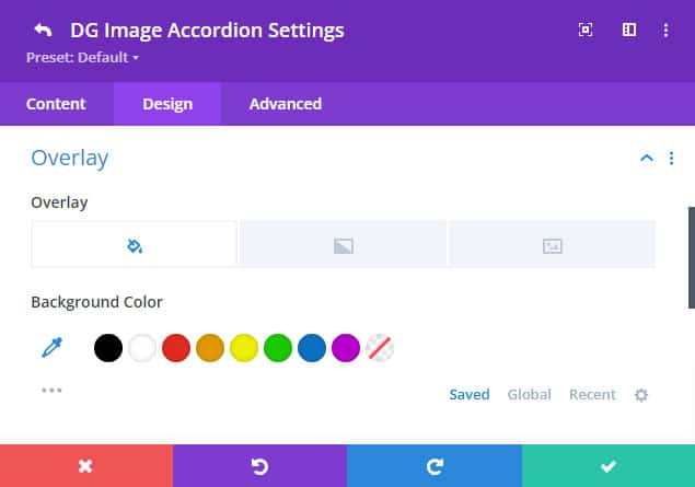
Overlay
The Overlay Settings in the Image Accordion Item Design Tab give you control over how the background overlay appears on hover or at all times, providing an additional layer of design customization. Overlays are useful for enhancing the visual appeal of your accordion items, adding contrast, or highlighting specific content.
Background Color Overlay
The Background Color Overlay setting allows you to apply a solid color overlay over the image or icon within the accordion item. This color typically becomes visible on hover, creating an engaging effect.
Background Gradient Overlay
This setting allows you to apply a gradient overlay, combining two or more colors that blend across the image or icon. A gradient overlay can add depth and complexity to your design, making it more dynamic than a single-color overlay. You can fully control the look of the gradient
Background Image Overlay
The Background Image Overlay setting allows you to use an image as an overlay, creating a multi-layered visual effect. This is a powerful design feature that gives you total creative freedom over the look of each accordion item.
Tips For Overlay Settings
-
Subtlety vs. Boldness: Overlays can either create a subtle effect that complements the content or a bold, eye-catching feature that grabs attention. Use opacity and color to control the balance between these two extremes.
-
Text Readability: Ensure that the overlay does not obscure or clash with text or buttons on the accordion item. A slight transparency in the overlay color or gradient often works best to keep content legible.
-
Consistent Styling: When using overlays across multiple accordion items, consider maintaining consistency in your color schemes and hover effects to ensure a cohesive look across the module. This keeps the design professional and polished.
-
Pairing with Box-Shadow: For added emphasis, combining overlay effects with box-shadow settings can give each accordion item a three-dimensional feel, making the design more engaging and interactive.
Image Accordion FAQ
Q. Can I use the Image Accordion module on any WordPress site?
Yes, the Image Accordion module can be used on any WordPress site with the Divi theme and the Divigrid plugin installed.
Q. Is the Image Accordion module mobile-responsive?
Yes, the module is fully responsive and adjusts seamlessly to various screen sizes, including mobile devices.
 |
 |
Q. What is the purpose of the accordion-style layout?
The accordion layout allows for more content to be displayed in a condensed space, improving user interaction and design aesthetics.
Q. How many accordion items can I add to this module?
You can add as many accordion items as needed, depending on your design preferences and content requirements.
Q. What is the difference between hover and click triggers?
With hover, the accordion items expand when hovered over, while with a click, users need to click on an item to expand it.
Q. How do I set which accordion item is active by default?
You can specify the active item by using the Active Item Number setting. The number corresponds to the item that will be expanded by default.
Q. What is the purpose of the 'Use Content Animation' switch?
Activating this switch enables various content animation options, allowing you to add dynamic transitions to the accordion’s content when expanded.
Q. Can I apply global design settings to all accordion items?
Yes, you can apply global design settings to all accordion items, saving time by styling all items uniformly rather than adjusting each item individually.
Q. How can I apply an overlay to each accordion item?
The overlay settings allow you to add a background color, gradient, or image to each accordion item. You can adjust the opacity and hover effects for the overlay as well.
Q. Is it possible to add unique hover effects for each accordion item?
Yes, you can assign unique hover effects to each accordion item, including content and overlay transitions.
Q. Can I customize the content position for each accordion item?
Yes, you can choose from 9 different content positions, which determine where the content (title, description, and button) appears within the accordion item.
Q. How do I make the content appear only when the accordion item is expanded?
In the Accordion Settings of the Content tab, set the Visible Content Always switch to “No” to make the content appear only when the accordion item is expanded.