Once you have installed DiviGrid Module, you will find Divi List Grid alongside the rest of the Divi Modules that are available in the “Insert Module” window.
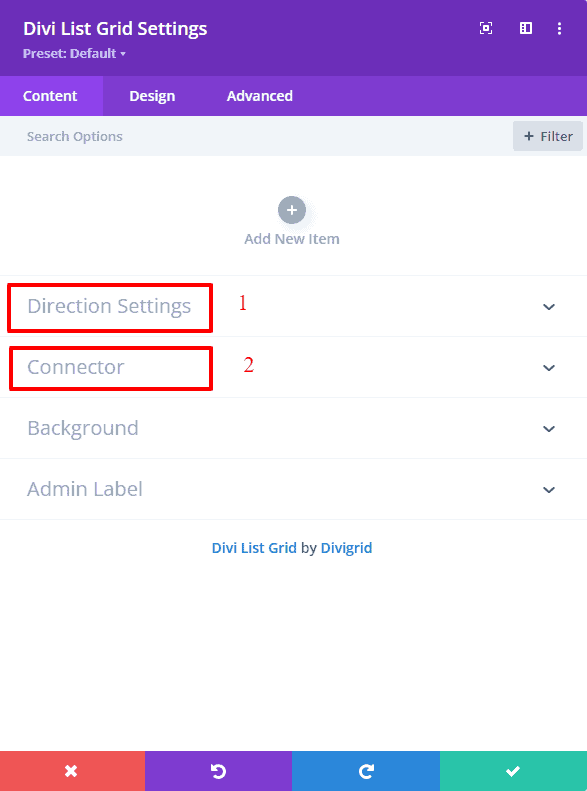
Divi List Grid Settings
After inserting Divi List grid you will find two extra toggles along with the default toggles.
a. Direction Settings
b. Connector
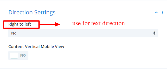
Direction Setting
In Direction settings, you will find a select option whose name is Right to Left. This Right to Left select option declared the direction of a text element displayed on a page. It is mainly used for languages written from right to left (like Hebrew or Arabic) and left to right (like English and most other languages). If you choose Yes, it means, you want to write directions from left to right. Right to Left selected by default No.
You've also got a switch button called Content Shows Vertically on Mobile View It only works in the mobile version. If you choose YES, your content will be displayed vertically (top to bottom). Otherwise, it displays horizontally (left to right) in the mobile version. By default, this switch button is selected NO.
Connector
There are two switches inside the connector
a. Use connector
b. Use Mobile Connector
Use Connector
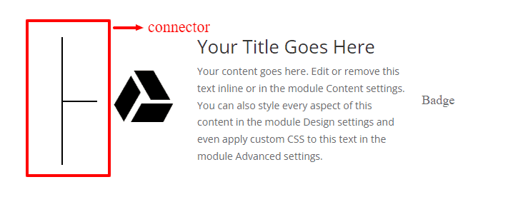
If you choose the YES button, you will find several options to change your connector. You can change the color, height, width, spacing, position, and sizes (vertically and horizontally) of your connectors, as well as move them from left to right.
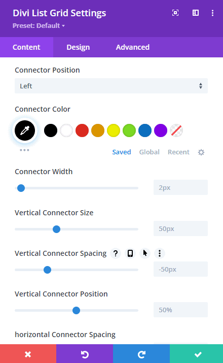
By default Use Connector is OFF.
The Use Mobile Connector button is a switch by which you can decide whether you want to show this connector on mobile or not. If YES then you can show the connector on mobile view also.
By default Use Mobile Connector is ON.
-----------------------------------------------------------------------------------------------------------------------------------
Design Tab
An Advanced tab has different designing toggles for designing the contents of the list grid items to facilitate the need. Also, several options have been added to some of the default toggles.
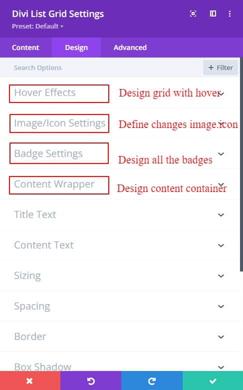
Hover Effects
In Design Tab, there is a new module called Hover Effects. Basically, it is a Yes_No button. If you want to use Hover Effects then press yes. Now you have found two options.
a. Focus Item
b. Overlay
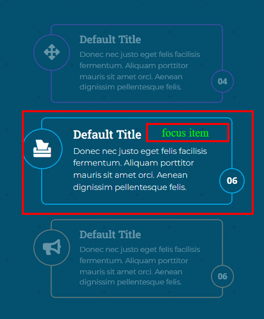
FOCUS ITEM
Typically, when the User hovers over any of the items in a section, that item will appear zoomed in slightly from other items in that section.
OVERLAY
An overlay is just a name in hover effect styles. Here you can choose different types of hover effects such as Swipe, Diagonal swipe, Alternate, etc.
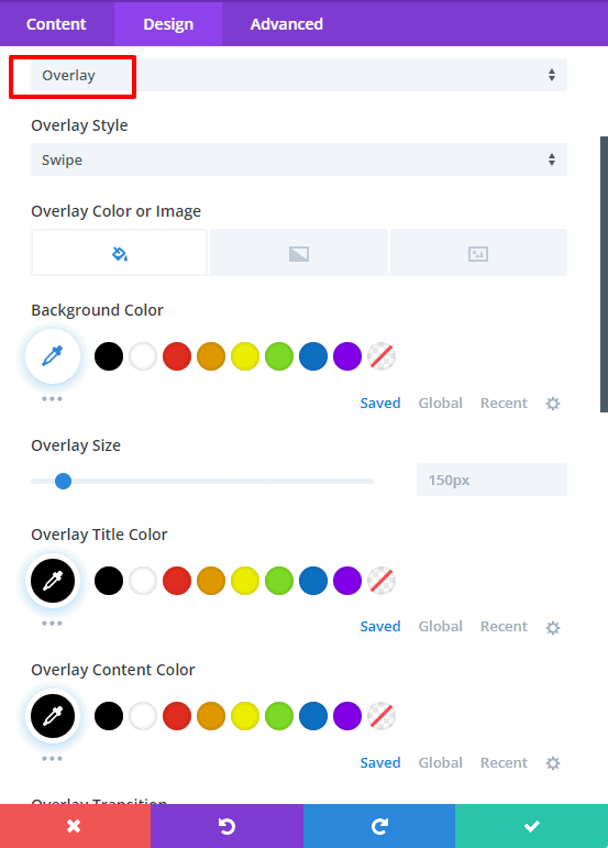
Overlay Style Names
a. Swipe
b. Position Aware
c. Diagonal Swipe
d. Alternate
e. Double Swipe
f. Smoosh
g. Diagonal Close
h. Zooming In
I. Corners
j. Collision
k. Slice
In every hover effect style, you will find various options to style your list grid.
[ N.B: If you use hover effects then you cannot use a connector. ]
Color & Transition
In Overlay Hover Effect, you can change your title color, subtitle color, and content color in hover.
Background
You can use a background color in all styles but there are certain hover styles in which you cannot use background image and background gradient color. Below is a list of those that cannot be used.
a. Diagonal Swipe,
b. Diagonal Close,
c. Zooming In,
d. Slice
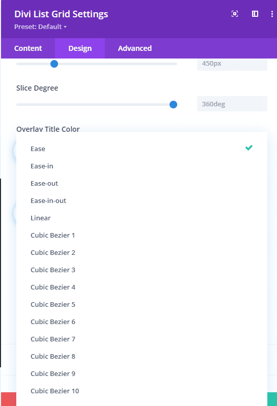
Overlay Transition Speed Curve
This Overlay Transition Speed Curve specifies the speed curve of the transition effect. This property allows a transition effect to change speed over its duration. Choose from our many speed curves that fit your style.
-----------------------------------------------------------------------------------------------------------------------------------
Divi List Grid Item Settings
In this module, you will find some new toggles called Content, Images & Icons, and Item Position.
Content
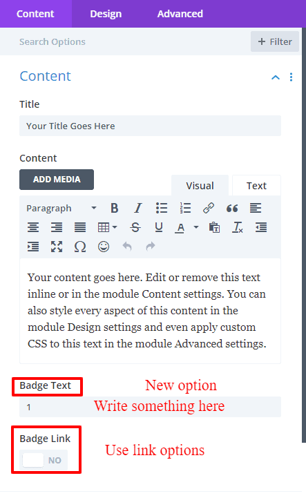
Title
In the Content tab, there is a writing text option called Title. You can write your List grid item title here.
Content
In the Content tab, there is a writing short description text option called Content.
This option is provided to enter a short description of the list grid.
Badge Text
You'll find a new option called Badge Text in the Content toggle on the Content tab. A badge is basically a markup option for design purposes. For design convenience, you can write some small text or numbers and use them with or without links as you like.
Images & Icons
You can add images or icons to this toggle. It would be better to write the image's alt name along with the image. Image alt is very useful for SEO purposes.
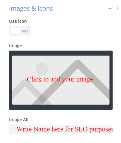
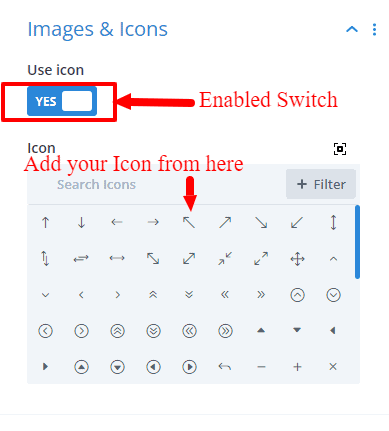
If you want to add an icon, then there is a switch called Use Icon, enabling it will bring up the option to add an icon.
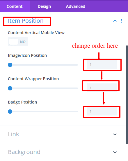
Item Position
Basically, you will find a switch inside the item position and the option to change the item position order.
Design Tab
Shape settings
By enabling the shape setting switch, some shape pattern styles are available. Some pre-made images or icon shape patterns are provided for the list grid in the shape pattern option.
Change the shape as you wish without any hassle. You can also easily change the shape icon color, border color, border width shape background color, image, gradient, and box-shadow. In these shape settings, there are so many options for designing shapes.
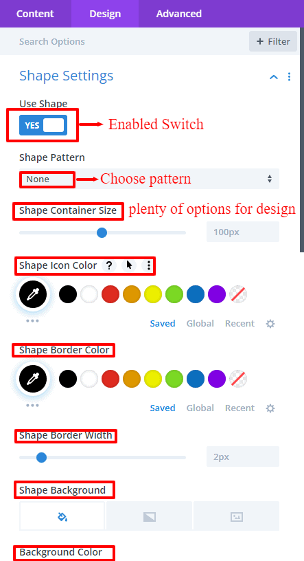
[N.B: When you use the hover effect on shape, please put your shape pattern into the container box to get a better hover effect]
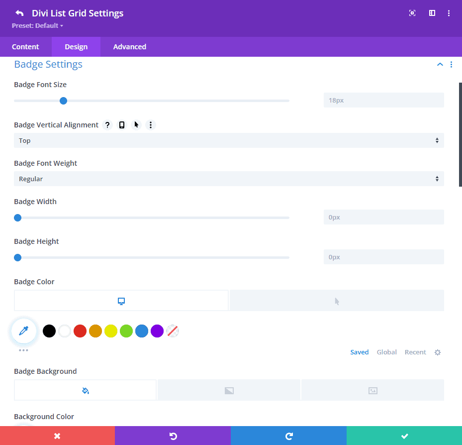
Badge Settings
There are many options for designing your badge in the badge settings
You can use font size, font weight, height, width, text color, background image, color or gradient color, border styling options, box-shadow, etc. for your design purposes
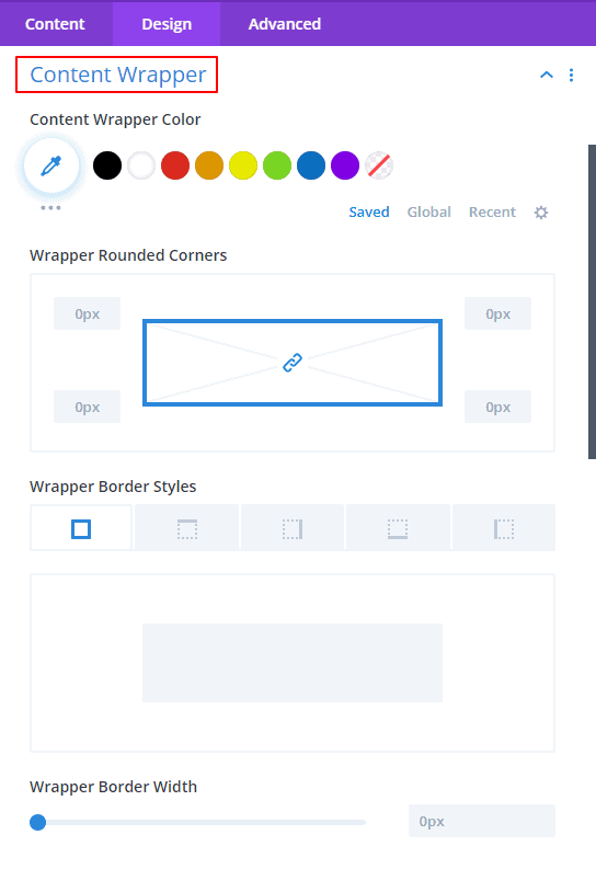
Content Wrapper
Here you can design and change the background color of your content wrapper. Border design features can make your items more beautiful and attractive.
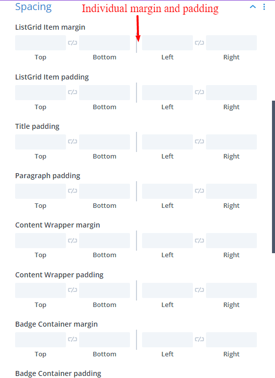
Spacing
Here are added options to give margin and padding to each content separately.
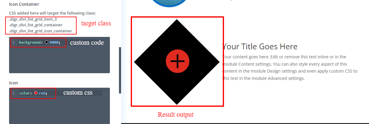
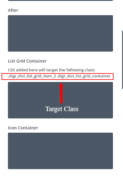
Custom CSS
You can write your custom CSS code here for your design purpose.
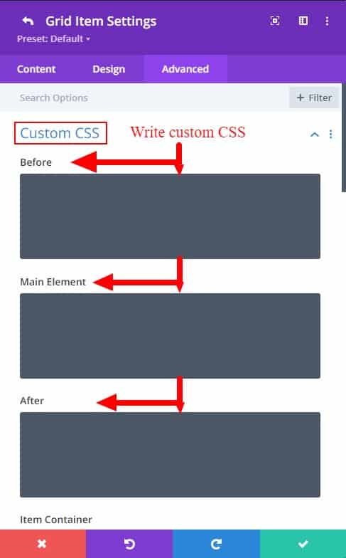
You can see which class you want to write your custom code in by clicking on the question mark.
Here are some of the custom code demo examples: