Discover the DiviGrid Advanced Image Carousel – a dynamic solution that takes your website's visual journey to new heights. The possibilities are endless with two versatile carousel types, horizontal and vertical slider orientations, adjustable item height, autoplay, and looping options, and the flexibility to navigate from left to right or right to left. Enrich your carousels further with the ability to incorporate background images. Elevate your site's engagement with a carousel experience that's genuinely advanced and exceptional.
Experience simplicity with the DiviGrid Advanced Image Carousel. Designed for ease, it offers seamless usage. For any concerns, find assistance in our welcoming documentation. Your journey is our priority.
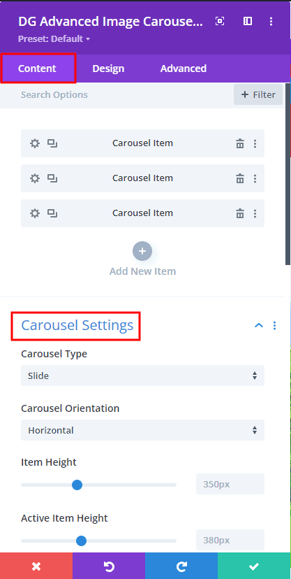
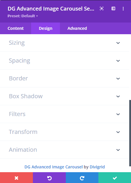
Carousel Settings
Regarded as the cornerstone of the Divi Advanced Image carousel module, the Carousel setting holds paramount significance. Within this setting lie several advanced attributes that define its capabilities. Delve into an exploration of how these features operate and contribute to an enhanced carousel experience.
 |
 |
- Carousel Type
Within the Carousel Setting, the Carousel Type feature empowers designers to select the carousel type for the module. As a designer, you can opt for either the Slide or Coverflow carousel type, catering to your design requirements. Make your choice to achieve the desired visual effect.
When you select Coverflow, discover its Coverflow effect settings, which offer many options for enhancing your carousel. Adjust slider shadows for depth, apply slide rotation for dynamic movement, stretch gaps between slides for balance, control slide depth for layered effects, and fine-tune slide modifiers for a personal touch. These settings transform your carousel into a visually impressive and interactive masterpiece.
- Carousel Direction
The slider direction feature enables effortless switching between vertical and horizontal orientations. The carousel loops smoothly both vertically (top to bottom) and horizontally (left to right), ensuring a dynamic content display. This versatile customization offers full control over your carousel's appearance and behavior.
- Item Height
The Item Height attribute proves highly beneficial when incorporating images of different sizes. This feature ensures the same image height, enhancing the visual consistency of your carousel's content presentation.
- Active Item Height
The height of active slider items in the carousel can be precisely adjusted to align with your design vision. Modify their dimensions to be smaller or larger than other items, creating a distinct visual effect that enhances your carousel's overall appearance.
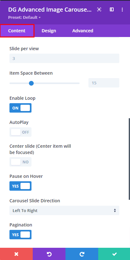
- Slide Per View
The "Slides Per View" setting in the carousel allows you to control the number of slides that are visible within the carousel's viewport at any given time. This feature offers flexibility in choosing how many slides are displayed, influencing the user's viewing experience and the overall design of the carousel.
- Item Space Between
The "Item Space Between" setting in the carousel module allows you to define the spacing between individual items. By adjusting this parameter, you can control the gap between each slide, fine-tuning the overall look and feel of your carousel's layout.
- Enable Loop
The "Enable Loop" option within the carousel module grants the ability for slides to loop continuously. When activated, the last slide seamlessly transitions back to the first, creating a smooth and uninterrupted carousel experience for your website visitors.
- Auto Play
The "Autoplay" feature in the carousel module facilitates automatic and continuous slide transitions. When enabled, the carousel cycles through its slides at a predefined interval, enhancing user engagement and interaction without requiring manual navigation.
- Center Slide
The "Center Slide" functionality centers a specific slide within the carousel's viewport, gives it prominence and focus, and makes it upper from other items, ensuring that the highlighted slide becomes the central visual element, increasing its visibility and attracting audience attention.
- Pause On Hover
The "Pause on Hover" option within the carousel module allows for automatic slide transitions to halt when a user hovers their cursor over the carousel. This interaction offers users control over the carousel's pacing, enhancing the browsing experience.
- Carousel Slide Direction
The Carousel Slider Direction setting governs slide movement. Opt for left-to-right or right-to-left direction, influencing carousel navigation and enhancing user engagement.
- pagination
Enabling the pagination option displays bullet point navigation on the left side of the static panel. Shifting the static panel's alignment from left to right will correspondingly relocate the pagination to the right. It's worth noting that pagination will exclusively appear beneath static content for mobile devices. Should you prefer not to have pagination visible, simply toggle off the switch. Furthermore, the advanced tab provides options for modifying bullet point size, color, line height, and line color, offering extensive customization possibilities.
Content Settings (Width & Position)
In the "Content Settings" of the DiviGrid Advanced Image Carousel module, you can fine-tune several crucial aspects:

Static Content Position: Adjust the positioning of static content, choosing between left-to-right or right-to-left alignment to suit your design flow.
Static Content Width: Define the width of the static content within the carousel, ensuring it fits seamlessly and aligns with your design preferences.
Carousel Content Width: Similarly, you can specify the width of carousel content. This allows for consistent and balanced alignment of items as users navigate through the carousel.
By utilizing these content settings, you can precisely control how content is displayed, ensuring a polished and cohesive carousel presentation that aligns harmoniously with your overall design vision.
Background Carousel
Enable Slider Background Image
The "Enable Slider Background Image" feature gives you the ability to include impressive background images within the carousel. Enable this option to add an extra layer of visual appeal to your carousel slides, increasing their impact and making your content more immersive. Individual background images can be used for each item or a single image can be used. Totally it's up to you.
NB: No single color can be used on a single item. Only images can be used. If you want to use color, you have to use color from the background of the content tab
Background Images
The background image within the slider functions as a unifying backdrop, seamlessly connecting the static and carousel panels while bridging the gap between these segments. Infusing depth, emotion, and visual harmony, it serves as a complementary canvas for the core content, be it images or text. This background image assumes a pivotal role, captivating the audience, eliciting emotions, and amplifying the impact of the carousel's conveyed message.
Functioning akin to an image gallery, the background image option empowers you to curate the carousel's aesthetics. From your media collection, handpick one or multiple images, tailoring the carousel's appearance. Each item possesses the potential for a distinct background image, or a singular image may envelop all items cohesively. Upon uploading background images corresponding to the slider items, each image seamlessly integrates as the backdrop for its respective item, enriching the visual experience.
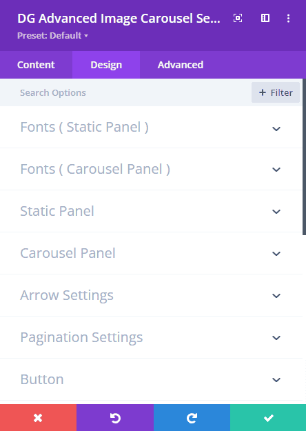
Advanced Tab Settings
The "Advanced" tab in the DiviGrid Advanced Image Carousel module presents a bunch of sophisticated customization options, enabling a higher degree of control over the module's appearance and behavior.
 |
 |
In the "Advanced" tab of the DiviGrid Advanced Image Carousel module, you'll discover a range of powerful customization options to elevate your carousel's design and functionality. "Arrow Settings" allow you to precisely define navigation arrow icons, ensuring seamless and intuitive user interaction. The Static Font Styles & Carousel Panel Font Styles empower you to fine-tune font attributes for both static and carousel panels, harmonizing typography throughout. Static and Carousel Panel Styles provide the means to customize image height, width, alignment, border, box shadow, margin, padding, borders, overlay, and other visual elements, adding a unique touch to each section. In "Pagination Settings," tailor pagination dot features for easy navigation.
All required toggles are also present by default. Simply put, a carousel has all the toggles to make it attractive and visually appealing. No need to write any custom code. Style is now in your hands.
- Static Panel Fonts
In the "Static Panel Fonts" section, you'll find two distinct sub-toggles: "Title" and "Description." These toggles share the same font styles, allowing for consistent typography across your static content.
Within each sub-toggle, you're presented with a range of font customization options. These encompass choosing the font itself, determining the font weight and style, aligning the text, selecting colors, adjusting text size, and configuring line height, among others. These comprehensive customization choices ensure that your static content's fonts align precisely with your design vision, presenting a polished and cohesive appearance throughout the module.
- Carousel Panel Fonts
Within the "Carousel Panel Fonts" section, you'll encounter two distinct sub-toggles: "Title" and "Description." Remarkably, both sub-toggles share identical font styles, promoting uniformity in typography across your carousel content.
- Static Panel Styles
Under the "Static Panel Styles" section, you have the opportunity to define the visual attributes of the static content. Key customization points include:
- Image Alignment: Adjust the alignment of images within the static panel, ensuring they are positioned precisely according to your design intentions.
-
Image Width and Height: Set specific dimensions for images in the static panel, maintaining visual consistency and enhancing the overall presentation.
-
Background Color: Choose a background color for the static panel, harmonizing it with your branding or design scheme for a polished look.
-
Spacing: Fine-tune the spacing around the static content, ensuring optimal alignment and an organized visual layout.
These customization options within the "Static Panel Styles" enable you to curate a visually appealing and well-structured static content presentation that seamlessly integrates with the overall module design.
- Carousel Panel Styles
In the "Carousel Panel Styles" section, you're granted the ability to shape the visual characteristics of your carousel content. Here are the key customization points:
-
Carousel Content Alignment: Precisely align the carousel content within each panel to achieve your desired visual composition and symmetry.
-
Overlay Color: Apply an overlay color to the carousel content, adding depth and visual interest while ensuring readability and aesthetics.
-
Background Color: Define a background color for the carousel panels, harmonizing them with your design theme and enhancing overall coherence.
-
Spacing: Adjust spacing around the carousel content, allowing for optimal layout and alignment of elements within each panel.
By manipulating these customization options in the "Carousel Panel Styles" section, you can create an engaging and visually captivating carousel that seamlessly integrates with your design vision and elevates the overall user experience.
- Arrow Settings
In the realm of the "Arrow Settings" feature, you're granted a suite of tools to finely craft your navigation arrows, ensuring a fluid and engaging user experience. This intricate customization encompasses:
- Select Next and Previous Arrow: Exercise your choice in picking arrow icons that impeccably match your design sensibilities, allowing users to effortlessly navigate through your content.
- Position: Tailor the placement of arrow icons to your precise specifications, ensuring they're optimally located for intuitive interaction.
- Border: Apply borders to arrow icons for an attention-grabbing effect, accentuating their presence and integrating them harmoniously into your design.
- Icon Size: Delve into the minutiae of icon sizing, balancing functionality and aesthetics for a visually pleasing navigation experience.
- Opacity: Master the art of opacity adjustments, adjusting the transparency of arrow icons to seamlessly blend with your module's visual theme.
- Arrow Margin: Exercise pixel-perfect control over arrow spacing, allowing you to achieve a polished and organized visual layout.
- Arrow Container/Box Margin: Fine-tune the margins around the arrow container or box, ensuring their integration aligns seamlessly with your overall design concept.
By harnessing these comprehensive options within the "Arrow Settings," you can expertly fashion navigation arrows that not only facilitate movement but also harmonize flawlessly with your module's design language, enhancing both user interaction and visual appeal.
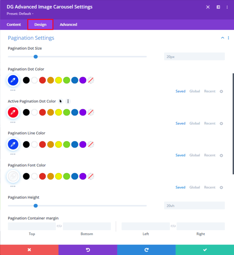
- Pagination Settings
Within the "Pagination Settings," you'll uncover a treasure trove of options for refining your pagination appearance. This feature grants you the power to meticulously tweak various aspects, including:
- Bullet Point Size: Adjust the size of pagination bullet points, ensuring they're easily discernible and aligned with your design aesthetics.
- Color Customization: Infuse personality into your pagination with color choices that resonate with your branding and overall theme.
- Active Dot Color: Define the color of the active dot, facilitating seamless navigation and enhancing user understanding.
- Line Color: Fine-tune the color of connecting lines, achieving visual cohesion and contributing to a polished look.
- Pagination Height: Tailor the height of the pagination area, ensuring it's proportionate to your content and design layout.
This comprehensive suite of customization options in the "Pagination Settings" empowers you to curate a pagination experience that harmonizes seamlessly with your module's visual identity, enhancing both aesthetics and user interaction.
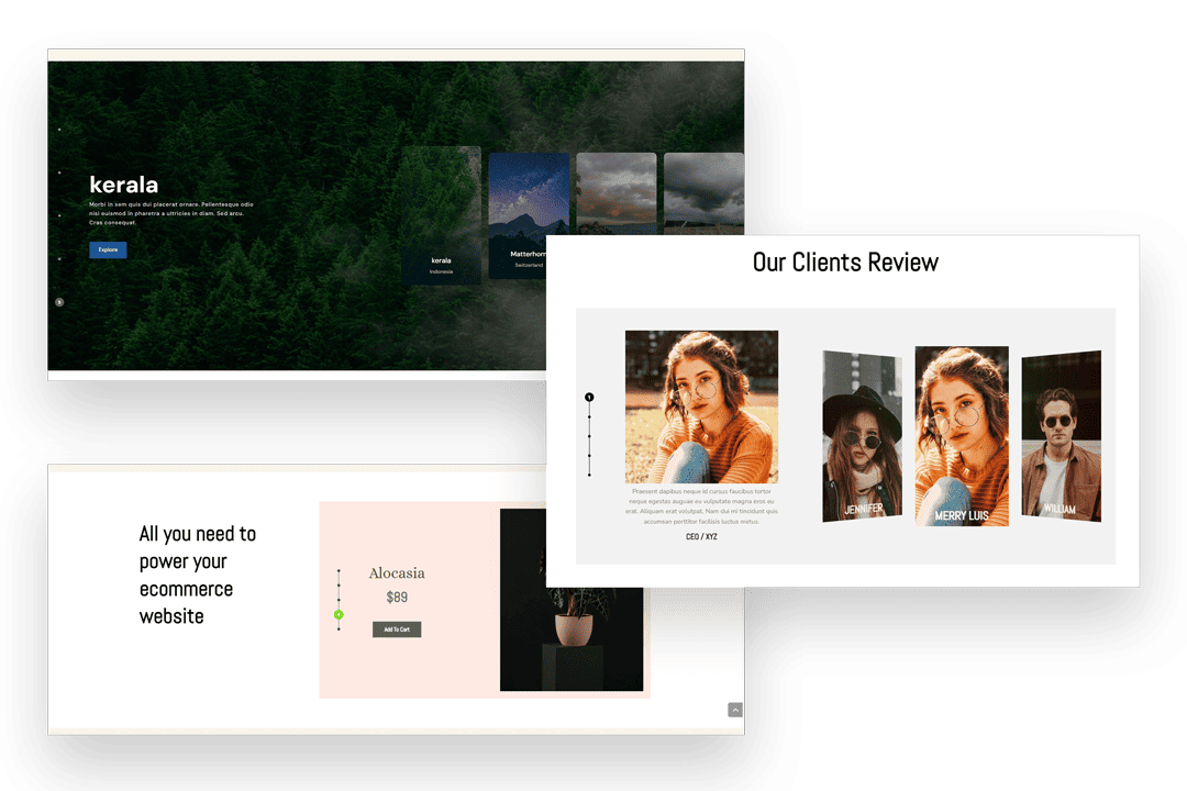
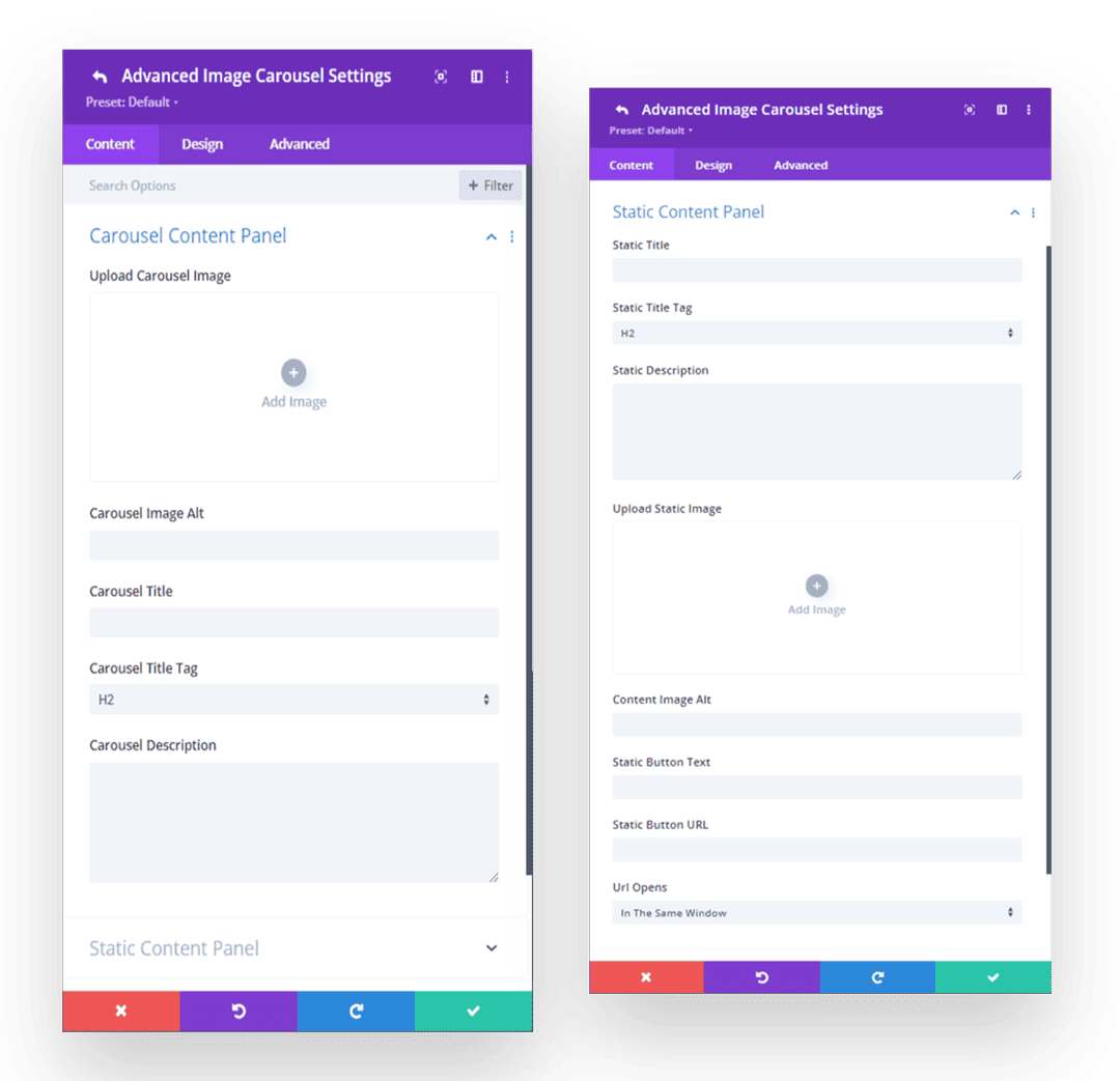
Static Panel And Carousel Panel
We have divided the DiviGrid Advanced Image Carousel into two parts. The first is a static panel and the second is a carousel panel. In the static panel, you can use an image, title, text, and a linkable button. On the other hand, you can use images, text, and titles in the carousel panel.
The static and carousel panels are combined in such a way that when the carousel item slides, the static panel of the carousel item also slides through a transition. This means you can provide different information simultaneously as each carousel item slides. Static and carousel panels can be repositioned from left to right. Again there is a facility to use overlay color on carousel items as per design requirement.
What are static content and carousel content?
Static content refers to elements located in a container outside of the carousel's slider items, such as titles, descriptions, images, and buttons. Users navigate through the carousel, enter required information, and maintain continuity. When the slider item changes, the static items also change with it.
On the other hand, carousel content consists of dynamic items that change as users interact with the carousel. These are images, text or other media that users scroll or swipe through, creating an engaging and interactive browsing experience. Carousel content is the centerpiece of the carousel's visual presentation, while static content adds context and information to each slide.
What can I add to static and carousel content?
In static content, you can add elements like titles, descriptions, images, buttons, and other informative components. This content provides context, branding, and essential information.
In carousel content, you can include dynamic elements such as images, text, or description that changes as users interact with the carousel. This content captures users' attention, conveys your message, and creates an engaging browsing experience.
How do horizontal and vertical orientation work?
In a carousel setting, the choice between horizontal and vertical orientation significantly influences the arrangement and navigation of content within each slide. When opting for a horizontal orientation, the content within a slide is organized from left to right. This is particularly advantageous for showcasing a series of images, products, or any sequential information that benefits from a side-by-side presentation.
On the other hand, vertical orientation arranges content from top to bottom within a carousel slide. This arrangement is ideal for presenting information in a stacked format and naturally follows a top-down flow.
By selecting the appropriate orientation for each carousel slide, you can tailor the content's layout to match its nature and optimize the user's viewing experience. This choice directly affects how users interact with the carousel and engage with the presented content.
What is carousel item height and active item height?
Carousel Item Height refers to the vertical measurement of each individual item or slide within a carousel. It determines how much vertical space a single slide occupies within the carousel container. Carousel Item Height remains constant for all slides, ensuring a uniform appearance.
Active Item Height, on the other hand, pertains to the height of the slide that is currently in focus or active within the carousel. This height can be adjusted independently from the Carousel Item Height. Having control over Active Item Height allows you to create visual emphasis on the active slide, making it stand out from the rest.
By customizing both Carousel Item Height and Active Item Height, you can enhance the visual presentation of your carousel, highlight specific content, and maintain a cohesive design throughout the carousel navigation.
Are there any options for autoplay and looping?
Yes, carousel modules often include options for autoplay and looping.

These features provide the ability to set your carousel to play automatically, transitioning from one slide to another at specified intervals. This can be especially useful for showcasing content without requiring users to manually navigate through each slide.
Looping, on the other hand, ensures a seamless experience by allowing the carousel to cycle back to the beginning after reaching the last slide. This prevents any abrupt stops in the carousel's progression, maintaining a continuous and smooth viewing experience.
With these options, you can create dynamic and engaging carousels that captivate users while offering user-friendly and uninterrupted interaction.
What is the way to move static content from the left side to the right side?
To move static content from left to right, you need to go to Content Settings in the Content tab. Then change the static content position from left to right.
What purpose does the background image serve in the carousel?
The slider background image acts as a background between the static and carousel panels, bridging the two sections. It adds depth, emotion, and visual cohesion that complements the primary content, whether images or text. The background image plays an important role in captivating the audience, evoking emotion, and reinforcing the message conveyed through the carousel, making it more impactful.
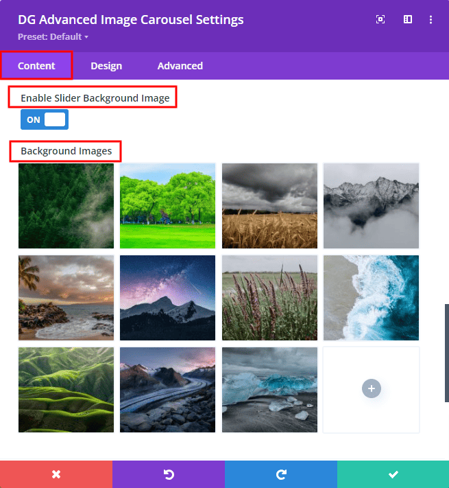
The background image option works as an image gallery. You can select one or more images from your media collection to customize the look of your carousel. Each item can have a unique background image, or a single image can be used across all items. If you upload background images corresponding to the number of slider items, each image will appear as a background for each item.
However, if you want to use a different background color or gradient color for each item, I'm sorry to inform you that this is not possible. You can set a specific color as the background of all items, which can be either a solid background color or a gradient color.
Can I use the background color on every single item?
No, unfortunately, you cannot use a background color on an item. If you can use a background color, you must use the same background color for all items. For that, the background color should be selected from the background option of the content tab.
Can the width of static content or carousel content be increased or decreased?
Yes, of course. You can increase or decrease the width of static or carousel content from the content settings toggle. Define the width of static and carousel content based on your carousel design
How can I change the slider direction for the carousel item?
To change the direction of the slider, navigate to Carousel Settings within the Content tab. Within this section, look for the option labeled "Carousel Slider Direction". Here, you can change the direction of the carousel slide as per your preference. Adjust this setting to determine whether the slides go left to right or right to left. Go to Content Tab-> Carousel Settings-> Carousel Slide Direction for the change of the Carousel Slide Direction.
Can pagination be used in this carousel?
Certainly, the carousel supports pagination functionality. You have the option not only to enable but also to customize and modify pagination through the pagination settings. If desired, you can disable pagination altogether. When activated, the pagination is represented by vertical bullet points situated on the left side of the carousel.
Within the pagination settings, you can easily adjust the size, color, and spacing of these bullet points to align with your design preferences. This level of customization ensures that the pagination seamlessly integrates with your overall carousel presentation.
Still Stuck? Our 24/7 support team is always ready. We are always ready for any need you may have.