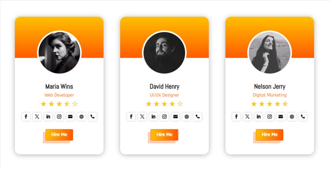
The Advanced Person module by Divigrid for the Divi theme is a highly customizable module that allows users to create detailed and visually appealing profiles. With a wide range of settings, this module is perfect for showcasing team members, personal profiles, and more. This documentation will guide and provide a comprehensive overview of all available customization options.
Content Tab Customization
The Content tab of the Advanced Person module is where you define the primary elements of the profile, such as the title, designation, description, images, and more. This section provides a detailed breakdown of the customization options available within each sub-section of the Content tab.
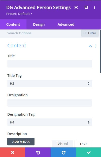
1. Content Section
Title: This field allows you to input the name or title of the person. The title is typically the most prominent piece of text on the profile card, so make sure it’s clear and representative of the person’s role or identity.
Designation: This field is used to specify the person’s job title or designation. Like the title, this is an important piece of information that provides context to the user.
Description: The description field allows you to write a brief bio or introduction for the person. This is where you can elaborate on their role, achievements, or any other relevant information.
 |
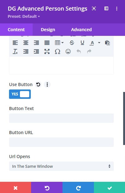 |
Use Button Switch: Enabling this switch adds a call-to-action (CTA) button to the profile card. This is particularly useful if you want to link to more information or prompt user interaction.
-
Button Text: Define the text that will appear on the button. (e.g., "Learn More," "Contact").
-
Link URL: Provide the URL the button will link to. This could be a page within your site or an external link.
-
URL Opens: Choose whether the link opens in the same tab or a new tab, offering control over the user's navigation experience.
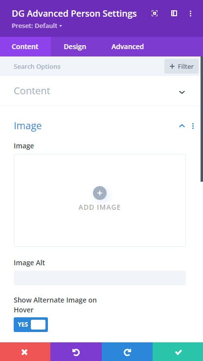
2. Image Section
Image: Upload the primary image of the person here. This image is the face of the profile card, so it’s essential to choose a high-quality and representative picture.
Image Alt: The alt text is crucial for accessibility and SEO, providing a textual alternative for users who cannot view the image.
 |
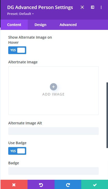 |
Show Alternate Image Switch: This switch allows you to add an alternate image that can be used in various scenarios, such as when hovering over the profile.
- Alternate Image Field: Upload a secondary image that can be displayed based on specific interactions or when the visitor hovers the card.
- Alternate Image Alt: Provide alternative text for the alternate image, following the same guidelines as the primary image alt text.
Use Badge Switch: After turning ON the badge switch, Enter text for a badge that can be displayed on the profile image. Badges can be used to highlight special statuses, awards, or other noteworthy information.
3. Configuration Section
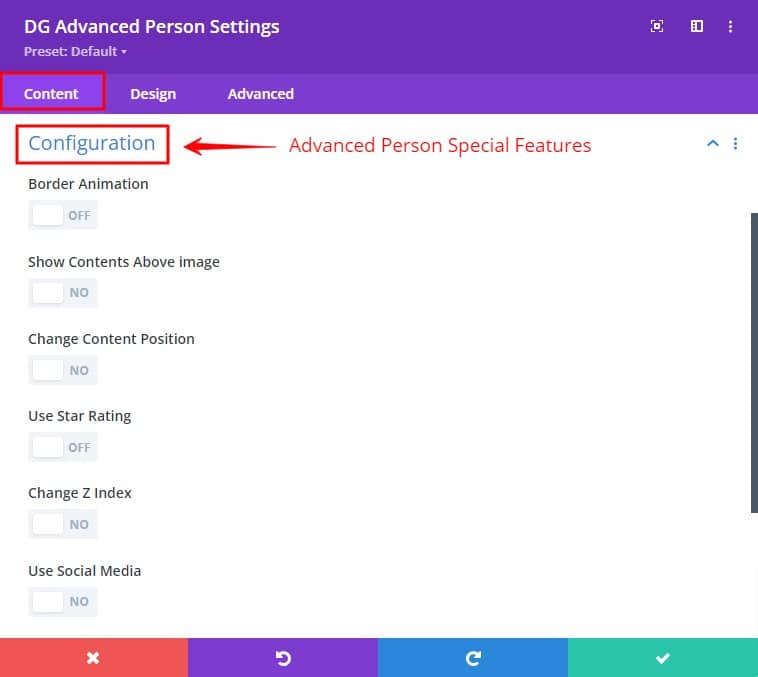
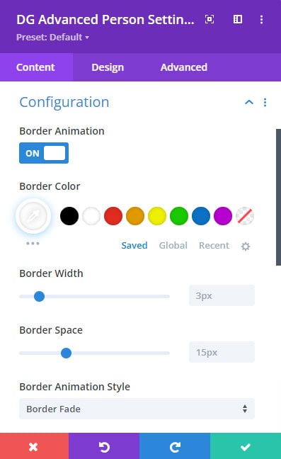
Border Animation Switch
This switch enables border animation around the profile card, adding a dynamic element to the design. The border animation switch allows you to add dynamic border animations to the Advanced Person module, enhancing the visual appeal of the content box.
 |
 |
Settings:
-
Border Color: Customize the color of the border surrounding the content box. You can choose any color that matches your site's theme.
-
Border Width: Adjust the thickness of the border by setting the width in pixels.
-
Border Space: Define the space between the content and the border. This spacing can be adjusted to create more visual separation.
-
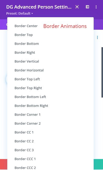
Border Animation Style: Choose from 19+ animation styles to create the desired visual impact. Each style offers a unique look, ranging from subtle glows to more pronounced effects.
Show Content Above Image Switch
This switch allows you to control whether the content (such as title, designation, description, etc.) appears above the image or not.
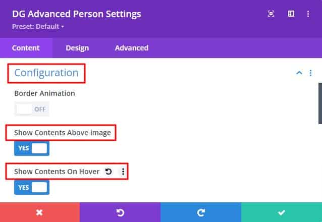
Show Content on Hover Switch: Enable this option if you want the content to be visible only when the user hovers over the image. This creates a cleaner, more minimalistic design, revealing information only on interaction.
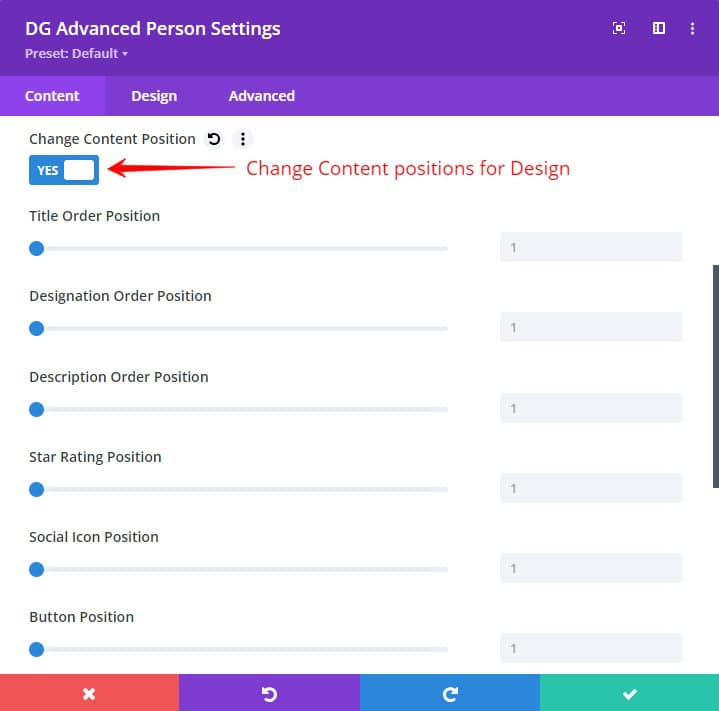
Change Content Position
This setting provides control over the positioning of various content elements within the module. You can rearrange these elements to appear in any order you prefer, ensuring the layout meets your design requirements. This flexibility allows you to highlight the most important information first.
Use Star Rating Switch
The star rating feature is useful for showcasing ratings or feedback, such as client testimonials, team member evaluations, or product reviews.
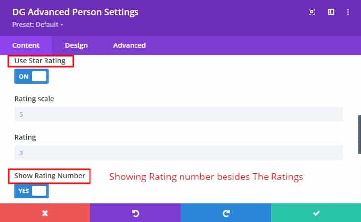
- Rating Scale: Choose the scale for the rating (e.g., 1-5 stars).
- Rating: Set the rating value that should be displayed (e.g., 4 out of 5 stars).
- Show Rating Number Switch: Enable this option to display the numerical rating alongside the star icons. This can help provide more precise feedback.
Change Z Index Switch
The z-index settings allow you to control the stacking order of the content and image wrappers. This is particularly useful when layering content elements or ensuring certain aspects are always on top. Adjust the z-index of the image wrapper and Content wrapper z-index, determining its position relative to other components.
Use Social Media Switch
Social media integration allows you to display social icons alongside individual profiles, making it easy for visitors to connect via social platforms.
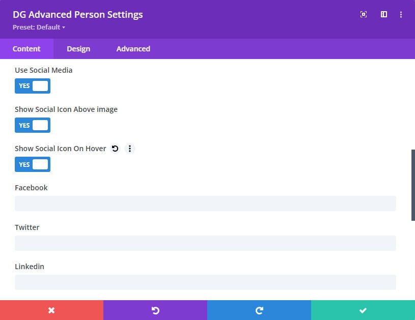
Show the Social Icon Above Image Switch: This setting determines whether social icons are displayed above the image. You can use this to highlight your social media presence or link directly to social profiles.
Design Tab Customization
The Design tab provides extensive styling options, allowing you to control the visual presentation of the profile elements. This tab ensures that the profile aligns with your overall site design and branding.
1. Image Settings
Image Hover Type: Choose from 10 modern image hover animations that apply effects when the user hovers over the profile image. These animations add an interactive element to the profile, enhancing user engagement.
Alignment: Align the profile image within its container (left, center, right). This setting is crucial for ensuring the profile looks balanced within different layouts.
Image Height & Width: Define the height and width of the profile image. These settings allow you to maintain a consistent image size across all profiles. This setting is responsive, allowing you to specify different heights & widths for desktop, tablet, and mobile views.
Use Overlay Switch: This switch allows you to add an overlay over the image.
- Background Color: Set a solid background color for the overlay that appears over the image.
- Gradient Color: Choose a gradient overlay, providing a smooth transition between colors for a more dynamic effect.
- Background Image: Upload an image to use as the overlay background, adding texture or branding elements.
Image Spacing: Control the spacing around the image, ensuring it fits well within the profile layout without crowding other elements.
Image Border: Customize the border around the image with various color, width, and style options.
Image Box Shadow: Add a shadow to the image, creating depth and a more polished look.
2. Font Style
This section allows for individual styling of the text elements within the module, including the title, designation, and description.
The font styling feature offers a comprehensive suite of options for tailoring the visual appearance of text elements. Users can fine-tune font size to ensure optimal readability and visual hierarchy. By selecting from bold, italic, or underlined styles, users can emphasize key points and create a sense of urgency or importance. Precise alignment options (left, center, right) allow for balanced and organized layouts. Additionally, adjusting letter spacing and line height enables users to control the density and spacing of text, improving readability and visual appeal. For added depth and dimension, users can apply text shadows with customizable color, blur, and position settings. Finally, the ability to select specific text colors allows for seamless integration with the overall design palette, creating a cohesive and visually pleasing composition.
3. Badge
Badge Alignment: Position the badge in any of the 9 available positions around the image, such as top-left or bottom-right.
Badge Rotation: Rotate the badge to create dynamic angles that make your design stand out.
Badge Background: Customize the badge’s background using a solid color, gradient, or image to match your overall design theme.
Badge Spacing: Control the margins around the badge for proper alignment with other elements.
Badge Font Styles: Tailor the text within the badge, adjusting font size, style, alignment, and color, and applying text shadows.
Badge Border and Box Shadow: Enhance the badge’s appearance with borders and shadows, giving it more prominence on the page.
4. Social Media Settings
The Social Media section allows you to style the social media icons that are displayed within the Advanced Person module. These settings ensure that the icons align with your site’s design and branding.
Social Media: Customize the color and background color of individual social media icons (such as Facebook, Twitter, and Instagram). This allows you to ensure that each icon aligns with your site's branding or the specific aesthetic you want to achieve.
- Icon Color: Set the color of the social media icons to either the brand colors of the platforms or a custom color that fits your design.
- Background Color: Choose a background color that complements the icon color. You can use solid colors or gradients for a more dynamic look.
Social Media Wrapper:
Alignment: This option allows you to align the social media icons within the content area. You can align them to the left, center, or right, depending on your design preference.
Social Icon Size: Adjust the size of the social media icons to ensure they are prominent and easy to interact with. Larger icons may be more visually striking, while smaller icons can be more subtle.
Social Icon Space: Control the spacing between each social media icon to create the right amount of separation. This helps to prevent clutter and ensures a clean, organized appearance.
Global Social Icon Color and Background Color: Set a uniform color and background color for all social media icons if you prefer a consistent look across the board.
Social Icon Container Margin: Adjust the margin around the social media icon container to create space between the icons and other content elements.
Social Icon Margin and Padding: Customize the margin and padding of each social media icon to fine-tune its placement within the container.
Border and Box Shadow: Apply borders and shadows to the social media icons to give them more definition and depth. Borders can be solid, dashed, or dotted, while shadows add a three-dimensional effect that helps the icons stand out.
5. Star Rating Settings
The Star Rating section provides options for customizing the appearance and layout of star ratings within your module. These settings allow you to control the size, spacing, and colors of the stars, ensuring they complement your overall design.
Star Rating Alignment: Align the star ratings to the left, center, or right within the content area. Proper alignment helps maintain balance and symmetry in your design.
Star Font Size: Adjust the size of the star icons to ensure they are easily visible and make a strong visual impact.
Star Icon Space: Control the spacing between each star to prevent them from appearing too close together or too far apart. This helps maintain clarity and readability.
Filled Star Color: Set the color for filled stars to highlight the rating value. This color should contrast well with the empty stars for better visibility.
Empty Star Color: Choose a color for the empty stars that complements the filled stars. The empty star color is usually lighter or more subdued to make the filled stars stand out.
Star Rating Number Color: Customize the color of the numerical rating displayed next to the stars. This color should be easily readable and consistent with the overall color scheme.
Star Rating Background: Set a background color for the star rating area. This can be a solid color or a gradient, depending on your design preference.
Star Rating Spacing: Adjust the spacing around the star rating area to ensure it is well-positioned within the content layout.
Star Rating Border: Add a border around the star rating area to give it a more defined look. You can customize the border’s color, width, and style to match your design.
6. Content Wrapper Settings
The Content Wrapper section allows you to customize the area that surrounds your content (such as text and images). This section is crucial for creating a cohesive and visually appealing layout.
Content Wrapper Alignment:
Align the content wrapper to the left, center, or right. This ensures that the content is properly positioned within the module and aligns with other design elements.
Content Wrapper Width:
Set the width of the content wrapper to control how much space it occupies within the module. This allows you to create a balanced layout that doesn't overwhelm the viewer.
Content Wrapper Height:
Adjust the height of the content wrapper to ensure it accommodates all the content without causing overflow or excessive white space.
Content Wrapper Background
- Background Color: Choose a background color for the content wrapper that complements the overall design. This can be a solid color or a gradient.
- Background Gradient: Apply a gradient background to the content wrapper for a more dynamic and visually interesting effect. Gradients can be subtle or bold, depending on the design goal.
- Background Image: Set an image as the background for the content wrapper to create a more immersive experience. Ensure the image is high-quality and relevant to the content.
Content Wrapper Spacing:
Adjust the spacing around the content wrapper to create a balanced and well-organized layout. Proper spacing helps to prevent clutter and ensures the content is easy to read.
Border:
Add a border around the content wrapper to give it more structure. You can customize the border’s color, width, and style (solid, dashed, dotted, etc.).
Box Shadow:
Apply a box shadow to the content wrapper to add depth and dimension. Shadows can create a more dynamic look and help the content stand out from the background.
7. Button Styling
The Call to Action (CTA) button is a powerful tool for directing user behavior. Divi's Design Tab provides a robust set of customization options to create visually appealing and effective CTAs.
Easily tailor the appearance of your CTA button by adjusting text color, background color, font size, and padding. To create a more interactive experience, apply hover effects that change color or size when the user hovers over the button. With these features, you can design CTAs that not only look great but also encourage users to take the desired action.
FAQs About Advanced Person Module
Q. What is the purpose of the 'Show Alternate Image' feature, and how do I use it?
The 'Show Alternate Image' feature allows you to display a different image under certain conditions, such as on hover. To use this feature, enable the 'Show Alternate Image Switch' in the Content tab, then upload your alternate image and set its alt text.
Q. Can I specify different alt text for the primary and alternate images?
Yes, you can provide separate alt text for both the primary and alternate images, ensuring that each image is described accurately for accessibility purposes.
Q. Is it possible to control when the alternate image is displayed?
The alternate image typically displays on hover or based on other interactive triggers. You can manage these settings through the module’s configuration options.
Q. How do I add and configure social media icons in the Advanced Person module?
To add social media icons, enable the 'Use Social Media Switch' in the Content tab. Then, configure the individual social media links and customize the icon settings in the Social Media section.
Q. Which social media platforms are supported by the Advanced Person module?
The module supports a variety of popular social media platforms, including Facebook, Twitter, Instagram, LinkedIn, and more. You can easily add icons for these platforms in the Content tab.
Q. Is it possible to set different colors for social media icons and their backgrounds?
Yes, you can independently set colors for both the icons and their backgrounds in the Social Media section under the Design tab.
Q. What can I customize in the Title and Designation fields?
In the Content tab, you can customize the title and designation text, select appropriate HTML tags, and control their positioning within the module.
Q. What is the 'Use Star Rating' feature?
The 'Use Star Rating' feature allows you to display a star rating for the profile, with customizable rating scales, star icons, and the option to show the rating number.
Q. Can I adjust the Z-index of the image and content wrappers?
Yes, the Content tab includes settings for changing the Z-index of both the image wrapper and content wrapper, helping you manage stacking orders.
Q. What are the customization options for badges?
Badge settings in the Design tab allow you to adjust alignment, rotation, background (color, gradient, image), spacing, font styles, borders, and box shadows.
Q. Is it possible to adjust the spacing between stars?
Yes, the spacing between stars can be adjusted in the Star Rating section of the Design tab.
Q. Can I globally style all social media icons?
Yes, global styling options are available in the Design tab, allowing for consistent color, size, and other design elements across all icons.
Q. Is it possible to add custom social media icons?
While the module supports standard icons for popular platforms, custom icons may require additional setup or plugins.
Q. Can I rotate the badge or image for creative effects?
Yes, rotation settings are available in the Design tab, allowing you to apply creative transformations to badges or images.
Q. Can I display the star rating as numerical values?
Yes, toggle the 'Show Rating Number' option in the Content tab to display the numerical value alongside the star icons.
Q. Can I ensure the module is responsive across various devices?
Yes, use the responsive editing tools in the Design tab to ensure the module adapts well to different screen sizes.