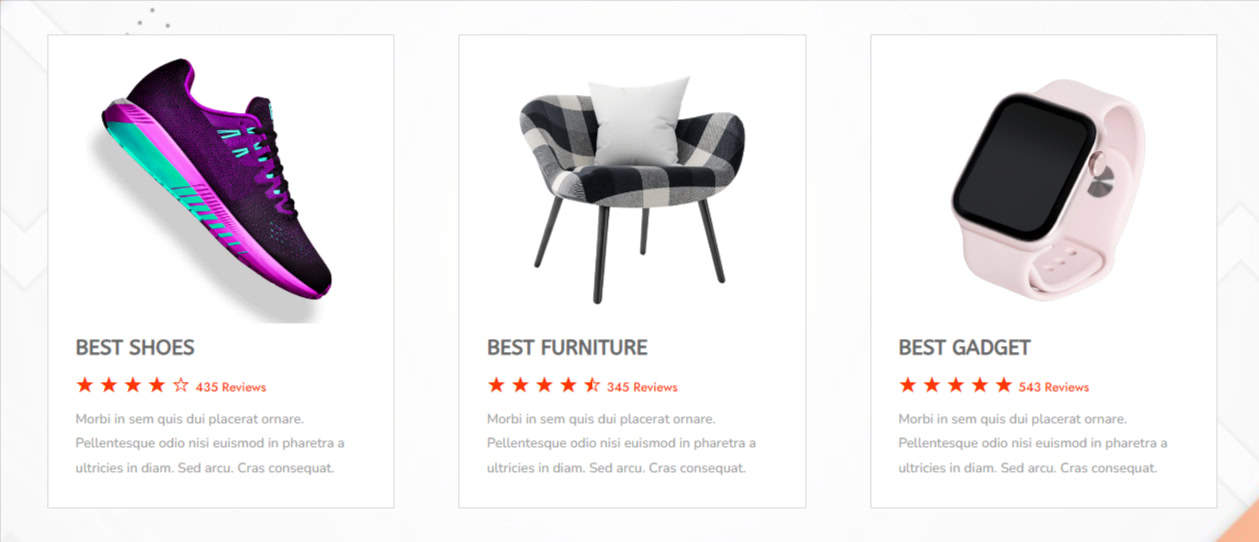
The Divigrid Star Rating Module is an intuitive and highly customizable feature designed to add a star-based rating system to your website. This module, a part of the Divigrid plugin for the Divi theme, is ideal for product reviews, service evaluations, or any rating system where user feedback is essential. With flexible options like custom rating icons, detailed star design settings, and the ability to display user reviews, this module allows you to present ratings in a visually appealing and informative way.
Content Tab Settings
The Content Tab holds the fundamental settings for defining the appearance and structure of your Star Rating module. Here, you can control the rating scale, customize icons, and manage the title, subtitle, and description.
Star Rating Settings
Rating Scale
The Rating Scale allows you to define the maximum number of stars or icons that represent the rating system. The default setting is typically a 5-star system, which is widely recognized in product or service reviews. However, with this option, you can adjust the scale to fit your needs, whether it’s a 10-point scale or something unique like 6 stars. This flexibility allows you to match the rating system with your website's theme or business model.
[ Tip: For customer reviews, the standard 5-star rating system is widely understood and user-friendly. For more specialized industries, consider adjusting the scale accordingly.]
Rating
This option lets you set the default rating that will appear in the module. For example, if you are showcasing a specific product's rating, you can preset it as 3 out of 5 stars. The rating can either be static or dynamically adjustable based on the feedback from users or customers. This is especially useful if you’re displaying product or service ratings that have been reviewed multiple times.
Show Rating with Title (Switch)
When this switch is activated, the Star Rating and the Title will be aligned in a single horizontal line. This creates a compact layout, which is ideal when space is limited, such as in a product summary widget or a compact review section.
Show Rating Number (Switch)
Enable this switch to display the actual numeric rating alongside the stars, enclosed in parentheses (e.g., 3/5). This is a helpful visual cue for users to quickly gauge the rating without needing to count the stars manually. It also adds an extra layer of transparency by showing both the stars and the number.
Use Custom Rating Icon (Switch)
This is a standout feature in the Star Rating module. Activating this switch allows you to replace the traditional star icons with custom icons from the Divi icon library. For example, you could replace stars with hearts, thumbs, or other symbols that match your branding or the nature of the review.
Show Total Reviews (Switch)
Activating this switch will show the total number of reviews alongside the rating. This gives more context to the rating by indicating how many users contributed to the score.
Wrap Rating Item
Control the layout and appearance of the rating by wrapping it inside a customizable container. This setting allows you to ensure that the rating item behaves consistently across devices and layouts.
Content Settings
Use Image (Switch)
If you want to add a visual element alongside the star rating, activate this switch to include an image. When activated, the following settings become available:
- Upload Image: Upload an image, such as a product photo, user avatar, or brand logo.
- Image Alt Text: Provide an Alt Text for the image for SEO and accessibility purposes.
- Use Badge (Switch): Toggle this option to add a badge overlay on the image.
- Use Badge Icon: Choose an icon for the badge, which can be a star, checkmark, or any other symbol that complements the rating.
Title Text & Title Tag
Enter the Title for the rating section (e.g., Product Name or Review Title). The Title Tag allows you to set the heading level (H1, H2, H3, etc.) for SEO hierarchy and accessibility.
Use Subtitle (Switch)
Activate this switch to display a Subtitle below the main title. This adds additional information to complement the title, such as a product's tagline or a brief summary of the review.
Use Description (Switch)
Enabling this option will display a description field below the subtitle. You can use this to provide a more detailed explanation of the product, service, or user experience that is being rated.
Design Tab Settings
The Design Tab gives you control over the visual appearance of the Star Rating module. This includes settings for images, fonts, icons, and overall layout styling.
Image Position
Choose where the image will be placed in relation to the rating and text. The available positions are:
- Top
- Right
- Bottom
- Left
Image Alignment
When the image is positioned at the top or bottom, you can align it to the left, center, or right. If the image is placed on the left or right, you can align it to the top, center, or bottom.
Image Width & Height
Adjust the width and height of the image to suit your design. This ensures that the image does not overpower the rating and remains proportional to the layout.
Image Spacing
Define the space between the image and other content elements like the star rating or the description. This helps maintain a clean and balanced layout.
Border
You can customize the border width, style (solid, dashed, dotted, etc.), and color. Borders can help define the image’s boundaries, making it stand out more clearly.
Box Shadow
This setting allows you to create a shadow around the image, giving it a three-dimensional effect. You can control the color of the shadow, its spread, blur, and position (horizontal/vertical offsets). Box shadows add depth and can make the image appear as though it’s floating.
Font Styles
Each text element—Title, Subtitle, and Description—can be styled independently, giving you granular control over the typography. You can modify:
- Font
- Font Weight & Style
- Alignment
- Line Height & Letter Spacing
- Text Shadow
- Text Color
Star Rating Settings
The Star Rating is the core visual element of this module. Customizing the stars allows you to match the rating design with the rest of your website, making it more engaging and visually cohesive.
Star Rating Alignment
You can control the alignment of the stars in relation to other content. Choose from:
- Left
- Center
- Right
Star Size
The size of the stars plays a significant role in their visual impact. Larger stars draw more attention, while smaller stars can blend in with the rest of the content. Adjust the star size to ensure it fits within your layout and remains visible without overpowering other elements.
Star Icon Space:
This setting controls the space between individual stars. Increasing the space can make each star more distinct while reducing it creates a more compact appearance.
Filled Star Color
Set the color for the filled (active) stars. This is the color that represents the actual rating value (e.g., 4 out of 5 stars).
Empty Star Color
Customize the color for the empty (inactive) stars. This color serves as the background or outline for the stars that are not filled.
Star Rating Number Color
Customize the color of the numeric value displayed next to the stars (if the option is enabled).
Star Rating Background
This option controls the background behind the star rating, giving it a container or background color for visual separation. Choose a solid background color or use gradients to add depth.
Star Spacing
This controls the space around the star rating block, ensuring it fits comfortably within the design layout. Set specific spacing (margin or padding) on all sides (top, bottom, left, right).
Star Border & Box Shadow
You can add borders around each star to give them more definition and emphasize the rating system. Set border width, color, and style (solid, dashed, dotted). Add shadows behind the stars to create depth and dimension. This can make the star rating more visually appealing. Control shadow color, blur radius, spread, and horizontal/vertical offset.
Star Rating Wrapper
The wrapper settings control the overall container around the stars, allowing you to refine further the placement, background, spacing, and border properties.
Star Rating Wrapper Width
Adjust the width of the container holding the star rating, which can help fit the rating into specific sections of a webpage. Set the width in pixels, or percentages, or use responsive scaling.
Wrapper Background
Define a background color for the entire star rating wrapper, making it distinct from the rest of the page. Choose solid colors, gradient fills, images, or transparent backgrounds.
Star Container Spacing
Control the spacing around the star container within the wrapper, ensuring that the stars fit neatly inside the container.
Border
You can customize the border width, style (solid, dashed, dotted, etc.), and color. Borders can help define the wrapper’s boundaries, making it stand out more clearly.
Box Shadow
This setting allows you to create a shadow around the container, giving it a three-dimensional effect. You can control the color of the shadow, its spread, blur, and position (horizontal/vertical offsets). Box shadows add depth and can make the container appear as though it’s floating.
Review Text
The review text section allows you to display textual feedback from users, which can be customized extensively for design and layout.
Review Text Space
Control the space around the review text to ensure it has proper separation from the star rating or other content elements. Increased space around review text can help make the feedback more prominent on the page.
Review Text Background
The background of the review text helps distinguish the text from the rest of the star rating. You can choose from:
- Solid Color: Pick a uniform background color for the review text.
- Gradient: Apply a gradient using two or more colors, which can add depth and visual interest.
- Image: Use a custom image as the background of the review text, adding a unique texture or pattern.
This setting allows you to play with color theory or match the brand theme to create a cohesive design.
Review Text Padding
Adjust the padding inside the review text block to create more breathing room between the text and the borders.
Font Style
You have full control over how the review text is styled, including font family, weight, alignment, and more.
- Font
- Font Weight & Style
- Alignment
- Line Height & Letter Spacing
- Text Shadow
- Text Color
Review Text Border & Review Text Box Shadow
You can add borders around the review text block for a cleaner, more defined look. Apply shadow effects to the review text block to give it more depth and make it stand out from the background.
Badge Settings
Badges can be used to display additional information alongside the star rating (e.g., "Top Rated" or "Editor’s Pick"). This section covers all customization options for badges.
Alignment
Control the alignment of the badge relative to the star rating module.
Gap
Adjust the gap between the badge and the star rating or other nearby elements.
Icon Position
For badges that include icons, this option lets you choose where the icon is positioned in relation to the text.
Icon Color
Define the color of the icon within the badge, which can either complement or contrast with the text and background.
Badge Background
The background of the review text helps distinguish the text from the rest of the star rating. You can choose from:
- Solid Color: Pick a uniform background color for the badge.
- Gradient: Apply a gradient using two or more colors, which can add depth and visual interest.
- Image: Use a custom image as the background of the badge, adding a unique texture or pattern.
Badge Font Styles
You have full control over how the badge text is styled, including font family, weight, alignment, and more.
- Font
- Font Weight & Style
- Alignment
- Line Height & Letter Spacing
- Text Shadow
- Text Color
The Divigrid Star Rating Module offers a comprehensive set of tools to create visually engaging and functional star rating systems for any Divi-powered website. With full control over design elements, animations, and responsiveness, this module can be customized to fit seamlessly into any layout. Whether you're showcasing product reviews, user feedback, or any other form of rating, this module provides all the features you need to create a polished and professional design.
FAQs About Star Rating Module
Q. How do I add the Star Rating module to a page or post in Divi?
Simply open the Divi Builder, add a new module, and select "Star Rating" from the list of available modules. You can then customize it according to your needs.
Q. How to Use the Star Rating Module
The Star Rating Module is highly versatile and can be used in various contexts:
- Product Reviews: Showcase customer feedback with star ratings.
- Service Evaluations: Allow users to rate services offered by your business.
- User Reviews: Enable visitors to rate blog posts, articles, or other content.
To use the module:
- Add the Star Rating Module to your Divi page layout.
- Configure the Content tab with your desired rating settings.
- Style the module using the Design tab.
- Use custom CSS in the Advanced tab if needed.
Q. Can I use custom icons instead of stars?
Yes, by enabling the Use Custom Rating Icon option, you can replace stars with any icon from the Divi library or upload custom icons.
Q. How do I display the number of reviews alongside the rating?
You can show the total number of reviews by enabling the Show Total Reviews switch in the Content tab.
Q. What is the purpose of the ‘Show Total Reviews’ switch?
When enabled, the Show Total Reviews switch will display the total number of reviews next to the star rating (e.g., "Based on 200 reviews").
Q. What is the 'Wrap Rating Item' feature?
The Wrap Rating Item feature ensures the entire star rating element wraps within a single container, which can be useful for responsive layouts or when aligning it with other content.
Q. Can I display a title along with the star rating?
Yes, you can add a title text by filling out the Title Text field in the Content tab.
Q. Can I customize the position and appearance of the badge?
Yes, in the Badge section of the Design Tab, you can adjust the Badge Alignment, Icon Position, Icon Color, and other appearance settings.
Q. Can I make the star icons larger for mobile devices?
Yes, you can use the Responsive Settings in the Design Tab to customize the Star Icon Size specifically for mobile devices.
Q. Can I display a numerical rating alongside the stars?
Yes, the module allows you to display a number representing the rating (e.g., 4.5 out of 5) alongside the stars.