Once you have installed DiviGrid Module, you will find the Divigrid inline popup alongside the other Divi Modules available in the “Insert Module” window.
Divigrid Inline Popup Module
An inline popup displays an area within a small popup element on the current page. It's like a dialog but doesn't have a title bar, header, or close button.
Inline pop-ups don't appear to be separate windows but appear to be separate parts of the same page. Our inline popup exposes hidden content vertically.
We hope you will enjoy our very own new Divi inline popup grid. Let's see what we have done in this module.
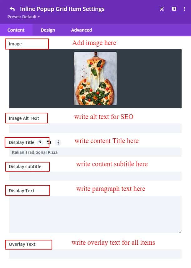
Inline Popup Grid Item Settings
An inline popup grid item has two sub-toggles for writing content.
a. Display Content
The Display Content sub toggle is the preview item that will be displayed by default. The content that will be written or given here will show in the item. To learn more, click on the Display item to show the contents of the details of contents as an inline popup.
As display content, you can add images, image alt text, title subtitle, text, and overlay text and do styling as required.
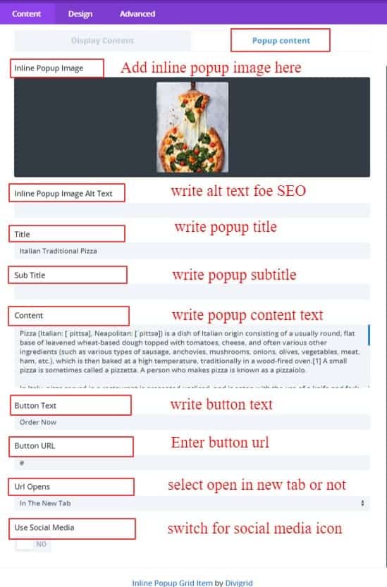
b. Popup Content
If you want to describe something in detail or take it to another website, you can display some content inline pop-ups. An inline pop-up is to describe something in detail to the client without the hassle of redirecting. If you want to discuss content in detail, this inline pop-up can be the best solution for you. Inline pop-up, you want to add an image, title, subtitle, text, a button for the link, button text, link in the same window or new window as pop-up content, and add a social media link of the company or individual. But you can add if you want.
Divi Inline Popup Content Settings
After inserting the Divi inline popup grid you will find a new toggle called grid settings alongside the defaults toggles.
Grid Settings
Inside the Grid Settings toggle, there are four more switches, grid options, and some fields for styling. The switches are listed below.
- Enable Auto Responsive,
- Popup Activate First,
- Enable Scroll To Viewport,
- Enable Backdrop Filter
Eneble Auto Responsive :
If you enable the auto responsive ON, it will detect the item's minimum width and set the item per column automatically.
Popup Activate First :
Activate the first item popup when the page is loaded. By default, the switch is OFF. but if you ON this switch it will activate the first item's popup content.
Enable Scroll To Viewport
The virtual scroll viewport itself acts as the scrolling element by default. After clicking on an element, the page scrolls down to viewport. By default, the switch is OFF.
Enable Backdrop Filter :
The backdrop-filter CSS property lets you apply graphical effects such as blurring or color shifting to the area behind an element. Because it applies to everything behind the element, to see the effect you must make the element or its background at least partially transparent. By default, the switch is OFF.
In addition to the switch, several styling options are provided. Trying to give an idea of how they work or what they do.
Grid Column Number :
The Grid Column Number specifies the number of columns in a grid container.
The values are a space-separated list, where each value specifies the size of the respective column.
Grid Gap :
The Grid Gap property defines the size of the gap between the rows and columns in a grid layout. By default, the grid gap is 5px but you can change the gap up to 50px for your design purpose.
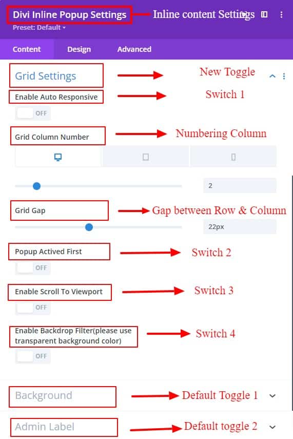
And there is the rest of the toggles named Background and Admin Label. The background is used for the Item's Background color or masking image.
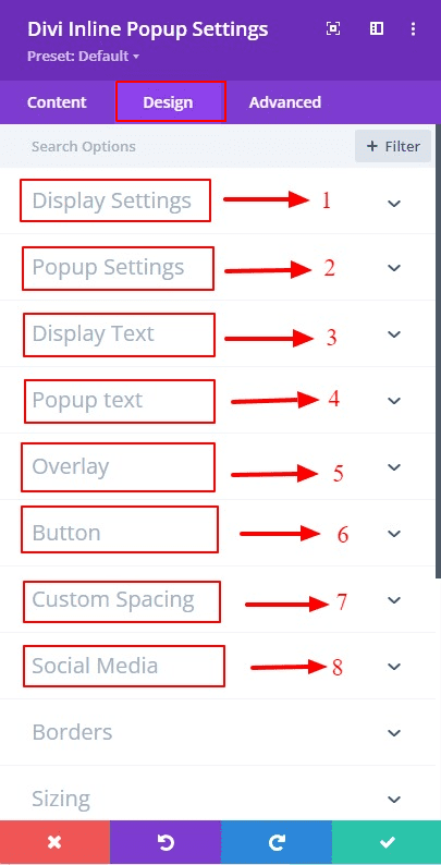
Design Tab
In the design tab, tons of new toggles have been added for design purposes. With the help of toggles such as Display Settings, Popup Settings, Display Text, Popup Text, Overlay, Custom Spacing, and Social Media. Everything can be designed very smoothly. An Advanced tab has different designing toggles for designing the contents of the inline popup grid items to facilitate the need. Also, several options have been added to some of the default toggles.
Display Settings :
In this Display Settings, there are styling options for Displaying image items. Items related to all the styling options are available in these settings.
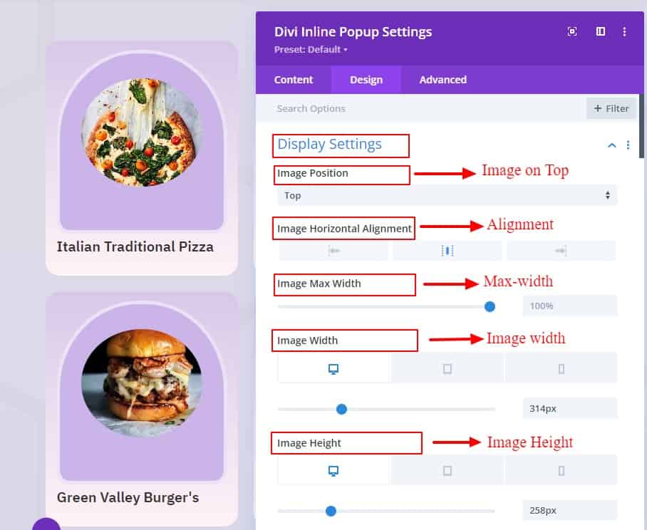
Image position :
You can define the position you want to keep your image from these four options (Left, Right, Top and Bottom). As per your selection, the contents will be inserted according to the position of the image.
Image Horizontal Alignment :
Image Position Left, Center or Right determines where you want your image to be placed when it is top or bottom position.
Image Max Width:
You can set the maximum width for your image from these settings.
Image width:
These image width settings are used to define what width the image should be to display nicely according to the display grid.
Image Height:
These image height settings are used to define what height the image should be to display nicely according to the display grid.
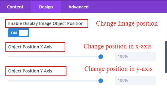
Enable Display Image Object Position:
After inserting the image into the container, the item box provides settings to change the position to expose the image well.

Enable Display Image Full Width:
If you want to keep or display the image in full width, then enabling the full-width switch, will show the image in full width.
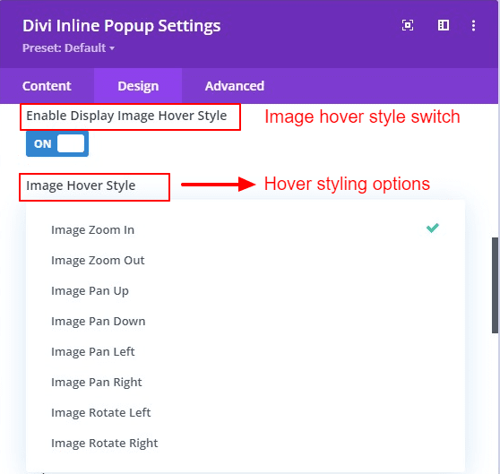
Enable Image Hover Style :
Several options have been added to these settings to determine how the display image will be styled when hovered over. You can choose the hover effect style as per your choice from here. No need to write custom CSS separately. By default, the switch is OFF.
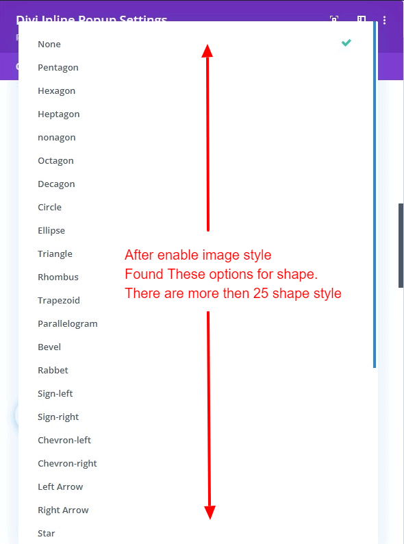
Enable Display Image Style:
There are more than 25 shapes to give different shapes to your images and different design patterns. You can use these settings to avoid the hassle of writing any custom code for any shape. By default, the switch is OFF.

Enable Display Image Wrapper Style:
You can use these styles in image wrappers like image styles. There are more than 25 shapes to give different shapes to your images and different design patterns. You can use these settings to avoid the hassle of writing any custom code for any shape.
If both image and image wrapper styles are turned ON, more new styles can be created.

Enable Display Image Background Color:
In the image, if you want can use the background color. The background color is given because sometimes loading issues can occur where the color comes first and the image takes time to load later.
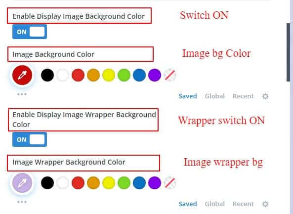
Image Border:
There is nothing new to say about the border toggle. The Divi default border is the same in all modules. Here in the image, you can use the border for a beautiful design.
Image Wrapper Border:
Like images, image wrappers also have options to use borders.
Item Box Shadow:
In these settings, you will find the option to use a box shadow for your preview content box item.
Popup Settings
In the popup settings, there are two sub-toggles called Basic & Misc.
Basic
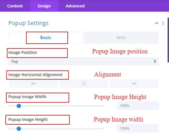
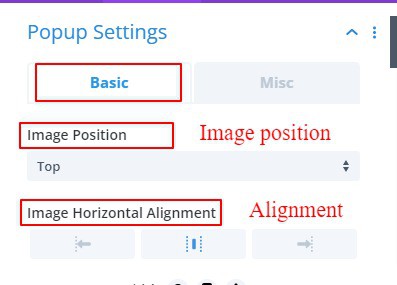
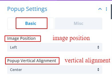
Image Position:
You can define the position you want to keep your image from these four options (Left, Right, Top and Bottom). As per your selection, the contents will be inserted according to the position of the image.
Popup Image Horizontal Alignment:
Image Position Left, Center or Right determines where you want your image to be placed when it is top or bottom position.
Popup Item Vertical Alignment:
Image Position Top, Center, or Bottom determines where you want your image to be placed when it is Left or Right position.
Popup Image width:
These image width settings are used to define what width the image should be to display nicely according to the display grid.
Popup Image Height:
These image height settings are used to define what height the image should be to display nicely according to the inline popup grid.
Enable Popup Image Style:
There are more than 25 shapes to give different shapes to your images and different design patterns. You can use these settings to avoid the hassle of writing any custom code for any shape. By default, the switch is OFF.
Enable Popup Image Object Position:
After inserting the image into the container, the item box provides settings to change the position to expose the image well. By default, the switch is OFF.
Popup Container Border:
There is nothing new to say about the border toggle. The Divi default border is the same in all modules. Here in the popup container, you can use the border for a beautiful design.
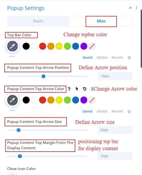
Misc
Top Bar Color:
In this setting, you can change the color of the top bar. which is shown after the "preview display content" and when the inline popup is enabled.
Popup Content Top Arrow Position :
Here you can change the position of the top arrow at your convenience. You can make your design look beautiful by changing the arrow position very easily.
Popup Content Top Arrow Color :
Depending on your design you can change the color of your top arrow here.
Popup Content Top Arrow size :
You can define the size of the top arrow here. You can also change the size or look of your arrow. It Can be scaled from 0 to 150 pixels.
Popup Content Top Margin From the Display Content :
You can define how far you can enable the tip bar from your display item. You can increase or decrease the distance from 0 to 100 pixels from this range field.
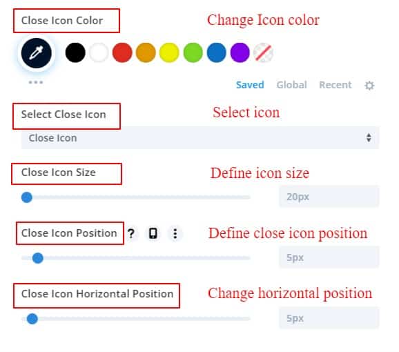
Close Icon Color:
In the popup content, there is a close icon in the top right corner to close the inline popup. for these designs, you can change or define the close icon color.
Close Icon Size:
You can define the size of your icon in these settings. You can resize your close icon from 0 to 150 pixels.
Close Icon Position:
Similarly, you can change the position of your close icon from here. If you have enlarged the icon but it is not in the right place, then you can change its position using this option.
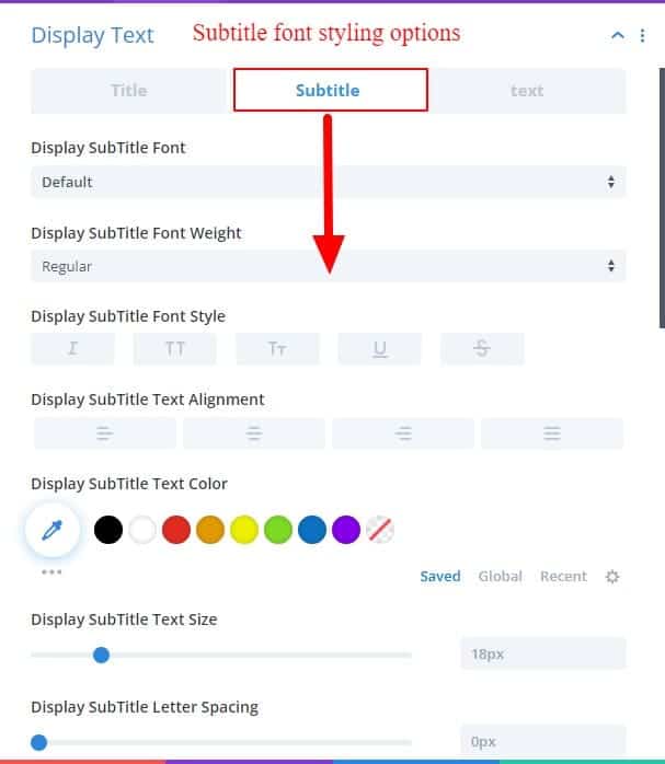
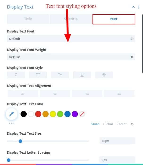
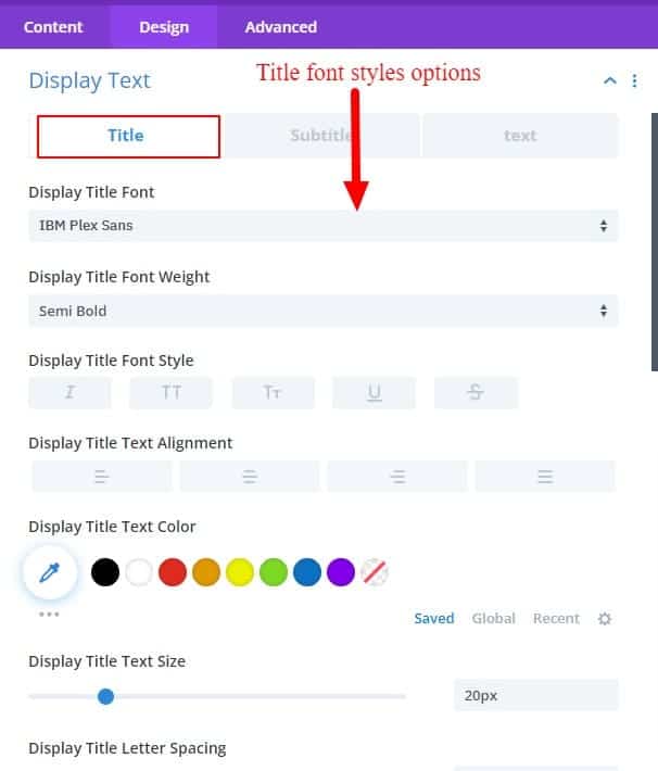
Display Text
This Display Text toggle provides all font styles for title, subtitle, and paragraph text in preview items. This toggle can change all font styles of multiple child items simultaneously.

Popup Text
It is also similar to the "display text" toggle. The title, subtitle, and paragraph text of all inline popups can be changed simultaneously.


Overlay
Image Opacity For The Display Content:
Use this setting to increase/decrease the opacity of the image. If you can reduce the opacity of the image and combine it with the background color, you can get some nice overlay effects.
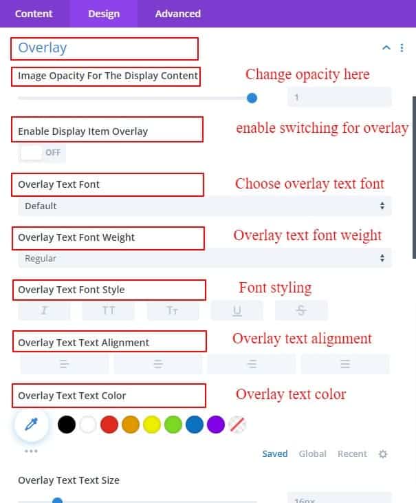
Enable Display Item Overlay:
Typically this is a switch. If turned on, you will get a field of Overlay Text and also select how the overlay style will be. Various overlay styles can be selected from here. And if you write something in the overlay text field, it will show in the middle of the preview image when overlayed.
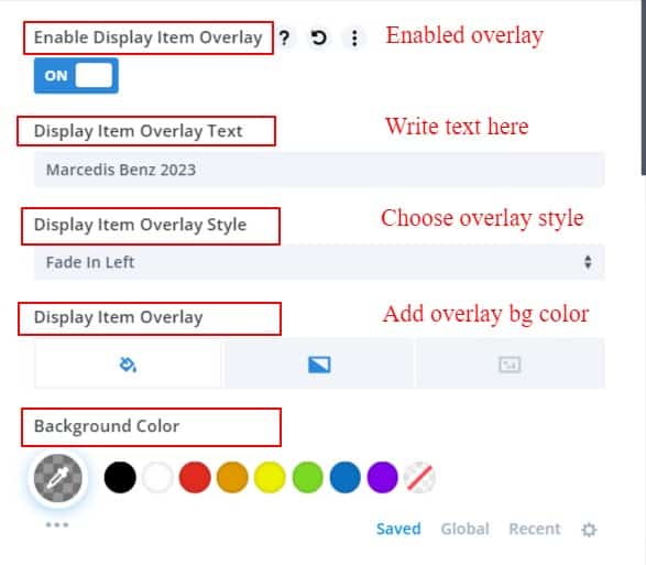
Display Item Overlay Text:
If you want to show any text in the overlay, you can write that text in this field. That text will show when overlaid on the item.
Display Item Overlay Style:
You can choose any style from Overlay Style for which side or where the overlay will start. Here we have created several styles.
Display Item Overlay Background:
You can use an overlay background color if you want to give a specific color to the overlay after it is switched on. You can use any color that matches the color of your item.
Overlay Text Font Items:
All overlay text styling options are available in overlay text fonts. Here you can style the font as you wish.
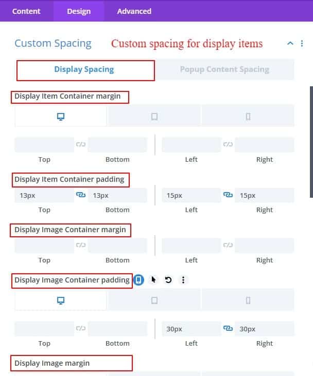
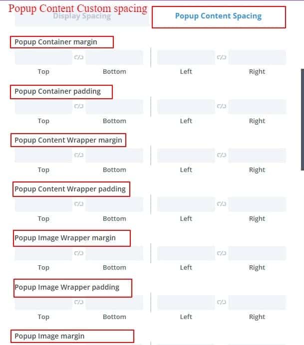
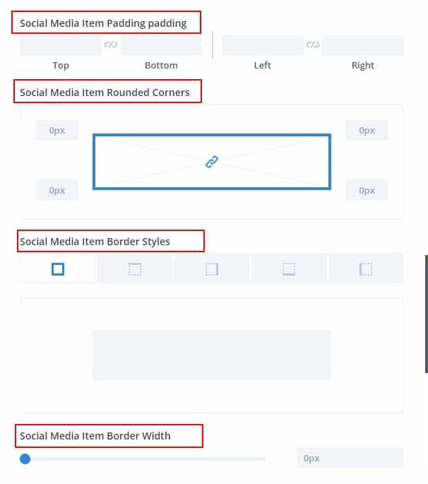
Custom Spacing
The margin and padding of each content between items are in this toggle settings option. Margin and padding of all child items can be given from this option.
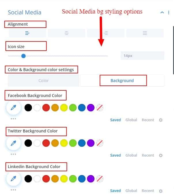
Social Media
You can use social media links below the inline pop-up content if you want. This is a very popular option now. You can use these icons for yourself or for business. Social media options can certainly give you some added benefits.
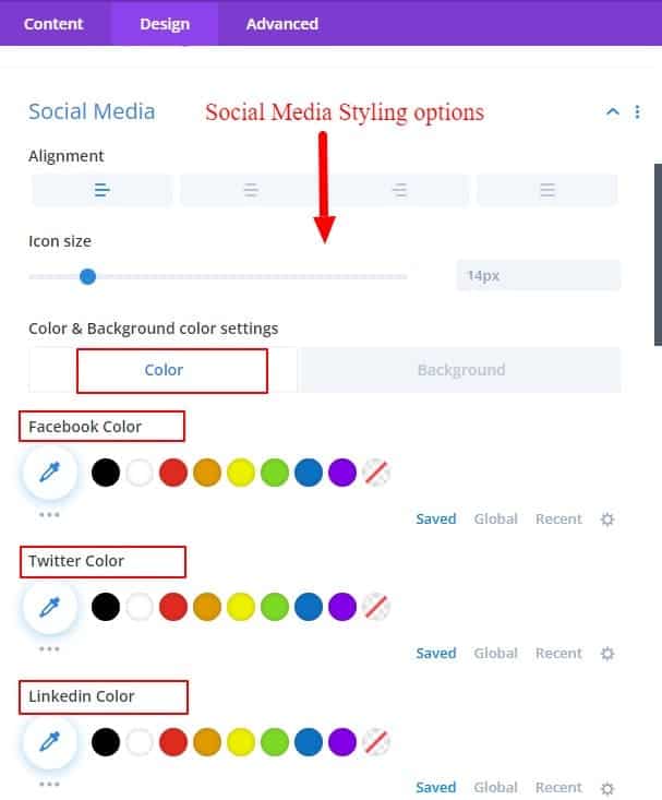
Alignment:
Social media icons can be selected on the left, center, or right. this alignment can start with the left, center, or right side.
Icon Size:
From here you can change the size of social media icons.
Color And Background Color For Social Media Icon:
You can change the color and background color of social media icons very easily. Given as a sub toggle for convenience.
Our guidelines have tried to give you a maximum idea of how to use this module. The inline popup grid module is designed to allow detailed discussion of any content without any redirects. If you want to know anything about our module, you can knock us anytime Here.
For Content Grid documentation please visit Content Grid