Once you have installed DiviGrid Module, you will find Divi Content Grid alongside the rest of the Divi Modules that are available in the “Insert Module” window.
Divi Content Grid Settings
After inserting the Divi Content grid you will find a new toggle called Grid Settings along with the default toggles.
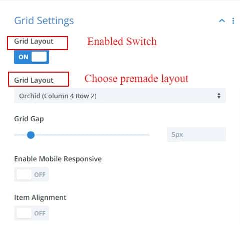
Grid Settings
Inside the Grid Settings toggle, there are three more switches and some grid options.
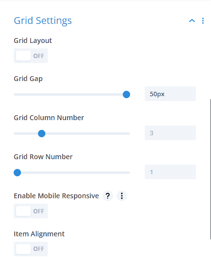
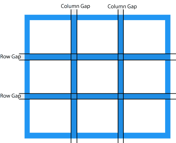
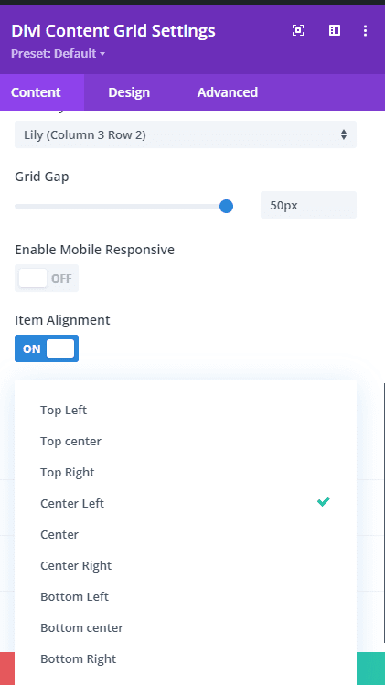
Grid Gap
The Grid Gap property defines the size of the gap between the rows and columns in a grid layout.
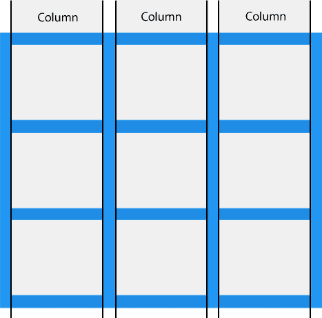
Grid Column Number
The Grid Column Number specifies the number of columns in a grid container.The values are a space-separated list, where each value specifies the size of the respective column.
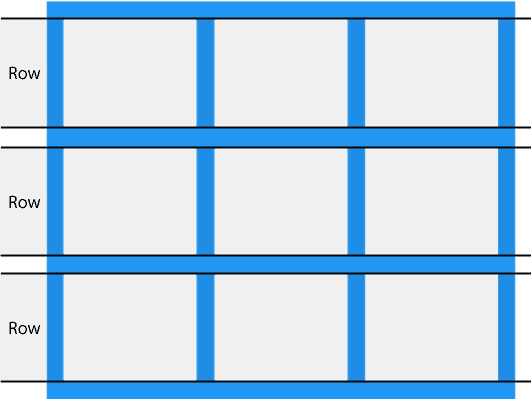
Grid Row Number
The Grid Row Number specifies the number of rows in a grid container.
The values are a space-separated list, where each value specifies the size of the respective row.
Grid Layout Switch
This is premade grid layout switch. If this switch is enabled, many built-in layouts will be available.
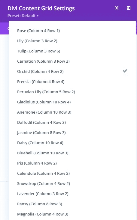
If you want, you can create a custom grid layout by clicking the Add item.
Enable Mobile Responsive Switch
this switch is used for mobile responsive views only।
If the switch is turned on, each item in the mobile grid layout will maintain the same height and width.
Item Alignment switch
Provides options to specify where contents can be displayed within the grid layout.
Design Tab
In the design tab, tons of new modules have been added for design purposes. With the help of modules such as title, subtitle, content, and image settings, everything can be designed very smoothly.
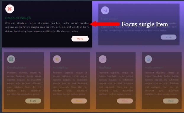
Hover Effects
In Design Tab, there is a new module called Hover Effects. Basically, it is a Yes_No switch button. If you want to use Hover Effects then press yes. Now you have found the hover effects style. Chose a style that matches your content.

a. Focus Item
b. Content Reveal
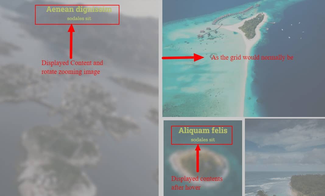
Focus ItemTypically, when the User hovers over any of the items in a section, that item will appear zoomed in slightly from other items in that section.
Content Reveal
The Content Reveal style is such that there is an image first and the contents of the grid are hidden. Those contents will appear above the image when hovered over. Also, the image is slightly zoomed and slightly rotated to increase the glamor of the style.
Spacing
The Spacing toggle provides options to set the margin or padding of each grid at once.
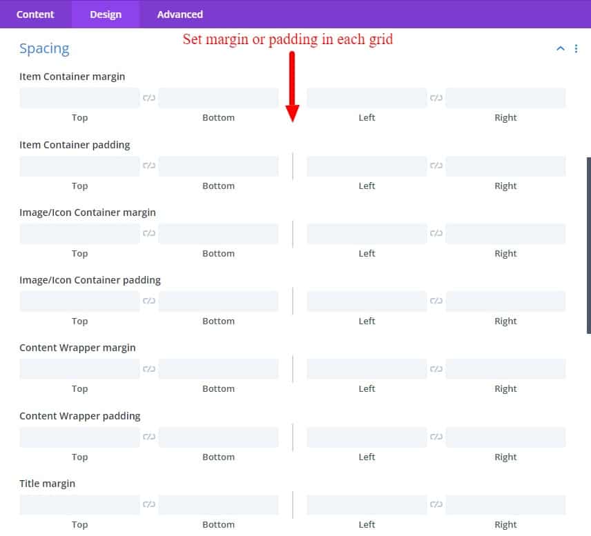
Also, in each module of the design tab, the necessary options are given.
-----------------------------------------------------------------------------------------------------------------------------------
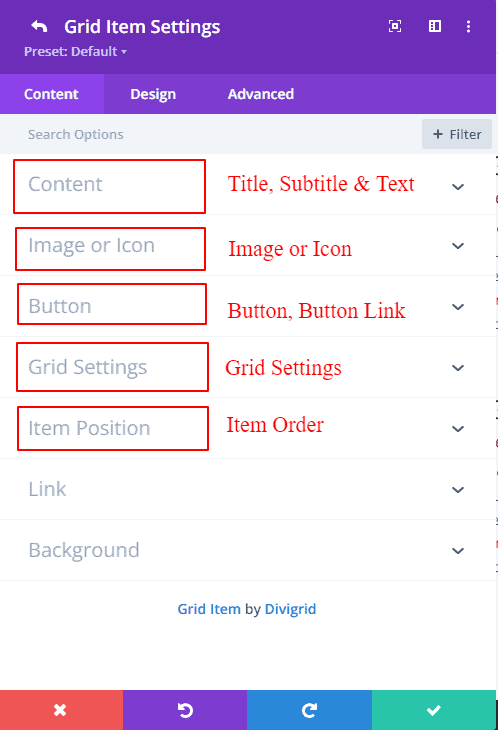
Divi Content Grid Item Settings
Content Tab
There are Five new modules inside the Content tab of the Divi Content Grid item
a. Content
b. Image or Icon
c. Button
d. Grid Settings
e. Item Position
Content
Write your Title, Subtitle, and Short description in the content toggle.
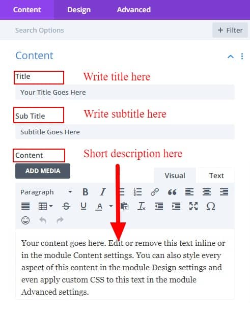
Image & Icon
You can add images or icons to this toggle. It would be better to write the image's alt name along with the image. Image alt is very useful for SEO purposes.
Image scale
The Image Scale property allows you to change the size of the uploaded image. Image scale Defines defines a transformation that resizes an element on the 2D plane. Because the amount of scaling is characterized by a vector, it can resize the horizontal and vertical dimensions at different scales.
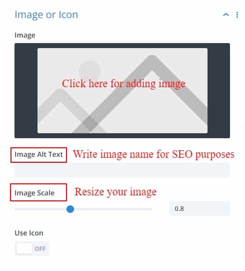
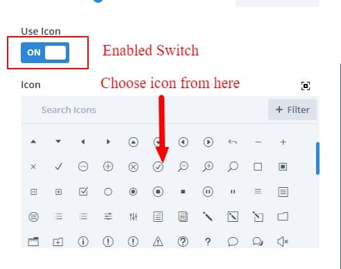
If you want to add an icon, then there is a switch called Use Icon, enabling it will bring up the option to add an icon.
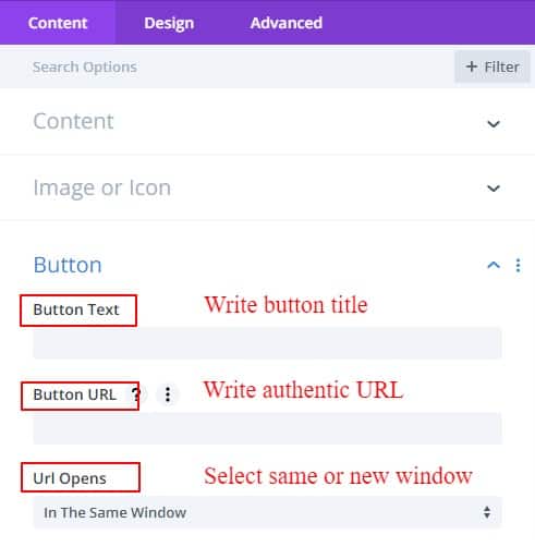
Button
A button is a small way to jump to a new page or specific post. In the button text option just enter the text title and also enter the exact URL. Then go to the specific page with one click.
After clicking, if you want to open the page or post in the same window or in a separate window, you can also select from the following URL opens.
Grid settings
How grid settings work is described in Content Grid Settings. Click here for details.
In this grid setting, there are two tabs named Column and Row. Where you can define where your columns and rows start and end.
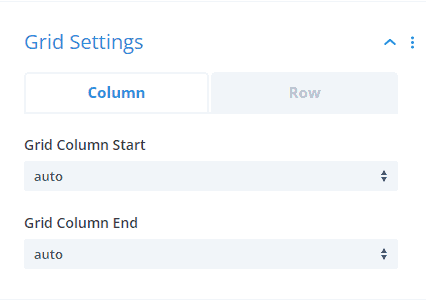
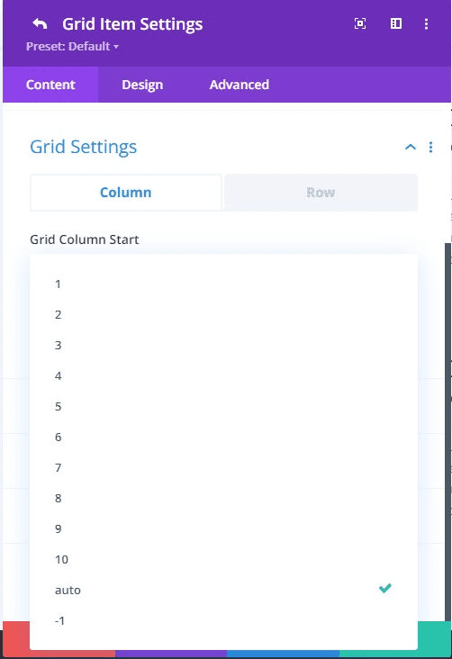
Grid column start
The grid column start property defines on which column-line the item will start.
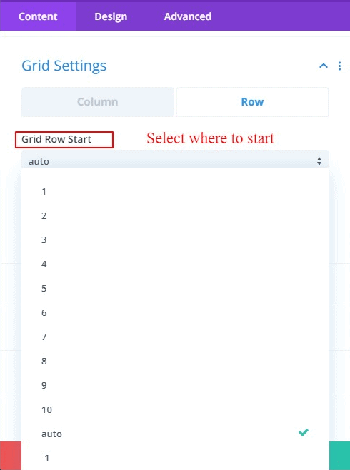
Grid row start
The grid row start property defines on which row-line the item will start.
Item Position
There are two switches here.
Enable Position and Item Alignment.
Enable positionIf Enable Position is enabled then the order of the item's position can be changed. You can change the order as per your wish here. By default, the Enable position switch is OFF.
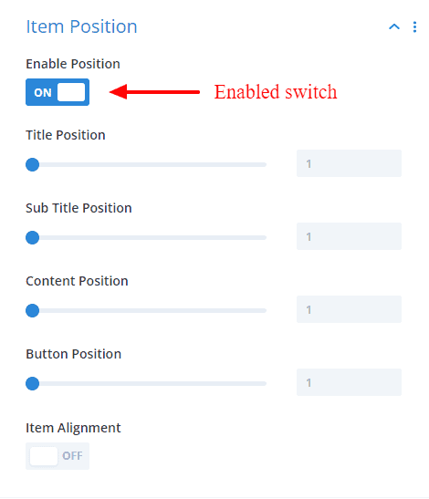
Item Alignment
Provides options to specify where contents can be displayed within the grid layout. By default, it's OFF.
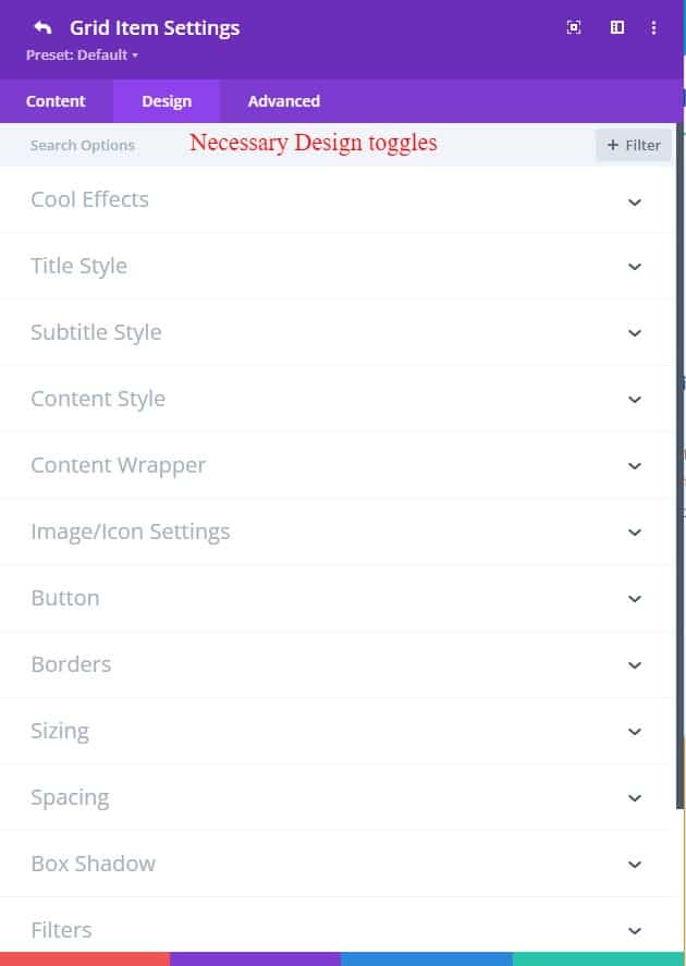
Design Tab
An Advanced tab has different designing toggles for designing the contents of the content grid items to facilitate the need. Also, several options have been added to some of the default toggles.
In Design Tab, there is a new module called Hover Effects. Basically, it is a Yes_No button. If you want to use Hover Effects then press yes. Now you have found an option.
Cool Effects
Typically, Cool Effects is a switch button to activate the Animated border. By default, the Animated border switch is OFF.
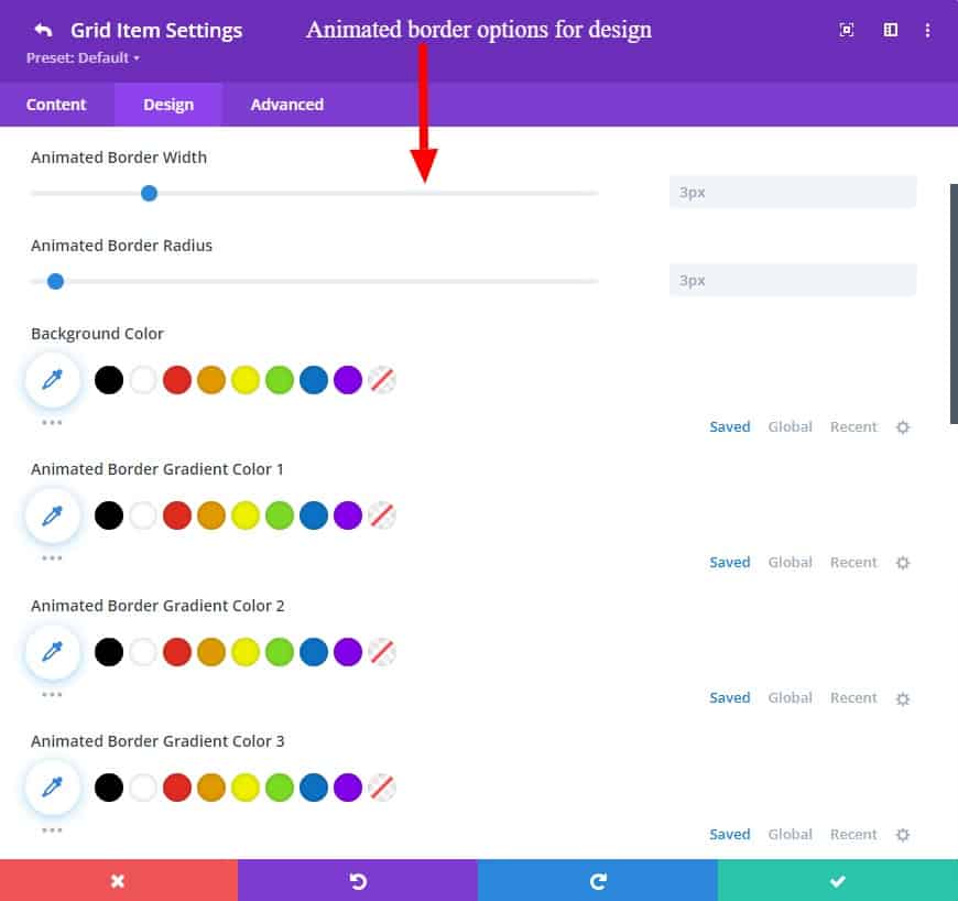
Animated Border
This is the first of many Cool Effects.
This effect is provided to give individual animated borders to all items in a grid. You can create colorful border animation with custom color, width, and border-radius without any hassle.
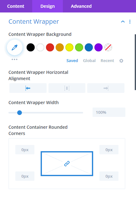
Content Wrapper
Here you can design and change the background and width of your content wrapper. You can even change your alignment horizontally. Border design features can make your items more beautiful and attractive.
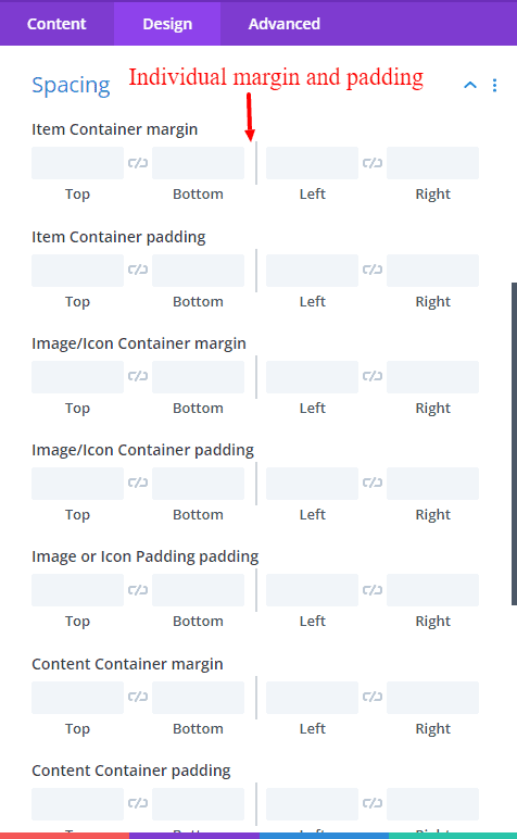
Spacing
Here are added options to give margin and padding to each content separately.
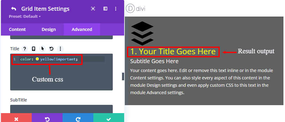
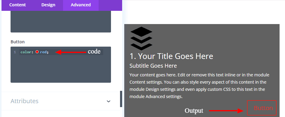
Custom CSS
You can write your custom CSS code here for your design purpose.
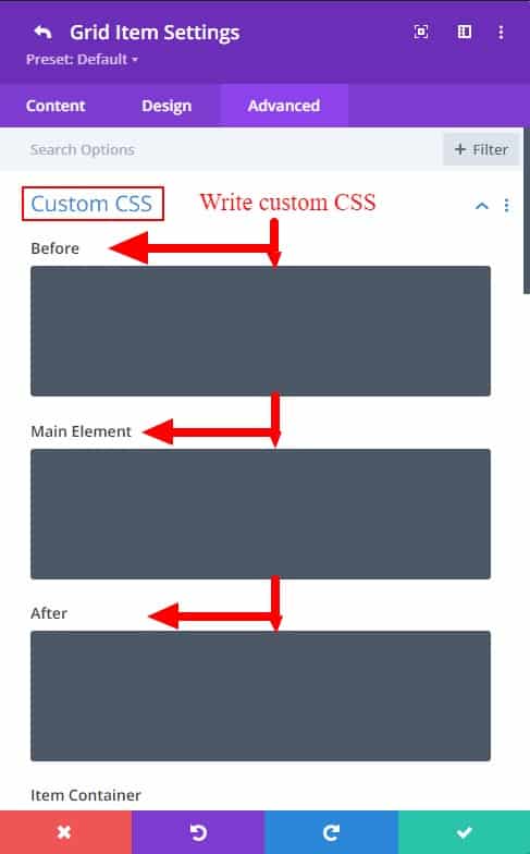
You can see which class you want to write your custom code in by clicking on the question mark
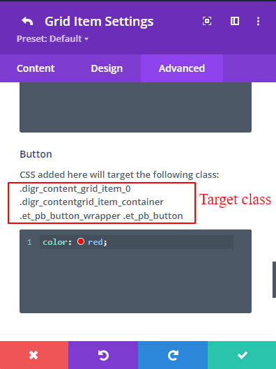
Here are some of the custom code demo examples
To learn more about grid-gap property please visit w3schools.com/grid