Overview
In the fast-paced world of web design and content creation, capturing your audience's attention is paramount. One effective way to do this is by presenting your blog posts in an appealing way. Blog carousels, also known as sliders, have become a staple feature on modern websites, and for good reason. They allow you to display your blog posts in an interactive and dynamic way, making it easier for visitors to discover your content and stay engaged. Whether you want to showcase your latest articles, highlight featured posts, or add a touch of professionalism to your homepage, a DiviGrid blog carousel plugin is the solution you've been searching for.
Blog Carousel Content Tab
After inserting the DiviGrid Blog Carousel Module you will find several new toggles along with the default toggles. Toggle names are listed below
- Settings
- Element
- Carousel Settings
- Category Settings
- Tag Settings
- Divider
- Item Order
- Item Background
Settings: Customize your posts
In the Settings tab, these toggles are valuable tools that provide you with the ability to fine-tune how your WordPress posts are displayed, organized, and styled. They allow you to ensure that your website's content aligns with your brand identity and objectives.
Post Count: The "Post Count" toggle is a simple but essential feature that allows you to decide whether or not to display the number of posts in a particular category, tag, or query result. Enabling this toggle adds a clear and concise count of the posts being showcased, providing valuable context to your audience about the quantity of content available.
Display Post By (Recent, by Category, by Tag): The "Display Post By" toggle is a versatile tool that empowers you to organize and present your content based on different criteria. You can toggle between "Recent" to showcase the latest posts, "by Category" to group posts under specific topics, or "by Tag" to highlight content associated with particular keywords or themes. This toggle offers flexibility in tailoring your content presentation to suit your website's objectives.
Order By (Newest to Oldest, Oldest to Newest, Random): The "Order By" toggle offers control over the chronological arrangement of your posts. You can choose to display content "Newest to Oldest" for a standard chronological order, "Oldest to Newest" for a reversed timeline, or "Random" to introduce an element of surprise. This toggle enhances your ability to curate content and engage your audience with diverse content exploration experiences.
Meta Wrapper: The "Meta Wrapper" feature offers you greater control and flexibility in how you display crucial post metadata, including categories, tags, dates, and authors. With a simple and intuitive interface, this feature empowers you to curate your post presentation to match your unique content strategy. When set to "Show," the post metadata will be prominently displayed alongside your content, providing context and organization.
Category and Tag Separator: The "Category and Tag Separator" toggle enables you to define how categories and tags are visually separated when multiple categories or tags are associated with a single post. You can customize this separator to match your website's style and layout preferences, ensuring a polished and cohesive presentation of your content.
In the Element tab, you have control over how your post is displayed. Adjust post content, use excerpts, show featured images, display publication dates, tags, Read More links, author information, categories, and more. Customize your post's appearance to match your content strategy and design preferences.
Carousel Settings: Customize Your Carousel Display
In your carousel settings, you have several key options to shape the carousel's behavior and appearance:
Carousel Type: Choose from various styles, such as "Slide," "Coverflow," "Flip," and "Cube," to determine how your carousel transitions between slides.
Slides per View: Specify how many slides are visible at once in the carousel, influencing the number of items shown concurrently.
Item Space: Set the spacing between individual carousel items to achieve the desired visual layout.
Auto Play: Enable or disable automatic slide transitions to make your carousel self-advancing.
Enable Loop: Decide whether your carousel should loop back to the beginning after reaching the last slide.
Pause on Hover: Control whether the carousel pauses its automatic movement when a user hovers over it.
Use Keyboard Navigation: Allow users to navigate through the carousel using their keyboard's arrow keys for enhanced accessibility and usability.
These carousel settings empower you to create an engaging and visually appealing user experience, tailored to your website's design and content requirements.
Divider in Blog Carousel: Enhance Visual Separation
Dividers serve as visual signposts, guiding your readers through your content. By choosing their placement based on item order selection, you can maintain a well-structured and organized post that suits your storytelling style. This dynamic approach to content structuring ensures that each post is unique
Read More Text Field:
The "Read More" text field is a valuable tool for content creators, particularly in blogs or news websites. It enables you to determine the specific text that appears as a clickable link or button, often used to encourage readers to continue reading a blog post or article. This customizable link text offers flexibility and helps you craft compelling calls to action, enticing visitors to delve deeper into your content.
Item Backgrounds in Carousel Items:
Item backgrounds within carousel items provide the background design of each slide or item in a carousel or slider. By customizing backgrounds with colors, and images. With this item's background options, you can add an image, gradient colors, and color in the each of carousel items.
Blog Carousel Advanced Tab
Layout: there are two types of layout styles in the carousel. In Layout 1, post content is presented in a columnar arrangement, providing a clean and organized appearance. What sets Layout 1 apart is its flexibility; users can easily change the order of content elements within the column to suit their preferences. On the other hand, layout 2, the positioning of the featured image on the left side of the post content. and it will show one post at a time.
Image overlay & Hover: The overlay will work when the item hovers over. If the overlay is switched on, two colors will appear. One is primary and the other is secondary. There will be directions for combining the two colors. Also, icons can be used as extras on overlays. All icon styles can be done here. Image Hover Type is one of the unique features of the Divi post grid. there are many image hover types in the list. from the several types of image hover types, you can choose one of the best image scale types for your featured image. you can use the image hover type with or without overlay active. if you don't use overlay then the image hover type works only in the images.
Alignments: There are three types of alignment in this setting. The first alignment will work if the image is in the background. The contents can then be used to align the top, center, or bottom as desired.
The 2nd alignment is bound by a switch. Switching it on will reveal the alignment option. This alignment allows each item to be positioned at the top, bottom, or center. This allows images, metadata, and post content to be repositioned together.
The 3rd and last alignment is the alignment of the metawrapper data. How categories, tags, dates, and author data can be positioned can be decided. Metadata can be changed to left, right, center, or justified positions.
Pagination Settings: There are two types of pagination. Bullets and fractions. pagination is the most important part of the carousel. you can style your pagination. All the style settings are contained in the pagination settings tab.
Common Questions about DiviGrid Blog Carousel
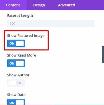
1. How to add a featured image?
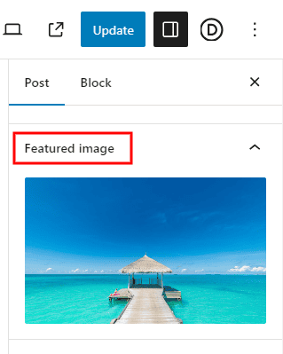
If the post does not have a featured image, you can set or replace the featured image from the WordPress post's settings option.
If the featured image is set in the post, you can show that image as desired.
You can turn it off if you want. There is a switch in the element toggles of the Postgrid plugin called Show Featured Images.
From there the featured image of the post can be turned on or off.
 |
 |
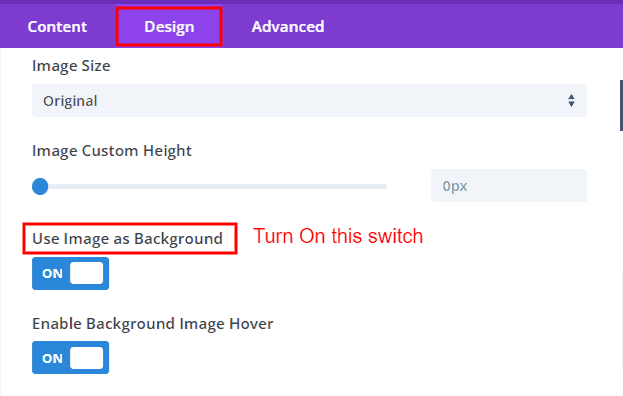
2. How to use the image as a background?
"If your post includes a featured image, you have the option to use it as the background image in our plugin. To do this, follow these simple steps:
- Access the image settings of your advanced tab.
- Enable the 'Use Image As Background' switch.
Once activated, all items within the carousel will display the featured image as their background."
go to the plugin's Advanced tab --> image settings --> ON the switch " Use Image As Background".
3. How to change meta data-position?
All metadata can be repositioned by wrapping them together.
First, the metadata should be switched on. Then open the Meta Wrapper switch from the settings toggle and select all metadata.
Then the metadata can be changed to Left, Right, Center, or Justified position from the Alignment toggle of the Design tab.
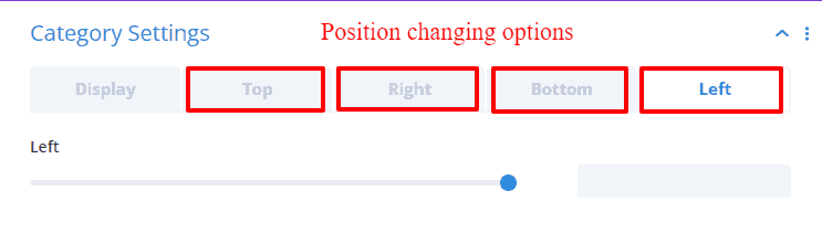
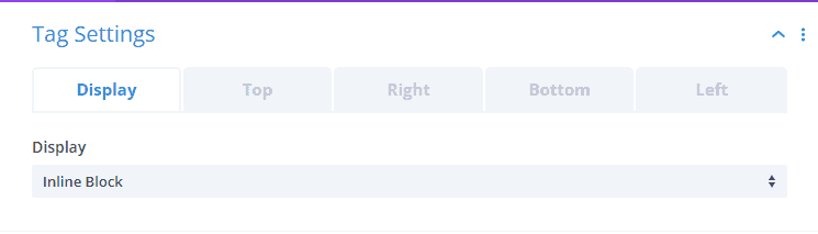
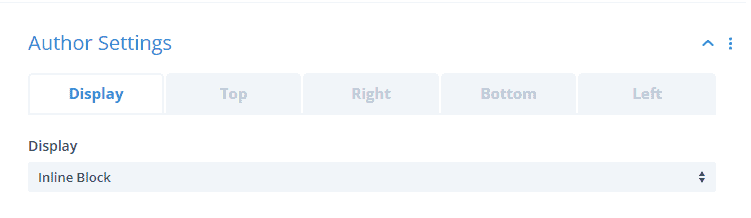
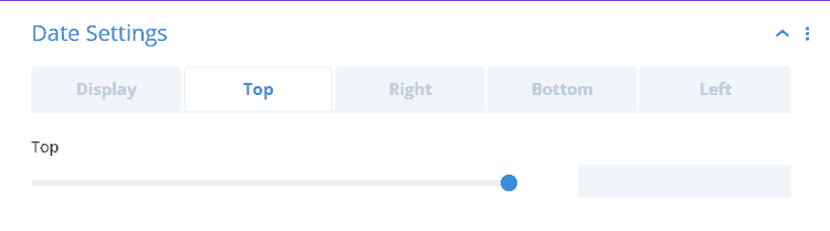
4. Can I change the position of individual metadata such as author, date, tag, and category?
From the element toggle of the content tab, the switch of the meta-data you want to change the position of should be turned on. A new settings toggle will be enabled in the Content tab as soon as it is turned on. From there you can change the location of your desired meta-data.
5. How to change post content position?
Go to the Alignment toggle on the Design tab. Here you choose to place the content wrapper at the top, center, or bottom, and If you want to change the position of the grid item, you can set the position to the top,
center or bottom by turning on the item alignment switch.
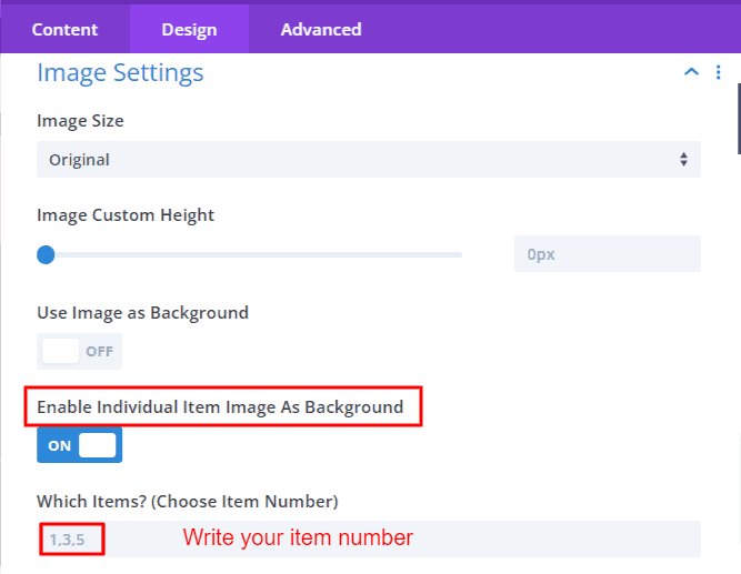
6. How to set the background image as a selected item?
If you want to use the featured image of one or more items in the carousel as a background,
you must turn on the Enable Individual Item Image As Background switch from the image Settings. Keep in mind that, when "Use image as background" switch is turned on then "Enable Individual Item Image As Background" switch does not show. You can define the item number which you want to use image as a background. The featured image of the defined numbers will show as a background.