Overview
Welcome to the Advanced Tabs module documentation! This module is designed to empower developers with a powerful and flexible solution for implementing tabbed navigation within web applications. Tabs play a crucial role in organizing and presenting content, and the Advanced Tabs module takes this fundamental UI pattern to new heights.
The primary goal of the Advanced Tabs module is to simplify the process of creating dynamic and interactive tabbed interfaces. By offering a rich set of features and customization options, this module allows developers to enhance user experiences, streamline content presentation, and build visually appealing applications with ease.
Common Questions About Advanced Tabs
🔴 How does the Use Nav Width Control Switch function, and what sets its operation apart as a specialized feature?
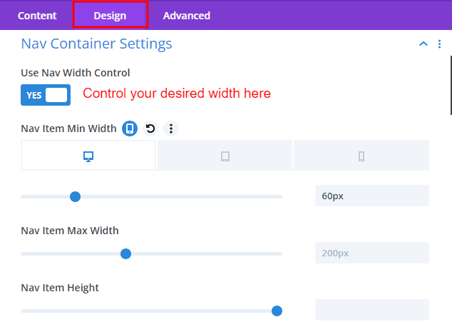
✔️ If you prefer not to maintain the navigation item width at 100%, you can utilize the switch to control its width. It allows you to set a specific height and define minimum and maximum width values.
To ensure proper alignment of items, the Nav Item Alignment option field lets you position them accurately, adjusting their size by specifying widths.
🔴 What are elegant ways to arrange multiple navigation items for a polished appearance on a tablet or mobile view?
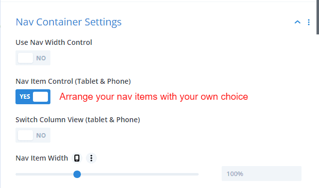
✔️ The Nav Item switch facilitates the tidy arrangement of navigation items in tablet and mobile views. Once activated, items can be organized into column sizes or adjusted to specific widths as needed.
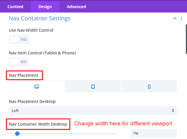
🔴 How can I set a specific width of items when the nav placement is in the left or right position?
✔️ If the navigation placement is configured to left or right, an option field will appear to set the specified width. In this field, you can define a specific width for the navigation, providing customization according to your requirements.
🔴 Can I use library content in these Advanced Tabs? How is that?
✔️ Certainly! To integrate library content into the Advanced Tab using Divi Advanced Tabs, start by selecting your preferred library layout from the Divi library and saving the layout. Keep in mind that the library content visuals will be visible only on the front end.

To showcase library content in the Advanced Tab, toggle the Content switch in the Advanced tab item. Upon clicking the content tab, a select field option named Tab Content Type will emerge. Choose the library layout option and select the specific layout from the available options. Save your changes, and the library content will be smoothly incorporated into the Advanced Tab.
🔴 Are there options to write custom CSS?
✔️ It's fantastic that our Advanced Tabs module includes the option to write custom CSS. By selecting Custom CSS from the Advanced tab, you gain the ability to craft specific styles for your tabs. This feature allows you to write custom CSS code for particular classes within the Custom CSS module elements, providing a high degree of customization and control over the appearance of your Advanced Tabs.
🔴 Is it possible to assign different positions to images within the content area?
✔️ Certainly! If you wish to adjust the placement of your image or icon within the content area, you have two options. Firstly, you can access the Advanced tab and navigate to the content area settings toggle. Once there, click on the toggle, and you will find an option field named image/icon placement. From this field, you can select your preferred positions.
 |
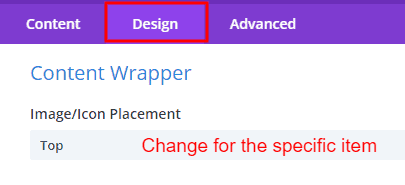 |
Alternatively, if you prefer to make this change from the Advanced tab Item, you can go to the content wrapper toggle within the Design tab. Within the content wrapper toggle, look for the image/icon placement option, and choose the desired placement for your image or icon. This dual-option approach provides flexibility in customizing the positioning of images or icons according to your design preferences.
🔴 How can I customize the backgrounds of individual navigation items to have distinct styles for each in a website or application?
✔️ You can choose a different background for each navigational item from the Advanced tab item's Navigation Background option.
Getting Started
The Advanced Tabs module is straightforward. With minimal setup, developers can quickly integrate tabbed navigation into their projects. The module is designed to be developer-friendly.
Whether you are a seasoned developer or just starting, the documentation provides step-by-step guides, and best practices to help you integrate and leverage the Advanced Tabs module effectively.
Let's dive into the documentation to explore the features, customization options, and best practices for incorporating the Advanced Tabs module into your projects.
Advanced Tabs Item Content Tab
👉 Navigation Content
Use Icon Switch
The Advanced Tabs module provides the flexibility to customize the appearance of tabs by allowing users to choose between icons and images for navigation content. Depending on your preference, you can enable or disable this feature to tailor the visual representation of your tabs.
Navigation Image
In the Advanced Tabs module, the introduction of navigation images becomes a pivotal feature, particularly when the icon switch is turned off. Users can leverage the image field to infuse visual appeal into their tabbed interface by adding relevant images to each tab in the navigation bar. The image field offers users the freedom to select images that resonate with the content or functionality of each tab, providing a quick and recognizable visual identifier.
Navigation Title
In the Advanced Tabs module, configuring the navigation title is a straightforward process that allows you to define clear and descriptive labels for each tab. Whether you're emphasizing functionality, providing context, or guiding users through specific sections, customizing tab titles enhances the overall user experience.
Description
The description field complements the title, providing an additional layer of information to offer users more context about the tab's content or functionality. Utilize the description to provide hints or brief details about what users can expect within the tab and Offer context that may not be fully conveyed by the title alone.
👉 Content
The content area is the space where the specific content related to the selected tab is displayed. It dynamically changes based on the user's tab selection. The content area can contain text, images, or any other relevant information based on the purpose of the tab.
Tab Content Type
Within the content area of the Advanced Tabs module, users enjoy a versatile design experience with the option to seamlessly switch between two distinctive layouts: custom and library layouts.
In the custom layout, users wield complete creative control, curating their own tabbed content with personalized elements. They can effortlessly integrate eye-catching icons or images to visually represent each tab, accompanied by a carefully crafted title and a descriptive narrative to provide valuable context. Additionally, users have the flexibility to insert engaging buttons, fostering interactive experiences within the tab.
On the other hand, the library layout taps into the Divi library, offering a collection of pre-designed templates for users to effortlessly apply to their tabs. Whether users opt for the freedom of custom layouts or the efficiency of library layouts, the Advanced Tabs module empowers them to shape a dynamic and visually compelling tabbed interface tailored to their unique preferences and content requirements.
Custom Layout
Flexibility to use Images or Icon
By default, the content area provides options for displaying images, accompanied by an image alt field for accessibility. However, the user has the power to activate the "use icon" switch, initiating a shift in the content presentation. Once enabled, users can opt for icons as visual identifiers instead of images. Notably, the system enforces exclusivity, ensuring that users can't use both images and icons simultaneously. This intelligent design choice streamlines the user experience, allowing for clean and purposeful customization of tab content based on individual preferences and design requirements.
Heading & Description Field
In the Advanced Tabs module, users have the flexibility to customize the heading and description fields within the content area, enriching each tab with meaningful information. The heading field serves as the primary title for the tab, providing a concise and clear label that encapsulates the essence of the content. Users can craft compelling titles that capture the user's attention and convey the purpose of the tab effectively.
Complementing the heading is the description field, offering users the opportunity to provide additional context or details about the tab's content. This descriptive text helps users understand the nuances of what each tab holds, fostering a more informative and engaging user experience. Whether users are creating a custom layout or leveraging the library layout, the ability to personalize headings and descriptions empowers them to curate a tabbed interface that aligns seamlessly with their content strategy and user engagement goals.
Button
For enhanced interactivity, users can integrate valuable buttons within the content area, facilitating seamless navigation or triggering specific actions. This flexible approach empowers users to curate a dynamic and user-centric experience within the content area, ensuring their tabs are not only visually appealing but also rich in informative and interactive elements.
👉 Navigation Background
An innovative aspect is the "Navigation Background" feature, which allows users to individualize the background of each navigation item. This unique capability means that, for every nav item, users can choose a different background, adding a layer of customization and personalization that goes beyond conventional navigation item interfaces. Whether it's selecting vibrant colors, gradients, or even images, this feature empowers users to the specific theme and branding of their web application.
Advanced Tabs Item Design Tab
👉 Content Alignment
The Advanced Tabs module introduces a nuanced approach to content alignment, featuring two essential fields: Tab Horizontal Alignment and Tab Vertical Alignment. Through the tab horizontal alignment field, users gain the capability to strategically position tab contents, choosing between left, center, or right alignments within the content area. Complementing this, the tab vertical alignment field empowers users to align content vertically with precision. Whether opting for a top, center, or bottom alignment, users can harmonize the vertical positioning of their tab contents, achieving a balanced and aesthetically pleasing arrangement.
👉 Content Icon Settings
The Advanced Tabs module offers users robust control over content icon settings, featuring customization options such as icon size, icon color, icon background, border, box shadow, margin, and padding. With the ability to define the content icon's size and color, users can seamlessly integrate icons into their tabbed content, aligning with their overall design theme.
The options for background, border, and box-shadow empower users to create visually distinctive icons that complement the aesthetic of their web application. Additionally, precise adjustments to margin and padding enable meticulous spacing control, contributing to a polished and well-balanced layout.
👉 Content Image Settings
With the ability to adjust image width and height, users can ensure optimal sizing within tabbed content. The options for margin and padding offer meticulous spacing control, allowing users to create a well-balanced and visually appealing layout.
Furthermore, users can define a border for the image, providing additional styling options. The inclusion of a box shadow feature adds a layer of depth and visual distinction to the image within the tab.
👉 Heading & Description Font
Those crucial features allow users to seamlessly tailor the typography within the content area, ensuring a harmonious blend with their design aesthetics. With the ability to update the font family, users can choose a style that aligns with their brand or visual theme. Precise adjustments to font size cater to readability preferences, while options for alignment provide flexibility in text positioning. Users can infuse personality into their tabs by customizing font color, and achieve optimal legibility by setting line height. Additionally, letter spacing options contribute to fine-tuning the overall text presentation.
👉 Content Wrapper Settings
Content Wrapper feature emerges as an important role in the customization of tab content. This powerful tool empowers users to thoughtfully organize their content by providing a designated space for images/icons and text. Users can place their image/icon in four different positions top, right, bottom, and left. Create separation between images/icons and text using the "Gap" feature, allowing for a well-defined layout.
Precise control over margin and padding for the content wrapper enables users to fine-tune the spacing around their content. Additionally, the capability to set a background for the content wrapper introduces a visual layer of distinction. Further customization options encompass adding a border to the content wrapper for enhanced styling and applying a box shadow to introduce depth and dimension.
👉 Button Settings
Starting now, you have the freedom to personalize the styling of specific buttons within the Advanced Tabs module. Divi introduces default button styling options, providing users with a versatile toolkit to tailor the appearance of buttons to their liking. From adjusting button colors and sizes to fine-tuning the border, margin, and padding, you have the creative control to seamlessly integrate buttons into your tabbed interface.
Advanced Tabs Content Tab
👉 Configuration
1. Event Type:
The Event Type setting offers two options: "Click" and "Hover." Users can choose their preferred interaction method to trigger tab actions. When the user clicks on a navigation item, the dependent tab content on that item will be displayed. If you choose to hover again, hovering over the navigation item will show its content.
2. Tab Reveal Animation:
Choose from a variety of 8+ animations in the Tab Reveal Animation setting to add dynamic transitions when activating tabs.
3. Animation Duration:
Define the speed of the reveal animations by setting the Animation Duration, allowing users to control the duration of the transition effect.
4. Gap (Navigation & Tab Item):
The Gap setting is used to create space between navigation items and tab content, facilitating a visually pleasing layout with customizable spacing.
Advanced Tabs Design Tab
Nav Container Settings
Nav Settings
Arrow Settings
Content Area Settings
Item Settings
Button Settings
Custom Spacing
Custom Border & Box Shadow
👉 Nav Container Settings
Use Nav Width Control switch:
When the switch is in the off position by default, navigation items extend across the entire tab area, forming alliances that evenly distribute space. However, toggling the switch on results in navigation items being precisely positioned. This allows users to specify the width and height according to their preferences, providing a customizable layout.
Nav Item Control switch (Only for Tablet & Phone):
Their display on phones or tablets may become suboptimal when dealing with numerous navigation items. This switch serves as a remedy for this issue. Once activated, the items seamlessly transform into a column format without requiring specific width settings for each item. Notably, this responsive adjustment exclusively applies to the phone and tablet view, optimizing the user experience on smaller screens.
Nav Placement:
In the context of Advanced Tabs, navigation placement stands out as a crucial feature, allowing users to strategically position navigation items in four distinct locations: Top, Left, Right, and Bottom. The default placement is set to the top position, ensuring an optimal starting point for user navigation. Notably, this navigation placement is designed to be fully responsive and device-friendly, adapting seamlessly to different screen sizes.
Moreover, when users opt for left or right navigation placement, an additional customization field, "nav container width," becomes available. This feature empowers users to adjust the width of the navigation container for each device view, providing a tailored and responsive layout.
Nav Item Alignment:
When users specify a specific width for navigation items, the widget introduces a valuable feature that enables precise control over the location of these items. This includes the ability to set navigation items to start, center, or end positions, aligning them according to the design preferences of the tabs. Whether users aim to emphasize the beginning, center the items for a balanced presentation, or place them at the end for a specific design effect, this functionality ensures flexibility in tailoring the appearance of the navigation items within the module.
Navigation Item gap:
This feature can be used to create a specified amount of gap between navigation items. Its function is to create a certain amount of space between each nav item.
Z-Index
The z-index parameter in Advanced Tabs allows users to control the stacking order of navigation items and tab content. By incrementing or decrementing the z-index value, the item with the higher value will be positioned above the one with a lower value. This straightforward functionality provides precise control over the visual hierarchy within the tabbed interface.
👉 Nav Settings
Within the nav settings of Advanced Tabs, two distinct sub-toggles, namely General and Active, offer users refined control over the appearance of navigation elements. Focusing on the General Settings sub-toggle, users gain the ability to efficiently modify parameters such as Image Height, Image Width, Icon Size, Icon Color, Icon Background, Image/Icon Placement, Alignment, Border, and Box Shadow. This comprehensive set of customization options empowers users to precisely tailor the visual attributes of navigation items.
Conversely, the Active sub-toggle within the nav settings of Advanced Tabs provides dedicated design options for the active item. Users can seamlessly customize the appearance of active items independently, as all design options are available separately in this sub-toggle. This streamlined approach allows users to effortlessly design and fine-tune the visual presentation of the active navigation item, ensuring it stands out distinctly in the tabbed interface.
👉 Arrow Settings
In the Arrow Settings of Advanced Tabs, users have specific options to customize the appearance and behavior of arrows within the tabbed interface:
1. Use Active Arrow Switch:
Activate or deactivate the switch to enable or disable the display of arrows for active items within the tab navigation. When the Use Active Arrow Switch is enabled the rest of the options are shown.
2. Active Arrow Color:
Define the color of arrows associated with active items, ensuring visual coherence with the overall design.
3. Arrow Size:
Specify the size of arrows to achieve the desired visual impact and alignment within the tabbed interface.
4. Arrow Alignment:
Control the positioning of arrows about the tab content, choosing an alignment that suits the design and layout preferences.
👉 Content Area Settings
In the Content Area Settings of Advanced Tabs, users enjoy a spectrum of customization options to finely tune the presentation of tabbed content:
1. Content Vertical Align:
Choose between "Start," "Center," or "End" to vertically align the content within the tab area.
2. Image/Icon Placement:
Define the placement of images/icons as "Top," "Right," "Bottom," or "Left" within the content area.
3. Gap:
Set the gap to create space between images/icons and texts, ensuring a visually appealing and organized layout.
4. Horizontal Alignment:
Opt for "Left," "Center," or "Right" alignment to position the content horizontally within the tab.
5. Vertical Alignment:
Align the content vertically with options such as "Top," "Center," or "Bottom" to achieve the desired layout.
6. Icon Size:
Specify the size of icons for a visually striking representation within the tabbed content.
7. Icon Color:
Define the color of icons to match the overall color scheme and design aesthetics.
8. Image Width and Height:
Customize the width and height of images within the content area for precise control over visual elements.
9. Content Area Background:
Set the background color of the content area to create a cohesive and visually pleasing design.
👉 Item Settings
1. Item Background:
Customize the background of tab items to match branding or design preferences, ensuring a visually cohesive tabbed interface.
2. Item Margin and Padding:
Adjust the margin to control the space between tab items and their surrounding elements. Similarly, set padding to determine the space within each tab item, allowing for precise layout adjustments.
3. Item Border:
Tailor the appearance of tab items by configuring the border settings. Define the color, style, and thickness of the border to add a polished and refined look to each tab item.
4. Item Box Shadow:
Introduce subtle or prominent box shadow effects to tab items, providing a sense of elevation and depth. This enhances the visual hierarchy and contributes to a modern and engaging tabbed interface.
👉 Button Settings
You have the freedom to personalize the styling of all buttons within the Advanced Tabs module. Divi introduces default button styling options, providing users with a versatile toolkit to tailor the appearance of buttons to their liking. From adjusting button colors and sizes to fine-tuning the border, margin, and padding, you have the creative control to seamlessly integrate buttons into your tabbed interface.
👉 Custom Spacing
In the realm of Advanced Tabs, users gain the capability to assign custom margins and padding to every navigation element, commencing with nav containers and extending to nav items. This inclusive customization of spacing ensures a tailored and visually cohesive layout. Similarly, users can conveniently set margins and padding for all elements within the tab content area, allowing for seamless adjustments. This centralized control over spacing empowers users to achieve a precise design.
👉 Custom Border & Box Shadow
Custom Border :
The Custom Border toggle in Advanced Tabs provides users with precise control over the visual appearance of various elements. With this feature, users can individually define the borders for nav items, navigation icons, navigation images, content wrappers, and content icons/images. This customization encompasses specifying border color, style, and thickness for each element, allowing users to achieve a cohesive design within the tabbed interface.
Custom Box Shadow Toggle:
Similarly, the Custom Box Shadow toggle empowers users to enhance the visual depth of their tabbed interface. This feature, allows users to apply custom box shadow effects to nav items, navigation icons, navigation images, content wrappers, and content icons/images. By adjusting parameters such as shadow color, blur, and offset, users can introduce subtle or pronounced shadows, providing a sense of elevation and dimension to different elements
Custom CSS (parent & child module)
The Advanced Tabs module goes a step further by offering users the flexibility to design and extend functionality through custom CSS. With the Custom CSS feature, users have the freedom to apply their unique design styles or introduce new features by writing custom code directly within the Advanced Tab. Whether it's fine-tuning layouts, introducing custom animations, or implementing unique styling, the Custom CSS feature provides an avenue for advanced users to unleash their creativity and achieve a truly customized and distinctive tabbed interface.