The DiviGrid Social Share module is an innovative and user-friendly tool designed to enhance the social media sharing experience for content creators on the web. Tailored specifically for users of 18+ social media platforms, this module empowers individuals to effortlessly share their blogs, articles, and content across various social networks.
Add The Module To Your Layout
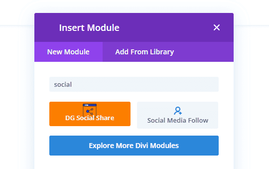
Once you've determined the module's placement, proceed to integrate it into your Divi Builder layout. In the Divi Visual Builder layout, initiate the addition of a new module by clicking the gray plus button. Expedite the process by utilizing the search bar and entering "social" to promptly locate our custom module titled "DG Social Share." Upon identification, select the module, and seamlessly incorporate it into your layout.
Add Social Network Buttons
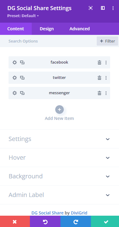
Upon adding the module to your layout, your initial task is to include the specific social networks you wish to showcase. Navigate to the main Content tab of the module, where you'll find a plus button for adding new networks. As you incorporate new networks, they will be displayed in a list format, allowing you the flexibility to rearrange them according to your preferences. For further customization, simply click on each individual network to access and edit its settings. This step ensures that the module aligns precisely with your chosen social media platforms and allows you to fine-tune each network's presentation as needed.
 |
 |
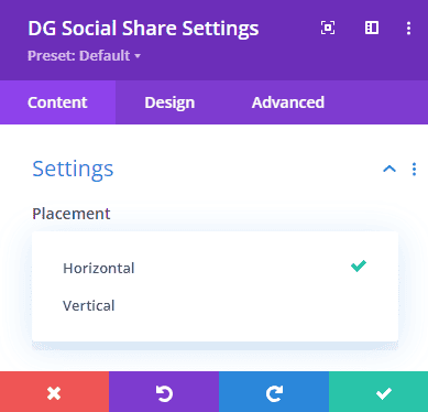
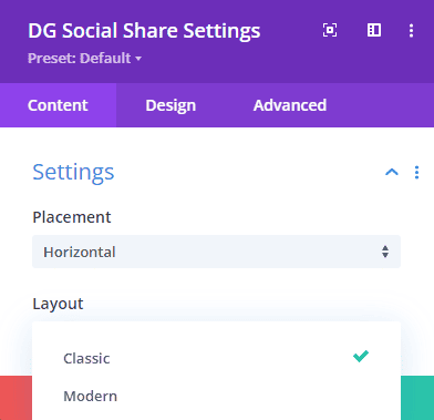
Choose A Layout And Placement Option
Following the addition of your preferred social networks, the subsequent crucial step involves selecting the desired layout option to showcase the buttons. The module provides two distinctive button layout choices: modern and classic. Depending on your preference between these layouts, you can then proceed to determine the horizontal and vertical placement of these social share items. Below this configuration, additional options will emerge, allowing you to fine-tune and customize the appearance of the social share buttons according to your design preferences. This pivotal step ensures that your chosen layout seamlessly aligns with your aesthetic vision, offering a tailored and visually appealing presentation of the social sharing buttons.
 |
 |
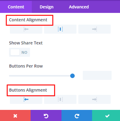
After incorporating your selected social networks and determining the layout, another significant aspect to consider is the number of buttons per row. This parameter allows you to control the arrangement and density of the social sharing buttons within each row. Whether you aim for a streamlined, single-button-per-row design or a more condensed multi-button layout, adjusting the buttons per row setting empowers you to achieve the optimal visual presentation. This level of customization ensures that the module aligns precisely with your preferred design aesthetics and provides a harmonious integration of social share within your layout.
Leveraging Title, Share Text, and Icon Switches
The Show Title switch empowers you to toggle the visibility of titles associated with each social network. Activate it to display titles and provide additional context for your users, or deactivate it for a cleaner, minimalist appearance.
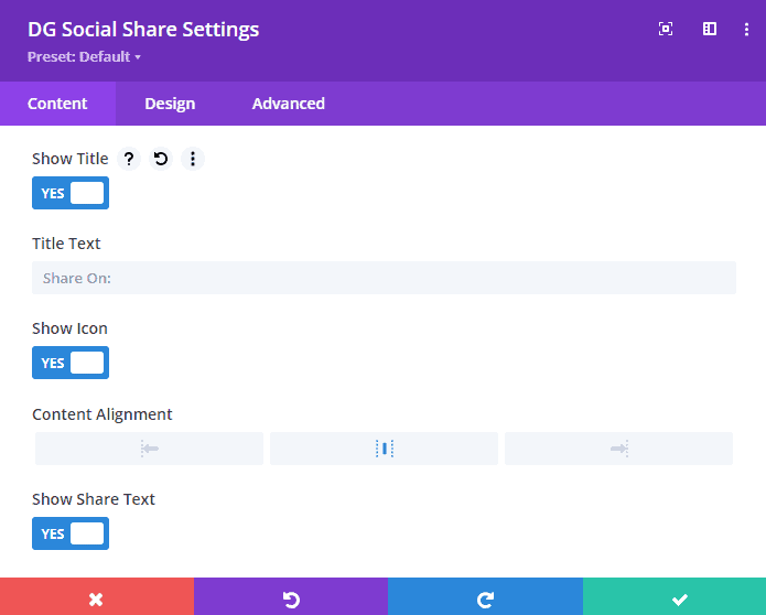
The Show Share Text switch allows you to control the visibility of accompanying share text for each social network. Turn it on to include descriptive text with your buttons, providing users with more information, or turn it off for a sleek and concise presentation.
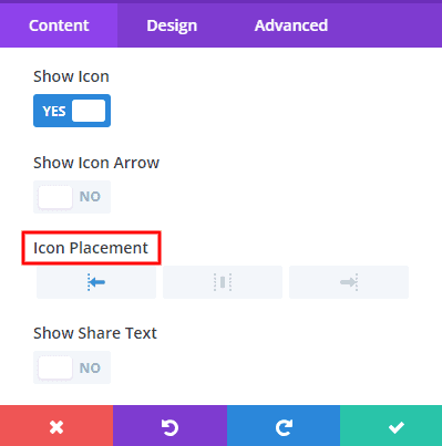
The Show Icon switch governs the display of icons associated with each social network. Activate this switch to showcase recognizable icons alongside your buttons, enhancing visual appeal and aiding in quick identification. Alternatively, switch it off for a text-only approach.
Adjust The Alignments
Navigate the visual intricacies of your social sharing module with precision through three key alignment controls. First, the Content Alignment option allows you to strategically position titles and share text, ensuring optimal readability and visual coherence. Next, fine-tune the presentation of social media icons with the Icon Alignment setting, selecting between centered, left-aligned, or right-aligned orientations for a polished appearance. Lastly, the Button Alignment feature provides flexibility in placing the social sharing buttons, allowing you to achieve a centered, left-aligned, or right-aligned arrangement that seamlessly integrates with your overall design aesthetic. These alignment controls empower you to create a visually cohesive and engaging user experience, aligning content, icons, and buttons precisely according to your design preferences.
 |
 |
Adjust The Design Settings
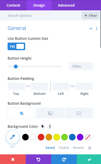
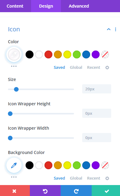
Now, you have the creative reins to tailor every design facet of the module to your exact specifications. The wealth of design settings we offer aims to provide you with a comprehensive toolkit, encompassing hundreds of possibilities. Whether you wish to personalize the text, alter the icon and button sizes, experiment with colors, adjust spacing, and borders, or implement box shadows, these customization options abound. Most of these settings are conveniently located in the module's dedicated Design tab, though some may be distributed across other tabs.
 |
 |
Notably, the module features main content and design tabs that exert a global influence on all buttons, ensuring consistent styling. Simultaneously, each individual network within the module possesses inner tabs, granting you the flexibility to override global settings and refine the appearance of each button independently. With this extensive array of design options, your social sharing buttons can seamlessly align with your unique vision and website aesthetics.
Ensure Everything Responsive
The Divi Social Sharing module seamlessly integrates responsive settings, aligning with the adaptable nature of other modules within the Divi Builder. This empowers you to fine-tune values and options independently for Desktop, Tablet, or Phone, allowing for a tailored user experience across various devices. The flexibility is yours to decide whether your layout or design necessitates responsive adjustments. While some settings remain harmonious across devices, others benefit from individual adjustments to optimize the user interface. The extensive range of customizable options spans from colors, font sizes, and icon sizes to layout structure, number of columns, button border color, background color, and more. Your creative control is virtually boundless, enabling you to curate a responsive and visually appealing presentation of your social sharing buttons that aligns seamlessly with your website's design vision.
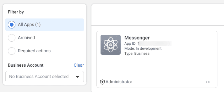
🔴 How Can I Find My Facebook App ID
✔️ Before You can implement any product of Facebook APIs, you must first Register as a Facebook Developer and App Dashboard to provide information about your app. Log in first Facebook App Dashboard. First Register your Facebook Developer ID and then you will create an app. After that, you will find your app ID.