The Multiple Button module in Divigrid is designed to help users create dynamic, interactive buttons for their website using the Divi theme. With extensive customization options, you can control the button layout, appearance, hover effects, fonts, borders, and more, ensuring a flexible and visually appealing design.
This documentation will guide you through the complete customization process available in both the Content and Design tabs. By the end of this, you will have a deep understanding of how to set up and modify buttons to fit your exact design needs.
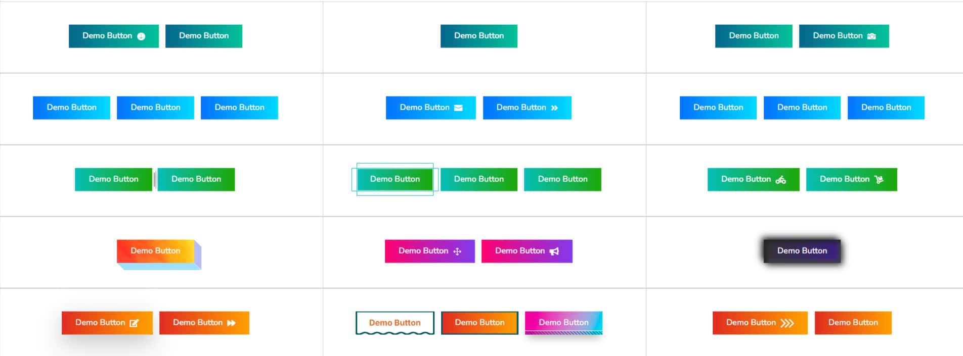
Multiple Button item customization ( Individual item )
Content Tab Customization
The Content tab is the cornerstone of the Multiple Button module, allowing you to define the fundamental elements of each button. Here, you can set up the button text, URL, and specify how the URL should open.
Button Text: This field allows you to specify the text displayed on each button. This is a key element for user interaction, so you should choose your text based on the purpose of the button (e.g., "Buy Now", "Learn More", "Contact Us").
Button URL: Here, you can input the URL to which the button links. You may want to link to different pages within your website or external pages.
[ Tip: Always ensure the URL is correct and begins with the appropriate protocol (http:// or https://) to prevent broken links. ]
URL Opens: This option allows you to choose where the linked URL will open:
- Same Window: Select this if you want the link to open in the current browser tab.
- New Window: Select this if you prefer the link to open in a new tab. This is useful for external links or resources you don’t want the user to navigate away from.
Design Tab Customization
The Design Tab offers powerful controls for customizing the appearance of each button. This is where you can modify the hover effects, fonts, icons, borders, and spacing to create visually appealing and interactive buttons that fit your brand and design preferences.
Hover Effect Customization
This setting provides access to over 30 modern CTA (Call-to-Action) button hover styles, each designed to introduce unique animation effects when users hover over the button. These hover styles add a dynamic, interactive element to your website, enhancing user engagement. You can choose from a wide range of hover effects. Each hover style offers its own set of customizable options to align with your design preferences perfectly.
Button Transition (Milliseconds): This controls the speed of the hover animation. A lower value (e.g., 200ms) will create a quick, snappy transition, while a higher value (e.g., 600ms) will create a smoother, more gradual effect.
Button Font Customization
Button Background:
You can choose between a solid background color, a gradient, or even a background image for your button. Each option gives you the flexibility to match your site’s overall color scheme or branding.
Background Color: This option lets you apply a solid background color to the text within the button.
Gradient Background: Create two-tone or multi-tone backgrounds by selecting two colors and adjusting the gradient direction (top to bottom, left to right, or diagonal).
Background Image: Upload an image to use as the background of your button. This can be especially effective for marketing or call-to-action buttons.
Button Font Styles:
Customize the font for button text. This ensures a consistent typography style across the entire button. You have full control over styling the button text, including font family, weight, alignment, and more.
- Font Family
- Font Weight
- Font Style
- Text Alignment
- Line Height
- Letter Spacing
- Text Shadow
Button Icon Customization
Select Button Icon: Choose from a diverse collection of icons available in the Divi Library. Adding an icon to your button can significantly enhance its visual appeal and draw more attention to the call to action. Whether you're looking for something minimalist or a bold, eye-catching design, there’s an icon to fit your specific needs.
Button Icon Color: Customize the color of the icon to match your button's text or complement the overall theme of your website. This feature allows you to ensure a cohesive look by aligning the icon color with your site's branding or color scheme.
Icon Font Size: Adjust the size of the icon to ensure it integrates seamlessly with the button’s design. Whether you prefer a subtle, small icon or a more prominent, bold symbol, this option gives you full control over the icon’s proportions relative to the button.
Button Icon Placement: Choose the ideal placement for your icon, either to the left or right of the button text. This customization allows you to create a balanced design that aligns with the button's purpose and the overall layout of the page.
Right Icon Spacing: Fine-tune the spacing between the icon and the button text for optimal alignment. Adjusting the space ensures that the icon doesn’t feel cramped or too far from the text, creating a clean, polished look that improves the button's overall presentation.
Show Icon on Hover: Enable this feature if you'd like the icon to appear only when the user hovers over the button. This option adds a sleek, minimalist touch to the button design, keeping it simple and understated until the user interacts with it, thereby creating a more engaging user experience.
Button Border Customization
Button Border Styles: Adjust the button’s border thickness and style. Choose between solid, dashed, or dotted borders.
Border Radius: Control how rounded the button’s corners are. A 0px value will create sharp corners, while higher values will result in more rounded buttons, giving a softer, friendlier feel.
Button Shadow Customization
Add shadow to the button, adjusting parameters such as blur radius, spread, offset, and color to give depth and make your buttons pop.
Multiple Button customization ( Global )
Multiple Button Content Tab Customization
Add New Item:
This section is crucial for adding multiple buttons. Each button acts as an individual item and has its own content and design settings.
[ Tip: You can add as many buttons as you want, each with its own unique text, URL, and customization options, enabling you to create a complex button setup.]
Button Direction
Row: The buttons will align side by side in a horizontal row. This is ideal for displaying multiple buttons in a compact space or when you want the buttons to be part of the same call-to-action area.
Column: The buttons will be stacked vertically. This setting works well when you want the buttons to be presented in a step-by-step format or in longer forms.
Button Alignment
This feature allows you to control how the buttons are aligned within their container.
- Left: Align the buttons to the left side of the row or column.
- Center: Aligns the buttons to the center, creating a balanced look.
- Right: Align the buttons to the right, which can give a clean, modern feel.
Multiple Button Design Tab Customization
Button Spacing: Gain full control over the spacing of your buttons with the ability to adjust both the margin and padding. The margin setting controls the space outside the button, dictating how much separation there is between the button and other elements on the page. Padding, on the other hand, adjusts the space inside the button, ensuring that the text and icon within the button have ample room and are not too cramped. This feature allows for precise positioning of your buttons within their container, whether they're part of a single row, column, or complex layout.
[Tip: By carefully adjusting the margins and padding, you can create a visually harmonious layout. This is especially useful when working with multiple buttons in a row or column, as proper spacing can ensure the buttons are evenly distributed and aligned, avoiding a cluttered or unbalanced appearance.]
Borders & Box Shadow: As with individual buttons, you can apply borders and box shadows to all the buttons in a set to ensure a cohesive and professional design. Borders can be customized in terms of thickness, style (solid, dashed, dotted), and color, allowing you to define the buttons' edges for a sharper or softer look. Adding a box shadow can introduce depth and dimension to your buttons, making them appear slightly elevated from the background for a more engaging design.
These settings allow you to create consistency across multiple buttons, ensuring that they have a uniform appearance while also giving you the flexibility to adjust the finer details to suit your design needs. Whether you're aiming for a minimalist look with subtle borders or a bold style with prominent shadows, these tools provide you with the versatility to design buttons that stand out while maintaining balance and professionalism.
Frequently Asked Questions (FAQ's)
Q. What is the Multiple Button module in Divigrid?
The Multiple Button module allows users to create interactive buttons with extensive customization options, including hover effects, fonts, borders, and more, for a visually appealing design.
Q. What is the purpose of the Button Text field?
The Button Text field allows you to specify the text that appears on each button, essential for guiding users toward a specific action, such as "Buy Now" or "Learn More."
Q. What customization options are available in the Design tab?
The Design tab allows you to adjust hover effects, fonts, icons, borders, spacing, and shadows, giving you full control over the appearance of each button.
Q. What are the benefits of using the Multiple Button module for my website?
The Multiple Button module offers flexibility in creating dynamic, interactive buttons with full customization over layout, hover effects, fonts, icons, and spacing, allowing you to enhance user experience and engagement.