Divigrid Honeycomb is a powerful tool that can help you showcase your image gallery on your website in a unique and stylish way. It's a module that allows you to easily create hexagon grids, making your gallery look like individual honeycomb cells.
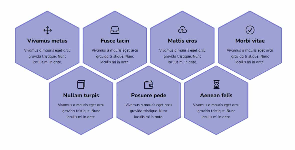
You can choose from a variety of placement options, such as linkable images, content, title, icon, and descriptions. This gives you the flexibility to customize your grid and make it your own.
The module also ensures that your images are resized to fit seamlessly within the available space, creating a sleek and tidy look. With Divigrid Honeycomb, you can showcase your work in a polished and sophisticated manner on various websites.
In short, if you want a gallery that stands out from the rest, Divigrid Honeycomb is the perfect choice for you.
Here is the demo image to give you an idea of what the honeycomb grid looks like
HoneyComb Settings
How do styles work?
Honeycomb style comes in two types, each with its unique way of working. The first type automatically arranges your grid items in a honey cell shape. The layout style depends on the number of grid items you have.
The second type allows you to create a triangle shape. You can create triangles with 4-3- 2 rows, as well as shapes with 4-3-4 rows. So, you have the flexibility to choose the shape that works best for your needs.
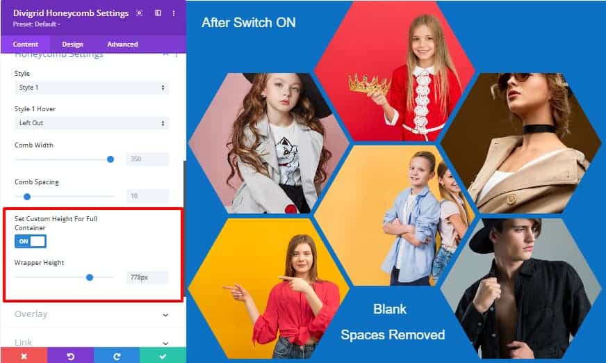
What does the "Set Custom Height For Full Container" switch do?
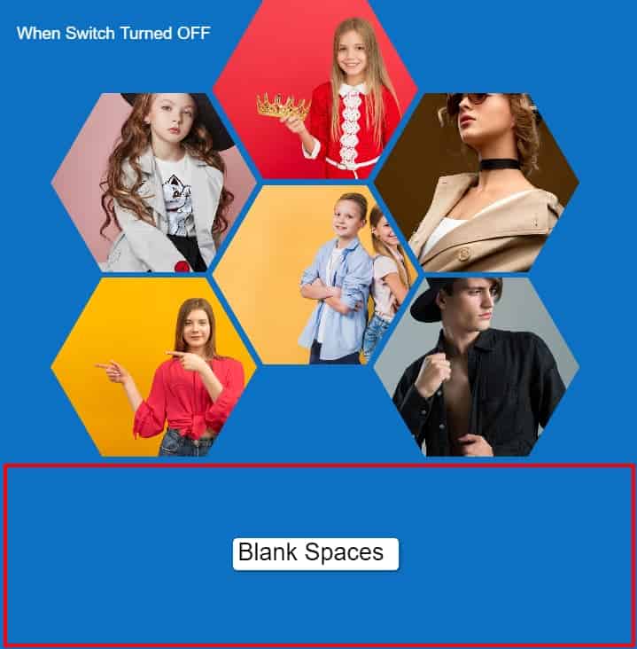
By default, the "Set custom height for entire container" switch is turned off in the Honeycomb module. When this switch is off, there might be some empty space under the grid items which can affect the overall look of your gallery. To fix this, you can turn on the switch which will automatically adjust the height of the container box based on the number of grid items. This will ensure that there is no extra blank space under the grid items, resulting in a cleaner and more polished gallery display.
How does the link URL work?
If you want to add a link to your product or images, simply enter the URL in the designated field. You can also choose whether the link will open in a new tab or not. Once you've added the link, your grid item will become clickable and users will be redirected to the desired website when they click on it. It's a great way to direct traffic to your product or website.
What contents can the user set on a grid item?
With Divigrid Honeycomb, users can enhance their website's visual appeal by adding titles, descriptions, and icons to each grid item. By using overlay colors, users can make their content stand out and direct their website visitors to specific links. This way, users can easily find out more about the product or service represented by the grid item, and also quickly find what they're looking for and get more information with just a click.
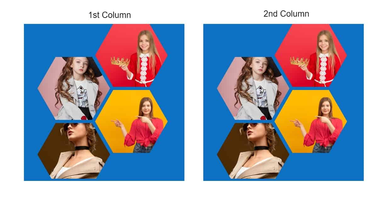
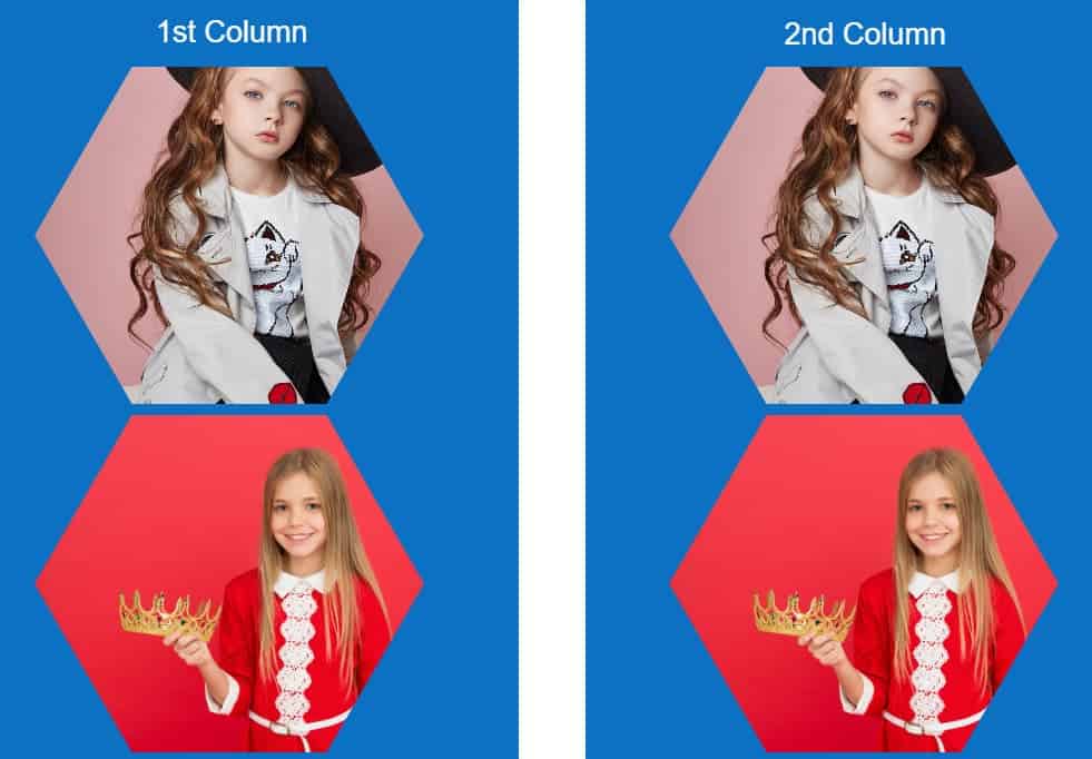
Does changing the column structure from one to two columns affect the honeycomb grid structure?
If you're using the first honeycomb style and change the column layout from one to two columns, the honeycomb grid will automatically adjust to fit the new layout. The grid items will form a neat two-column structure, filling up the space evenly. However, if you're using the second style, changing the column layout may cause the honeycomb grid to break. In this case, you can adjust the comb spacing to fix the issue.
What will the pattern look like if the structure is changed to 3 columns or more?
If you use the first honeycomb style and switch from one column to three or more columns, the honeycomb grid will automatically adapt to the new layout. Grid items will form a three- or more-column structure, evenly filling the space below. If you switch from three columns to four or more columns, one grid item at a time will continue to take up space at the bottom. Grid items will adapt to the new layout. In this case, the second style will also change in the same way.
What can be done with Comb Width & Comb Spacing?
By adjusting these values, you can change the appearance of the honeycomb grid, making the cells larger or smaller, and increasing or decreasing the spacing between them. It's important to note that changing these values may require additional adjustments to ensure that the grid is still properly aligned and visually appealing.
Comb Width: This attribute sets the width of each honeycomb cell. By default, it is set to 350px. This means that each cell will have a width of 350 pixels. You can adjust this value to change the size of the honeycomb cells.
Comb Spacing: This attribute sets the margin between each honeycomb cell. By default, it is set to a value of 10px. This means that there will be a margin of 10 pixels between each cell. You can adjust this value to change the spacing between the honeycomb cells.