The Divigrid Food Menu module is a powerful and flexible tool for restaurant and cafe websites, providing a customizable and visually appealing way to display menu items. Through both individual item customization and global styling options, this module ensures that your menu not only looks professional but also aligns perfectly with your branding. With its comprehensive customization capabilities for images, fonts, buttons, and badges, this module elevates your menu design to the next level.
Food Menu Item Customization
(Single Item Customization)
The Food Menu Item focuses on the customization of a single food entry in your menu. This flexibility allows you to showcase each menu item’s details, such as its name, description, and price, with precision. Additionally, you can add special promotional badges, customize icons, and apply styling to make each item stand out.
Content Tab Customization for Food Menu Item
The Content Tab is the primary section where you input the core information for each menu item, such as text, pricing, and imagery.
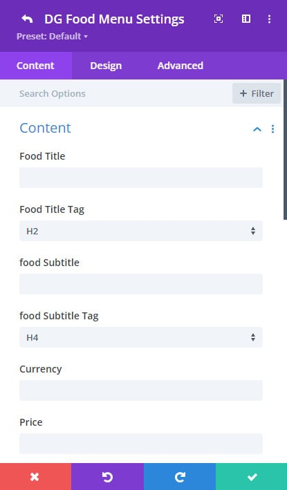
Content Section:
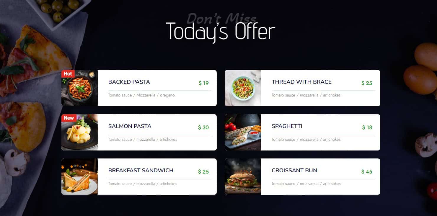
Food Title: This field allows you to enter the name of the food item, which is usually the most prominent text in the item box. The title is one of the first things visitors see, so it needs to be clear and prominent
Food Title Tag: Select the HTML heading tag (H1, H2, H3, etc.) for the title, useful for SEO and structuring your content.
[ Use H2 or H3 tags for food titles as it balance visual hierarchy while maintaining SEO best practices. ]
Food Subtitle: A space for additional information like a brief description, ingredients, or dietary information. The subtitle provides more context about the food item without cluttering the description.
Food Subtitle Tag: Choose the appropriate HTML tag (H1-H6, paragraph, etc.) for this subtitle.
Currency & Price: Input the currency symbol and the price of the food item, such as "$12.99." This field pairs directly with the food title, so users can immediately see the cost of each item.
 |
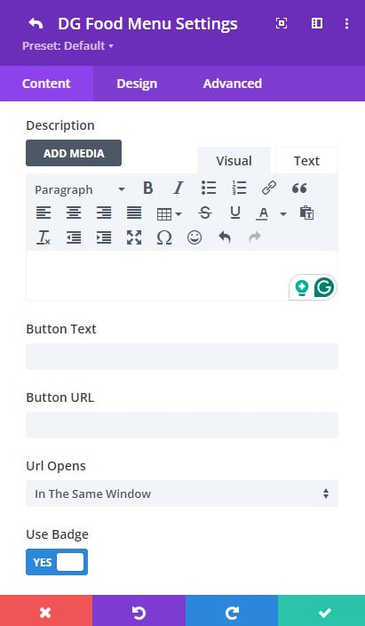 |
Description: Here, you can describe the food item in more detail, such as ingredients, preparation style, or any unique attributes. A detailed description helps customers make informed choices and adds personality to your menu.
Button Options:
- Button Text: This allows you to define a call-to-action (CTA) text like "Order Now" or "View Details."
- Button URL: Input the URL to which the button should direct users.
- URL Opens (Same Window or New Window): Decide whether the link should open in the same tab or a new tab.
[ If you’re linking to an external page or a third-party service, set it to open in a new window to keep users on your site. ]
Use Badge Switch: Enable this if you want to display a badge on the food item, such as "Best Seller" or "New Arrival."
- Badge Text: The text for the badge can be fully customized based on the promotion or special event, like “20% Off” or “Chef’s Choice.”
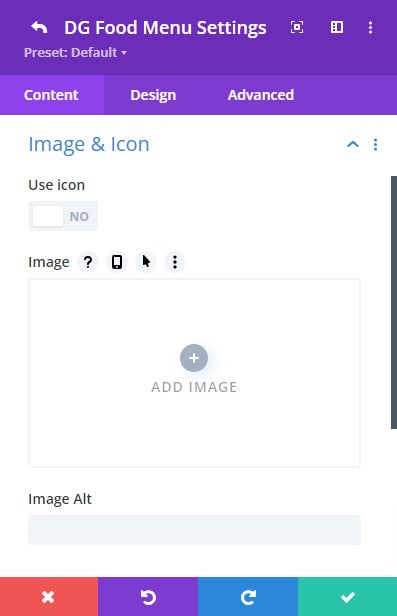
Image & Icon Section:
In this section, you control the visual elements that accompany the food item—either an image or an icon.
Use Icon Switch: This toggle allows you to use an icon instead of an image to represent your food item. If this switch is enabled, the image field disappears, and an icon selection appears. You can select from Divi's built-in icons or use Font Awesome to represent your item.
 |
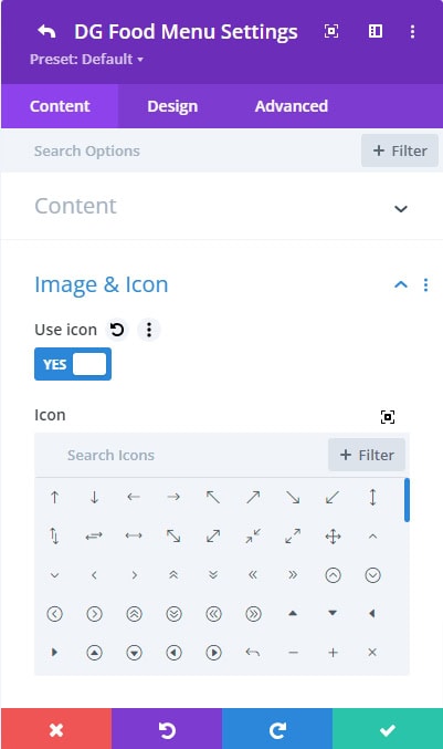 |
Image Upload Field: If you choose not to use an icon, this is where you upload an image representing the food item. Food images are a critical selling point for restaurants, helping entice visitors with visual appeal.
Image Alt Text: Enter alternative text for the image. Alt text is crucial for accessibility and SEO, describing the image content for screen readers and search engines.
Settings Section:
This section offers settings for adding separators and dividers, enhancing the layout and structure of each food menu item.
Show Separator Switch: Separators help visually distinguish between different pieces of information, creating a clean and organized layout. Enable this switch to add a separator between the food name and price.
Show Divider Switch: Dividers help break up content visually, making your menu easier to scan for users. This switch adds a divider between the food name/subtitle and the description.
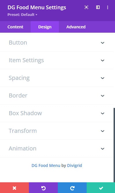
Design Tab Customization for Food Menu Item
The Food Menu Item Design tab provides granular control over the appearance of each individual menu item. Here’s a detailed look at the available customization options:
 |
 |
Alignment
You can align the content of each menu item to the top, center, or bottom of its container. This ensures that the content is positioned exactly where you want it within the item’s area.
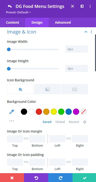
Image & Icon
Image Width and Height: Adjust the dimensions of the images used in your menu items to fit your design needs. This setting allows you to specify the exact width and height for each image.
[ Be consistent with image sizes to avoid a messy, uneven look. ]
Icon Size: Control the size of the icons used in your menu items. Larger icons can draw attention, while smaller ones can provide a subtler visual cue.
Icon Color: Choose the color of the icons to match your menu’s theme. You can select any color from the color palette or use custom hex codes.
 |
 |
Icon Background: Customize the background of icons with color, gradient, or image options. This setting allows you to create visually distinctive icons that stand out on your menu.
Image/Icon Spacing: Define the space around images and icons to ensure they are appropriately separated from other content elements.
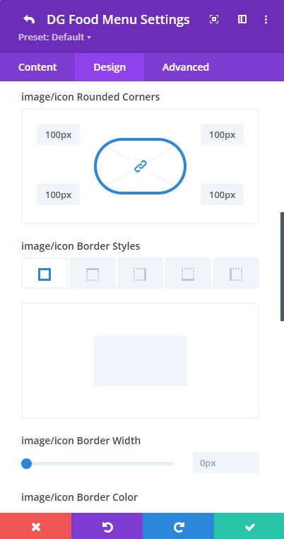
Image/Icon Border Styles: Apply borders to images and icons with customizable styles, including width, color, and type (e.g., solid, dashed).
Image/Icon Box Shadow: Add shadows to images and icons to give them a three-dimensional effect. This can enhance visual hierarchy and focus.
Font Styles
Typography is key in maintaining the readability and aesthetics of your menu, so selecting the right font and style is critical. You can customize the font family, size, weight, style, alignment, color, line height, and letter spacing for each text element (title, subtitle, and description).
Price Text: You can apply similar font options (font size, style, color, etc.) to the price and currency text, ensuring it stands out while staying consistent with the rest of the design.
Badge Settings
Badge Position: Badges are typically used for special promotions or best-selling items, and placement can make these more noticeable..Choose from 10+ different positions to place the badge, like top-left, top-right, or center.
Badge Rotation: Add a rotating effect to the badge for an extra visual appeal.
Badge Background: Set the badge’s background to a solid color, gradient, or image for enhanced styling.
Badge Spacing: Control the padding and margin around the badge to ensure it doesn’t overlap other content.
Badge Border & Box Shadow: Apply borders and shadows to define the badge further.
Wrapper Settings
Wrapper Background: Customize the background of the content wrapper using solid colors, gradients, or images.
Wrapper Spacing: Adjust padding and margins to create sufficient breathing room around the content.
Wrapper Border & Box Shadow: Add a border or box shadow to the wrapper to separate it from the background or other elements on the page.
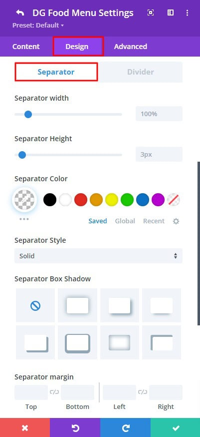
Separator & Divider
Width & Height: These settings allow you to define the exact dimensions of your separators and dividers. The width determines how long the line will be across the screen, while the height sets the thickness of the line. Adjusting these values can help the separator stand out or blend more subtly, depending on your design needs. For example, you might want a bold, thick line to separate sections or a thin, minimalist line to create subtle divisions.
 |
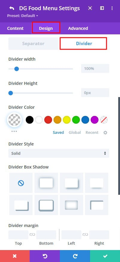 |
Color: This option lets you choose the perfect color for your separator or divider. You can match the line color to your website’s theme or menu design, ensuring a cohesive look. You could go for a neutral tone like gray or white, or make it pop with a vibrant accent color. This flexibility helps integrate the separator seamlessly into your overall design.
Style: DiviGrid offers multiple line styles to choose from. You can select a solid line for a clean, straightforward look, a dotted line for a lighter, less formal feel, or a dashed line for a more creative, playful touch. The choice of style can have a significant impact on the visual flow and tone of your menu layout.
Box Shadow & Margin: Adding a box shadow to your separator or divider gives it depth, creating a subtle 3D effect that can make your menu look more polished and professional. The margin setting allows you to control the spacing around the separator/divider, ensuring it doesn’t feel too cramped or isolated from other content. Proper margin settings enhance readability and create a balanced layout.
Button Styling
Use Divi’s default button customization options to style the call-to-action buttons. Options include button color, shape, text size, and hover effects.
Food Menu Content Tab Customization
[ Global Customization ]
The Food Menu component allows for global control over the overall layout and design of the menu. Any changes made here will affect all Food Menu Items under this module.
Content Tab Customization
Title and Title Tag
Set the menu title (e.g., “Dinner Menu” or “Specials”) and the appropriate heading tag. The title is important for both SEO and user readability, so ensure it’s clear and descriptive.
Grid Settings
Grid Column Number: Define how many columns will appear per row. Depending on your layout, you may want 2, 3, or even more items per row for a clean grid display.
Column Gap: Control the gap between individual menu items, ensuring there’s enough white space to make the layout visually appealing without feeling cluttered.
Food Menu Design Tab Customization
Header Section
Font Styles
The Font Styles settings provide extensive control over the typography used for the food menu title. You can adjust the font size to make the title more prominent or subtle, depending on the visual hierarchy of your design. The font weight, font style, line height, and letter spacing, create either a more open or condensed look. These combined options ensure your menu title stands out in a visually appealing and easily readable way.
Header Background
You have the ability to set a background for the header section, making it visually distinct from the rest of the menu. Choose between a solid color for a clean, simple design, a gradient for a more dynamic and eye-catching effect, or even an image to add texture or complement the theme of your restaurant or café. The right background choice can significantly enhance the visual appeal of the header, ensuring that the title not only grabs attention but also blends seamlessly with the overall aesthetic of the page.
Header Spacing
Spacing is crucial for creating a balanced design. With the Header Spacing settings, you can control the padding around the text, ensuring it has enough breathing room and doesn’t feel cramped. Additionally, you can adjust the margins, determining how far the header is from other sections on the page
Header Border and Box Shadow
Adding a border around the header can give it a more defined and structured look, helping to separate it from surrounding content. You can customize the border’s color, width, and style (solid, dashed, dotted) to suit your design needs. Additionally, applying a box shadow introduces depth and a subtle 3D effect, making the header stand out even more.
More Global Styling Options
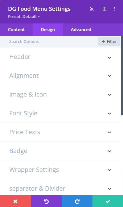
All the detailed styling options available in the Food Menu Item Design Tab—such as Alignment, Image & Icon, Font Styles, Price Text, Badge Settings, and Separator & Divider—can be applied globally to every menu item via the Food Menu Design Tab.
 |
 |
This ensures that all individual menu items share a consistent and cohesive appearance, streamlining the design process. Instead of styling each item individually, these global options allow you to make changes across the entire menu with a single adjustment. This not only saves time but also guarantees uniformity, ensuring that your menu design maintains a harmonious and professional look across every single item.
Food Menu Module FAQ
Q. What is the significance of the 'Use Badge' switch?
The "Use Badge" switch enables you to add a promotional badge to a food item. Badges are commonly used to highlight special promotions, such as "Best Seller" or "New Arrival." This feature allows you to add custom text for the badge, making it a great way to attract attention to particular menu items. By using badges strategically, you can guide customer choices and promote high-margin or popular dishes.
Q. What is the purpose of separators and dividers in the Food Menu module?
Separators and dividers help organize and structure the content in your food menu. Separators visually break up different pieces of information, such as the food title and price, to create a clear distinction between them. Dividers are used to separate sections of content, like the food name and description, making the menu easier to scan and read. Both elements enhance the overall layout, improving readability and user experience.
Q. What line styles are available for separators and dividers?
The Food Menu module offers several line styles for separators and dividers. You can choose from solid lines for a clean and straightforward appearance, dotted lines for a lighter, less formal look, or dashed lines for a more creative and playful touch. The choice of style impacts the visual flow and tone of your menu layout, allowing you to align it with your design preferences.
Q. What are the best practices for using separators and dividers in menu design?
Best practices for using separators and dividers include:
- Consistency: Use consistent styles for separators and dividers to maintain a cohesive look throughout the menu.
- Clarity: Ensure separators and dividers are visible but not distracting, and that they clearly delineate content without cluttering the design.
- Responsiveness: Adjust separator and divider styles for different screen sizes to ensure they remain effective across devices.
- Spacing: Provide adequate spacing around separators and dividers to avoid overcrowding and to enhance readability.
Q. What are the benefits of using the Food Menu module for restaurants and cafes?
The Food Menu module provides a professional, visually appealing way to showcase menu items with extensive customization options for branding and user experience.
Q. What are grid settings, and how do they affect the menu layout?
Grid settings allow you to define how many columns will appear per row and control the gap between individual menu items. This ensures a clean and visually appealing grid layout for your menu.
Q. What is the benefit of using global design settings for the Food Menu module?
Global design settings ensure consistency across the entire menu, making it easier to maintain a cohesive look and feel while applying uniform styles and settings.
Q. Is the Food Menu module mobile responsive?
Yes, the Food Menu module is designed to be mobile responsive. It adjusts the layout, font sizes, and image dimensions to ensure optimal viewing and usability on mobile devices.
Q. Can I apply unique styles to menu items for mobile view only?
Yes, you can apply unique styles to menu items for mobile view only by using responsive design settings and custom CSS. This allows you to create a tailored experience for mobile users without affecting the desktop layout.