Divi Image Mask Slider
Image masking sliders are not very common in the Divi marketplace. The Image Mask Slider is very lightweight, unique, and attractive. A slider created using CSS masks, animations, and transitions that will leave you mesmerized.
This documentation will help you to understand how to use the image mask slider efficiently.
Here's a quick look at the names of the new toggles you'll get when you activate the Image Mask slider.
Content Tab
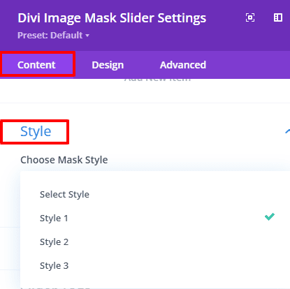
- Style
- Mask Style
- Slider tags
Advanced Tab
- Slider Settings
- Image Settings
- Arrow Settings
- Slider Text Style
- Badge Settings
- Content Wrapper
- Button
We will gradually learn how these toggles work. Before that, let's answer some common questions to help us understand how to use this image mask slider in the right way.
- What is Image Mask Slider?
Image masking is an extremely useful technique to edit your images in a non-destructive way. It is a non-destructive way to replace the original background and make the image unique. Typically, image masking is the process of limiting a certain visible adjustment in photos. With image masking, you can “conceal and reveal,” meaning you can hide portions of your image and display other portions, allowing you much more flexibility in how you edit your images. - How does the image mask slider work?
Our mask slider relies on two separate sprite mask images and they work together by adjusting the background image. The sprite mask image is hidden and added to the module which is not visible from the outside. x-axis values, y-axis values, and mask image steps are integrated very efficiently. You can easily create new effects by changing this field in the Mask Style toggle settings in the module. The entire slide is completed by combining the z-index values of the previous background image, the current background image, and the next background image. - Is using a background image essential for the image mask slider?
Yes of course! The background image is the actual part of this slider. If no background image is used or the same background image is used, the slider will not work. Note that using the same background image will not show the effect of the slider. - What will be the problem if I change the value of the Previous and Forward Mask styles?
The values we set as defaults are highly calculated and efficient. If someone wants to change that value, they can. Of course, care should be taken when changing the values of the Previous and Next Mask sliders as a small value change will change the effect of the entire slider. - How can badges be used outside of the container?
If design convenience requires the badge to extend outside the container, Divi's custom CSS field is the way to go. Then the visibility toggle for horizontal overflow and vertical overflow should be set to Visible from its default value.
Image Mask Slider Item Settings
Divi's default toggles have been removed except for some toggles required for sliders from the Image Mask item. There are only 3 toggles in the item to create a perfect slide. Every toggle is perfectly modified and works beautifully. The Item toggles are -
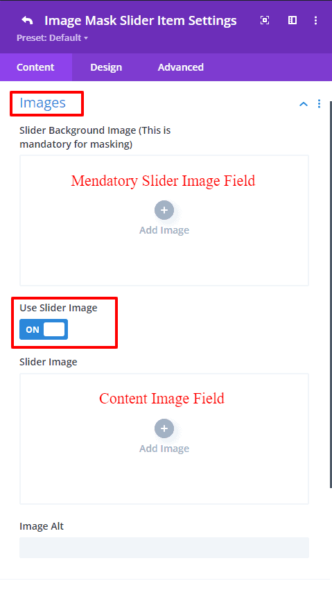
- Images
- Contents
- Badge
The image toggle contains the slider background image field essential for sliding. There is also an extra image switch for using images with content. Turning on the switch will bring up the image field. The image can be shifted to the left or right position from the options in the Design tab.
Title, subtitle, and content text fields have a clickable button to link to something. All have styling options and alignment features.
If one wants to use a badge in the slider, a badge field will appear by turning on the switch located in the badge toggle. The slider can be made more attractive by adding a highlighted text or number. Options for styling the badge are on the Design tab.
 |
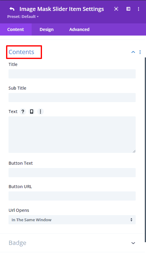 |
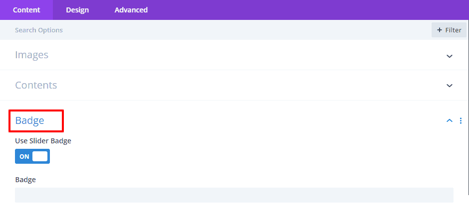
Image Mask Slider Settings
The first toggle on the Image Mask slider is Style. From here you can choose the styling of the slider. The default value will be no masking but sliding. The rest will show different sliding effects. Define the sliding style to suit the needs of the website from this toggle.
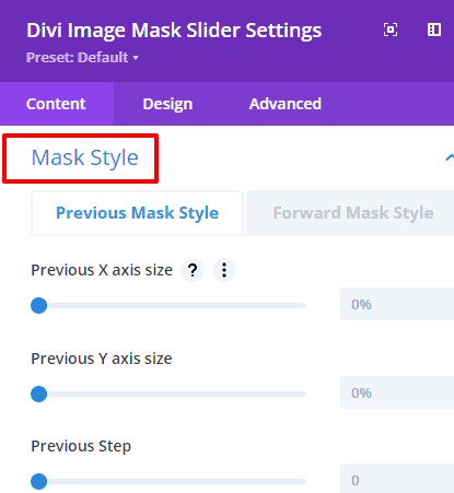
The Mask Style toggle provides some fields for forward and previous mask styles to change the preferred sliding effect from the style. Add values to those fields carefully. Because if you are not careful or if you input arbitrary values, the effect of sliding can change completely. We suggest not changing the masking value. By doing this you will get the perfect sliding effect.
There is also an option to change the HTML tag of the content from the slider tag. And the rest of the toggles are the default toggles of Divi.
 |
 |
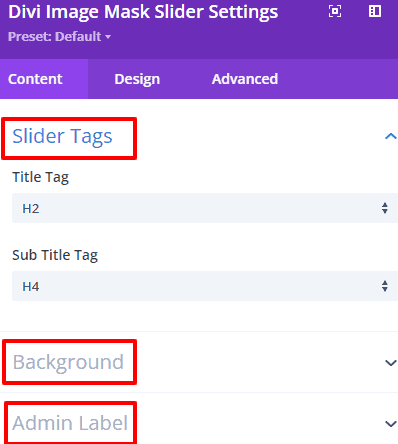 |
Image Mask Slider Design Tab Settings
👉 Slider Settings
The height of the slider container and the background overlay option is provided as an extra field to highlight the content within the slider. Backgrounds, gradient colors, or images can also be used in overlays.
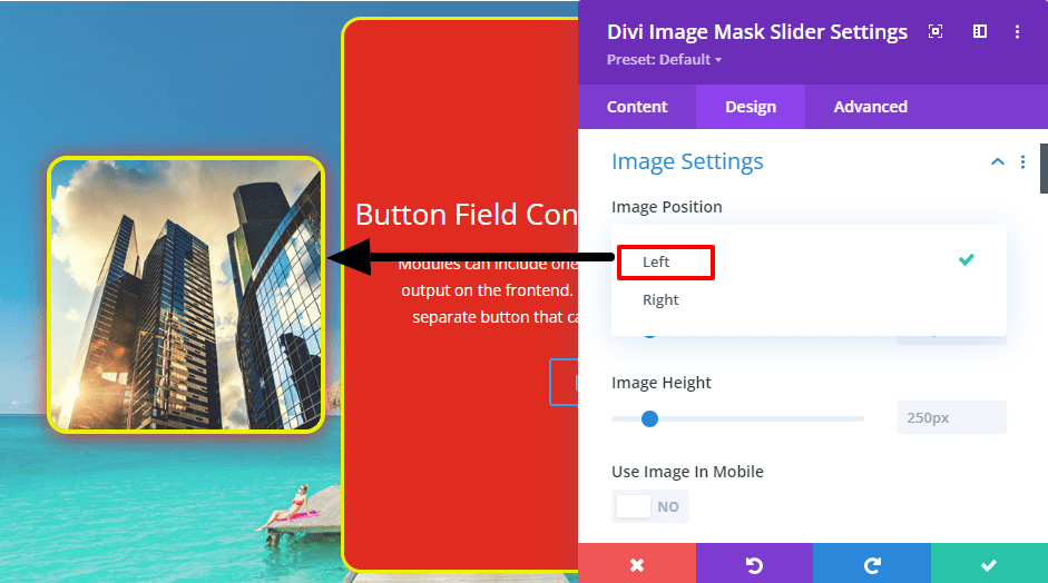
👉 Image Settings
This Image Settings provide essential styling options including padding, margin, height, width, border, and box-shadow to style an image. There is also an option to set the image to the left/right position of the content. Even in the mobile version, there is an on/off switch to show images.
In the desktop, and tablet versions, the content and images will be positioned side by side in rows but in the mobile version, the images and content will show in columns. That is, the image will show first and the contents below it. If you don't want to show the image in the mobile version, you have to turn off the "Use image in mobile" switch from the option.
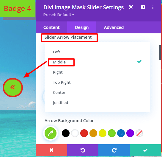
👉 Arrow Settings
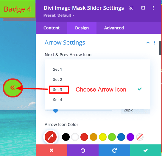
The slider has arrows to move to the previous and next slides. You can choose any icon from four types of arrow icons. Even there is a select field to set the arrow icons to specific positions. Also, there are left and right arrow position setting fields to set the left and right arrow positions. Through which the arrow can be moved to the left or right side, there are all the necessary settings fields for styling the arrows in this Arrow Settings.
 |
 |
👉 Slider Text Style
Divi's default styling options for styling titles, subtitles, and text are included in the form of a subtoggle. From this toggle, the contents of the slider can be styled simultaneously.
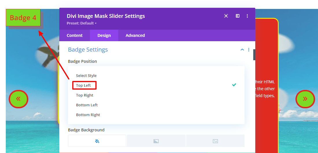
👉 Badge Settings
Added badges to bring some variety to the slider. Many times offers or sales are posted through sliders. Then this badge can play an important role. The position of the badges can be set to a suitable position. If the badge needs to be outside the container, visibility must be turned on from the custom CSS tab of the div. Besides, there is an option to style the badge in these Badge Settings.
👉 Content Wrapper
Added a settings field called Content Wrapper to wrap slider titles, subtitles, text, and buttons. Wrrapar's title, subtitle, text, and buttons will show in column form. Each content can be aligned in the left, center, or right position. There are styling settings to give the content wrapper a specific height/width and to style it.
And that’s it! I hope you find this tutorial useful and have fun creating your own cool mask effects! Don’t hesitate to share your creations, We would love to see them!