The before-after slider presents two images side-by-side, with one image representing the "before" state and the other representing the "after" state. The user can drag a slider or swipe left and right to reveal the difference between the two images. The slider may also display a percentage value indicating how much of the image has been revealed or hidden.
Before-after sliders are often used in photo editing software to compare the original image with the edited version, allowing users to see the changes made and the effect they have on the image. In web design, they can be used to demonstrate the visual impact of design changes or to showcase the transformation of a website over time.
Overall, before-after sliders are a simple yet effective tool for visually communicating change or transformation, and they are widely used in a variety of industries.
Few Common questions about Divigrid Before After Image Slider:
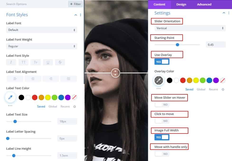
Is it possible to change the orientation of the image and handle in the image and compare the module?
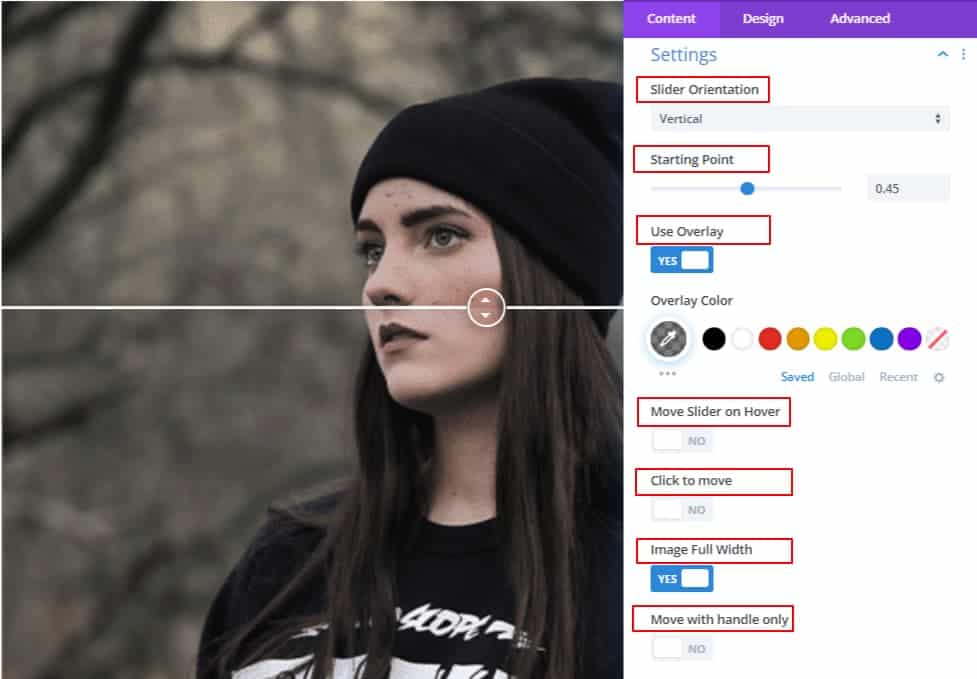
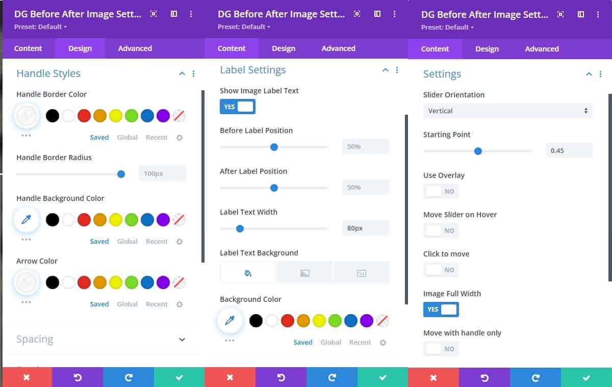
Yes, DiviGrid's "before-after image" slider allows you to easily change the orientation of the slider and handle to best fit your needs. Simply navigate to the Content tab, then to the Settings section, where you can select either a horizontal or vertical slider orientation. By default, the slider orientation is set to horizontal, but you have the flexibility to change it to a vertical orientation if it better suits your design. This feature provides you with more control over the look and feel of your before-after slider, allowing you to create a more user-friendly and engaging experience for your audience.
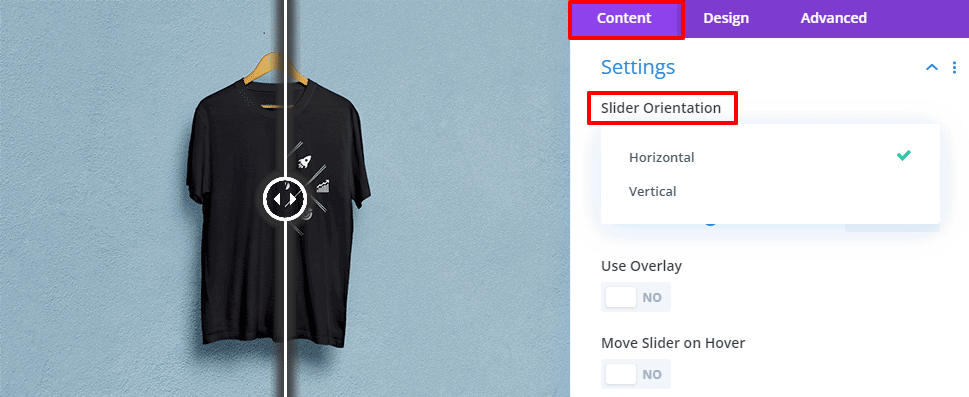
Simply, Goto Content Tab ->-> Settings ->-> Slider orientation.
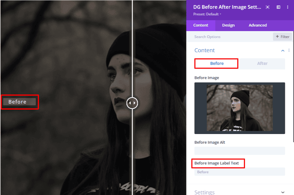
Can I add text labels to the before and after sections of the image to show the changes more clearly?
Yes, you can add text labels to the before and after sections of the image using DiviGrid's before-after slider. This feature can help make the changes in the image more clear and provide additional context to your audience. To add text labels, navigate to the Content tab and select the Before and After image sections. From there, you can add a text module or caption module and customize the content and styling to fit your needs. You can also adjust the positioning and layout of the text labels to best complement your images from the label settings. With this feature, you can create a more informative and engaging before-after slider that effectively showcases the changes in your images.
Can I customize the behavior of the handle in the before-after image module?
In the content tab settings, you can adjust the handling behavior by selecting one of the available handle options. These options include drag, hover, and click. With the drag option, the handle will move when the user clicks and drags it across the image. With the hover option, the handle will move when the user hovers over it with their cursor. And with the click option, the handle will move only when the user clicks on it.
How do I adjust the position of the handle in the before-after image module?
To adjust the position of the handle in DiviGrid's image compare module, follow these steps:
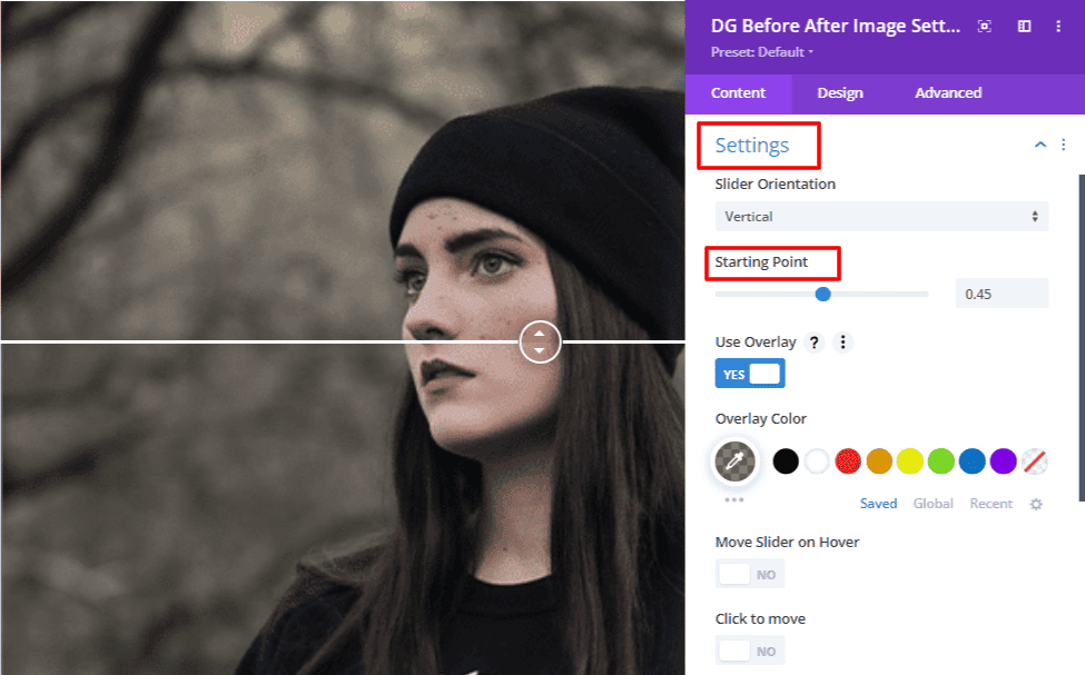
go to the content tab settings and then define the position from starting point option. Define any point from 0.1 to 0.9, the handle position will be fixed at that place.
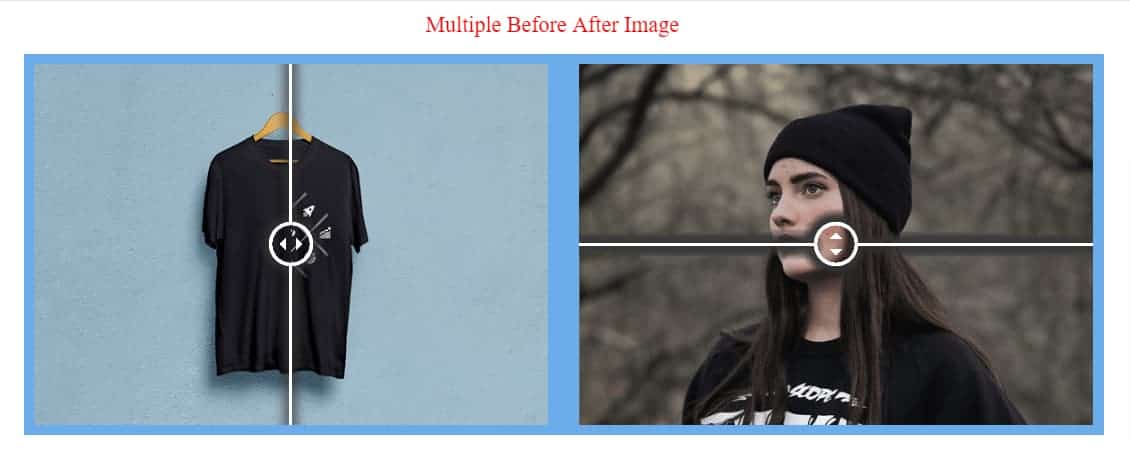
Is it possible to add multiple before-after sliders to a single page using this module?
Yes, it is possible to add multiple before-after sliders to a single page using DiviGrid's before-after slider module. This allows you to showcase different comparisons and transformations on a single page, making it easier for your audience to explore your content. To add multiple sliders, simply add the before-after slider module to the page as many times as you need and customize each instance with your images and text labels. You can also adjust the settings for each slider individually. With this flexibility, you can create a unique and interactive user experience for your audience and effectively communicate the value of your work or products. Whether you're a photographer, designer, or marketer, the ability to add multiple before-after sliders to a single page can help you showcase your skills and build credibility with your audience.
What type of images can be used with Divigrid's before-after image?
DiviGrid's Before-After Image module supports most image formats, including JPG, JPEG, PNG, and GIF. However, it's important to note that the module works best with images that have similar dimensions and aspect ratios. Using images that are significantly different in size or shape may result in distortion or visual anomalies. It's also recommended to use high-quality images with good contrast and clarity for the best visual impact.
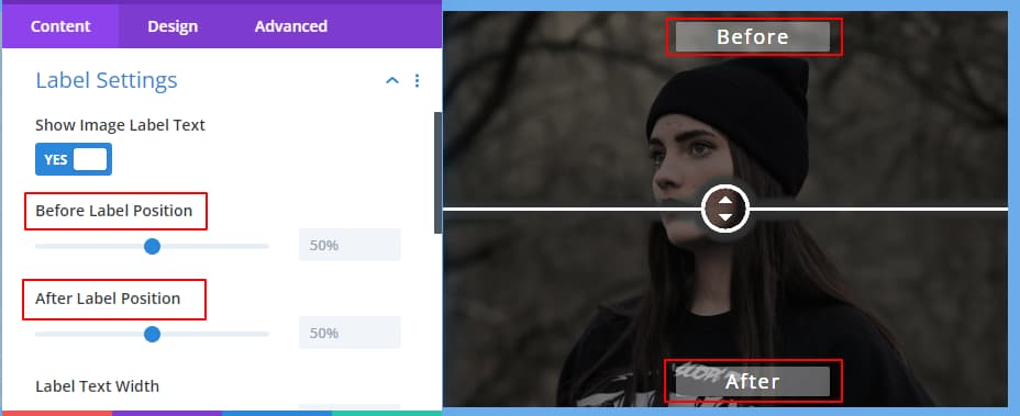
Is there an option to add captions to the before-after slider images?
Yes, you can add captions to the before-after slider images using DiviGrid's Before-After Image module. To add captions, simply go to the Content tab of the module settings and enter the text for the captions in the "Before Label" and "After Label" fields. You can customize the font size, color, and alignment of the captions using the available options in the "Font Styles" toggle in the Advanced Tab. Adding captions can help provide additional context to the images and highlight the changes made between the before and after versions.

Can I move the label text as I wish?
Yes, you can move the label text in DiviGrid's Before-After Image slider as per your requirement. In the Label settings, you will find two options to set the label position. One is for Before label position and the other is after label position. where you can choose your desired position of the slider handle. You can also adjust the label's font size, font color, and background color to make it more visually appealing and match your website's design. With these options, you can move and customize the label text as per your preference, making the slider more informative and engaging for your users.
Are there any customization options available for the appearance of the handles and labels?
Yes, DiviGrid's before-after image slider offers several customization options for the appearance of the handles and labels. You can choose the color, size, font, and style of the handles and labels to match your website's design. Additionally, you can set the position of the labels to be above, below, or to the side of the slider handles. With these customization options, you can create a before-after image slider that seamlessly integrates with your website's design and effectively showcases your images.
Can I move the handles by hovering over them instead of clicking and dragging?
You are correct, DiviGrid's before-after image slider does have the option to move the handles by hovering over them instead of clicking and dragging. This feature can be enabled in the content settings toggle under the "Move Slider on Hover" option for Handle Behavior. Turn on the switch to enable the hover option.
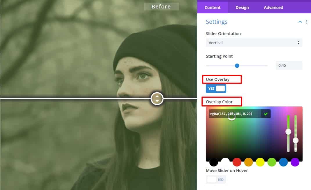
Is it possible to have an overlay of the slider?
Yes, it is possible to have an overlay on the slider in DiviGrid's before-after image module. The overlay can be customized with different colors, opacity levels, and blend modes to create various effects. You can add an overlay to the entire slider, depending on your preference. This feature is useful for adding text elements that enhance the visual impact of the slider and highlight the changes between the before and after images. With DiviGrid's before-after image module, you have the flexibility to customize the overlay to create the desired effect and make your images stand out.
Are there any examples or demos of the image compare module in use that I can see before deciding to use it on my own website?
Yes, there are many demos and examples of the Before After Image module in use that you can check out before deciding to use it on your own website. Here is the Link: https://divigrid.xyz/
Is the Before After image module mobile-friendly and responsive?
Yes, the Before After Image module from DiviGrid is mobile-friendly and responsive. It is designed to work seamlessly on various devices, including mobile phones and tablets, without compromising on the user experience. The module automatically adjusts to fit the screen size of the device it is being viewed on, ensuring that the slider remains functional and easy to use. This feature allows you to showcase your work on different platforms and devices, making it accessible to a wider audience. So, whether your audience is viewing your website on a desktop, tablet, or mobile phone, they will be able to experience your before-after images without any issues.