Today we will introduce a module that has never been in Divi before. Its name is Interactive Divi Card. We make many cards for different needs but in this module, you will be guaranteed to create a beautiful card without complications. How to install this module and use it will be described in detail in this documentation article. Let's start...
Once you have installed DiviGrid Module, you will find the Interactive Divi Card alongside the other Divi Modules available in the “Insert Module” window.
Interactive Divi Card Module
Generally, a card has two parts. One front part and another back part. Usually, the front part has the company identity and the back part has the full details. This interactive card has been created keeping in mind the idea of how to look out beautifully on a webpage by combining both.
Through interactive cards, you can present your identity and the organization's identity to your clients in a wonderful and attractive way.
We hope you will enjoy our very own new Interactive Divi Card. Let's see what we have done in this module.
Interactive Divi Card Content Settings
After inserting the Interactive Divi card you will find a new toggle called Grid Settings along with the default toggles.
grid settings
Inside the grid settings, there are two more fields for the layout selection.
a. Grid column Number
b. Grid Gap
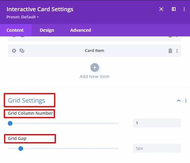
Grid Column Number
How many columns will be in a row can be defined from this field. Columns can be easily defined for specific designs. From one to ten columns can be defined from this field.
Grid Gap
This field is used to define exactly how much gap you want in each grid column. You can create the same amount of gaps in columns and rows from this grid gap field. The gap can be created from 0 to 50 pixels.
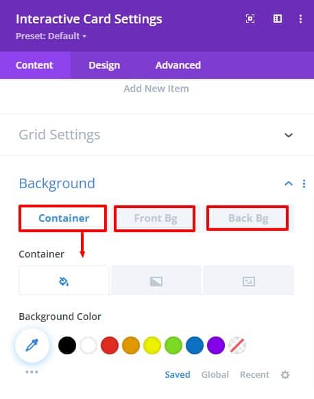
Background
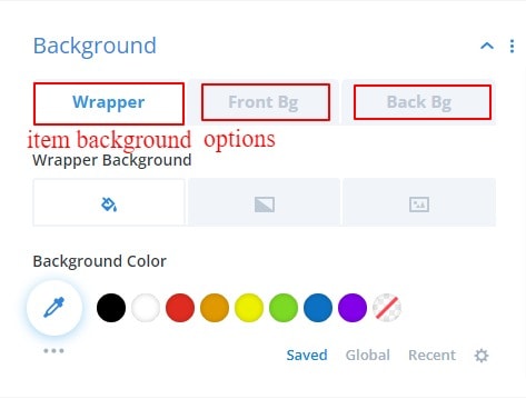
We modified the background field. there are 3 sub toggles in the background field. first, for the container box, 2nd for the interactive cards front part, and 3rd is the interactive cards back parts. Background color can be set globally for all module items.
Interactive Divi Card Item Content Settings
The interactive Divi card has four new toggles and modified background settings.
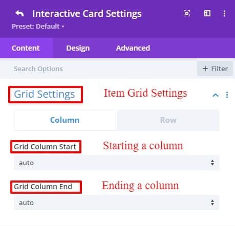
Grid Settings
In this grid setting, there are two tabs named Column and Row. Where you can define where your columns and rows start and end.
Grid column start
The grid column starts property defines on which column line the item will start.
Grid column end
The grid column end property defines on which column line the item will end.
Grid row start
The grid row starts property defines on which row-line the item will start.
Grid row start
The grid row ends property defines on which row line the item will end.
Enable Dual Part
There are two switches in the Enable Dual Parts toggle settings.
a. Enable Dual Part
If you open this switch, your front part and back part will show side by side at the same time. Divide the entire length of a column into two equal parts, the front part, and the back part will show at the same time.
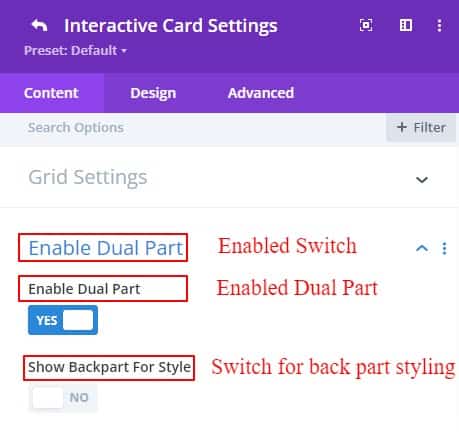
b. Show Back Part For Style
The 2nd switch is for Visual Builder only. Because that part cannot be seen while designing the back part. This switch is provided for the convenience of designing by looking at the back part. It doesn't show anything on the front end or website.
Content
Inside the content settings, there are two sub-toggles named The Front Content and the Back Content. In the front content, there are a title, subtitle, content text, and a button. On the other hand in the back content part, there are title, subtitle, content text, button text, button URL, and a useful social media switch. if you open the social media switch there are Facebook, Twitter, and other 4 more social media fields to write URL links.
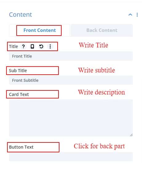
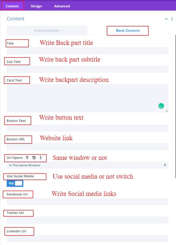
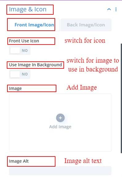
Image & Icon
Inside the image and Icon settings, you can set an image or icon. On the other hand, if you want you can use an image in the background-position. just ON the background switch, the image is automatically positioned in the background. Always keep in mind that image alternative text is very useful for SEO purposes.
Background
Background Settings has three sub-toggles. From here you can use the item, front part, back part a color, gradient color, and image.
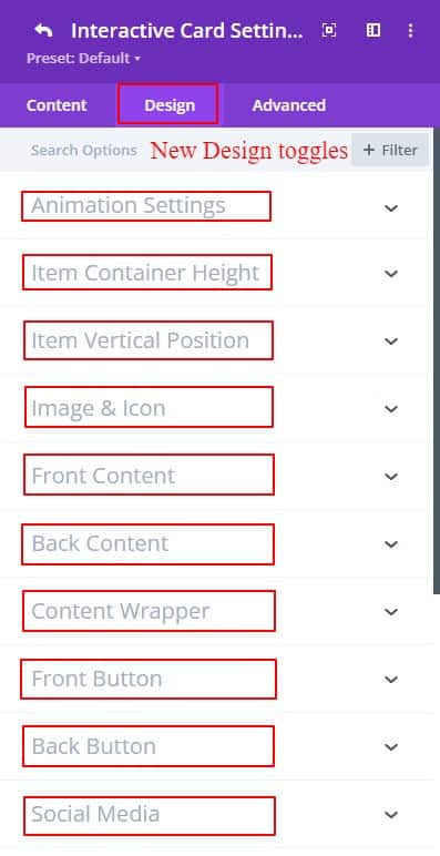
Interactive Divi Card Design Settings
In the design tab, tons of new modules have been added for design purposes. The new design toggle items are listed below.
a. Item Container Height
b. Item Vertical Position
c. Image & Icon
d. Front Content
e. Back Content
f. Content Wrapper
g. Front Button
h. Back Button
i. Social Media
j. Animation Settings
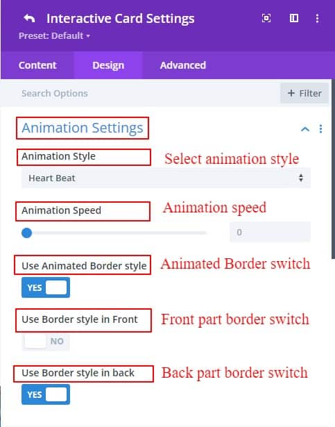
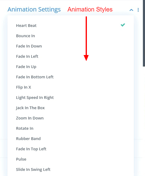
Animation Settings
Since only the front part can be seen between the front part and the back part, there are several styles for how you want to show the back part in these settings and also set the time. If you want, you can use an animated border on the front and back parts. You can select one of our favorite animated borders. Here, you can also set the border width, color, and border from here.
Item Container Height
Item Container Height toggle to specify how much height is required for each column. You can define the height for the front part and the back part as per requirement. This height is applicable for both the front part and the back parts. You can easily set the height of both items and cards. Also, define height separately for each module from the item.
Item Vertical Position
Inside the Item vertical position has two sub-toggles named front Item Position and Back Item Position. You can choose a height for the front and back parts. After defining a certain amount of height, you can vertically align the contents of the item according to your preference. There are three ways to align: Top, Center, and Bottom. Usually, the contents of the item will be aligned at the top position. You can do this vertical alignment from the item and card toggle tab. The advantage of doing this from cards is that you can align all the items at the same time.
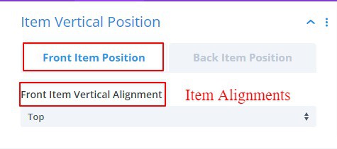
Image & Icon
Overlay Color
If the image is set to background, you can use the overlay color on the front or back part where you used the image in the background. This overlay color option will come only if you use an image in the background.
Image/ Icon position :
You can define the position you want to keep your image from these four options (Left, Right, Top and Bottom). As per your selection, the contents will be inserted according to the position of the image.
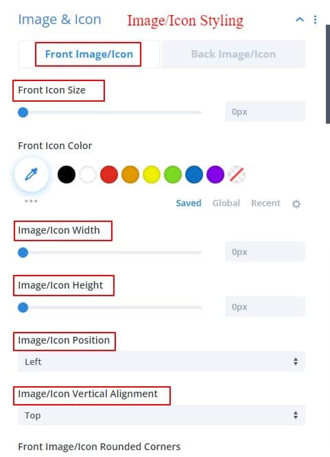
Image/ Icon Horizontal Alignment :
Image Position Left, Center or Right determines where you want your image to be placed when it is top or bottom position.
Image/ Icon Vertical Alignment
Image Position top or bottom determines where you want your image to be placed when it is left, center, or right position.
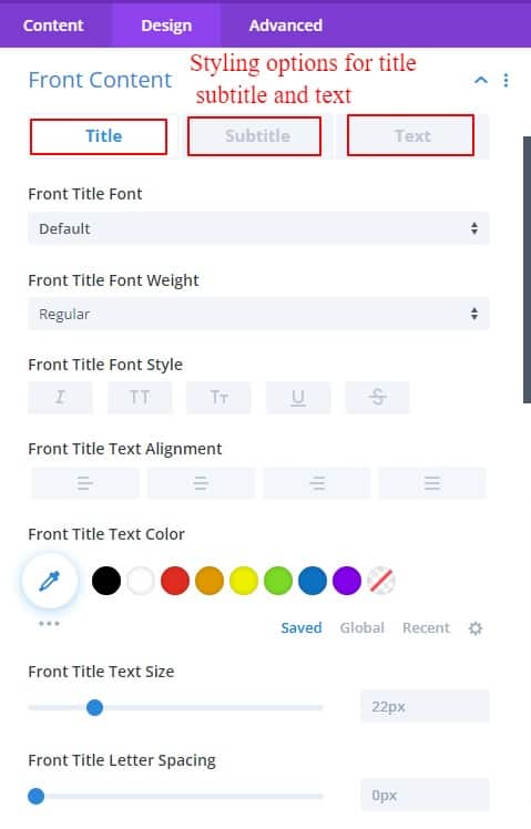
Front Content
In the front content design tab, there are three more sub-toggles. each sub-toggles has the same options for designing texts.
Back content
The Back part also has three sub-toggles. Divi defaults text designing options available there
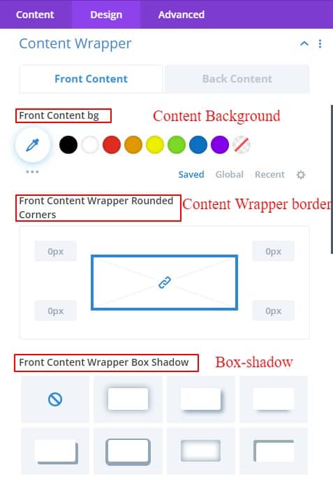
Content Wrapper
Content Wrapper has two more sub-toggles. one for the front part and another for the back part. both have the same options for designing content wrappers. Content background, Content Box shadow, and border are available to design the content box.
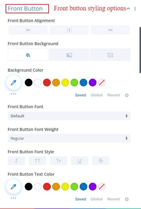
Front Button
Everything you need to design a button is found in this Front Button Toggles.
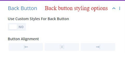
Back button
Divi default button options can be found in these back button toggles.
Social Media
You can use social media links below the inline pop-up content if you want. This is a very popular option now. You can use these icons for yourself or for business. Social media options can certainly give you some added benefits.
Alignment:
Social media icons can be selected on the left, center, or right. this alignment can start with the left, center, or right side.
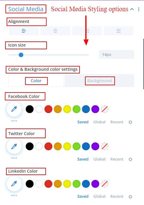
Icon Size:
From here you can change the size of social media icons.
Color And Background Color For Social Media Icon:
You can change the color and background color of social media icons very easily. Given as a sub toggle for convenience.
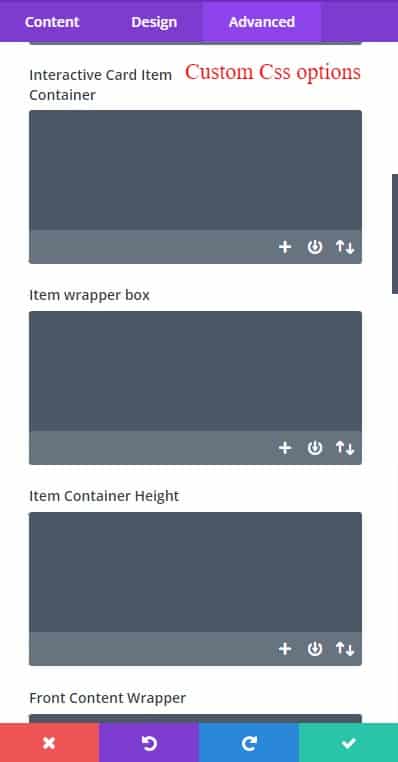
Write Custom CSS Code
Options for writing custom code as required are provided in Custom CSS Options.
Our guidelines have tried to give you a maximum idea of how to use this module. If you want to know anything about our module, you can knock us anytime Here.