The Image Carousel module by Divigrid for Divi is a powerful tool designed to create visually engaging and interactive image sliders. This module features a parent-child relationship, allowing users to add and customize content through child items, ensuring flexibility and precision in design. This documentation will be providing comprehensive guidance on leveraging the module's features to create professional, SEO-friendly, and user-friendly carousels.

Child Content Tab Customization
The Child Content tab is where you add and customize individual slides within the carousel. Each child item represents a unique slide, with its own content and settings.
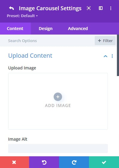
1. Upload Content
In the Upload Content section, you add the main visual elements and accompanying text for each slide.
- Upload Image: Upload the image that will be displayed in the slide. The quality and dimensions of the image are important to ensure it fits well within the carousel’s layout.
- Image Alt Text: Provide descriptive alt text for the image. This is crucial for accessibility and SEO, as it helps search engines understand the content of the image and improves the experience for users with screen readers.
 |
 |
 |
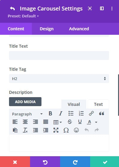
- Title Text: Enter a title for the slide. This text can be displayed over the image or in a specified position and serves to provide context or highlight important information
- Title Tag: Choose the HTML tag for the title text (e.g., H1, H2, H3). This is important for maintaining the correct semantic structure of your page and for SEO purposes.
- Description: Add a description for the slide. This can be used to provide additional details or context and can be displayed alongside the title or in a separate area.
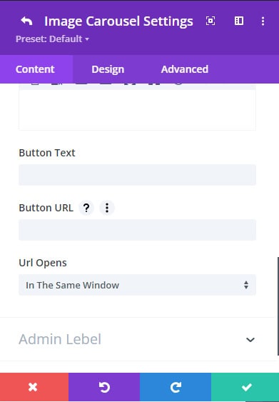
- Button Text & URL: If you want to include a call-to-action (CTA) on the slide, enter the text for the button and the URL it should link to. This is ideal for driving traffic to other pages or external sites directly from the carousel.
Child Design Tab Customization
Button Settings
- Style Buttons Individually: In the child item settings, you have the flexibility to style each button individually. This allows you to create unique styles for every button in the carousel, tailoring them to match the specific content or design of each slide. Customize font size, color, background, border, shadow, and other properties for a truly personalized look.
Parent Content Tab Customization
The Parent Content tab is where you control the overarching settings for your image carousel, including adding new items, configuring the carousel’s behavior, and managing pagination.
1. Add New Item
The "Add New Item" option allows you to create a new slide in the carousel. Each new item represents an individual slide, which you can further customize in the Child Content tab. Simply click "Add New Item" to begin adding your content.
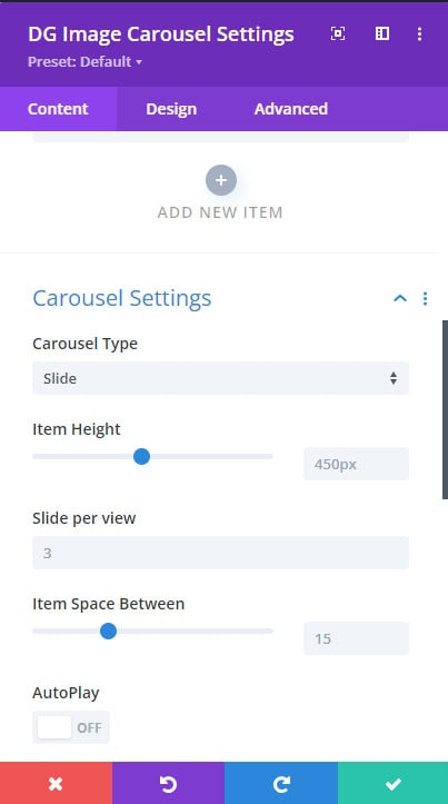
2. Carousel Settings
The Carousel Settings section is where you configure the main features and behavior of the carousel. Each setting allows for a high degree of customization, ensuring your carousel performs exactly as desired.
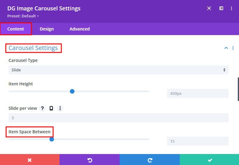
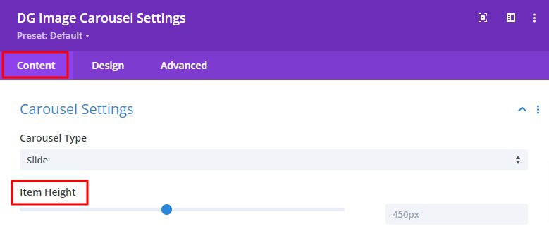
- Carousel Type: Choose from various carousel types ( Slide, Coverflow, Flip, Cube ) to define the layout and behavior of your carousel. The available types will dictate how your images are displayed.
- Item Height: Set the height for each item within the carousel. Consistent heights are ideal for uniformity, but varying heights can create a dynamic, artistic effect.
- Slider Per View: Specify how many slides are visible at once. You can opt for a single slide or multiple slides to be displayed simultaneously, depending on your design needs.
- Item Space Between: This setting allows you to control the space between each slide. Adjusting the spacing can help create a more open or tightly packed carousel layout.
- Autoplay Switch: Enable this switch to cycle the carousel automatically through slides. This is particularly useful for carousels on homepages or landing pages where you want to showcase multiple images without user interaction.
 |
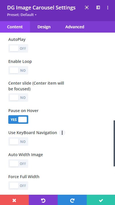 |
- Enable Loop Switch: When enabled, the carousel will continuously loop through the slides, returning to the first slide after the last slide is displayed. This is ideal for creating an endless slideshow effect.
- Center Slide: This option focuses the carousel on the center slide, making it the most prominent image in view. It’s especially effective in the Coverflow carousel type.
- Pause on Hover Switch: Toggle this switch to pause the carousel’s autoplay when a user hovers over it. This feature enhances user control and ensures that important content isn’t missed.
- Use Keyboard Navigation: Enable this to allow users to navigate through the carousel using the left and right arrow keys on their keyboard, improving accessibility.
- Auto Width Image Switch: When enabled, images will automatically adjust their width to fit the container. This is useful for maintaining a responsive design across different screen sizes.
- Force Full Width Switch: This setting forces the carousel to occupy the full width of its container, creating a more immersive viewing experience.
3. Pagination Settings
Pagination is essential for helping users understand where they are within the carousel. The Pagination Settings allow you to customize the appearance and behavior of these navigational elements.
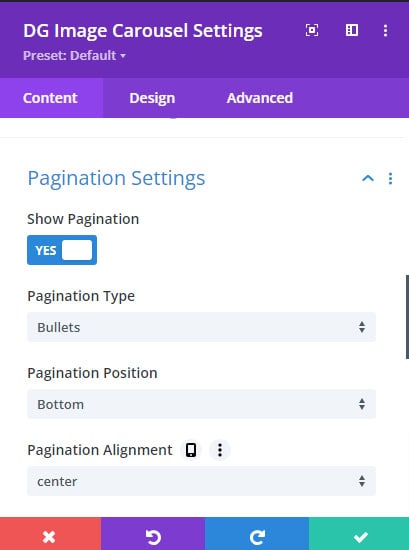
1. Show Pagination Switch
Enable this switch to display pagination controls, helping users navigate between slides.
- Pagination Type: Choose between "Bullet" and "Fraction" pagination styles:
- Bullet: Displays small dots to indicate each slide.
- Fraction: Shows the current slide number in relation to the total number of slides (e.g., 2/5).
- Pagination Position: Set the position of the pagination within the carousel. You can choose from top, right, left, or bottom placements.\
- Pagination Alignment: Align the pagination to the left, center, or right, depending on the overall design and layout of your page.
- Pagination Alignment: Align the pagination to the left, center, or right, depending on the overall design and layout of your page.
- Image Pagination Switch: Enable this to use thumbnail images as pagination indicators. This provides a more visual navigation option.
 |
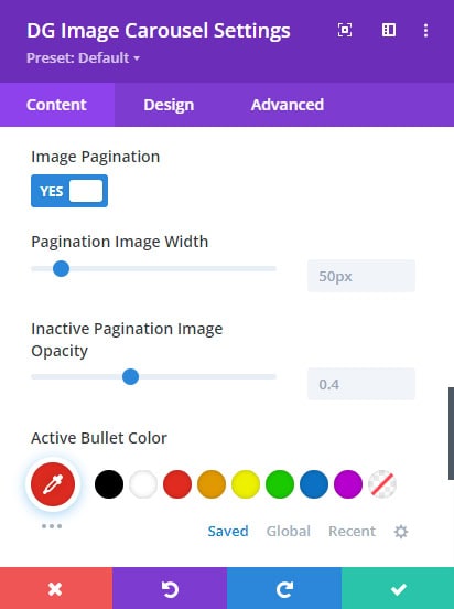 |
- Dynamic Bullet Switch: Enable dynamic bullets, where the pagination bullets will animate or change style based on the active slide.
- Bullet Color: Customize the color of pagination bullets to match your branding or page design.
- Bullet Size: Adjust the size of the bullets for better visibility or to create a subtle navigation option.
- Bullet Border Radius: Modify the bullet’s border radius to change its shape (e.g., round, square).
- Active Bullet Style Switch: This option allows you to apply a unique style to the active pagination bullet, making it stand out from the inactive ones.
- Pagination Container Margin: Adjust the margin around the pagination container to fine-tune its position and spacing within the carousel.
Parent Design Tab Customization
1. Overlay
Enable Overlay Switch
Enable this switch to add an overlay to the carousel images. Overlays can enhance the visual appeal of your images and make text more readable.
Background Styling Options:
- Background Color: Choose a solid background color for the overlay.
- Background Image: Add a background image for the overlay, which can add depth and texture to your carousel.
- Background Gradient Color: Apply a gradient color to the overlay for a more dynamic visual effect. You can customize the direction and colors of the gradient to match your design theme.
2. Hover Settings
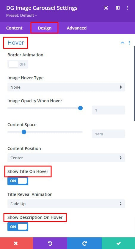
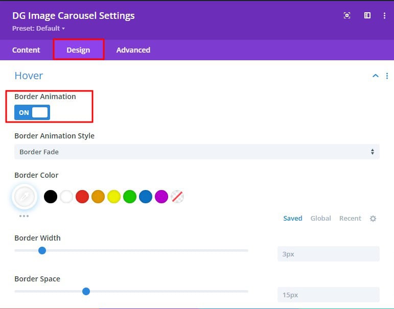
- Border Animation
-
- Border Animation Style: Choose from over 20 different border animation styles to add dynamic effects when users hover over the carousel items.
- Border Color: Customize the color of the border animation to match or contrast with your site’s color scheme.
- Border Width: Set the width of the border to enhance its visibility and impact.
- Border Space: Adjust the space between the border and the image to create a desired visual effect.
- Image Hover Type: Choose from over 10 different image hover effects, including Zoom, Pan, Rotate, and Blur. These effects add interactivity and can make your carousel more engaging.
- Image Opacity When Hovered: Control the opacity of the image when hovered over. This feature is useful for creating focus on text or other overlay elements.
- Content Space: Adjust the space around the content (title, description, button) within each slide. This helps ensure that the content is readable and aesthetically pleasing.
- Content Position: Choose from 9+ content position options to determine where the text and buttons appear within the slide.
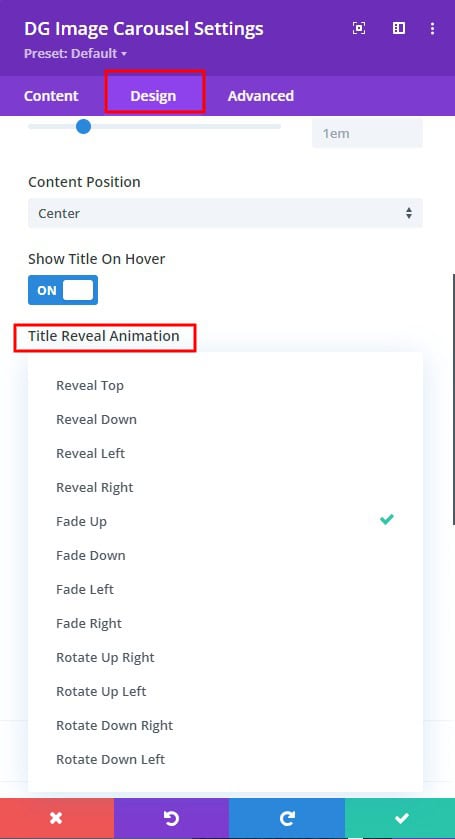
- Show Title on Hover:
-
- Title Reveal Animation: Select from 12+ modern animations to reveal the title when the user hovers over the slide. These animations add a sophisticated touch to your carousel.
- Show Description on Hover:
-
- Description Reveal Animation: Choose from 12+ animations to reveal the description when the user hovers over the slide.
- Show Call to Action Button on Hover:
-
- Button Reveal Animation: Apply one of 12+ button reveal animations to create dynamic interactions when users hover over the slide.
3. Arrow Settings
Arrows are essential for navigation within the carousel. The Arrow Settings section allows you to customize their appearance and behavior.
- Enable Arrow Switch: Enable this switch to display navigation arrows on the carousel, allowing users to manually cycle through slides.
- Previous and Next Arrow Icon Selection Panel: Choose icons for the previous and next arrows from a selection panel. This allows you to match the arrows with the overall design of your carousel.
- Arrow Position: Set the position of the arrows within the carousel. You can place them at the edges, corners, or center depending on your design preference.
- Arrow Alignment: Align the arrows to the left, center, or right for better visual harmony.
- Arrow Opacity: Adjust the opacity of the arrows to make them more or less prominent within the carousel.
- Arrow Icon Color: Customize the color of the arrow icons to ensure they are easily visible against the background.
- Arrow Icon Size: Set the size of the arrow icons, making them larger or smaller depending on the importance of navigation.
- Arrow Icon Background Color: Choose a background color for the arrow icons to help them stand out against the carousel images.
- Arrow Icon Border Color: Set a border color around the arrow icons to give them a defined edge.
- Arrow Icon Border Radius: Adjust the border radius to make the arrow icons square, round, or anywhere in between.
- Arrow Icon Border Style: Choose a border style for the arrow icons, such as solid, dashed, or dotted, to match your site’s design theme.
- Previous Arrow Margin & Padding: Set the margin and padding for the previous arrow to control its placement and spacing.
- Arrow Container Margin & Padding: Control the margin and padding around the entire arrow container for optimal spacing and alignment.
4. Font Styles
Typography is a key aspect of design. The Font Styles section allows you to customize the text within your carousel. Customize the font size, weight, line height, letter spacing, text shadow, font style (bold, italic, underline), alignment, color, margin, and padding for the title and description text.
5. Fraction Font:
If you’re using fraction pagination, this setting allows you to style the fraction text, including font size, weight, line height, letter spacing, font style, alignment, and color.
6. Pagination Settings
- Image Pagination Border Styles: Customize the border styles around image pagination, including border width, color, and style.
- Image Pagination Box Shadows: Add shadow effects to the image pagination for a more pronounced and 3D appearance.
- Active Image Pagination Border Styles: Apply distinct styles to the border of the active image pagination to make it stand out.
- Active Image Pagination Box Shadows: Enhance the active image pagination with shadow effects, helping users easily identify the current slide.
7. Button Settings
The Button Settings section offers global settings for all buttons within the carousel. Customize the appearance of all buttons in the carousel, including font size, weight, letter spacing, border radius, color, background color, border style, padding, and margin.
The Image Carousel module by Divigrid is a versatile tool that allows you to create highly customizable and visually appealing image sliders within Divi. By understanding and leveraging the settings within the Content and Design tabs, you can create carousels that not only look great but also function seamlessly across different devices and screen sizes. This documentation serves as a comprehensive guide to help you get the most out of the Image Carousel module, ensuring your carousels are both professional and user-friendly.
Whether you’re showcasing a portfolio, highlighting product features, or creating an engaging slideshow, the Image Carousel module provides all the tools you need to make your content stand out.
FAQs About Image Carousel
Q. Is the Image Carousel module responsive?
Yes, the Image Carousel module is fully responsive and can be customized to display correctly on all device sizes.
Q. What types of content can I add to the Image Carousel module?
You can add images, titles, descriptions, and buttons to each slide in the carousel.
Q. How do I adjust the spacing between items in the carousel?
The spacing between items can be adjusted in the Parent Content tab under Carousel Settings by changing the "Item Space Between" setting. Go to Carousel Settings >> Item Space Between
Q. Can I control the height of the items in the carousel?
Yes, the item height can be set in the Parent Content tab under Carousel Settings. o to Carousel Settings >> Item Height
Q. What is the “Center Slide” option?
The "Center Slide" option focuses on the center item in the carousel, making it more prominent compared to the others.
Q. How do I enable keyboard navigation for the carousel?
Keyboard navigation can be enabled in the Parent Content tab under Carousel Settings by turning on the "Use Keyboard Navigation" switch. Parent Content Tab >> Carousel Settings >> Use Navigation switch >> Turn ON
Q. Can I apply hover effects to the images in the carousel?
Yes, hover effects can be applied in the Design tab under Hover Settings. You can choose from various effects like zoom, pan, rotate, and more.
Q. What is the “Auto Width Image” feature?
The "Auto Width Image" feature automatically adjusts the image width to fit within the carousel dimensions.
Q. Can I pause the carousel when the user hovers over it?
Yes, you can enable this by turning on the "Pause On Hover" switch in the Carousel Settings.
Q. What types of pagination are available in the Image Carousel module?
The module supports bullet and fraction pagination types, which can be selected in the Content tab under Pagination Settings.
Q. How do I apply hover animations to the title and description?
Hover animations for the title and description can be enabled and customized in the Parent Design tab under Hover Settings, with options for revealing animations and effects.
 |
 |
Q. What are border animation settings in the Hover Settings?
Border animation settings allow you to add animated borders to the images on hover, with over 20 animation styles to choose from.
Q. How do I optimize the Image Carousel module for SEO?
To optimize the Image Carousel for SEO, ensure that alt text is provided for all images, use descriptive titles and descriptions, and consider using pagination for better indexing.
Q. How to display images instead of bullets for pagination in the Image Carousel module
To display images instead of bullets for pagination in the Image Carousel module, follow these steps:
Enable Image Pagination:
In the Parent Content tab, navigate to Pagination Settings.
Ensure the Show Pagination switch is turned on.
Enable the Image Pagination switch. This automatically uses the images from your carousel as pagination indicators, so there's no need to upload separate images. Use this setting to adjust the width of the pagination images to suit your design preferences and to differentiate between active and inactive pagination images, adjust the Inactive Pagination Image Opacity setting. Lowering the opacity for inactive images will help highlight the active image while still keeping the others visible.
By following these steps, you can effectively use the carousel's own images as pagination indicators, enhancing the navigation experience.