The Gradient Text Module allows website designers and developers to add engaging gradient color effects to text elements in Divi. Whether you’re looking to highlight important content, create vibrant headers, or simply add a dynamic visual element, the Gradient Text Module offers numerous customization options to make your text stand out. This documentation will guide you through the module’s features, including text and gradient customization, animation, stroke text, individual prefixes, infix, suffix text, hover effects, and advanced settings.
How to Add a Module to Your Page
Once Divi Grid is activated, multiple modules are introduced to the Divi Builder. To add a module to a page, follow these steps:
Create or Edit a Page/Post: Open an existing page or post, or create a new one using the Divi Builder.
Create or Edit a Row: Add a new row or edit an existing one within the page layout.
Add a Module:
- Click the Add New Module button within the selected row.
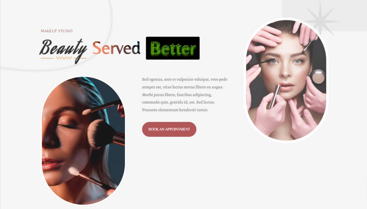
- From the module list, select DG Gradient Text.
Module Overview
The Gradient Text Module is designed to create attention-grabbing text elements with customizable gradient overlays. The module allows users to apply gradient effects to text by configuring the primary and secondary colors, adjusting gradient direction, and adding hover effects. Additionally, it includes responsive settings, so you can tailor your design to work perfectly on desktop, tablet, and mobile devices.
Key features include:
- Individual Prefix, infix, and suffix texts
- Individual Prefix, infix, and suffix text customization
- Customizable gradient text colors
- Gradient direction control (linear, radial)
- Typography settings (font, size, weight, style)
- Background clipping
- Animations
- Stroke Text
- Hover effects to animate text
- Advanced CSS customization options
- Responsive design for different screen sizes
Content Tab Customization
The Content Tab in the Gradient text module provides you with a variety of input fields and settings to customize the text content and structure of your headings.
Content
Prefix Text: Add a text prefix to your heading. This could be a small introductory word or phrase that precedes your main title.
Infix Text: Place additional text in the middle of your heading, allowing you to emphasize or highlight certain parts of the title.
Suffix Text: Add text after your main title to complete the heading. This can be useful for subheadings or additional context.
Title Tag: Select the appropriate HTML tag for your heading (e.g., H1, H2, H3, etc.). This not only defines the visual hierarchy but also impacts SEO.
Design Tab Customization
Heading
Use Background ( Switch )
When the "Use Background" switch is enabled, the Gradient Text Design Tab allows you to customize the heading text background. This feature adds an extra layer of design flexibility, making it easy to enhance the visual appeal of your gradient text by adding contrast or highlighting specific content.
-
Background Color: This option lets you apply a solid color overlay to the text within the module's row.
-
Background Gradient: With this setting, you can apply a gradient overlay, blending two or more colors across the text. Gradients can add depth and make your design more visually dynamic than using a single color. You have full control over the gradient's appearance.
-
Background Image: This feature allows you to use an image as the background, creating a layered effect. It provides complete creative control over the design of each accordion item, offering a powerful way to enhance your content's look.
Margin & Padding: Adjust the space around the heading to control its placement and spacing in relation to other elements.
Border: Define a border around the heading, with options for rounded corners, color, style, and thickness.
Box Shadow: Add a shadow effect to the heading for depth and emphasis.
Heading Font
Customize the font for all heading text (prefix, infix, and suffix). This ensures a consistent typography style across the entire heading. You have full control over how the review text is styled, including font family, weight, alignment, and more.
- Font
- Font Weight
- Style
- Alignment
- Line Height
- Letter Spacing
- Text Shadow
- Text Color
Font Styles
Each text element—Prefix, Infix, and Suffix—can be styled independently, giving you granular control over the typography. You can modify:
- Font
- Font Weight
- Style
- Alignment
- Line Height
- Letter Spacing
- Text Shadow
- Text Color
Gradient Heading
Once the "Use Gradient Color" switch is enabled, a variety of customization options become available, allowing you to design visually appealing gradient effects for your text. These settings give you complete control over the colors, style, and flow of the gradient applied to your heading.
Select Gradient Field: This option allows you to choose which part of the text will display the gradient effect. You can apply the gradient to the prefix (the beginning), infix (the middle), or suffix (the end) of the text, offering flexibility in how and where the gradient is displayed.
Gradient Type: This setting allows you to select the style of the gradient you want to apply. You can choose between different types, such as linear, where colors transition smoothly from one side to another, or radial, where the colors radiate from a central point. Each gradient type provides a unique visual effect, giving you more options to match your design needs.
Primary Color & Location: This setting lets you choose the starting color of your gradient and determine where it begins within the gradient flow. You can adjust the color position to control how much of the text is covered by the primary color, ensuring the gradient transitions smoothly.
Secondary Color & Location: Similar to the primary color setting, the secondary color marks the ending point of your gradient. You can select the color and decide where it should appear within the gradient, creating a balanced or contrasting effect depending on your design preferences.
Gradient Angle: This option allows you to set the angle at which the gradient flows. Adjusting the angle changes the direction in which the colors transition, giving you full creative control over how the gradient interacts with the text. You can create horizontal, vertical, or diagonal gradients by manipulating the angle setting.
By using these settings, you can fully customize the gradient effect on your heading, tailoring it to your design's aesthetic while maintaining flexibility in color placement and flow.
Background Clip
The Background Clip settings provide additional customization for how the background interacts with the text. These options let you determine whether the background is clipped specifically to the text and whether you want to include an image to enhance the visual design.
Select Background Clip Field: This option allows you to decide if the background should be clipped to the shape of the text. When enabled, the background will only appear within the text itself, creating a cleaner and more focused design.
Image Field: Here, you have the option to upload and use an image as the background for the text. This feature allows for more creative expression, letting you combine both text and imagery to create a visually compelling effect. The image will be clipped according to your text settings, ensuring a seamless integration.
Prefix, Infix & Suffix Settings
The Prefix, Infix & Suffix Settings provide fine-tuned control over the appearance and behavior of each part of your text. These settings allow you to apply unique styling and layout customizations to ensure that each text element stands out and complements your overall design.
Enable Outline/Stroke Text Switch: Toggle this option to add an outline around the text, making it more distinct and enhancing its visibility. This effect can help your text stand out, especially against complex backgrounds.
Overflow Visible Switch: Enable this option to ensure that any text exceeding its container remains visible, rather than being clipped. This is useful when you want the full text to display without restrictions on space.
Display Block Switch: When enabled, this setting makes the text behave as a block-level element. This means the text will take up the full width available, allowing for greater control over its layout and positioning within the design.
Use Background Switch: This setting allows you to apply a background color or image specifically to the prefix, infix, or suffix text. You can customize each part of the text individually, giving your design more flexibility in terms of visual emphasis.
Margin & Padding: These settings let you adjust the spacing around the prefix, infix, and suffix text elements. By fine-tuning the margins and padding, you can control how much space is around each text segment, ensuring balanced and precise placement.
Border: Add borders around the prefix, infix, or suffix to create a distinct separation or emphasize certain parts of the text. You can customize the border's style, color, and width to fit your design needs.
Box Shadow: Apply a shadow effect to individual text elements, such as the prefix, infix, or suffix, to create depth and a sense of separation from the background. This feature enhances the overall visual impact, giving your text a more three-dimensional look.
Animation Settings
When the "Use Animation" switch is enabled, various customization options will become available, allowing you to animate different parts of your heading text. These settings offer flexibility in how animations are applied, adding dynamic movement to your design and enhancing user engagement.
Select Animation Field: This option lets you choose which part of the heading (prefix, infix, or suffix) the animation should apply to. You can animate different sections of your text independently, giving you control over which part of the heading draws attention.
Animation Type: Choose from over 12 different animation types to bring your heading text to life. Whether you prefer subtle fade-ins or eye-catching bounces, these animation options add movement and interactivity to your design, making the heading more engaging.
Animation Speed: This setting allows you to control how fast the animation plays. You can adjust the animation speed to match the overall flow of your webpage, ensuring that the pacing feels natural and doesn’t distract from the content.
These animation settings provide the tools to create dynamic and visually appealing headings, adding a layer of interactivity to your design while giving you full control over which parts of the text are animated and how they behave.
Hover Settings
Once the "Use Hover Effect" switch is enabled, a range of customization options becomes available, allowing you to apply dynamic hover effects to your text. These effects bring an interactive element to your design, enhancing user engagement with over 30 modern and aesthetic styles to choose from.
Select Hover Field: This setting allows you to specify which part of the text (prefix, infix, or suffix) the hover effect will apply to. By customizing the hover effect for different sections of the text, you can create unique visual interactions that highlight specific parts of your heading when users hover over them.
Select Hover Style: With access to over 30 stylish and modern hover effects, you can create dynamic headings that react to user interaction. These hover styles offer a wide range of effects, from subtle transitions to bold animations, allowing you to design engaging text that stands out and responds visually when hovered over.
Additionally, Divi's default design settings—such as Spacing, Border, Box Shadow, Transform, Animation, and more—are fully available to further customize the Gradient Text module. These built-in options provide added flexibility, allowing you to refine the layout, adjust visual elements, and apply advanced design effects to create a polished and unique look for your gradient text. Whether you're fine-tuning spacing or adding depth with shadows, these settings give you full control over the module's design.
Frequently Asked Questions ( FAQ's )
Q. What is the Gradient Text Module in Divi?
The Gradient Text Module allows designers to add dynamic gradient effects to text elements, offering customization options like gradient color, animation, stroke text, hover effects, and more.
Q. What key features does the Gradient Text Module offer?
It includes prefix, infix, and suffix text, gradient colors, gradient direction, stroke text, hover effects, typography, animations, background clipping, and responsive design settings.
Q. What does the "Display Block" switch do?
It makes the text behave like a block element, meaning it will occupy the full width available in the row or section.
Q. Can I animate the prefix, infix, and suffix independently?
Yes, you can choose to apply animations to each text section (prefix, infix, suffix) independently.
Q. Can I apply different gradients to the prefix, infix, and suffix?
No, the gradient effect applies to the entire text as a whole, but you can control which section (prefix, infix, suffix) gets the gradient.
Q. What is the purpose of the 'Enable Outline/Stroke Text' switch?
The "Enable Outline/Stroke Text" switch serves to apply a visible outline around your text, improving its clarity and making it more prominent, especially when placed over intricate or visually busy backgrounds. This feature is particularly useful in ensuring that your text remains readable and visually appealing in any design context.
Once activated, you can further customize the stroke effect using several settings. These include:
- Outline Width: Adjust the thickness of the outline to suit your design.
- Outline Color: Choose the color of the outline to match or contrast with your text and background.
- Outline Fill Color: Set the inner color of the text to complement the outline for a cohesive look.
These customizable options allow for a high degree of flexibility, enabling you to tailor the text appearance to match your design needs.
Q. Is it possible to apply gradient effects individually to Prefix, Infix, and Suffix text elements?
Yes, the module allows you to apply unique gradient effects to the Prefix, Infix, and Suffix text elements, enabling precise customization for each section of your heading.
Q. Can I apply individual backgrounds to the Prefix, Infix, and Suffix elements?
Yes, the module provides options to apply unique backgrounds—whether color, gradient, or image—to apply background in the prefix, infix, or suffix, go to
Q. Is it possible to add borders around each text element?
Yes, the module allows for the addition of borders around the Prefix, Infix, and Suffix text elements, with full customization options for border style, color, width, and radius.
Q. Does the module support responsive design across different devices?
Yes, the module is fully responsive, allowing you to customize how your heading appears on desktop, tablet, and mobile devices to ensure a seamless experience across platforms.