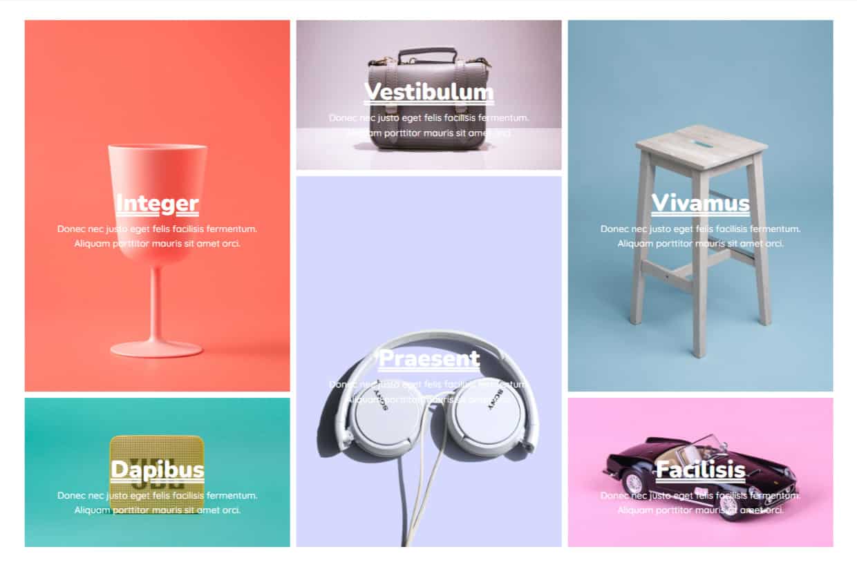
The DiviGrid Masonry Gallery Module is a versatile tool designed to showcase images in a stylish masonry layout. This module offers dynamic image grids that automatically adjust based on the content, creating a seamless and visually appealing gallery. Whether you want to present a portfolio, a collection of images, or a photo gallery, the Masonry Gallery Module is a powerful solution that integrates smoothly with Divi.
How to Add a Module to Your Page
Once Divi Grid is activated, multiple modules are introduced to the Divi Builder. To add a module to a page, follow these steps:
Create or Edit a Page/Post: Open an existing page or post, or create a new one using the Divi Builder.
Create or Edit a Row: Add a new row or edit an existing one within the page layout.
Add a Module:
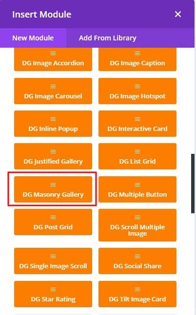
- Click the Add New Module button within the selected row.
- From the module list, select DG Masonry Gallery.
 |
 |
Content Customization
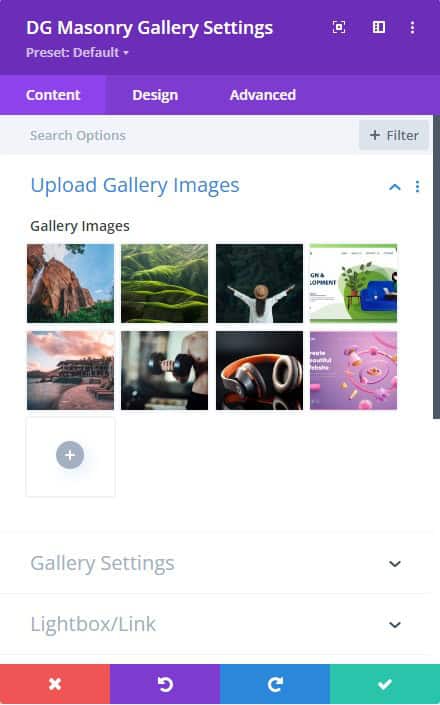
1. Upload Gallery Images
Go to the Content tab >> Upload Gallery Images >> Gallery Images >> Add Gallery Images. It will open Media Library, and select the images you want to display in the Masonry Gallery.
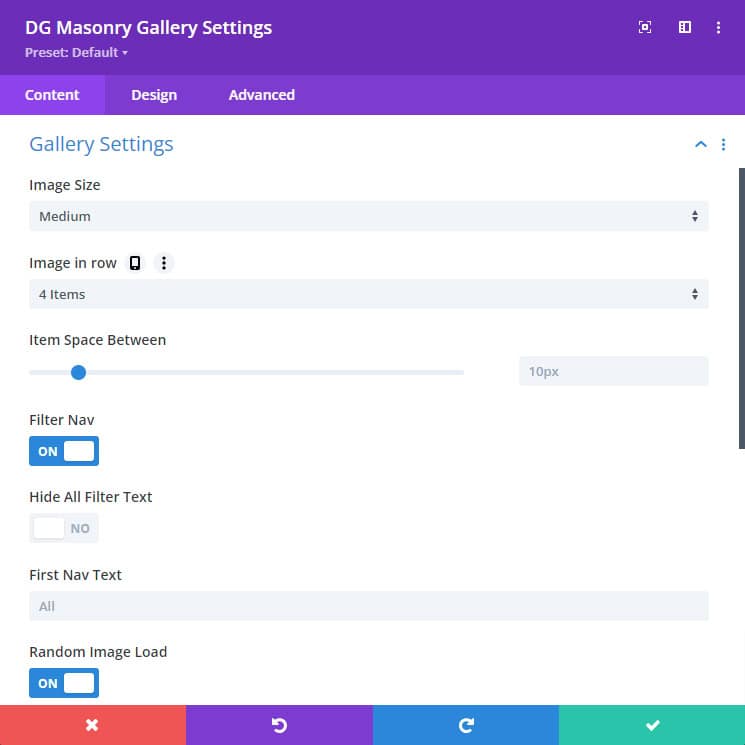
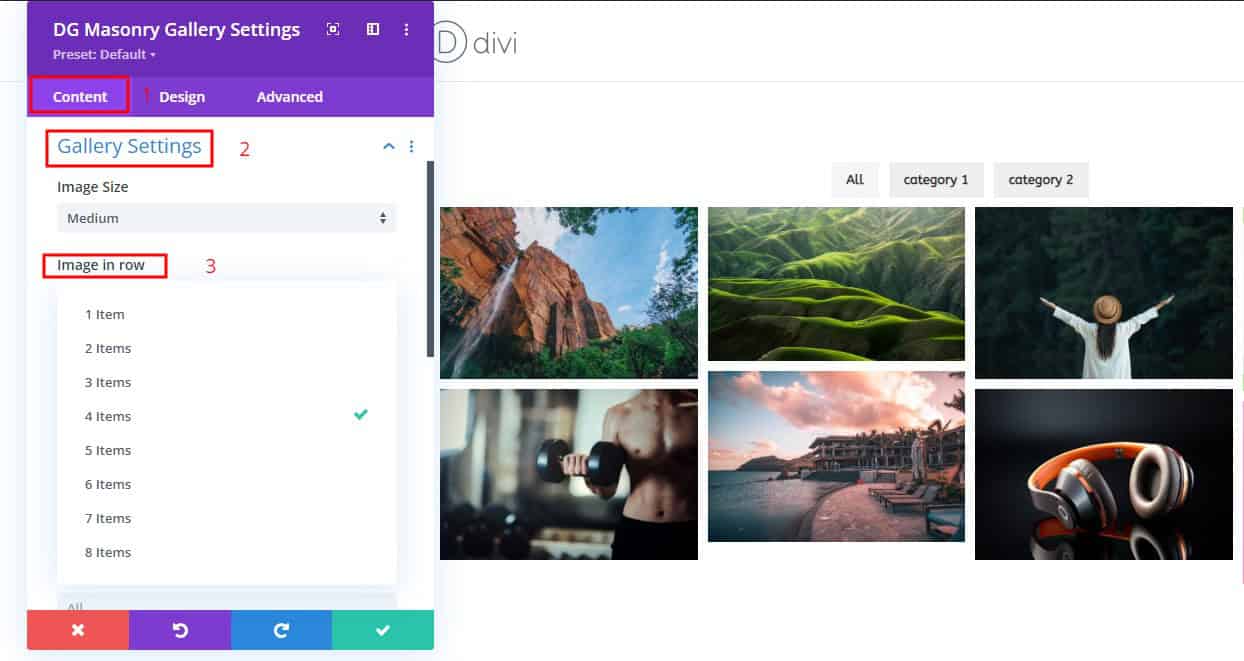
2. Gallery Settings
This section offers extensive options for controlling the layout and presentation of your images:
-
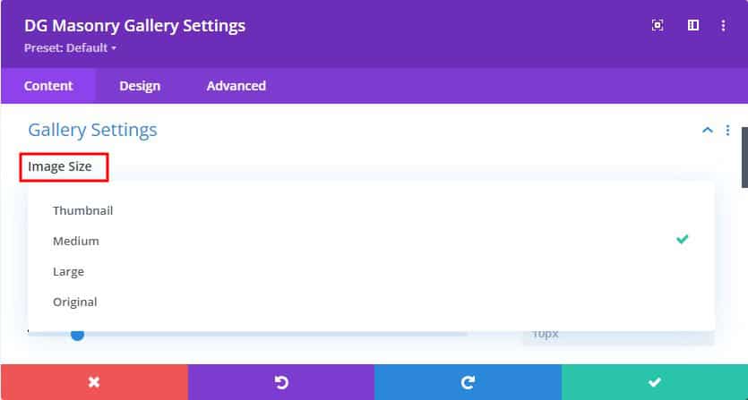
Image Size: Choose the size of your images, ranging from thumbnail to full size. You can select predefined sizes or set custom dimensions to ensure a consistent visual style across your gallery.
-
Images in Row: Determine how many images appear in each row, with options from 1 to 8. This setting allows you to create dense layouts with more images or spacious arrangements with fewer items per row.
-
Item Space-Between: Adjust the spacing between images to control the compactness or spread of your gallery. Whether you prefer tightly packed images or a layout with generous whitespace, this setting offers precise control.
-
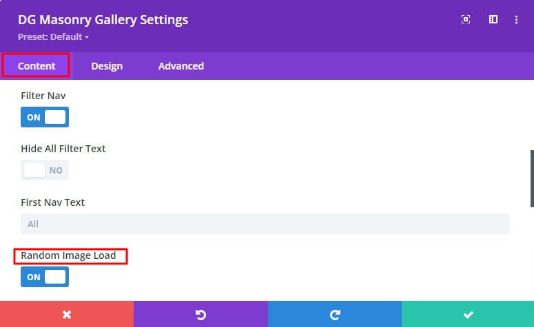
Filter Navigation:
- Filter Nav Switch: Toggle this option to enable a filter navigation menu above your gallery, allowing users to filter images by category.
- Hide All Filter Text Switch: Hide the default "All" filter option if it’s not needed, giving a more focused user experience.
- First Nav Text Input Box: Customize the label for the first filter category, ensuring it aligns with your content or branding.
- Random Image Load: Enabling this setting will display your images in a random order each time the page loads, creating a fresh and dynamic gallery experience.
3. Lightbox/Links
Control how images behave when clicked, with a range of options for linking and lightbox presentation:
-
Link Options: You can select the action that occurs when an image is clicked:
- Lightbox: Opens the image in a lightbox for a closer view.
- Media File: Links directly to the image file itself.
- Attachment Page: Redirects to a page containing the image and additional information.
- Custom URL: Set a custom link to any URL, making the gallery interactive and functional.
- No Link: Disable linking entirely if you only want the images to be displayed without further action.
- Lightbox Image Fit in Window: Ensure that images opened in the lightbox automatically resize to fit within the user’s screen, providing an optimized viewing experience.
4. Pagination
For galleries with many images, pagination options help manage loading and display by splitting content across multiple pages. You can control the number of images per page and style the pagination controls.
5. Overlay
This setting allows precise customization through the selection of a primary and secondary color, along with control over the gradient’s direction. These options enable designers to create smooth, visually engaging transitions that align with their design preferences. The flexibility offered by these settings ensures a dynamic and polished hover effect. You can also adjust the opacity for a seamless hover experience.
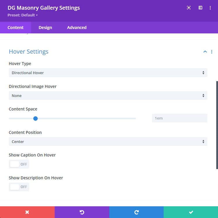
6. Hover Settings
The Masonry Gallery module provides two categories of hover effects, offering rich animation and interaction possibilities:
-
Directional Hover Settings: These settings control the hover effects that animate based on the direction of the mouse movement:
- Image Rotate: This applies a smooth rotation to the image when hovered over.
- Image Rotate (Odd and Even): Alternates the rotation direction for odd and even images in the gallery, adding variation.
- Image Blur: Introduces a blur effect on hover for a stylized appearance.
-
Advanced Hover Settings: More complex hover animations can be configured here, including border animations and content reveal:
- Hover Types: Choose from six different hover types, each offering distinct visual effects.
- Border Animation: 19+ animated border transitions that play when an image is hovered over.
- Image Hover type: The Masonry Gallery module offers over 10 image hover animations, such as pan left, pan right, zoom, and more. When hovering over images, these effects add dynamic motion and visual interest. Simply select the desired hover type from the available options and preview the results to see the differences in action.
Additionally, you can fine-tune hover content behavior:
- Content Space: Adjust the padding around content displayed on hover, ensuring it aligns well within the image area.
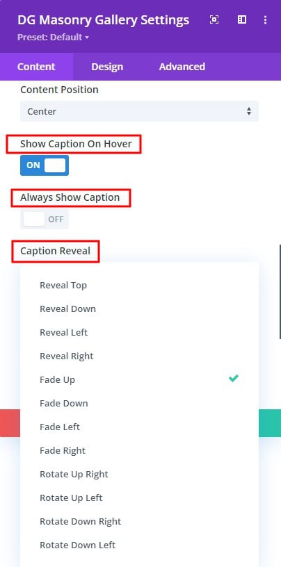
- Content Position: Choose where hover content appears (top left, center, bottom right & more) for optimal layout.
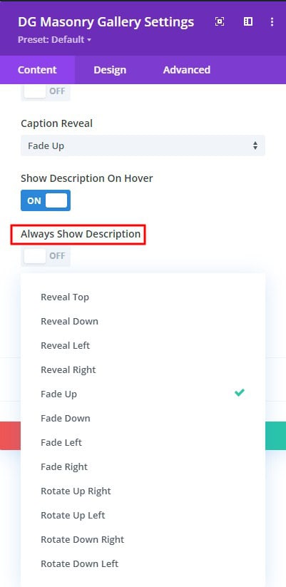
- Show Caption on Hover: Enable captions that appear only when hovering over an image.
- Caption Reveal: Select from 12 unique reveal effects for captions, such as sliding in, fading, or zooming.
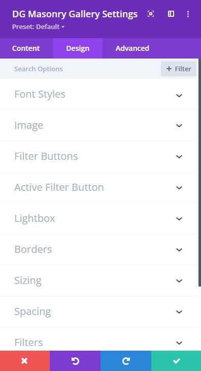
Design Customization
The Design tab focuses on styling and appearance, allowing you to customize every visual detail of your gallery for a polished and cohesive look.
Font Styles
Control the typography of text elements like captions and descriptions:
- Customize font family, weight, style, and size.
- Adjust line height, letter spacing, and text alignment.
- Choose colors that align with your overall design scheme.
Image Styling
- Customize the appearance of images using the following options:
- Border: Set border styles to define the outline of images.
- Box Shadow: Apply shadow effects to add depth and dimension.
- Image Hue: Adjust the hue to alter the color tone of images.
- Image Opacity: Control transparency to achieve various overlay effects.
- Image Blend Mode: Choose blend modes to control how images interact with backgrounds and overlays.
Filter Buttons & Active Filter Buttons
Style the filter buttons to align with your design by adjusting:
- Alignment: Position filter buttons as needed.
- Background: Customize the background color and hover states.
- Font Styles: Set the typography for filter button text.
- Borders: Apply border styles to define the button edges.
- Box Shadow: Add shadow effects for a 3D appearance.
 |
 |
 |
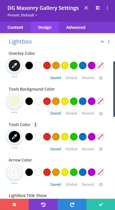
Lightbox
The Lightbox feature enhances the viewing experience by providing a pop-up window for images. Customize the lightbox with the following settings:
- Overlay Color: Choose the background color of the lightbox overlay, which appears behind the image and can affect the overall contrast and focus.
- Tools Background Color: Set the background color for the lightbox navigation tools (e.g., download, share) to ensure they blend with or contrast against the overlay.
- Tools Color: Customize the color of the lightbox navigation tools to enhance visibility and match your design theme.
- Arrow Color: Adjust the color of the navigation arrows within the lightbox to make them stand out or blend seamlessly with the overall design.
- Lightbox Title Show Switch: Toggle this option to display or hide the title of the image within the lightbox.
- Title Style: Choose from four title styles to fit your design:
- Pill: Rounded edges with a pill-like appearance.
- Transparent: A clear background with text only.
- Bar: A solid bar with the title text.
- Block: A block-style background with the title text.
- Preloader Type: Select from 10 different preloader animations to display while the lightbox image is loading. Options are (Plane, Chase, Bounce, Pulse & more)
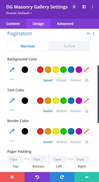
Pagination ( Normal & Active )
The Pagination settings control the appearance and spacing of pagination controls used for navigating through multiple pages of gallery images:
- Background Color: Set the background color for pagination buttons to ensure they are clearly visible and complement your gallery’s design.
- Text Color: Customize the color of the pagination text for clarity and consistency with your overall color scheme.
- Border Color: Define the color of the borders around pagination buttons to enhance their visibility and styling.
- Padding: Adjust the padding inside pagination buttons to control the spacing between the button text and its edges, ensuring a balanced appearance.
- Spacing: Set the spacing between pagination buttons to provide adequate separation and improve usability.
Some Common FAQs About Masonry Grid Module
How can I control the number of images displayed in each row?
In the Gallery Settings section of the Content tab, there is an option called Images in Row. You can choose to display between 1 and 8 images per row, allowing you to create a compact or spacious gallery layout.
Can I categorize and filter images in the gallery?
Yes, you can enable filter navigation in the Gallery Settings by toggling the Filter Nav Switch. This adds a filter menu above your gallery, letting users view images by category. You can also customize the filter labels and hide the default "All" filter if needed.
What hover effects can I apply to images in the gallery?
The module offers two types of hover effects: Directional Hover Settings and Advanced Hover Settings. Directional hover settings include options like image rotation and blur, while advanced hover settings provide more complex animations such as image hover type (12 image hover type) border transitions and multiple contents reveal effects.
Go to Hover Settings >> Select Hover types >> Customize style as you desire.
Is it possible to randomize the order in which images load?
Yes, you can enable the Random Image Load option in the Gallery Settings. This feature shuffles the order of the images each time the page is loaded, creating a fresh viewing experience. Go to Gallery Settings >> Turn ON Random image load switch.
How can I ensure that the lightbox images fit properly on all screen sizes?
The Lightbox Image Fit in Window option ensures that images opened in the lightbox resize automatically to fit within the user’s screen, providing an optimal viewing experience across devices. Go to Lightbox/Links >> Turn ON Lightbox Image Fit in Window Switch
Can I customize the captions displayed on hover?
Yes, in the Hover Settings, you can enable captions to display on hover and choose from 12 different captions to reveal effects. You can also adjust the caption’s font style, positioning, and space to fit your design preferences.
 |
 |
What types of image sizes can I choose for the gallery?
You can select from predefined image sizes such as thumbnail, medium, large, or full-size. Additionally, you have the flexibility to set custom dimensions, ensuring consistency and a balanced visual style within your gallery.
How do I control the spacing between images in the gallery?
In the Gallery Settings of the Content tab, there is an option called Item Space Between. You can adjust this setting to increase or decrease the gap between images, allowing for either a tighter or more spaced-out layout.
What happens if I disable the lightbox option?
Disabling the lightbox option in the Lightbox/Links settings will prevent images from opening in a pop-up window. Instead, depending on your link choice, images can either link directly to a media file, attachment page, or a custom URL or have no link at all.
Can I display content on hover that’s different from the image itself?
Yes, within the Hover Settings, you can enable and configure different content to show on hover, such as captions, buttons, or other elements. You also have options to control the content position and reveal effects.
What are the different caption reveal effects available?
The Masonry Gallery module offers 12 unique captions reveal effects, including sliding in from different directions, fading, zooming, and more. These options allow you to create dynamic visual transitions that enhance the user experience.
Is there an option to always show content on mobile devices?
Yes, within the Hover Settings, you can enable the option to always display content (such as captions) on mobile devices. This ensures that important information remains visible even when hover effects aren’t triggered on touch devices.
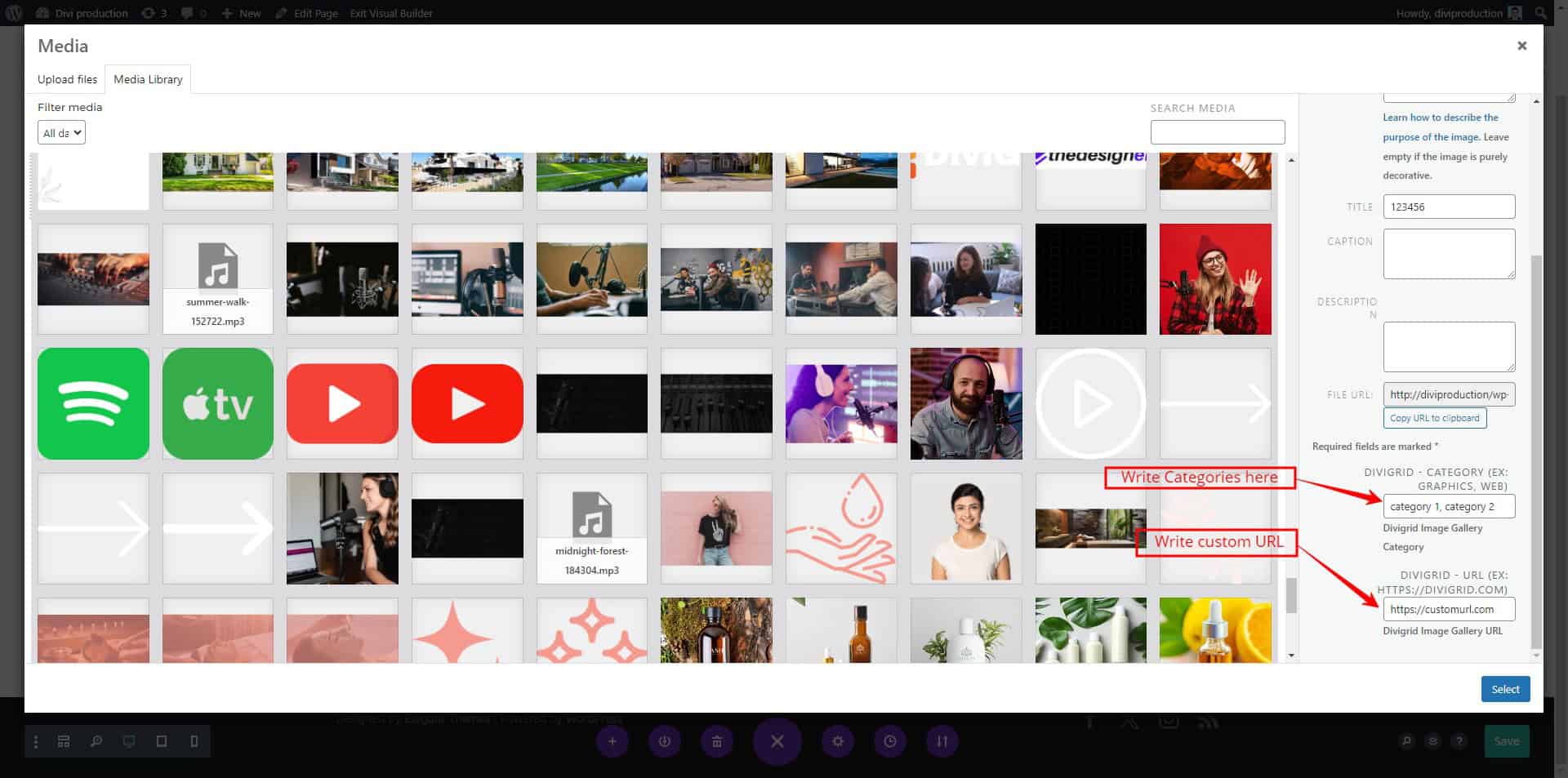
where do I write the custom URL & categories?
To write a custom URL, enter the specified URL in the Media Library DivGrid Custom URL field.
How to add the caption and the description?
When you upload an image to the media library or choose to upload a new file, you'll see a field next to each image where you can add a caption and description. Simply type in your desired caption and description for each image in those fields. If you choose not to provide any caption or description, they won't be displayed for that particular image in the gallery. So, it's completely up to you whether you want to include captions and descriptions for your images in the justified gallery.