Overview
Introducing the Advanced Blurb Module, a game-changer that transcends the limitations of the standard Divi Builder Blurb module. This module is a class apart, boasting a wealth of unique features and a modern aesthetic that sets it apart from the rest. What makes it truly special is its perfect blend of complete responsiveness across all devices and an easy-to-use customization interface, making it a powerful tool for crafting stunning content.
This documentation will help you to understand how to use the Advanced Blurb Module efficiently.
Advanced Blurb Content Tab
After inserting the DiviGrid Advanced Blurb Module you will find several new toggles along with the default toggles. Toggle names are listed below
- Content
- Image & Icon
- Badge
- Content Position
Content:
In the content toggle, you can title, subtitle, description, and button. The required content for a blurb, i.e. title, subtitle, description and linkable buttons can be added from this toggle.
Image & Icon: There is an opportunity to go beyond conventional concepts and use images and icons together. There is also an option to change the image while hovering and use a different image. If you want to use this unique feature, you have to turn on the Show Alternate Image on the Hover switch from the Image & Icon toggle. After turning on an image field will appear. You just have to upload the image to use it. What to do for that is :
Go to image & icon --> Enable Show Alternate Image Switch --> Upload and alternate image --> Save and publish.
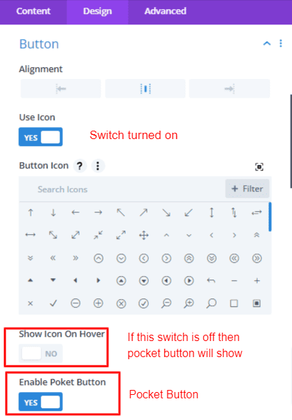
Also, if you need to use the icon for the sake of necessity, just switch on the use icon. Then select the icon and publish to see the image and icon showing simultaneously.
Badge: You can use badges in blurb in two ways. With and without images. When the image is present the badge will change its orientation to focus on the image. This means the badge can be set at any position on the image. Also when not using the image in some cases the badge will change its position by focusing on the full box. The idea that only text can be used in the bag can be changed by using badges and badge icons at the same time. Turn on the Use badge icon switch and select the icon. That's it.
Content Position: You can change the order between titles, subtitles, dividers, descriptions, and buttons located inside the container/box. The default value is 1. Gradually increasing the value from 1 causes the fields to change their position and move downwards. Decreasing the value of any of the fields below will make it appear above. Similarly, if you increase the value of any field placed above, it will appear below.
Advanced Blurb Design Tab
After inserting the DiviGrid Advanced Blurb Module you will find several new toggles along with the default toggles in the design tab. Toggle names are listed below
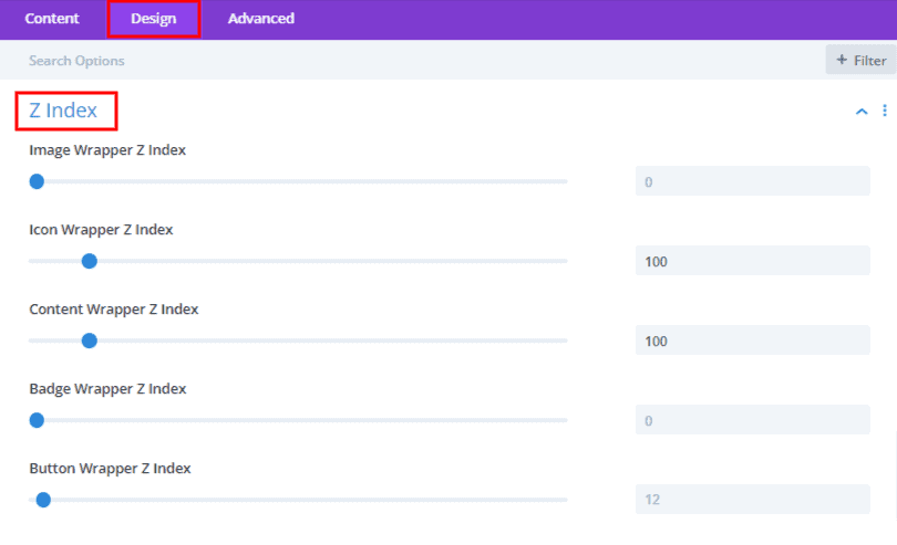
- Z Index
- Icon Settings
- Image Settings
- Hover Effect
- Badge Settings
- Divider Settings
- Content Wrapper Settings
- Button
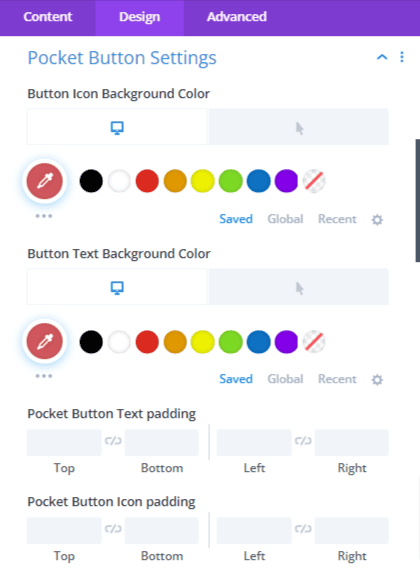
- Pocket Button Settings
Z Index: Each element in the blurb is a separate stack. You can change the position of the stack by the z index value. The element with the lowest value will be at the bottom. Whichever has more will be at the top of the stack.
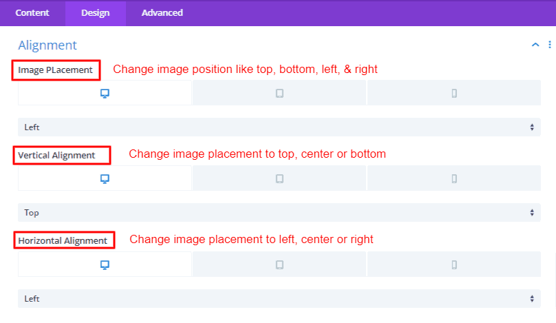
Alignment: This alignment feature allows for effortless image repositioning. It provides the flexibility to place the image at any desired location, whether it's the top, bottom, left, or right. Once you've chosen a position, you can further fine-tune the image's alignment both vertically and horizontally, ensuring a precise placement. Plus, it seamlessly adapts to various devices, making it easy to opt for a left alignment on a desktop and switch to a top alignment on mobile views.
Icon Settings: Modify the icon's color, size, margin, padding, border, box shadow, background, and alignment to your content. You have the flexibility to position the icon relative to the content box, whether it's at the top, left, right, or bottom, as well as adjust its placement. This feature seamlessly adapts to different devices and is a breeze to personalize. Moreover, for those who wish to write their own custom CSS, the Advanced tab provides a Custom CSS field for your creative expressions.
Image Settings: You have the power to adjust the blurb image's height, width, margin, padding, border, box-shadow, background, and alignment according to your preferences. You can use two types of values in image width, pixel value and percentage. The image's placement can be easily shifted using the Alignment options. This feature smoothly adapts to various devices, offering effortless personalization. Within the Image Settings, there's a captivating feature known as Image Overlay. This allows you to introduce a unique touch to your website by adding Mannan's signature overlay color to your image, enhancing its visual appeal. Moreover, if you're inclined to craft your own custom CSS, the Advanced tab offers a dedicated Custom CSS field, giving you the creative freedom to express yourself.
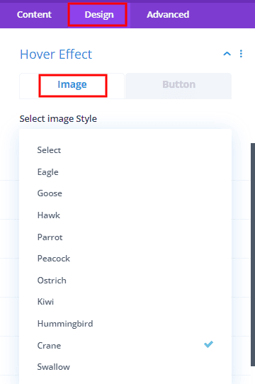
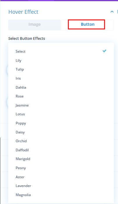
Hover Effect: A variety of effects can be created from hover effects to blurb images and custom buttons. Many hover effects are customized to save users time from writing custom code. Each effect is unique and new. Which is not possible to do with the Divi default button. Just choose and use. 10+ image hover effects and 15+ button hover effects are added in this hover effects toggle.
 |
 |
Badge Settings: Blurb badges are a fundamental component, serving a vital role in drawing attention to specific items. These badges can significantly enhance the focus of your content. Within the settings, you'll discover the ability to incorporate an icon into your badge. These settings grant you the flexibility to position the icon alongside your badge text, allowing for precise customization. You have complete control over badge attributes like font style, color, icon size, icon color, spacing, background, margin, padding, border, box-shadow, and alignment. Choose from nine different positions to place your badge, and even explore rotation options, enabling you to express your content in a visually compelling and effective manner.
A crucial point to remember is that the location of the badge is dependent on the presence of an image. When an image is present, the badge will adjust its position to the image. However, where there is no image, the placement of the badge shall be based on the entire container or box. That means, the badge cannot be used against the container if it has an image in it.
Divider Settings: Dividers can be used to increase the readability of content. Besides, content can be more focussed by changing the order and replacing the title or subtitle nicely. You can change the divider color, height, width, align style margin, etc. from the divider settings.
Content Wrapper Settings: The contents of the content wrapper are a title, subtitle, description, divider, and button. Content wrappers about these. This text content is enclosed with a wrapper. It also has the necessary customization options. You can easily change width, alignment, background color, border, etc. from these settings
Pocket Button Settings: These configuration options are designed for customizing the appearance of button text and icons on pocket buttons, offering the flexibility to style them differently. Notably, these settings come into effect when the "Show Icon On Hover" switch is turned off. This separation of styles allows for individual adjustments of padding, background color, border, box-shadow, and more, specifically for the button text and icons. This innovative feature opens the door to creating distinctive button designs that can elevate the visual appeal of your content.
 |
 |
Some common questions of Advanced Blurb
1. How to use the alternate image?
If you want to show another image along with the blurb image, switch to Alternate Image. After that upload and save the image. When hovering over the image, the original image will fade away to reveal the alternate image through a smooth transition. This is a unique feature which is not available in other blurb modules.
2. Can I use images and icons at the same time?
Yes Sure. You can use images and icons together. you can use and align both as your desired place.
3. What are pocket buttons? How does it work?
Pocket button is a feature. If you want to customize your button text and icon with your own choice, you can do so by switching the pocket button switch turned on. What to do for that is to first switch on the use icon and switch off the show icon on hover. A pocket button switch is available after turning it off. You can switch and design the pocket button from the settings as you like.
4. Can badges only be used in images?
No, you can use the badge on the image and also on the container. But it depends on some conditions. If your blurb module contains an image, the badge is relative to the image. Depending on the condition of the image, the badge can change its position to 9 different places. Again if there is no image in the module then the badge will change its position against the container.